


Flutter响应式布局插件responsive_widgets的使用
Flutter响应式布局插件responsive_widgets的使用

此插件帮助创建响应式小部件,通过计算运行应用程序的屏幕与参考屏幕大小(宽度、高度)之间的比例来自动调整大小。该包仅对原始小部件(如“Container”)应用一个计算函数。
重要提示
自版本2.0.0起,我们开始使用ScreenUtils包(flutter_screenutils)进行所有计算,有许多重大更改,因此如果您之前使用过此包,请停止使用ResponsiveWidgets.getSize(),改用此包内部的ScreenUtils。有关如何使用此包的更多信息,请查看该包的原始文档:
https://pub.dev/packages/flutter_screenutil。
基本上,现在此包变成了另一个包的辅助工具,帮助在小部件中更快地使用,并在使用ResponsiveWidgets.builder()时自动为Web版本添加LayoutBuilder。
如果您想使用旧版本的包,请使用版本1.1.0并在您的pubspec.yaml中指定:responsive_widgets: 1.1.0
功能
| 功能/支持平台 | 状态 |
|---|---|
| Android | ✅ |
| iOS | ✅ |
| 智能手机 | ✅ |
| 5.5英寸屏幕 | ✅ |
| 垂直模式 | ✅ |
| 水平模式 | ✅ |
| 平板 | ✅ |
| 平板垂直模式 | ✅ |
| 平板水平模式 | ✅ |
| Web支持 | ✅ |
开始使用
首先,您需要在应用程序的第一个屏幕上使用代码ResponsiveWidgets.init(context)来使插件工作。使用ResponsiveWidgets.builder(child: ),以便在设备尺寸发生变化时重新计算比例,甚至当设备旋转时也是如此。代码应放置在应用程序的第一个屏幕的build方法中,如下所示:
class _HomeScreenState extends State<HomeScreen> {
  [@override](/user/override)
  Widget build(BuildContext context) {
    // 初始化响应式插件
    ResponsiveWidgets.init(context,
      height: 1920, // 可选参数
      width: 1080,  // 可选参数
      allowFontScaling: true, // 可选参数
    );

    // 构建响应式布局
    return ResponsiveWidgets.builder(
      height: 1920, // 可选参数
      width: 1080,  // 可选参数
      allowFontScaling: true, // 可选参数
      child: Scaffold(
        body: Container(),
      ),
    );
  }
}
小部件
ContainerResponsive
ContainerResponsive(
    child: Widget, // 子小部件
    height: double, // 响应式高度
    heightResponsive: bool, // 是否启用响应式高度
    width: double, // 响应式宽度
    widthResponsive: bool, // 是否启用响应式宽度
)
SizedBoxResponsive
SizedBoxResponsive(
    child: Widget, // 子小部件
    height: double, // 响应式高度
    width: double, // 响应式宽度
)
EdgeInsetsResponsive(可用于任何带有padding参数的小部件)
Padding(
    child: Widget,
    padding: EdgeInsetsResponsive.all(50), // 响应式填充
)
TextResponsive
TextResponsive(
    text: String, // 响应式字体大小
)
RaisedButtonResponsive
RaisedButtonResponsive(
    child: Widget, // 子小部件
    onPressed: () {}, // 点击事件
)
负责重新计算大小的函数
在某些特殊情况下,可能没有创建响应式小部件,例如Positioned。为了解决这个问题,可以简单地使用此函数,它将返回正确的屏幕值。
// 根据设计稿的像素尺寸进行适配
// 适配屏幕宽度: ScreenUtil().setWidth(540),
// 适配屏幕高度: ScreenUtil().setHeight(200),

// 如果您的dart sdk >= 2.6,您可以使用扩展函数:
// 宽度: 50.w
// 高度: 200.h

// 示例:
Container(
  width: 50.w,
  height: 200.h,
)
字体适配
// 传入字体大小,单位为像素,字体不会根据系统设置缩放
ScreenUtil().setSp(28)

// 传入字体大小,单位为像素,字体会根据系统设置缩放
ScreenUtil().setSp(24, allowFontScalingSelf: true)

// 示例:
Column(
  crossAxisAlignment: CrossAxisAlignment.start,
  children: [
    Text(
      '我的字体大小在设计稿上是24px,不会随着系统改变',
      style: TextStyle(
        color: Colors.black,
        fontSize: ScreenUtil().setSp(24),
      ),
    ),
    Text(
      '我的字体大小在设计稿上是24px,会随着系统改变',
      style: TextStyle(
        color: Colors.black,
        fontSize: ScreenUtil()
            .setSp(24, allowFontScalingSelf: true),
      ),
    ),
  ],
)
示例
混合响应式和普通布局

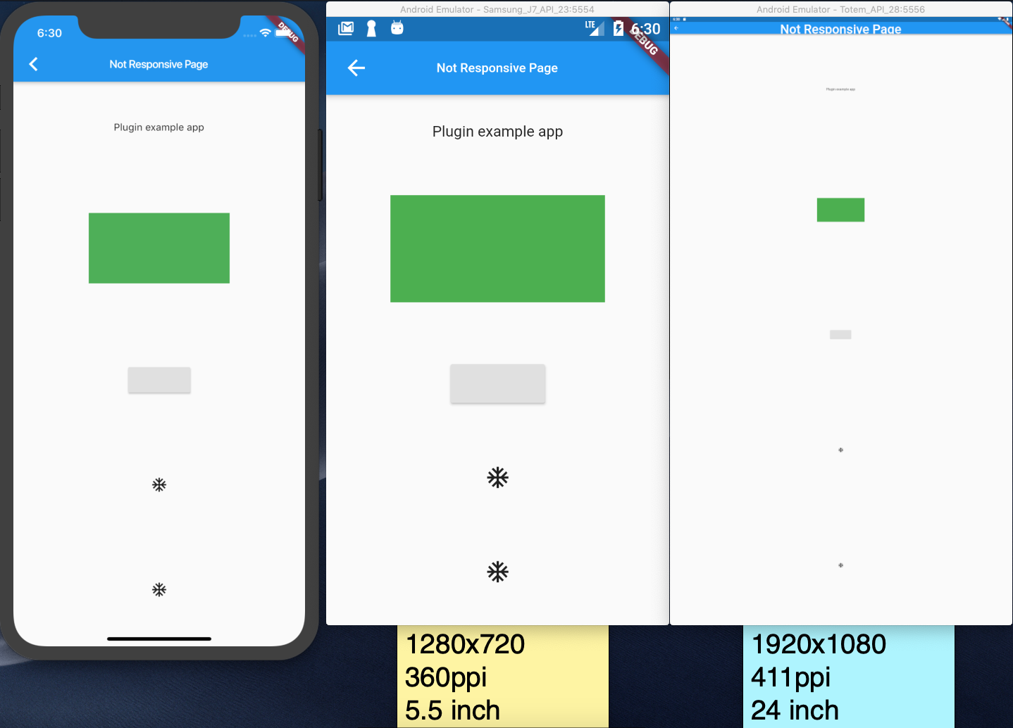
非响应式页面
响应式页面

示例代码
以下是一个完整的示例代码,展示如何使用responsive_widgets插件创建响应式布局。
import 'package:flutter/material.dart';
import 'package:responsive_widgets/responsive_widgets.dart';

void main() => runApp(MyApp());

class MyApp extends StatelessWidget {
  [@override](/user/override)
  Widget build(BuildContext context) {
    return MaterialApp(
      title: 'Flutter Responsive Example',
      theme: ThemeData(
        primarySwatch: Colors.blue,
      ),
      home: HomeScreen(),
    );
  }
}

class HomeScreen extends StatelessWidget {
  [@override](/user/override)
  Widget build(BuildContext context) {
    // 初始化响应式插件
    ResponsiveWidgets.init(context,
      height: 1920, // 参考屏幕高度
      width: 1080,  // 参考屏幕宽度
      allowFontScaling: true, // 是否允许字体缩放
    );

    return ResponsiveWidgets.builder(
      height: 1920, // 当前屏幕高度
      width: 1080,  // 当前屏幕宽度
      allowFontScaling: true, // 是否允许字体缩放
      child: Scaffold(
        appBar: AppBar(
          title: TextResponsive(
            text: '响应式布局示例',
            fontSize: 24,
          ),
        ),
        body: Center(
          child: Column(
            mainAxisAlignment: MainAxisAlignment.center,
            children: <Widget>[
              ContainerResponsive(
                width: 300,
                height: 200,
                color: Colors.blue,
                child: Center(
                  child: TextResponsive(
                    text: '这是一个响应式容器',
                    fontSize: 18,
                  ),
                ),
              ),
              SizedBox(height: 20),
              SizedBoxResponsive(
                width: 150,
                height: 50,
                child: RaisedButtonResponsive(
                  onPressed: () {},
                  child: TextResponsive(
                    text: '点击按钮',
                    fontSize: 16,
                  ),
                ),
              ),
            ],
          ),
        ),
      ),
    );
  }
}
更多关于Flutter响应式布局插件responsive_widgets的使用的实战教程也可以访问 https://www.itying.com/category-92-b0.html

更多关于Flutter响应式布局插件responsive_widgets的使用的实战系列教程也可以访问 https://www.itying.com/category-92-b0.html
responsive_widgets 是一个用于 Flutter 的响应式布局插件,它可以帮助开发者根据屏幕尺寸和方向自动调整 UI 布局。这个插件提供了一些便捷的 Widget,使得在不同设备上创建响应式布局变得更加容易。
安装
首先,你需要在 pubspec.yaml 文件中添加 responsive_widgets 依赖:
dependencies:
  flutter:
    sdk: flutter
  responsive_widgets: ^2.0.0
然后运行 flutter pub get 来安装依赖。
基本用法
responsive_widgets 提供了几个主要的 Widget,如 ResponsiveWidgets、ScreenTypeLayout、OrientationLayout 等,用于根据屏幕尺寸和方向来调整布局。
1. ResponsiveWidgets
ResponsiveWidgets 是一个包装器,它可以根据屏幕尺寸和方向来调整子 Widget 的布局。
import 'package:flutter/material.dart';
import 'package:responsive_widgets/responsive_widgets.dart';

class MyHomePage extends StatelessWidget {
  [@override](/user/override)
  Widget build(BuildContext context) {
    return Scaffold(
      appBar: AppBar(
        title: Text('Responsive Widgets Example'),
      ),
      body: ResponsiveWidgets(
        child: Center(
          child: TextResponsive(
            'Hello, World!',
            style: TextStyleResponsive(
              fontSize: 20.sp,
            ),
          ),
        ),
      ),
    );
  }
}
2. ScreenTypeLayout
ScreenTypeLayout 允许你根据屏幕类型(如手机、平板、桌面)来显示不同的布局。
import 'package:flutter/material.dart';
import 'package:responsive_widgets/responsive_widgets.dart';

class MyHomePage extends StatelessWidget {
  [@override](/user/override)
  Widget build(BuildContext context) {
    return Scaffold(
      appBar: AppBar(
        title: Text('ScreenTypeLayout Example'),
      ),
      body: ScreenTypeLayout(
        mobile: Center(
          child: Text('This is a mobile layout'),
        ),
        tablet: Center(
          child: Text('This is a tablet layout'),
        ),
        desktop: Center(
          child: Text('This is a desktop layout'),
        ),
      ),
    );
  }
}
3. OrientationLayout
OrientationLayout 允许你根据设备的方向(纵向或横向)来显示不同的布局。
import 'package:flutter/material.dart';
import 'package:responsive_widgets/responsive_widgets.dart';

class MyHomePage extends StatelessWidget {
  [@override](/user/override)
  Widget build(BuildContext context) {
    return Scaffold(
      appBar: AppBar(
        title: Text('OrientationLayout Example'),
      ),
      body: OrientationLayout(
        portrait: Center(
          child: Text('This is a portrait layout'),
        ),
        landscape: Center(
          child: Text('This is a landscape layout'),
        ),
      ),
    );
  }
}
自定义响应式尺寸
responsive_widgets 还提供了一些工具来帮助你根据屏幕尺寸动态调整 Widget 的大小。例如,你可以使用 ResponsiveWidgets 的 sp 和 dp 单位来设置字体大小和边距。
import 'package:flutter/material.dart';
import 'package:responsive_widgets/responsive_widgets.dart';

class MyHomePage extends StatelessWidget {
  [@override](/user/override)
  Widget build(BuildContext context) {
    return Scaffold(
      appBar: AppBar(
        title: Text('Custom Responsive Sizes'),
      ),
      body: ResponsiveWidgets(
        child: Center(
          child: Container(
            width: 100.dp,
            height: 100.dp,
            color: Colors.blue,
            child: Center(
              child: TextResponsive(
                'Hello',
                style: TextStyleResponsive(
                  fontSize: 20.sp,
                ),
              ),
            ),
          ),
        ),
      ),
    );
  }
}