


HarmonyOS 鸿蒙Next中List实现任意ListItem悬停效果
HarmonyOS 鸿蒙Next中List实现任意ListItem悬停效果
通常做法是使用 ListItemGroup({ header: this.ListHeader() }) 和 sticky(StickyStyle.Header) 来实现滚动时候自动悬停效果
但是这种做法局限性比较大,不够灵活 只能是在使用ListItemGroup时候支持
实现思路
组件的通用事件里面有onVisibleAreaChange(组件可见区域变化事件),我们就可以监听任意组件包括ListItem的可见区域变化,当不可见的时候显示需要悬浮的组件,反之隐藏。
onVisibleAreaChange([0.0, 1.0], (isVisible: boolean, currentRatio: number) =>
第一个参数为 阈值数组 表示组件可见面积的变化。 0表示完全不可见
第二个参数 回调函数 是否显示,当前可见面积的比例(阀值)
有了它之后我们就可以实现自动控制悬浮组件的显示隐藏,轻松实现滚动过程中悬停的效果
代码如下:
import { promptAction } from '@kit.ArkUI';
@Component
struct ListPage {
@State isVisible: boolean = false
@State textOpacity: number = 0
@State message: string[] = [
'Hello World0',
'Hello World1',
'Hello World2',
'Hello World3',
'Hello World0',
'Hello World1',
'Hello World2',
'Hello World3',
'Hello World0',
'Hello World1',
'Hello World2',
'Hello World3',
];
build() {
RelativeContainer() {
List() {
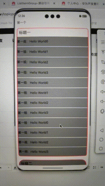
ListItem() {
Text('第一个')
.padding(10)
}
.onDetach(() => {
console.log('ListPage', `onDetach 第一个`)
})
.onVisibleAreaChange([0.0, 1.0], (isVisible: boolean, currentRatio: number) => {
console.info('ListPage', 'Test Text isVisible: ' + isVisible + ', currentRatio:' + currentRatio)
this.textOpacity = currentRatio
this.isVisible = isVisible
if (isVisible && currentRatio >= 1.0) {
console.info('ListPage', 'Test Text is fully visible. currentRatio:' + currentRatio)
}
if (!isVisible && currentRatio <= 0.0) {
console.info('ListPage', 'Test Text is completely invisible.')
}
})
.onDisAppear(() => {
console.log('ListPage', `第一个 不可见`)
})
ListItemGroup({ space: 2, header: this.ListHeader('一') }) {
ForEach(this.message, (item: string) => {
ListItem() {
Text(`第一组:${item}`)
.backgroundColor(Color.Gray)
.width('100%')
.height(50)
}
})
}
.borderRadius(10)
.borderWidth(2)
.borderColor(Color.Red)
.margin(10)
ListItemGroup({ header: this.ListHeader('二') }) {
ForEach(this.message, (item: string) => {
ListItem() {
Text(`第二组:${item}`)
.width('100%')
.height(50)
}
})
}
.divider({ color: Color.White, strokeWidth: 2 })
.borderRadius(30)
.borderWidth(2)
.backgroundColor(Color.Gray)
.borderColor(Color.Red)
.margin(10)
ListItem() {
Text('最后一个')
}.margin(10)
}
.id('AaPageHelloWorld')
.width('100%')
.height('100%')
//.sticky(StickyStyle.Header | StickyStyle.Footer)
.alignRules({
center: { anchor: '__container__', align: VerticalAlign.Center },
middle: { anchor: '__container__', align: HorizontalAlign.Center }
})
Text('第一个')
.width('100%')
.padding(10)
.visibility(this.isVisible ? Visibility.None : Visibility.Visible)
.opacity(1 - this.textOpacity)//元素的不透明度,取值范围为0到1,1表示不透明,0表示完全透明, 达到隐藏组件效果,但是在布局中占位。
.backgroundColor(Color.White)
.alignRules({
top: { anchor: '__container__', align: VerticalAlign.Top },
left: { anchor: '__container__', align: HorizontalAlign.Start }
})
.onClick(() => {
promptAction.showToast({ message: '元素的不透明度,取值范围为0到1,1表示不透明,0表示完全透明' })
})
}
.height('100%')
.width('100%')
}
@Builder
ListHeader(title: string) {
Text(`标题${title}`)
.fontSize(20)
.fontWeight(FontWeight.Medium)
.padding(10)
}
}
更多关于HarmonyOS 鸿蒙Next中List实现任意ListItem悬停效果的实战教程也可以访问 https://www.itying.com/category-93-b0.html


在HarmonyOS鸿蒙Next中,实现List中任意ListItem的悬停效果可以通过使用ListContainer和Component的布局属性来实现。具体步骤如下:
-
创建ListContainer:首先,使用
ListContainer组件来创建列表。ListContainer是鸿蒙系统中用于展示列表数据的基础组件。 -
自定义ListItem:为
ListContainer中的每一项创建一个自定义的Component。这个Component将作为ListItem的布局。 -
设置悬停效果:在自定义的
Component中,通过设置Component的onHover事件监听器来实现悬停效果。onHover事件会在用户将鼠标悬停在Component上时触发。 -
更新UI:在
onHover事件的处理函数中,更新Component的UI状态,例如改变背景颜色、显示额外的信息等,以实现悬停效果。 -
绑定数据:将数据绑定到
ListContainer中的每一项Component上,确保每个ListItem都能正确显示数据,并在悬停时展示相应的效果。 -
优化性能:为了确保列表的流畅性,可以使用
RecycleItemProvider来优化ListContainer的性能,避免在滚动时频繁创建和销毁Component。
以下是一个简单的代码示例,展示如何在ListContainer中实现ListItem的悬停效果:
class MyListItem extends Component {
  build() {
    Column() {
      Text('List Item Content')
        .fontSize(16)
        .fontColor(Color.Black)
    }
    .width('100%')
    .padding(10)
    .backgroundColor(Color.White)
    .onHover((isHovered) => {
      if (isHovered) {
        this.backgroundColor = Color.Gray;
      } else {
        this.backgroundColor = Color.White;
      }
    });
  }
}

class MyListContainer extends Component {
  build() {
    ListContainer() {
      ForEach(this.listData, (item) => {
        ListItem() {
          MyListItem()
        }
      })
    }
    .width('100%')
    .height('100%')
  }
}
在这个示例中,MyListItem组件通过onHover事件监听器实现了悬停效果,当用户将鼠标悬停在ListItem上时,背景颜色会变为灰色,移开时恢复为白色。MyListContainer则负责展示整个列表。