


HarmonyOS鸿蒙Next原子化服务开发实战-dialog自定义弹窗
HarmonyOS鸿蒙Next原子化服务开发实战-dialog自定义弹窗 主要实现为:
- 自定义弹窗容器。
属性:
除了支持通用属性外,还支持如下属性。
| 名称 | 类型 | 默认值 | 必填 | 描述 |
|---|---|---|---|---|
| dragable7+ | boolean | false | 否 | 设置对话框是否支持拖拽 |
说明:
- 弹窗类组件不支持focusable、click-effect属性。
样式:
仅支持通用样式中的width、height、margin、margin-[left|top|right|bottom]、margin-[start|end]样式。
事件:
不支持通用事件,仅支持如下事件:
| 名称 | 参数 | 描述 |
|---|---|---|
| cancel | - | 用户点击非dialog区域触发取消弹窗时触发的事件。 |
| show7+ | - | 对话框弹出时触发该事件。 |
| close7+ | - | 对话框关闭时触发该事件。 |
方法:
不支持通用方法,仅支持如下方法。
| 名称 | 参数 | 描述 |
|---|---|---|
| show | - | 弹出对话框。 |
| close | - | 关闭对话框。 |
示例
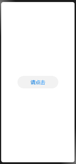
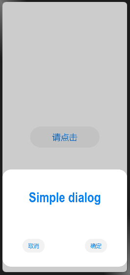
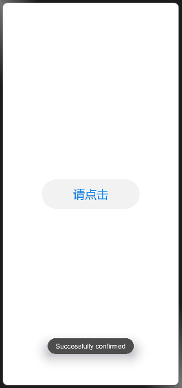
效果展示:
示例代码:
index.hml
<div class="doc-page">
    <div class="btn-div">
        <button type="capsule" value="请点击" class="btn" onclick="showDialog">请点击</button>
    </div>
    <dialog id="simpledialog" dragable="true" class="dialog-main" oncancel="cancelDialog">
        <div class="dialog-div">
            <div class="inner-txt">
                <text class="txt">Simple dialog</text>
            </div>
            <div class="inner-btn">
                <button type="capsule" value="取消" onclick="cancelSchedule" class="btn-txt">取消</button>
                <button type="capsule" value="确定" onclick="setSchedule" class="btn-txt">确定</button>
            </div>
        </div>
    </dialog>
</div>
index.css
.doc-page {
    flex-direction: column;
    justify-content: center;
    align-items: center;
}
.btn-div {
    width: 100%;
    height: 200px;
    flex-direction: column;
    align-items: center;
    justify-content: center;
}
.btn {
    width: 200px;
    height: 60px;
    font-size: 24px;
    background-color: #F2F2F2;
    text-color: #0D81F2;
}
.txt {
    color: #0D81F2;
    font-weight: bold;
    font-size: 39px;
}
.dialog-main {
    width: 500px;
}
.dialog-div {
    flex-direction: column;
    align-items: center;
}
.inner-txt {
    width: 400px;
    height: 160px;
    flex-direction: column;
    align-items: center;
    justify-content: space-around;
}
.inner-btn {
    width: 400px;
    height: 120px;
    justify-content: space-around;
    align-items: center;
}
.btn-txt {
    background-color: #F2F2F2;
    text-color: #0D81F2;
}
index.js
import prompt from '@system.prompt';
export default {
    showDialog(e) {
        this.$element('simpledialog').show()
    },
    cancelDialog(e) {
        prompt.showToast({
            message: 'Dialog cancelled'
        })
    },
    cancelSchedule(e) {
        this.$element('simpledialog').close()
        prompt.showToast({
            message: 'Successfully cancelled'
        })
    },
    setSchedule(e) {
        this.$element('simpledialog').close()
        prompt.showToast({
            message: 'Successfully confirmed'
        })
    },
    doubleclick(e){
        prompt.showToast({
            message: 'doubleclick'
        })
    }
}
更多关于HarmonyOS鸿蒙Next原子化服务开发实战-dialog自定义弹窗的实战教程也可以访问 https://www.itying.com/category-93-b0.html
3 回复


在HarmonyOS鸿蒙Next的原子化服务开发中,自定义弹窗(Dialog)可以通过以下步骤实现:
-
创建自定义布局:首先,在
resources/base/layout目录下创建自定义弹窗的布局文件,例如custom_dialog.xml。 -
定义Dialog类:在Java或Kotlin中创建一个继承自
CommonDialog的类,重写onCreateView方法,加载自定义布局。 -
设置弹窗属性:在
onCreateView方法中,可以设置弹窗的宽度、高度、背景、动画等属性。 -
显示弹窗:在需要显示弹窗的地方,实例化自定义Dialog类,并调用
show()方法。
示例代码:
public class CustomDialog extends CommonDialog {
    @Override
    protected Component onCreateView() {
        Component rootLayout = LayoutScatter.getInstance(getContext())
            .parse(ResourceTable.Layout_custom_dialog, null, false);
        return rootLayout;
    }
}
通过以上步骤,你可以轻松实现自定义弹窗,满足不同的UI需求。