


HarmonyOS鸿蒙Next中如何在快应用中实现标签组件
HarmonyOS鸿蒙Next中如何在快应用中实现标签组件
什么是标签组件
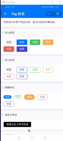
用于展示1个或多个文字标签,可点击切换选中、不选中的状态。
| 图1 uniapp组件效果 | 图2 原生快应用实现效果 |
|---|---|
 |
 |
以上标签组件具有如下特点:
- 可以配置标签内容
- 可以配置大小尺寸
- 可以配置颜色类型
- 是否为禁用状态
- 是否无需背景颜色
- 是否为圆角样式
- 是否为标记样式
- 自定义标签样式
基本实现
标签组件化设计
Tag标签组件是由一个text组件构成的,通过计算属性来设置css样式来实现的。
代码结构如下:
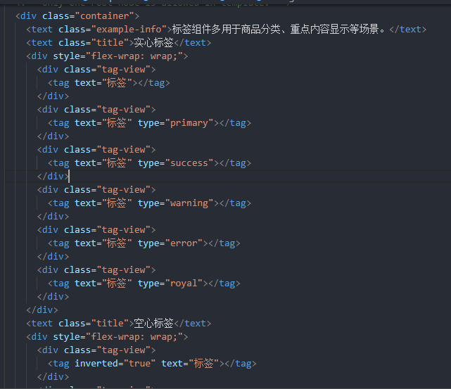
<import name="tag" src="./Tag/tag.ux"></import>
<template>
  <div class="container">
    <text class="title">实心标签</text>
    <div style="flex-wrap: wrap;">
      <div class="tag-view">
        <tag text="标签"></tag>
      </div>
      <div class="tag-view">
        <tag text="标签" type="warning"></tag>
      </div>
    </div>
  </div>
</template>
子组件标签组件设计
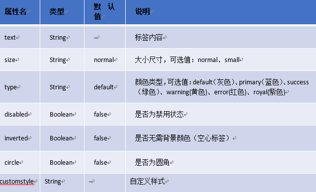
支持的属性
标签子组件布局及样式
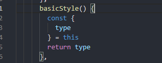
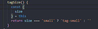
- type控制Tag组件标签类型,可设置default、primary、success、warning、error、royal。通过计算属性获取设置的type值及css样式。

- size控制标签大小,可设置normal, small。通过计算属性获取设置的size值并判断是否使用small样式及对应css样式。
- text控制标签内容。
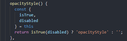
- Disabled控制是否是不可点击状态,默认是false。通过计算属性获取设置的size值,并判断是否可点击及对应css样式。
- Inverted控制标签是否是实心显示,通过计算属性获取设置的Inverted值并判断是否实心,然后显示其对应的css样式。
- circle控制是否为圆角样式,通过计算属性获取设置的circle值并判断是否圆角,然后显示其对应的css样式。
- Mark控制是否为标记样式,通过计算属性获取设置的Inverted值并判断是否标记样式,然后显示其对应的css样式。
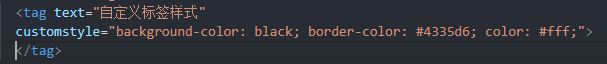
- Customstyle控制自定义样式。
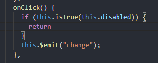
自定义子组件-change事件
子组件通过this.$emit注册
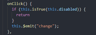
父组件通过onchange去监听
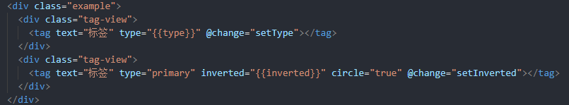
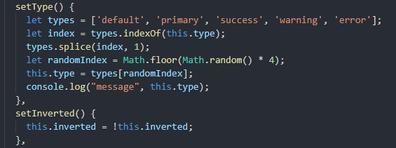
父组件引用标签子组件
总结
- 熟悉快应用子组件的设计和属性定义;
- 熟悉text组件以及通用样式的使用;
- 熟悉通过计算属性来设置样式;
- 熟悉$emit事件的使用;
代码附录
标签字组件Tag.ux代码
<template>
<text class="tag {{markStyle}} {{basicStyle}} {{invertedColor}} {{tagSize}} {{opacityStyle}}{{radiuSize}}" style="{{customstyle}}" @click="onClick">{{ text }}</text>
</template>
<style>
.tag {
padding: 5px 15px;
color: #333;
border-radius: 5px;
background-color: #eeecec;
border-width: 1px;
border-color: #eeecec;
font-size: 28px;
}
.default-inverted {
color: #333;
background-color: #ffffff;
border-width: 1px;
border-color: #eeecec;
font-size: 28px;
}
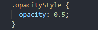
.opacityStyle {
opacity: 0.5;
}
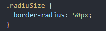
.radiuSize {
border-radius: 50px;
}
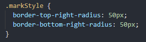
.markStyle {
border-top-right-radius: 50px;
border-bottom-right-radius: 50px;
}
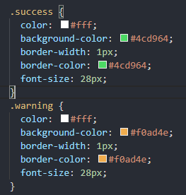
.success {
color: #fff;
background-color: #4cd964;
border-width: 1px;
border-color: #4cd964;
font-size: 28px;
}
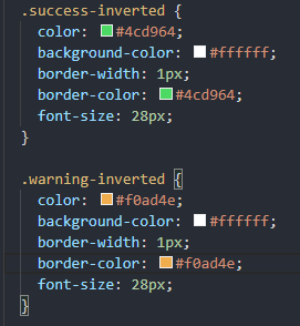
.success-inverted {
color: #4cd964;
background-color: #ffffff;
border-width: 1px;
border-color: #4cd964;
font-size: 28px;
}
.warning {
color: #fff;
background-color: #f0ad4e;
border-width: 1px;
border-color: #f0ad4e;
font-size: 28px;
}
.warning-inverted {
color: #f0ad4e;
background-color: #ffffff;
border-width: 1px;
border-color: #f0ad4e;
font-size: 28px;
}
.error {
color: #fff;
background-color: #dd524d;
border-width: 1px;
border-color: #dd524d;
font-size: 28px;
}
.error-inverted {
color: #dd524d;
background-color: #ffffff;
border-width: 1px;
border-color: #dd524d;
font-size: 28px;
}
.royal {
color: #fff;
background-color: #4335d6;
border-width: 1px;
border-color: #4335d6;
}
.royal-inverted {
color: #4335d6;
background-color: #ffffff;
border-width: 1px;
border-color: #4335d6;
font-size: 28px;
}
.primary {
color: #fff;
background-color: #007aff;
border-width: 1px;
border-color: #007aff;
font-size: 28px;
}
.primary-inverted {
color: #007aff;
background-color: #ffffff;
border-width: 1px;
border-color: #007aff;
}
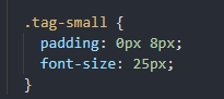
.tag-small {
padding: 0px 8px;
font-size: 25px;
}
</style>
<script>
module.exports = {
props: {
type: {
// 标签类型default、primary、success、warning、error、royal
type: String,
default: "default"
},
size: {
// 标签大小 normal, small
type: String,
default: "normal"
},
// 标签内容
text: {
type: String,
default: ""
},
disabled: {
// 是否为禁用状态
type: [Boolean, String],
default: false
},
inverted: {
// 是否为空心
type: [Boolean, String],
default: false
},
circle: {
// 是否为圆角样式
type: [Boolean, String],
default: false
},
mark: {
// 是否为标记样式
type: [Boolean, String],
default: false
},
customstyle: {
type: String,
default: ''
}
},
data: {
invertedColor: '',
radiuSize: '',
markStyle: '',
tagSize: '',
},
computed: {
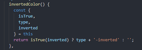
invertedColor() {
const {
isTrue,
type,
inverted
} = this
return isTrue(inverted) ? type + '-inverted' : '';
},
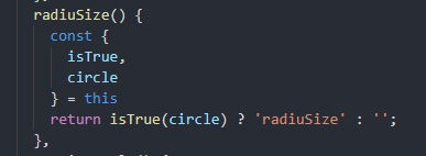
radiuSize() {
const {
isTrue,
circle
} = this
return isTrue(circle) ? 'radiuSize' : '';
},
opacityStyle() {
const {
isTrue,
disabled
} = this
return isTrue(disabled) ? 'opacityStyle' : '';
},
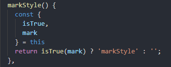
markStyle() {
const {
isTrue,
mark
} = this
return isTrue(mark) ? 'markStyle' : '';
},
basicStyle() {
const {
type
} = this
return type
},
tagSize() {
const {
size
} = this
return size === 'small' ? 'tag-small' : ''
}
},
isTrue(value) {
return value === true || value === 'true'
},
onClick() {
if (this.isTrue(this.disabled)) {
return
}
this.$emit("change");
},
}
</script>
更多关于HarmonyOS鸿蒙Next中如何在快应用中实现标签组件的实战教程也可以访问 https://www.itying.com/category-93-b0.html
1 回复

更多关于HarmonyOS鸿蒙Next中如何在快应用中实现标签组件的实战系列教程也可以访问 https://www.itying.com/category-93-b0.html
在HarmonyOS鸿蒙Next中,快应用通过<tabs>和<tab-bar>组件实现标签功能。首先,在<tabs>中定义多个<tab-content>,每个<tab-content>对应一个标签页内容。然后,使用<tab-bar>定义标签栏,通过<tab-bar-item>设置每个标签项。通过index属性绑定当前选中的标签页,实现切换效果。示例代码如下:
<tabs index="{{currentIndex}}">
  <tab-bar>
    <tab-bar-item for="tabs" value="{{$item}}">{{$item}}</tab-bar-item>
  </tab-bar>
  <tab-content for="tabs">
    <text>{{$item}} Content</text>
  </tab-content>
</tabs>
在data中定义tabs数组和currentIndex,控制标签页的显示和切换。