


HarmonyOS鸿蒙Next中快应用如何实现tab页面切换时更新tab样式?
HarmonyOS鸿蒙Next中快应用如何实现tab页面切换时更新tab样式? 问题背景: 在日常开发中,有时需要实现tab页面切换时更新tab样式,比如使tab文字突出显示。
解决方案: 快应用中,tabs配套tab-content组件实现选项卡样式。在js代码中,动态绑定tabs的index属性,监听tabs的change事件,实现页签与内容页的联动。
实现方法:
- 通过点击页签,将index值赋给currentIndex。
- 通过监听tabs,将evt.index值赋给currentIndex。
- tab选中的时候样式设为active;未选中的时候设为’'或者初始化默认的样式。
实现代码:
<template>
<div class="tutorial-page">
<div class="flexible-tabs">
<div class="flexible-tabbar">
<text class="{{currentIndex === 0 ? 'active' : ''}}" "clickTabBar"(0)>聊天</text>
<text class="{{currentIndex === 1 ? 'active' : ''}}" "clickTabBar"(1)>发现</text>
<text class="{{currentIndex === 2 ? 'active' : ''}}" "clickTabBar"(2)>通讯录</text>
</div>
<tabs "changeTabactive" index="{{currentIndex}}">
<tab-content class="flexible-tab-content">
<div class="tab-content-section">
<text>聊天</text>
</div>
<div class="tab-content-section">
<text>发现</text>
</div>
<div class="tab-content-section">
<text>通讯录</text>
</div>
</tab-content>
</tabs>
</div>
</div>
</template>

<style lang="less">
.tutorial-page {
flex: 1;
.flexible-tabs {
flex: 1;
flex-direction: column;
.flexible-tabbar {
height: 100px;
padding: 0 30px;
background-color: #f1f1f1;
align-items: center;
text {
flex-grow: 1;
height: 100px;
margin: 0 30px;
text-align: center;
border: 0px solid #f1f1f1;
border-bottom-width: 5px;
}
image {
height: 50px;
width: 50px;
resize-mode: contain;
}
.active {
color: #0faeff;
border-bottom-color: #0faeff;
}
}
.flexible-tab-content {
flex: 1;
.tab-content-section {
flex: 1;
background-color: #ffffff;
justify-content: center;
}
}
}
</style>

<script>
export default {
private: {
currentIndex: 0
},
onInit() {
this.$page.setTitleBar({
text: 'tabs'
})
},
changeTabactive(evt) {
this.currentIndex = evt.index
},
clickTabBar(index) {
this.currentIndex = index
},
}
</script>
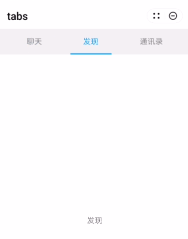
效果截图:
更多关于HarmonyOS鸿蒙Next中快应用如何实现tab页面切换时更新tab样式?的实战教程也可以访问 https://www.itying.com/category-93-b0.html
1 回复

更多关于HarmonyOS鸿蒙Next中快应用如何实现tab页面切换时更新tab样式?的实战系列教程也可以访问 https://www.itying.com/category-93-b0.html
在HarmonyOS鸿蒙Next中,快应用实现tab页面切换时更新tab样式,可通过监听页面切换事件并动态修改样式。具体步骤:
- 定义Tab组件:使用
<tabs>和<tab-bar>组件创建Tab布局。 - 监听切换事件:使用
@change事件监听Tab切换。 - 动态更新样式:在事件回调中,通过修改
class或style属性更新当前选中Tab的样式。
示例代码:
<tabs @change="onTabChange">
  <tab-bar>
    <text :class="{'active': currentTab === 0}">Tab1</text>
    <text :class="{'active': currentTab === 1}">Tab2</text>
  </tab-bar>
</tabs>
export default {
  data() {
    return {
      currentTab: 0
    };
  },
  methods: {
    onTabChange(e) {
      this.currentTab = e.index;
    }
  }
};
通过currentTab动态控制class,实现样式更新。