


HarmonyOS鸿蒙Next中【快应用】倒三角怎么实现
HarmonyOS鸿蒙Next中【快应用】倒三角怎么实现 现象描述
在快应用中使用border来实现一个倒三角,未能实现预想的效果。联盟可以,华为不行。
代码如下:
<div class="triangle-container">
<div class="triangle-area">
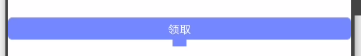
<text class="triangle-text">领取</text>
<div class="triangle-icons"></div>
</div>
</div>
<style lang="less">
.triangle-container {
width: 100%;
height: 70px;
display: flex;
justify-content: center;
align-items: center;
flex-direction: column;
.triangle-area {
width: 100%;
height: 100%;
display: flex;
justify-content: center;
align-items: center;
flex-direction: column;
.triangle-text {
width: 100%;
height: 50px;
background-color: #7584f9;
border-radius: 10px;
font-size: 25px;
text-align: center;
line-height: 50px;
color: #fff;
}
.triangle-icons {
width: 0;
height: 0;
border-top: 15px solid #7584f9;
border-right: 15px solid transparent;
border-left: 15px solid transparent;
}
}
}
</style>
效果图如下:
问题分析
这是华为与联盟的底层实现差异导致的。
解决办法:
- 用
stack组件父节点,然后再用依次div覆盖在上,在div中设置相关样式,从而达到最终效果。
代码如下:
<div class="container">
  <stack class="item-container">
    <div class="arrow_a"></div>
    <div class="arrow_b"></div>
  </stack>
</div>

<style>
.container {
  flex: 1;
  flex-direction: column;
}
.item-container {
  width: 500px;
  height: 500px;
}
.arrow_a {
  width: 80px;
  height: 80px;
  background-color: rgb(66, 66, 241);
  top: 250px;
  left: 250px;
  margin-top: -40px;
  margin-left: -40px;
  transform: rotate(45deg);
}
.arrow_b {
  width: 150px;
  height: 150px;
  background-color: #ffffff;
  top: 250px;
  left: 250px;
  margin-top: -150px;
  margin-left: -75px;
}
</style>
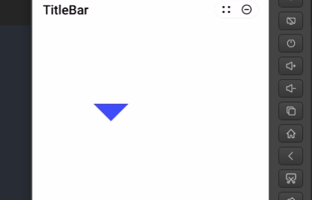
效果图如下:
- 使用
canvas组件画一个出来。 - 使用图片堆叠来实现。
更多关于HarmonyOS鸿蒙Next中【快应用】倒三角怎么实现的实战教程也可以访问 https://www.itying.com/category-93-b0.html
1 回复

更多关于HarmonyOS鸿蒙Next中【快应用】倒三角怎么实现的实战系列教程也可以访问 https://www.itying.com/category-93-b0.html
在HarmonyOS鸿蒙Next中实现【快应用】的倒三角效果,可以通过CSS样式和组件布局来完成。以下是实现步骤:
- 使用
<div>元素:创建一个<div>元素作为倒三角的容器。 - 设置样式:通过CSS的
border属性来绘制倒三角。将border-left和border-right设置为透明,border-bottom设置为所需的颜色和宽度。 - 调整大小:通过
width和height属性调整倒三角的大小。
示例代码:
.triangle {
    width: 0;
    height: 0;
    border-left: 10px solid transparent;
    border-right: 10px solid transparent;
    border-bottom: 20px solid #000;
}
在快应用的.ux文件中应用此样式:
<div class="triangle"></div>
这样即可在快应用中实现倒三角效果。