


HarmonyOS鸿蒙Next手表智能穿戴设备圆形屏幕圆形列表适配,圆形列表两端逐渐缩小、渐隐效果
HarmonyOS鸿蒙Next手表智能穿戴设备圆形屏幕圆形列表适配,圆形列表两端逐渐缩小、渐隐效果
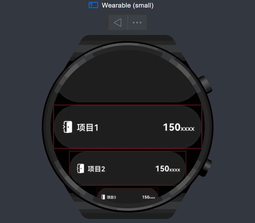
当ListItem滑到屏幕中间时显示最大比例,往两侧边缘滑时逐渐缩小至最小比例,由于在使用 scale 对组件进行缩小后,缩小前的位置会仍然占有,导致循环列表的每一项都会有不均匀的间隙,我这里通过 offset 来进行偏移补偿解决,但是这会带来一个问题就是,当ListItem缩小到最小值的时候,滑动到某一位置会很突然地一下子消失了,视觉效果很不好,如何解决?
更多关于HarmonyOS鸿蒙Next手表智能穿戴设备圆形屏幕圆形列表适配,圆形列表两端逐渐缩小、渐隐效果的实战教程也可以访问 https://www.itying.com/category-93-b0.html

感谢提问,为了更快的解决您的问题,请提供以下信息:
- 手表设备的品牌类型
- 手表设备版本
我们将在收到信息后尽快处理。
更多关于HarmonyOS鸿蒙Next手表智能穿戴设备圆形屏幕圆形列表适配,圆形列表两端逐渐缩小、渐隐效果的实战系列教程也可以访问 https://www.itying.com/category-93-b0.html


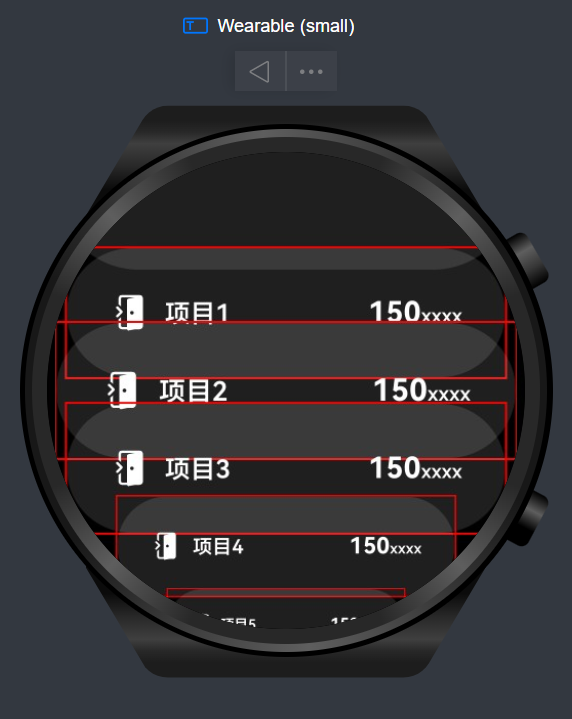
重新优化了一下代码,由于使用 scale 对组件进行缩小后(由大到小),缩小前的位置会仍然占有,导致循环列表的每一项都会有不均匀的间隙,此次我将不再通过 offset 来进行偏移来补偿解决,而是通过使用 scale 对组件进行放大的方案(由小到大)来解决.
解释
之前: scale 从 1 到 0.5 占用的位置为 1
现在: scale 从 1 到 2 放大后占用的位置为 1
由于使用 scale 对组件进行缩放,占用的位置并不会实时跟随,所以当组件放大到 2 后,占有的位置仍为 1,这样就会导致组件重叠如下图:
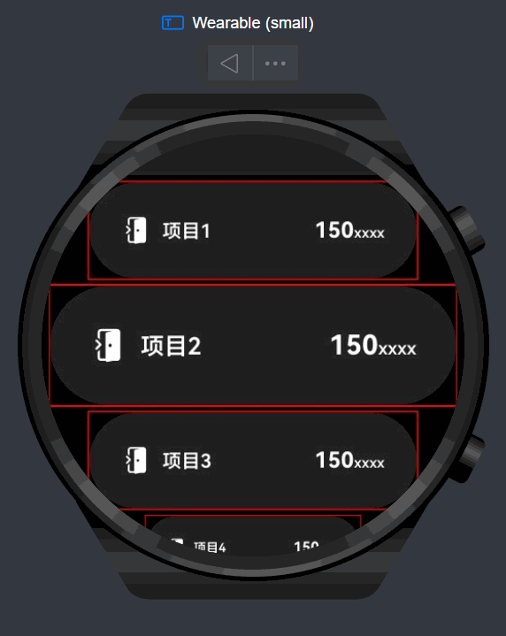
这里,只要动态重新计算一下组件的高度即可解决:
.height(33 * this.listItemScale[index])
最终效果:
完整代码如下:
interface ScaleRange {
  MIN: number,
  MAX: number
}

interface ScaleZone {
  TOP: number, // 顶部渐隐区
  CENTER: number[], // 中心区域
  BOTTOM: number // 底部渐隐区
}

[@Entry](/user/Entry)
[@Component](/user/Component)
struct Index {
  [@State](/user/State) yOffset: number = 0
  [@State](/user/State) listItemScale: number[] = []
  private listScroller: ListScroller = new ListScroller()
  [@State](/user/State)
  array: Array<string> =
    ['1', '2', '3', '4', '5', '6', '7', '8', '9', '10']
  private readonly SCALE_RANGE: ScaleRange = {
    MIN: 1, // 渐隐最小比例
    MAX: 2 // 最大比例
  };
  private readonly SCROLL_ZONE: ScaleZone = {
    TOP: 0, // 顶部渐隐区(0-86.5)
    CENTER: [86.5, 146.5], // 中心区域
    BOTTOM: 233   // 底部渐隐区(146.5-233)
  };

  build() {
    Stack({ alignContent: Alignment.Center }) {
      List({
        scroller: this.listScroller,
        space: 4,
      }) {
        ListItem() {
          Column() {
            Text('12:00')
              .fontColor(Color.White)
            Blank().height(8)
            Text('圆形列表')
              .fontSize(17)
              .fontWeight(FontWeight.Bold)
              .fontColor('#39C5BB')
          }.padding({
            top: 10, bottom: 10
          })
        }

        ListItem()
          .width('100%')
          .height(82)
          .backgroundColor('#1FFFFFFF')
          .borderRadius(41)

        ForEach(this.array, (item: string, index: number) => {
          ListItem() {
            // 列表项内容...
            CommonListItem({
              icon: $r('sys.media.return_home_fill'),
              text: '项目' + item,
              slot: dataItem,
              slotValue1: 150,
            })
              .border({ width: 0.5, color: Color.Red })
              .scale({
                x: this.listItemScale[index],
                y: this.listItemScale[index],
              })
          }
          .width('100%')
          .height(33 * this.listItemScale[index])

          .onAreaChange((oldValue, newValue) {
            const ITEM_HEIGHT = newValue.height as number // 列表项原始高度
            const childCenter = (newValue.position.y as number) + ITEM_HEIGHT / 2;

            let scale = this.SCALE_RANGE.MAX

            // 处理顶部区域(0-86.5)
            if (this.SCROLL_ZONE.TOP <= childCenter && childCenter <= this.SCROLL_ZONE.CENTER[0]) {
              const progress = Math.min(1,
                (childCenter - this.SCROLL_ZONE.TOP) / (this.SCROLL_ZONE.CENTER[0] - this.SCROLL_ZONE.TOP))

              // 缩放比例从0.5到1.0
              scale = this.SCALE_RANGE.MIN + (this.SCALE_RANGE.MAX - this.SCALE_RANGE.MIN) * progress
            }
            // 中心区域(86.5-146.5)保持最大值
            else if (childCenter >= this.SCROLL_ZONE.CENTER[0] && childCenter <= this.SCROLL_ZONE.CENTER[1]) {
              scale = this.SCALE_RANGE.MAX
            }
            // 处理底部区域(146.5-233)
            else if (this.SCROLL_ZONE.CENTER[1] <= childCenter && childCenter <= this.SCROLL_ZONE.BOTTOM) {
              const progress = Math.min(1,
                (childCenter - this.SCROLL_ZONE.CENTER[1]) / (this.SCROLL_ZONE.BOTTOM - this.SCROLL_ZONE.CENTER[1]))

              // 缩放比例从1.0到0.5
              scale = this.SCALE_RANGE.MAX - (this.SCALE_RANGE.MAX - this.SCALE_RANGE.MIN) * progress
            } else {
              scale = this.SCALE_RANGE.MIN
            }

            this.listItemScale[index] = Math.min(
              this.SCALE_RANGE.MAX,
              Math.max(this.SCALE_RANGE.MIN, scale)
            );

          })

        })
      }
      .height('100%')
      .width('100%')
      .padding({ left: 4, right: 4 })
      .scrollSnapAlign(this.yOffset > 0 ? ScrollSnapAlign.CENTER : ScrollSnapAlign.START)
      .scrollBar(BarState.Off)
      .alignListItem(ListItemAlign.Center)
      .defaultFocus(true)
      .onWillScroll(() => {
        this.yOffset = this.listScroller.currentOffset().yOffset
      })

    }
    .width('100%')
    .height('100%')
  }
}

[@Component](/user/Component)
export struct CommonListItem {
  [@Builder](/user/Builder)
  CustomBuildFunction() {}

  icon?: Resource
  [@Prop](/user/Prop) text: string
  slotValue1?: number | string
  slotValue2?: number | undefined
  [@BuilderParam](/user/BuilderParam) slot: (value1: number | string, value2?: number | undefined) => void = this.CustomBuildFunction

  build() {
    Row({ space: 4 }) {
      Image(this.icon)
        .width(10)
        .height(10)
        .fillColor(Color.White)
      Text(this.text)
        .fontColor(Color.White)
        .fontSize(6.5)
        .fontWeight(600)
        .layoutWeight(1)
        .textAlign(TextAlign.Start)
      if (!this.slotValue2) {
        this.slot(this.slotValue1!)
      } else {
        this.slot(this.slotValue1!, this.slotValue2!)
      }
    }
    .width('50%')
    .height(33)
    .padding({
      left: 11,
      right: 11,
    })
    .backgroundColor('#1FFFFFFF')
    .borderRadius(33)
  }
}

[@Builder](/user/Builder)
export function dataItem(value1: number | string) {
  Text() {
    Span(`${value1 || '--'}`)
      .fontColor(Color.White)
      .fontSize(7.5)
      .fontWeight(700)
    Span('xxxx')
      .fontColor(Color.White)
      .fontSize(5)
      .fontWeight(600)
  }
}
