


HarmonyOS鸿蒙NEXT应用元服务常见列表操作Tabs吸顶场景
HarmonyOS鸿蒙NEXT应用元服务常见列表操作Tabs吸顶场景
Tabs吸顶场景
场景描述
Tabs嵌套List的吸顶效果,常用于新闻、资讯类应用的首页。
本场景以Tabs页签首页内容为例,在首页TabContent的内容区域使用List组件配合其它组件,构建下方列表数据内容。进入页面后,向上滑动内容,中间Tabs页签区域实现吸顶展示的效果。
页面整体结构图
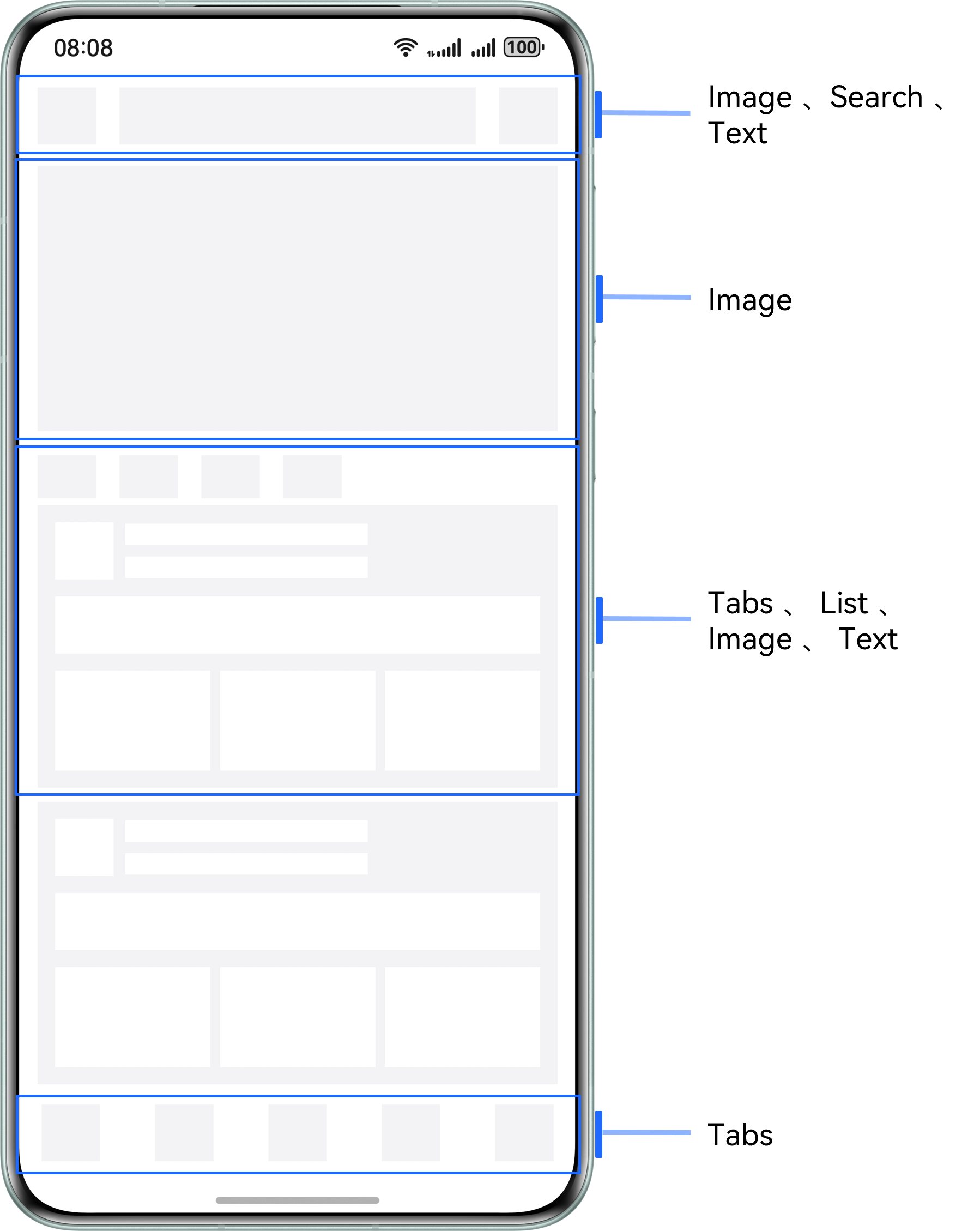 |
 |
实现原理
Tabs组件可以在页面内快速实现视图内容的切换,让用户能够聚焦于当前显示的内容,并对页面内容进行分类,提高页面空间利用率。
通过Tabs组件,配合使用Stack、Scroll、Search以及List等基础组件构建完整页面,再使用List组件的nestedScroll属性,结合calc计算高度,实现中间Tabs页签区域吸顶展示的效果。
开发步骤
-
构建Tabs的自定义tabBar内容。
-
示例:
@Builder
.tabBuilder(img: Resource, title: Resource, index: number) {
  Column() {
    Image(img)
      // ...
      .fillColor(this.currentIndex === index ? '#0a59f7' : '#66000000')
    Text(title)
      // ...
      .fontColor(this.currentIndex === index ? '#0a59f7' : '#66000000')
  }
  // ...
  .onClick(() => {
    this.currentIndex = index;
    this.tabsController.changeIndex(this.currentIndex);
  })
}
ManagerPage.ets
.Tabs({ barPosition: BarPosition.End, controller: this.tabsController }) {
  TabContent() {
    // ...
  }
  .tabBar(this.tabBuilder($r('app.media.mine'), $r('app.string.tabBar1'), 0))

  // ...
}
// ...
.onChange((index: number) => {
  this.currentIndex = index;
})
- 构建顶部搜索区域。
.Row() {
  Image($r('app.media.app_icon'))
    // ...
  Search({
    placeholder: 'guess you want to search...',
  })
    .searchButton('search', { fontSize: 14 })
    // ...
  Text('more')
    // ...
}
- 图片占位区域、自定义导航内容及列表内容构建。
// Home page content.
.Scroll(this.scrollController) {
  Column() {
    // Image position-holder area
    Image($r('app.media.pic5'))
      // ...

    Column() {
      // Customize tabBar.
      Row({ space: 16 }) {
        ForEach(this.tabArray, (item: string, index: number) => {
          Text(item)
            .fontColor(this.currentTabIndex === index ? '#0a59f7' : Color.Black)
            .onClick(() => {
              // Click to switch tabs content.
              this.contentTabController.changeIndex(index);
              this.currentTabIndex = index;
            })
        }, (item: string) => item)
      }
      // ...

      // Tabs
      Tabs({ barPosition: BarPosition.Start, controller: this.contentTabController }) {
        TabContent() {
          List({ space: 10, scroller: this.listScroller }) {
            CustomListItem({
              imgUrl: $r('app.media.pic1'),
              title: $r('app.string.manager_content')
            })
            // ...
          }
          // ...
        }
        .tabBar('follow')
        // ...
      }
      // ...
    }
    // ...
  }
}
// ...
.scrollBar(BarState.Off) // Hide the scroll bar
- 给List组件添加的
nestedScroll属性,结合calc计算实现中间自定义Tab页签区域吸顶展示的效果
.Tabs({ barPosition: BarPosition.Start, controller: this.contentTabController }) {
  TabContent() {
    List({ space: 10, scroller: this.listScroller }) {
      // ...
    }
    // ...
    // Customize the tabBar to achieve ceiling suction by combining the nestedScroll attribute with Calc to calculate height.
    .nestedScroll({
      scrollForward: NestedScrollMode.PARENT_FIRST, // Set the effect of scrolling the component to the end: The parent component rolls first, and then rolls itself to the edge
      scrollBackward: NestedScrollMode.SELF_FIRST // Set the effect of rolling the component to the start end: Rolls itself first, and then the parent component scrolls to the edge
    })
  }
  .tabBar('follow')
  // ...
}
.barHeight(0)
.height('calc(100% - 100vp)')
.onChange((index: number) => {
  this.currentTabIndex = index;
})
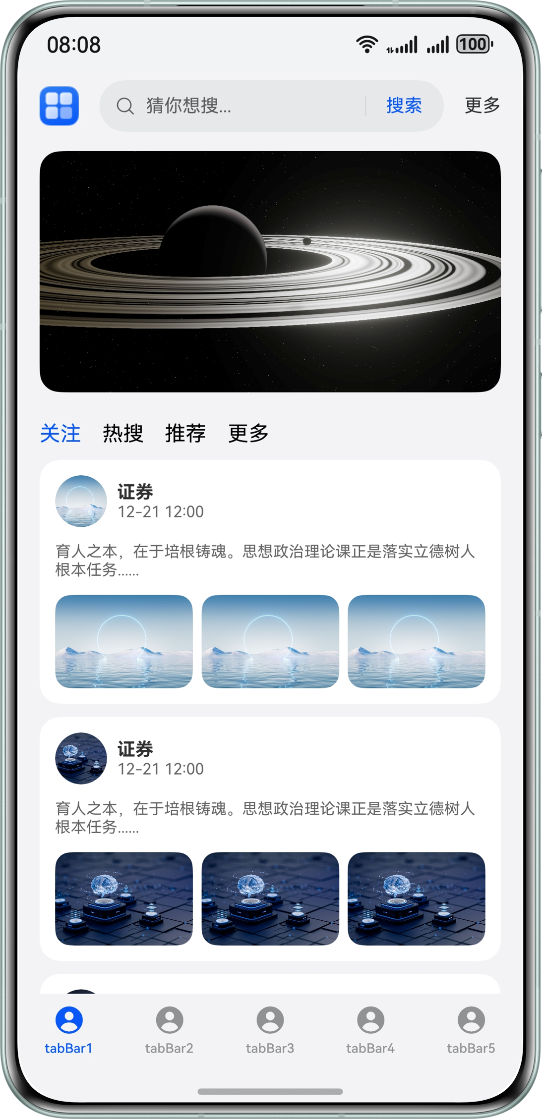
实现效果
本文主要引用整理于鸿蒙官方文档
更多关于HarmonyOS鸿蒙NEXT应用元服务常见列表操作Tabs吸顶场景的实战教程也可以访问 https://www.itying.com/category-93-b0.html

在HarmonyOS NEXT中实现Tabs吸顶效果主要使用Scroll组件配合position属性。当Scroll滚动到指定位置时,通过监听滚动事件动态修改Tabs的position为fixed。关键代码示例:
@Entry
@Component
struct StickyTabs {
  private scroller: Scroller = new Scroller()
  @State isSticky: boolean = false

  build() {
    Column() {
      Scroll(this.scroller) {
        // 列表内容
      }.onScroll((offset: number) => {
        this.isSticky = offset > 200
      })

      if(this.isSticky) {
        Tabs().position({x: 0, y: 0}).zIndex(1)
      }
    }
  }
}
主要逻辑是通过Scroll的onScroll事件监听滚动位置,当超过阈值时切换Tabs的定位方式。注意需要设置zIndex确保Tabs显示在最上层。
更多关于HarmonyOS鸿蒙NEXT应用元服务常见列表操作Tabs吸顶场景的实战系列教程也可以访问 https://www.itying.com/category-93-b0.html

在HarmonyOS NEXT中实现Tabs吸顶效果,关键在于合理使用nestedScroll属性和calc高度计算。以下是核心实现要点:
- 布局结构:
- 使用Stack作为根容器
- Scroll作为主滚动容器
- Tabs组件嵌套List实现内容区域
- 关键代码实现:
Tabs({ controller: this.tabsController }) {
  TabContent() {
    List() {
      // 列表内容
    }
    .nestedScroll({
      scrollForward: NestedScrollMode.PARENT_FIRST,
      scrollBackward: NestedScrollMode.SELF_FIRST
    })
  }
}
.height('calc(100% - 100vp)') // 动态计算高度
- 实现原理:
- nestedScroll控制滚动行为:上滑时父组件先滚动到底部,下滑时子列表先滚动到顶部
- calc动态计算高度确保Tabs区域能正确吸顶
- 通过scrollController控制滚动位置
- 注意事项:
- 确保外层Scroll和内层List的滚动控制器正确绑定
- 需要精确计算吸顶区域的高度值
- 测试不同滚动方向的交互效果
这种实现方式性能较好,能流畅处理长列表滚动,是资讯类应用的典型实现方案。