


HarmonyOS鸿蒙NEXT应用元服务常见列表操作分组吸顶场景
HarmonyOS鸿蒙NEXT应用元服务常见列表操作分组吸顶场景
分组吸顶场景
场景描述
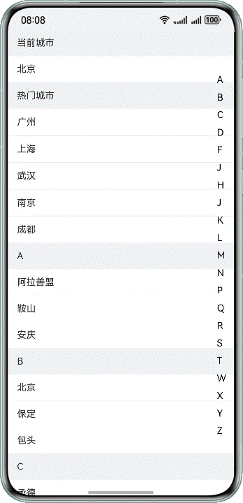
双列表同向联动,右边字母列表用于快速索引,内容列表根据首字母进行分组,常用于通讯录、城市选择、分组选择等页面。
本场景以城市列表页面为例,左侧城市列表数据和右侧字母导数据通过List组件来展示,并通过Stack组件使两个列表数据分层显示。在进入页面后,通过滑动左侧城市列表数据,列表字母标题吸顶展示,对应右侧字母导航内容高亮显示;点击右侧字母导航内容,左侧城市列表展示对应内容。
实现原理
左侧List作为城市列表,右侧List为城市首字母快捷导航列表,通过ListItem对对应数据进行渲染展示,并使用Stack堆叠容器组件,字母导航列表覆盖城市列表上方,再给对应List添加sticky属性和onScrollIndex()方法,实现两个列表数据间的联动效果。
开发步骤
城市列表使用ListItemGroup,对“当前城市”“热门城市”“城市数据”进行分组,并通过ListItem展示每个分组中的具体数据。
// List data content.
@Builder
textContent(content: string) {
  Text(content)
    // ...
}
CityList.ets
List({ scroller: this.cityScroller }) {
  // Current city.
  ListItemGroup({ header: this.itemHead($r('app.string.current_city')) }) {
    ListItem() {
      Text(this.currentCity)
        .width('100%')
        .height(45)
        .fontSize(16)
        .padding({ left: 16, top: 12, bottom: 12 })
        .textAlign(TextAlign.Start)
        .backgroundColor(Color.White)
    }
  }

  // Popular cities.
  ListItemGroup({ header: this.itemHead($r('app.string.popular_cities')) }) {
    ForEach(this.hotCities, (item: string) => {
      ListItem() {
        this.textContent(item);
      }
    }, (item: string) => item)
  }
  .divider({
    strokeWidth: 1,
    color: '#EDEDED',
    startMargin: 10,
    endMargin: 45
  })

  // City data.
  ForEach(this.groupWorldList, (item: string) => {
    // Traverse the first letter of the city and use it as the header of the city grouping data.
    ListItemGroup({ header: this.itemHead(item) }) {
      // Retrieve and display corresponding city data based on letters.
      ForEach(this.getCitiesWithGroupName(item), (cityItem: City) => {
        ListItem() {
          this.textContent(cityItem.city);
        }
      }, (cityItem: City) => cityItem.city)
    }
  })
右侧字母导航列表数据,同样通过List组件进行展示。
// Side letter navigation data.
Column() {
  List({ scroller: this.navListScroller }) {
    ForEach(this.groupWorldList, (item: string, index: number) => {
      ListItem() {
        Text(item)
          // ...
      }
    }, (item: string) => item)
  }
}
使用堆叠容器组件Stack,将字母导航内容覆盖到城市列表内容上方。
Stack({ alignContent: Alignment.End }) {
  // City List Data.
  List({ scroller: this.cityScroller }) {
    // ...
  }
  // ...

  // Side letter navigation data.
  Column() {
    List({ scroller: this.navListScroller }) {
      // ...
    }
  }
  // ...
}
最后,给城市列表添加sticky属性实现标题吸顶效果,及添加onScrollIndex()方法,通过selectNavIndex变量与字母导航列表内容进行关联,控制的对应字母导航内容的选中状态。
在字母导航列表中,添加点击事件,在点击事件中通过城市列表控制器cityScroller的scrollToIndex()事件,控制城市列表内容的改变,实现二者数据的联动效果。
Stack({ alignContent: Alignment.End }) {
  // City List Data.
  List({ scroller: this.cityScroller }) {
    // ...
  }
  // ...
  .onScrollIndex((index: number) => {
    // By linking the selectNavIndex state variable with index, control the selection status of the navigation list.
    this.selectNavIndex = index - 2;
  })

  // Side letter navigation data.
  Column() {
    List({ scroller: this.navListScroller }) {
      ForEach(this.groupWorldList, (item: string, index: number) => {
        ListItem() {
          Text(item)
            // ...
            .onClick(() => {
              this.selectNavIndex = index;
              // Select the navigation list and set isClickScroll to true to prevent changes in the navigation list status during the scrolling process with the city list.
              this.isClickScroll = true;
              // By using the scrollIndex method of cityScanner, control the sliding city list to specify the Index,
              // as there are "current city" and "popular city" in the city list, so the index needs to be incremented by 2.
              this.cityScroller.scrollToIndex(index + 2, false, ScrollAlign.START);
            })
        }
      }, (item: string) => item)
    }
  }
  // ...
}
实现效果
本文主要引用整理于鸿蒙官方文档
更多关于HarmonyOS鸿蒙NEXT应用元服务常见列表操作分组吸顶场景的实战教程也可以访问 https://www.itying.com/category-93-b0.html

HarmonyOS NEXT中实现列表分组吸顶效果,需使用ArkUI组件。主要步骤:
- 使用List组件构建基础列表
- 搭配ListItemGroup实现分组
- 通过sticky属性设置分组头吸顶
- 配合@State管理分组数据状态
示例代码片段:
List() {
  ForEach(this.groups, (group) => {
    ListItemGroup({ header: this.GroupHeader(group) })
      .sticky(StickyStyle.Header)
    ForEach(group.items, (item) => {
      ListItem() {
        Text(item)
      }
    })
  })
}
关键点:需确保ListItemGroup的header组件配置正确,sticky属性仅对header生效。
更多关于HarmonyOS鸿蒙NEXT应用元服务常见列表操作分组吸顶场景的实战系列教程也可以访问 https://www.itying.com/category-93-b0.html

在HarmonyOS Next中实现分组吸顶效果,可以通过以下关键技术点实现:
- 使用List组件和ListItemGroup实现分组列表,通过sticky属性实现分组标题吸顶效果:
ListItemGroup({ header: this.itemHead('分组标题') }) {
  // 分组内容
}.sticky(StickyStyle.Header)
- 双列表联动实现:
- 主列表使用onScrollIndex事件监听滚动位置
- 侧边导航列表通过scrollToIndex方法控制主列表跳转
- 使用Stack组件实现布局叠加
- 关键交互逻辑:
// 主列表滚动时更新侧边导航选中项
.onScrollIndex((index: number) => {
  this.selectNavIndex = index - offset;
})

// 侧边导航点击时滚动主列表
.onClick(() => {
  this.cityScroller.scrollToIndex(index + offset, false, ScrollAlign.START);
})
- 性能优化建议:
- 对于大数据列表使用LazyForEach
- 合理设置ListItem的复用机制
- 避免在滚动过程中进行复杂计算
这种实现方式适用于通讯录、城市选择等需要快速导航的场景,通过原生组件能力可以获得流畅的交互体验。