


HarmonyOS鸿蒙Next中Stack子组件对齐方式的疑问
HarmonyOS鸿蒙Next中Stack子组件对齐方式的疑问
如下面demo代码所示,Stack内有多个组件,需要按照不同对齐规则
要求组件嵌套结构不能变
1、2对齐Stack下中
3对齐Stack左下
4对齐Stack右下
怎么实现呢?
//Stack的各种对齐方式
// Stack的子组件需要不同的对齐规则
//1、2对齐Stack下中
//3对齐Stack左下
//4对齐Stack右下
@Entry
@Component
struct StackAligning01 {
  build() {
    Scroll() {
      Column() {
        Stack() {
          Text('4')
            .backgroundColor('#ff8ecef3')
            .width(300)
            .height(60)

          Text('3')
            .backgroundColor('#ffdef0c4')
            .width(200)
            .height(30)

          Text('2')
            .backgroundColor('#ffc4ddf0')
            .width(40)
            .height(30)

          Text('1')
            .backgroundColor('#ffd8c4f0')
            .width(30)
            .height(30)
        }
        .backgroundColor('#fff3df8e')
        .width(100)
        .height(100)
        .alignContent(Alignment.Bottom) //stack子组件

      }
      .backgroundColor('#fff3bf8e')
      .width(350)
      .height(350)
    }
  }
}
更多关于HarmonyOS鸿蒙Next中Stack子组件对齐方式的疑问的实战教程也可以访问 https://www.itying.com/category-93-b0.html

Stack布局中,调整子组件的对齐方式
更多关于HarmonyOS鸿蒙Next中Stack子组件对齐方式的疑问的实战系列教程也可以访问 https://www.itying.com/category-93-b0.html

结合Stack容器的对齐属性与子组件定位能力,实现不同对齐规则:
Stack() {
  // 组件1、2底部居中
  Component1()
    .align(Alignment.Bottom) // 底部对齐
    .position({ x: '50%' })  // 水平居中
    .margin({ bottom: 10 })  // 微调间距

  Component2()
    .align(Alignment.Bottom)
    .position({ x: '50%' })
    .margin({ bottom: 10 })

  // 组件3左下对齐
  Component3()
    .align(Alignment.BottomStart) // 左下角对齐
    .position({ x: 0, y: '100%' })

  // 组件4右下对齐
  Component4()
    .align(Alignment.BottomEnd) // 右下角对齐
    .position({ x: '100%', y: '100%' })
}
.width('100%')
.height(200)
.alignContent(Alignment.Bottom) // 统一底部对齐基线
楼主好,由于Stack的alignContent属性会统一作用于所有子组件,要实现不同子组件的独立对齐方式,需结合绝对定位和偏移量计算,
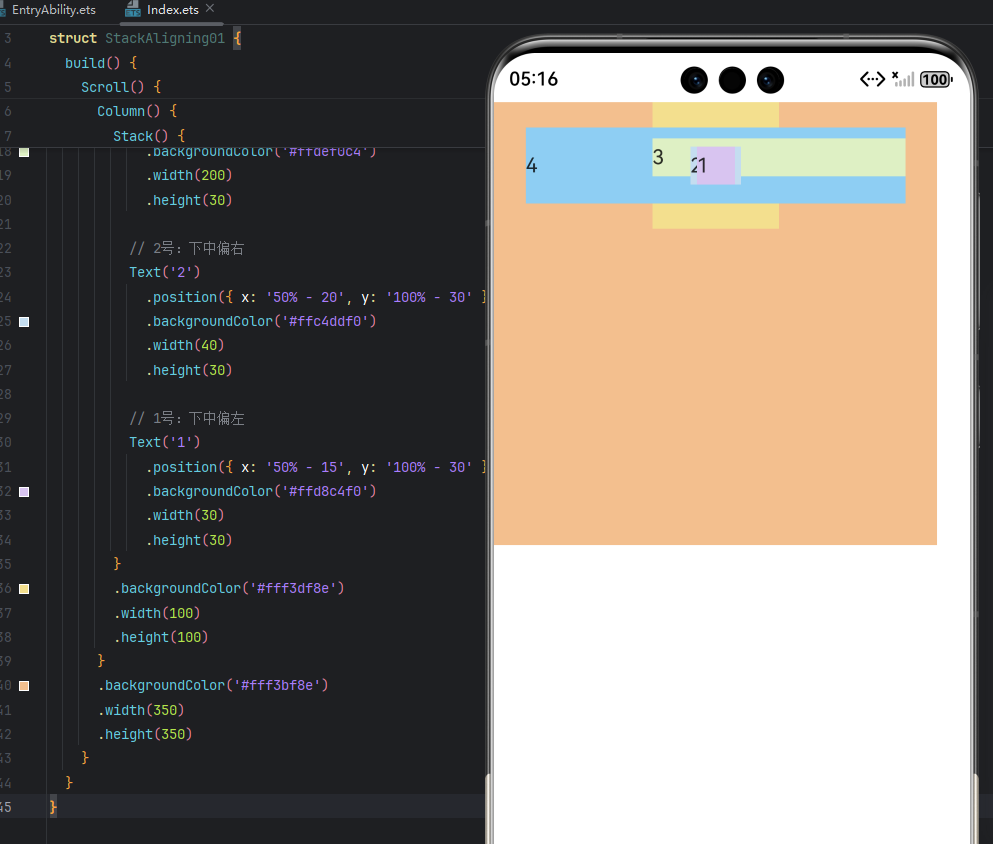
修改后代码:
@Entry
@Component
struct StackAligning01 {
  build() {
    Scroll() {
      Column() {
        Stack() {
          // 4号:右下对齐
          Text('4')
            .position({ x: '100% - 300', y: '100% - 60' })
            .backgroundColor('#ff8ecef3')
            .width(300)
            .height(60)
          // 3号:左下对齐
          Text('3')
            .position({ x: 0, y: '100% - 30' })
            .backgroundColor('#ffdef0c4')
            .width(200)
            .height(30)
          // 2号:下中偏右
          Text('2')
            .position({ x: '50% - 20', y: '100% - 30' })
            .backgroundColor('#ffc4ddf0')
            .width(40)
            .height(30)
          // 1号:下中偏左
          Text('1')
            .position({ x: '50% - 15', y: '100% - 30' })
            .backgroundColor('#ffd8c4f0')
            .width(30)
            .height(30)
        }
        .backgroundColor('#fff3df8e')
        .width(100)
        .height(100)
      }
      .backgroundColor('#fff3bf8e')
      .width(350)
      .height(350)
    }
  }
}

该布局可以使用 RelativeContainer 来实现
目录结构
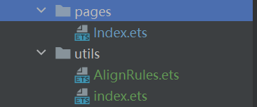
- 封装 AlignRules 工具
// AlignRules.ets

// 组件锚点类型
type WidgetAnchor =
  'lt' | 'ct' | 'rt' |
  'lc' | 'c' | 'rc' |
  'lb' | 'cb' | 'rb';

// 容器锚点类型
type ContainerAnchor =
  'LT' | 'CT' | 'RT' |
  'LC' | 'C' | 'RC' |
  'LB' | 'CB' | 'RB';

/**
 * 相对布局对齐规则枚举
 * - 规则:[组件锚点(小写)]2[容器锚点(大写)]
 * - 前2字符:组件自身的参考点(lt=左上, ct=中上, rt=右上等)
 * - 后2字符:目标容器的参考点(LT=左上, RT=右上, C=中心等)
 * - 共9×9=81种组合
 * */
export enum RelativeAlignment {
  // 组件左上(lt) -> 容器锚点
  lt2LT, lt2CT, lt2RT, lt2LC, lt2C, lt2RC, lt2LB, lt2CB, lt2RB,

  // 组件中上(ct) -> 容器锚点
  ct2LT, ct2CT, ct2RT, ct2LC, ct2C, ct2RC, ct2LB, ct2CB, ct2RB,

  // 组件右上(rt) -> 容器锚点
  rt2LT, rt2CT, rt2RT, rt2LC, rt2C, rt2RC, rt2LB, rt2CB, rt2RB,

  // 组件左中(lc) -> 容器锚点
  lc2LT, lc2CT, lc2RT, lc2LC, lc2C, lc2RC, lc2LB, lc2CB, lc2RB,

  // 组件中心(c) -> 容器锚点
  c2LT, c2CT, c2RT, c2LC, c2C, c2RC, c2LB, c2CB, c2RB,

  // 组件右中(rc) -> 容器锚点
  rc2LT, rc2CT, rc2RT, rc2LC, rc2C, rc2RC, rc2LB, rc2CB, rc2RB,

  // 组件左下(lb) -> 容器锚点
  lb2LT, lb2CT, lb2RT, lb2LC, lb2C, lb2RC, lb2LB, lb2CB, lb2RB,

  // 组件中下(cb) -> 容器锚点
  cb2LT, cb2CT, cb2RT, cb2LC, cb2C, cb2RC, cb2LB, cb2CB, cb2RB
}

export class AlignRules {
  // 修改映射表为 Map 结构
  private readonly widgetAnchorMap: Map<WidgetAnchor, [string, string]> = new Map([
    ['lt', ['left', 'top']],
    ['ct', ['middle', 'top']],
    ['rt', ['right', 'top']],
    ['lc', ['left', 'center']],
    ['c', ['middle', 'center']],
    ['rc', ['right', 'center']],
    ['lb', ['left', 'bottom']],
    ['cb', ['middle', 'bottom']],
    ['rb', ['right', 'bottom']]
  ]);
  private readonly containerAnchorMap: Map<ContainerAnchor, [HorizontalAlign, VerticalAlign]> = new Map([
    ['LT', [HorizontalAlign.Start, VerticalAlign.Top]],
    ['CT', [HorizontalAlign.Center, VerticalAlign.Top]],
    ['RT', [HorizontalAlign.End, VerticalAlign.Top]],
    ['LC', [HorizontalAlign.Start, VerticalAlign.Center]],
    ['C', [HorizontalAlign.Center, VerticalAlign.Center]],
    ['RC', [HorizontalAlign.End, VerticalAlign.Center]],
    ['LB', [HorizontalAlign.Start, VerticalAlign.Bottom]],
    ['CB', [HorizontalAlign.Center, VerticalAlign.Bottom]],
    ['RB', [HorizontalAlign.End, VerticalAlign.Bottom]]
  ]);

  // 默认对齐规则
  private defaultRule(id: string): AlignRuleOption {
    return {
      middle: { anchor: id, align: HorizontalAlign.Center },
      center: { anchor: id, align: VerticalAlign.Center }
    };
  }

  // 解析枚举键
  private parseEnumKey(alignContent: RelativeAlignment): [WidgetAnchor, ContainerAnchor] | null {
    const enumKey = RelativeAlignment[alignContent];

    if (!enumKey) {
      return null;
    }

    // 手动拆分字符串,避免解构赋值
    const parts = enumKey.split('2');
    if (parts.length !== 2) {
      return null;
    }

    const widgetKey = parts[0] as WidgetAnchor;
    const containerKey = parts[1] as ContainerAnchor;
    return [widgetKey, containerKey];
  }

  /**
   * 根据对齐类型生成对齐规则
   * @param alignContent 相对布局对齐规则枚举值
   * @param id 锚点元素ID (默认容器)
   * @returns 对齐规则配置对象
   */
  align(alignContent: RelativeAlignment, id: string = '__container__'): AlignRuleOption {
    const parsed = this.parseEnumKey(alignContent);
    if (!parsed) {
      return this.defaultRule(id);
    }

    // 避免解构赋值 - 使用数组索引访问
    const widgetKey = parsed[0];
    const containerKey = parsed[1];

    // 安全访问映射表
    const widgetProps = this.widgetAnchorMap.get(widgetKey);
    const containerAligns = this.containerAnchorMap.get(containerKey);

    if (!widgetProps || !containerAligns) {
      return this.defaultRule(id);
    }

    // 显式创建规则对象
    const result: AlignRuleOption = {};

    // 处理水平属性
    const horizontalProp = widgetProps[0];
    const horizontalAlign = containerAligns[0];

    // 使用显式赋值代替动态属性
    switch (horizontalProp) {
      case 'left':
        result.left = { anchor: id, align: horizontalAlign };
        break;
      case 'right':
        result.right = { anchor: id, align: horizontalAlign };
        break;
      case 'middle':
        result.middle = { anchor: id, align: horizontalAlign };
        break;
    }

    // 处理垂直属性
    const verticalProp = widgetProps[1];
    const verticalAlign = containerAligns[1];

    switch (verticalProp) {
      case 'top':
        result.top = { anchor: id, align: verticalAlign };
        break;
      case 'bottom':
        result.bottom = { anchor: id, align: verticalAlign };
        break;
      case 'center':
        result.center = { anchor: id, align: verticalAlign };
        break;
    }

    return result;
  }
}

export const alignRules = new AlignRules();
- 导出 AlignRules 工具
// index.ets

export * from './AlignRules'
- 在使用的页面导入工具
// 示例页面
import { alignRules, RelativeAlignment } from '../utils'
- 完整实例
// StackAligning01.js

import { alignRules, RelativeAlignment } from '../utils'


@Entry
@Component
struct StackAligning01 {
  build() {
    Scroll() {
      Column() {
        RelativeContainer() {

          Text('4')
            .backgroundColor('#ff8ecef3')
            .width(300)
            .height(60)
            .alignRules(alignRules.align(RelativeAlignment.rb2RB))

          Text('3')
            .backgroundColor('#ffdef0c4')
            .width(200)
            .height(30)
            .alignRules(alignRules.align(RelativeAlignment.lb2LB))

          Text('2')
            .backgroundColor('#ffc4ddf0')
            .width(40)
            .height(30)
            .alignRules(alignRules.align(RelativeAlignment.cb2CB))

          Text('1')
            .backgroundColor('#ffd8c4f0')
            .width(30)
            .height(30)
            .alignRules(alignRules.align(RelativeAlignment.cb2CB))

        }
        .backgroundColor('#fff3df8e')
        .width(100)
        .height(100)

      }
      .backgroundColor('#fff3bf8e')
      .width(350)
      .height(350)
    }
  }
}

你好,RelativeContainer了解下😁:
RelativeContainer-行列与堆叠-ArkTS组件-ArkUI(方舟UI框架)-应用框架 - 华为HarmonyOS开发者
对于RelativeContainer子组件,使用alignRules()方法设定对齐规则:
位置设置-布局与边框-通用属性-ArkTS组件-ArkUI(方舟UI框架)-应用框架 - 华为HarmonyOS开发者


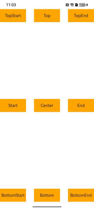
在HarmonyOS鸿蒙Next中,Stack子组件对齐通过alignContent属性控制,支持以下对齐方式:
- TopStart/TopCenter/TopEnd
- CenterStart/Center/CenterEnd
- BottomStart/BottomCenter/BottomEnd
- 绝对定位通过
position({x/y})实现
设置示例:
Stack({ alignContent: Alignment.TopStart }) {
  // 子组件
}
子组件默认按声明顺序堆叠,后声明的覆盖在先声明的组件上方。如需调整层级,可使用zIndex属性。

在HarmonyOS Next中,可以通过Stack组件的position属性和align属性来实现子组件的不同对齐方式。针对你的需求,建议修改代码如下:
@Entry
@Component
struct StackAligning01 {
  build() {
    Scroll() {
      Column() {
        Stack() {
          // 4对齐右下
          Text('4')
            .backgroundColor('#ff8ecef3')
            .width(300)
            .height(60)
            .position({x: '100%', y: '100%'})
            .margin({right: 0, bottom: 0})
            .align(Alignment.BottomEnd)

          // 3对齐左下
          Text('3')
            .backgroundColor('#ffdef0c4')
            .width(200)
            .height(30)
            .position({x: 0, y: '100%'})
            .margin({left: 0, bottom: 0})
            .align(Alignment.BottomStart)

          // 2对齐下中
          Text('2')
            .backgroundColor('#ffc4ddf0')
            .width(40)
            .height(30)
            .position({y: '100%'})
            .margin({bottom: 0})
            .align(Alignment.Bottom)

          // 1对齐下中
          Text('1')
            .backgroundColor('#ffd8c4f0')
            .width(30)
            .height(30)
            .position({y: '100%'})
            .margin({bottom: 0})
            .align(Alignment.Bottom)
        }
        .backgroundColor('#fff3df8e')
        .width(100)
        .height(100)
      }
      .backgroundColor('#fff3bf8e')
      .width(350)
      .height(350)
    }
  }
}
关键点说明:
- 使用position属性设置相对位置
- 使用align属性设置对齐方式
- 通过margin调整边距
- 1和2都使用Alignment.Bottom实现下中对齐
- 3使用Alignment.BottomStart实现左下对齐
- 4使用Alignment.BottomEnd实现右下对齐
注意Stack中子组件的顺序会影响显示层级,后添加的组件会覆盖在先添加的组件上方。