


HarmonyOS鸿蒙Next中关于text组件不用maquee如何实现类似跑马灯的效果
HarmonyOS鸿蒙Next中关于text组件不用maquee如何实现类似跑马灯的效果
text组件宽度为80%,传入文本,判断文本在text组件中渲染是否会溢出(单行,不换行),如果不溢出,则正常居中显示,如果溢出,则文字从右往左滚动,滚动时text组件的最右边25%的区域实现一个右侧文字刚进来时有一个逐渐从隐到显到效果,到25%之后就达到正常显示,仅右边需要左边不需要,如果滚动还要实现循环滚动,没有具体的时间要求。实现了几次始终达不到目标效果

通过 Text 组件的 onAreaChange 事件获取渲染后的文本宽度,并与容器宽度对比判断是否溢出。利用 Scroll 组件包裹 Text,通过动态调整 Scroll 的滚动偏移量实现滚动效果。结合 animateTo 方法实现循环动画。在 Text 组件右侧叠加渐变遮罩层,通过 LinearGradient 实现透明度过渡,主要代码:
struct CustomMarquee {

  private textContent: string = '这里是一段需要滚动展示的长文本示例'

  @State private scrollOffset: number = 0

  @State private textWidth: number = 0

  @State private containerWidth: number = 0

  @State private isOverflow: boolean = false

  // 判断文本是否溢出
  private checkOverflow() {
    if (this.textWidth > this.containerWidth) {
      this.isOverflow = true
      this.startScrollAnimation()
    } else {
      this.isOverflow = false
    }
  }

  // 启动滚动动画
  private startScrollAnimation() {
    const totalDistance = this.textWidth - this.containerWidth
    animateTo({
      duration: totalDistance * 20, // 速度控制
      iterations: -1, // 无限循环
      onFinish: () => {
        this.scrollOffset = 0 // 重置偏移量实现循环
      }
    }, () => {
      this.scrollOffset = -totalDistance
    })
  }

  build() {
    Column() {

      // 滚动容器
      Scroll() {
        Row() {
          Text(this.textContent)
            .onAreaChange((oldValue, newValue) => {
              this.textWidth = newValue.width
              this.checkOverflow()
            })
          // 复制文本实现无缝衔接
          if (this.isOverflow) {
            Text(this.textContent)
          }
        }
        .translate({ x: this.scrollOffset })
      }
      .width('80%')
      .onAreaChange((oldValue, newValue) => {
        this.containerWidth = newValue.width
        this.checkOverflow()
      })
      .clip(false) // 允许内容溢出

      // 右侧渐显遮罩层
      Stack() {
        LinearGradient()
          .angle(270)
          .colors([[Color.White, 0], [Color.White, 1]])
          .width('25%')
          .height('100%')
          .position({ x: '75%' })
      }
      .width('80%')
      .height('100%')
    }
  }
}
更多关于HarmonyOS鸿蒙Next中关于text组件不用maquee如何实现类似跑马灯的效果的实战系列教程也可以访问 https://www.itying.com/category-93-b0.html

以下是我写的完整案例,可以直接复制测试,先看下页面布局:
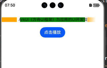
stack布局,两侧用Column叠在上面进行遮盖,右边采用线性渐变实现,去掉背景色如下:

动态演示:

完整源码如下:
import { display } from '@kit.ArkUI';

@Component
struct Index {
  pageStack: NavPathStack = new NavPathStack();
  @State isVisible: boolean = true;
  @State isVisible1: boolean = true;
  @State currentTip: string = "";
  @State isShowTip: boolean = false;
  @State message: string = "ArkUI(方舟UI框架)为应用的UI开发提供了完整的基础设施";
  @State translate_x: number = 0;
  @State screenWidth:number = 0;
  @State leftMarkWidth:number = 0;
  @State rightMarkWidth:number = 0;
  private textPosition = 0;
  @State textArea:Area | null = null;
  private textLength: number = 0;

  aboutToAppear(): void {
    this.screenWidth = px2vp(display.getDefaultDisplaySync().width);
    this.textLength = this.getUIContext().getMeasureUtils().measureText({
      textContent:this.message
    });
  }

  build() {
    Navigation(this.pageStack) {
      Column({space:20}) {
        Stack({alignContent:Alignment.Center}) {

           Column(){
             Text(this.message)
               .maxLines(1)
               .fontSize(15)
               .textAlign(TextAlign.Center)
               .width(px2vp(this.textLength))
               .translate({ x: px2vp(this.textLength) > (this.textArea?.width as number)?this.translate_x:0 })
               .onAreaChange((oldV: Area, newV: Area) => {
                 this.textPosition = this.textArea?.globalPosition.x as number;
               })

           }.width("80%") .onAreaChange((oldV: Area, newV: Area) => {
             this.textArea = newV;
           })

            Column().width(px2vp(this.screenWidth-(this.textArea?.width as number)/2)).backgroundColor(Color.White).height((this.textArea?.height as number))
              .offset({x:this.textArea?.position.x as number -((this.textArea?.width as number)/2)-(this.screenWidth - (this.textArea?.width as number))-10})
              .onAreaChange((oldV: Area, newV: Area) => {
                this.leftMarkWidth = newV.width as number;
                this.translate_x = this.textPosition;
              })
            Column().width(px2vp((this.screenWidth-(this.textArea?.width as number)/2)+20)).height((this.textArea?.height as number))
              .offset({x:this.textArea?.position.x as number +((this.textArea?.width as number)/2)+10})
              .linearGradient({
                direction:GradientDirection.Right,
                colors: [[0x42ffffff, 0.0], [0xFFffffff, 0.5]]
              })

        }.width("80%").onAreaChange((oldV:Area,newV:Area)=>{
          this.screenWidth = newV.width as number;
        })

        Button("点击播放").onClick((event: ClickEvent) => {
          if (px2vp(this.textLength)  > (this.textArea?.width as number)) {
            setInterval(() => {
              if (this.translate_x+(px2vp(this.textLength) ) < this.textPosition) {
                this.translate_x = this.textPosition+ (this.textArea?.width as number)+this.leftMarkWidth
              }
              this.translate_x -= 10;
            }, 100)
          }
        })
      }.margin({top:30})
    }
  }
}

在HarmonyOS Next中,可通过Text组件的onAreaChange监听结合动画实现跑马灯效果。使用显式动画(animateTo)控制Text的translateX属性,当文本超出容器时触发位移。关键代码:
@State textOffset: number = 0

animateTo({ duration: 2000, curve: Curve.Linear }, () => {
  this.textOffset = -textWidth
}).then(() => {
  this.textOffset = containerWidth
})
Text组件设置:
Text()
  .translate({ x: this.textOffset })
  .onAreaChange((oldVal, newVal) => {
    // 计算文本和容器宽度差
  })
需配合clip裁剪和overflow: Hidden样式限制显示范围。

在HarmonyOS Next中实现跑马灯效果可以通过自定义组件结合动画API来完成。以下是实现方案:
- 使用Canvas组件绘制文本,通过
measureText方法检测文本是否溢出:
const textWidth = canvasContext.measureText(text).width;
const isOverflow = textWidth > containerWidth * 0.8;
- 创建滚动动画:
// 使用显式动画API
animateTo({
  duration: textWidth * 20, // 根据文本长度调整速度
  iterations: -1 // 无限循环
}, () => {
  this.offsetX -= 1; // 每次向左移动1px
});
- 实现右侧渐变效果:
// 在Canvas绘制时添加渐变遮罩
const gradient = canvasContext.createLinearGradient(
  containerWidth * 0.75, 0,
  containerWidth, 0
);
gradient.addColorStop(0, 'rgba(255,255,255,0)');
gradient.addColorStop(1, 'rgba(255,255,255,1)');
canvasContext.fillStyle = gradient;
- 完整绘制逻辑:
// 在onDraw回调中
if (isOverflow) {
  // 滚动绘制
  canvasContext.fillText(text, offsetX, baseline);
  // 应用右侧渐变遮罩
  canvasContext.globalCompositeOperation = 'destination-in';
  canvasContext.fillRect(containerWidth * 0.75, 0, containerWidth * 0.25, height);
} else {
  // 居中绘制
  canvasContext.fillText(text, (containerWidth - textWidth)/2, baseline);
}
注意点:
- 需要处理好文本重绘时的性能优化
- 组件销毁时要取消动画
- 考虑设备像素比适配
这种方法相比使用marquee能提供更精细的控制,特别是实现了右侧的渐变效果。