


HarmonyOS鸿蒙Next中tabBar切换时如何实现滑动的效果?
HarmonyOS鸿蒙Next中tabBar切换时如何实现滑动的效果?
下面是一个Tabs的例子!tabBar在切换的时候感觉很强硬!
想要的效果是:点击第二个tabBar时,tabBar下面的下划线不消失,而是滑动到第二个tabBar下面!
@Entry
@Component
export struct TabsPage {
  tabController: TabsController = new TabsController()
  @State currentIndex: number = 0

  build() {
    Tabs({ controller: this.tabController }) {
      TabContent() {
        Column().width('100%').height('100%').backgroundColor('#ff5500')
      }
      .tabBar(AfterTradeTabBar({
        name: '壹',
        index: 0,
        currentIndex: this.currentIndex,
        tabController: this.tabController
      }))

      TabContent() {
        Column().width('100%').height('100%').backgroundColor('#99ff5500')
      }
      .tabBar(AfterTradeTabBar({
        name: '贰',
        index: 1,
        currentIndex: this.currentIndex,
        tabController: this.tabController
      }))

      TabContent() {
        Column().width('100%').height('100%').backgroundColor('#66ff5500')

      }
      .tabBar(AfterTradeTabBar({
        name: '叁',
        index: 2,
        currentIndex: this.currentIndex,
        tabController: this.tabController
      }))

      TabContent() {
        Column().width('100%').height('100%').backgroundColor('#33ff5500')

      }
      .tabBar(AfterTradeTabBar({
        name: '肆',
        index: 3,
        currentIndex: this.currentIndex,
        tabController: this.tabController
      }))

    }
    .width('100%')
    .height('100%')
    .onChange((value) => {
      this.currentIndex = value
    })
  }
}

@Builder
export function AfterTradeTabBar($$: AfterTradeTabBarClass) {
  Column() {
    Text($$.name)
    Divider().width(30).strokeWidth(2).color($$.index == $$.currentIndex ? Color.Red : Color.Transparent)
  }.onClick(() => {
    $$.tabController.changeIndex($$.index)
  })
}

export interface AfterTradeTabBarClass {
  name: string
  index: number
  currentIndex: number
  tabController: TabsController
}
更多关于HarmonyOS鸿蒙Next中tabBar切换时如何实现滑动的效果?的实战教程也可以访问 https://www.itying.com/category-93-b0.html

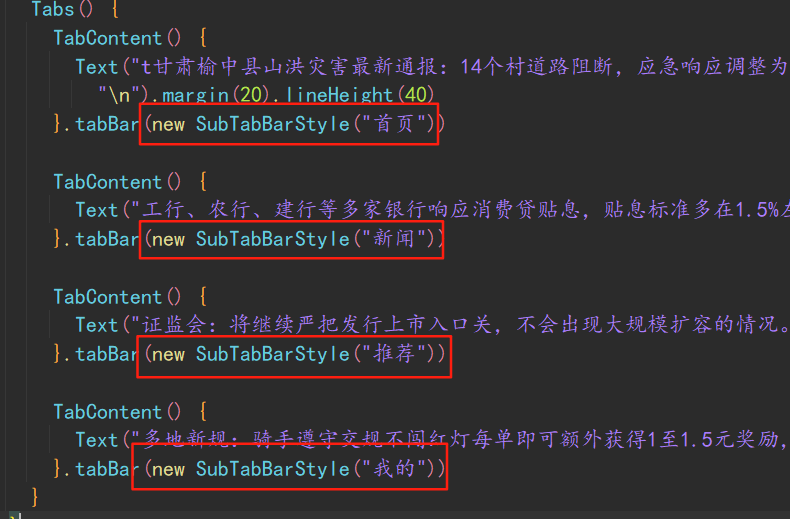
tabs组件中提供了底部下划线跟随tab切换滑动样式,主要是通过new SubTabBarStyle实现:先看效果:

当然,你也可以自定义,主要思路就是:设置tabs的属性barHeight为0,不显示,然后自定义一个导航,然后通过动画实现这个效果,其中要注意处理tab标题文字的宽度问题。
更多关于HarmonyOS鸿蒙Next中tabBar切换时如何实现滑动的效果?的实战系列教程也可以访问 https://www.itying.com/category-93-b0.html


楼主是这个意思吗
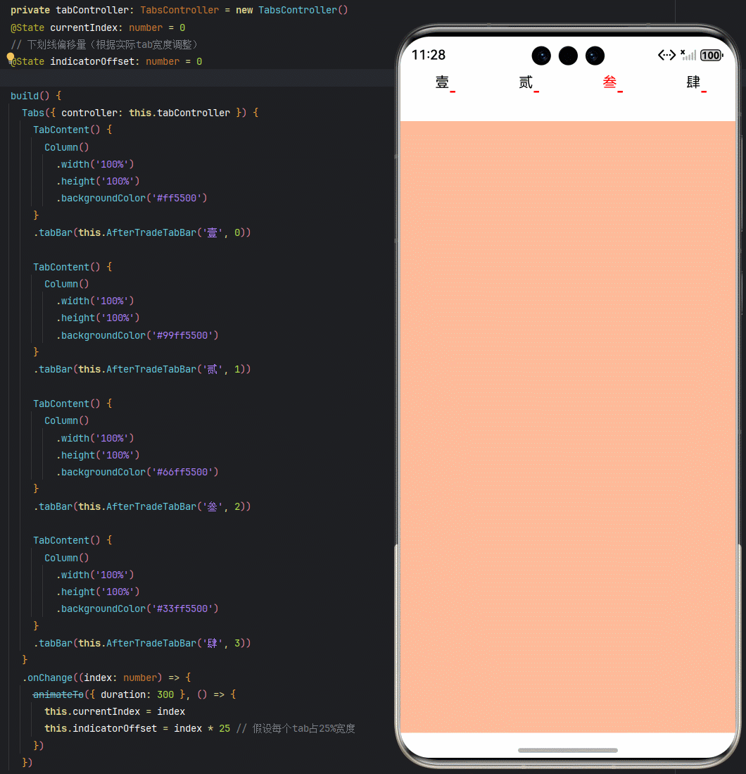
在你的基础上优化了一下:
@Entry
@Component
export struct TabsPage {
  private tabController: TabsController = new TabsController()
  @State currentIndex: number = 0
  // 下划线偏移量(根据实际tab宽度调整)
  @State indicatorOffset: number = 0

  build() {
    Tabs({ controller: this.tabController }) {
      TabContent() {
        Column()
          .width('100%')
          .height('100%')
          .backgroundColor('#ff5500')
      }
      .tabBar(this.AfterTradeTabBar('壹', 0))

      TabContent() {
        Column()
          .width('100%')
          .height('100%')
          .backgroundColor('#99ff5500')
      }
      .tabBar(this.AfterTradeTabBar('贰', 1))

      TabContent() {
        Column()
          .width('100%')
          .height('100%')
          .backgroundColor('#66ff5500')
      }
      .tabBar(this.AfterTradeTabBar('叁', 2))

      TabContent() {
        Column()
          .width('100%')
          .height('100%')
          .backgroundColor('#33ff5500')
      }
      .tabBar(this.AfterTradeTabBar('肆', 3))
    }
    .onChange((index: number) => {
      animateTo({ duration: 300 }, () => {
        this.currentIndex = index
        this.indicatorOffset = index * 25 // 假设每个tab占25%宽度
      })
    })
  }

  @Builder
  AfterTradeTabBar(name: string, index: number) {
    Column() {
      Text(name)
        .fontSize(16)
        .fontColor(this.currentIndex === index ? '#ff0000' : '#000000')

      // 下划线容器
      Stack() {
        Divider()
          .width('25%')
          .strokeWidth(2)
          .color('#ff0000')
          .offset({ x: `${this.indicatorOffset}%` })
          .transition({ type: TransitionType.All })
      }
      .height(2)
      .width('100%')
    }
    .width('25%') // 每个tab占屏幕宽度1/4
    .height(50)
    .onClick(() => {
      animateTo({ duration: 300 }, () => {
        this.tabController.changeIndex(index)
      })
    })
  }
}

export interface AfterTradeTabBarClass {
  name: string
  index: number
  currentIndex: number
  tabController: TabsController
}


在HarmonyOS Next中,要实现tabBar滑动效果,可以使用Tabs组件结合Swiper组件。Tabs作为导航栏,Swiper承载内容页。设置Tabs的onChange事件与Swiper的index属性绑定,使两者联动。通过Swiper的animationDuration属性调整滑动速度,gestureEnabled属性确保手势滑动生效。示例代码结构:
Tabs({ barPosition: BarPosition.Start }) {
  // Tab内容
}
.onChange((index: number) => {
  this.currentIndex = index
})

Swiper(this.currentIndex) {
  // Swiper页内容
}
.gestureEnabled(true)
.animationDuration(300)
在HarmonyOS Next中实现tabBar下划线滑动效果,可以通过动画来实现。以下是修改后的关键代码:
@Builder
export function AfterTradeTabBar($$: AfterTradeTabBarClass) {
  Column() {
    Text($$.name)
    Divider()
      .width(30)
      .strokeWidth(2)
      .color($$.index == $$.currentIndex ? Color.Red : Color.Transparent)
      .animation({
        duration: 300,
        curve: Curve.EaseOut
      })
  }.onClick(() => {
    $$.tabController.changeIndex($$.index)
  })
}
主要修改点:
- 为Divider添加了animation属性,设置动画持续时间为300ms
- 使用EaseOut曲线使动画更流畅
- 当tab切换时,下划线会平滑过渡到新的tab位置
如果希望更复杂的滑动效果,可以改用Stack布局+自定义滑块组件,通过改变滑块的位置来实现滑动动画。