


有没有HarmonyOS鸿蒙Next大佬知道这种效果怎么搞的
有没有HarmonyOS鸿蒙Next大佬知道这种效果怎么搞的

这是swiper底部一个效果 没有头绪
更多关于有没有HarmonyOS鸿蒙Next大佬知道这种效果怎么搞的的实战教程也可以访问 https://www.itying.com/category-93-b0.html
11 回复

如果有交互逻辑咱们再继续讨论
更多关于有没有HarmonyOS鸿蒙Next大佬知道这种效果怎么搞的的实战系列教程也可以访问 https://www.itying.com/category-93-b0.html

楼主是要画一个这样的图片还是图片是动图有什么交互逻辑?我简单花了一个差不多的哈哈,你可以再调整
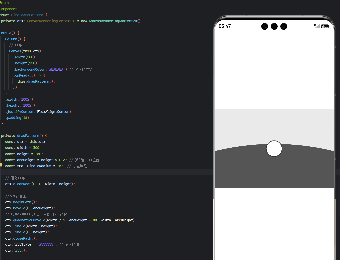
@Entry
@Component
struct CircleArcPattern {
  private ctx: CanvasRenderingContext2D = new CanvasRenderingContext2D();

  build() {
    Column() {
      // 画布
      Canvas(this.ctx)
        .width(500)
        .height(250)
        .backgroundColor('#EAEAEA') // 浅灰色背景
        .onReady(() => {
          this.drawPattern();
        })
    }
    .width('100%')
    .height('100%')
    .justifyContent(FlexAlign.Center)
    .padding(16)
  }

  private drawPattern() {
    const ctx = this.ctx;
    const width = 500;
    const height = 250;
    const arcHeight = height * 0.6; // 弧形的高度位置
    const smallCircleRadius = 25;  // 小圆半径

    // 清除画布
    ctx.clearRect(0, 0, width, height);

    //深灰色弧形
    ctx.beginPath();
    ctx.moveTo(0, arcHeight);
    // 贝塞尔曲线控制点,使弧形向上凸起
    ctx.quadraticCurveTo(width / 2, arcHeight - 80, width, arcHeight);
    ctx.lineTo(width, height);
    ctx.lineTo(0, height);
    ctx.closePath();
    ctx.fillStyle = '#555555'; // 深灰色填充
    ctx.fill();

    // 绘制小圆
    const circleCenterY = arcHeight - smallCircleRadius;

    ctx.beginPath();
    ctx.arc(width / 2, circleCenterY, smallCircleRadius, 0, 2 * Math.PI);
    ctx.fillStyle = '#ffffff'; // 白色圆形
    ctx.fill();
    ctx.strokeStyle = '#333333';
    ctx.lineWidth = 2;
    ctx.stroke();
  }
}


在HarmonyOS Next中实现特殊UI效果,可以使用ArkUI的声明式开发范式。通过自定义组件结合Canvas绘制能力实现复杂图形效果。利用@Extend装饰器扩展组件样式,或使用@AnimatableProp实现属性动画。布局层面可采用Flex、Grid等容器组件配合百分比布局。涉及动效时,优先使用显式动画API如animateTo()。具体实现需根据效果类型选择对应方案,如粒子效果需用CanvasRenderer,3D变换需调用XComponent能力。

要实现Swiper底部的这种效果,可以通过自定义Swiper指示器(indicator)来实现。在HarmonyOS Next中,可以通过以下方式实现:
- 使用Swiper组件的indicatorStyle属性来自定义样式
- 结合自定义组件实现更复杂的效果
示例代码:
@Entry
@Component
struct SwiperExample {
  private swiperController: SwiperController = new SwiperController()

  build() {
    Column() {
      Swiper(this.swiperController) {
        // 添加你的swiper内容
        ForEach([1,2,3,4], (item: number) => {
          Image($r('app.media.example'))
            .width('100%')
            .height(200)
        })
      }
      .indicator(true)
      .indicatorStyle({
        color: '#FF0000', // 未选中颜色
        selectedColor: '#00FF00', // 选中颜色
        size: 10, // 点大小
        mask: false
      })
      .height(200)

      // 自定义底部指示器
      Row() {
        ForEach([1,2,3,4], (item: number, index?: number) => {
          Column() {
            // 这里可以添加你的自定义指示器UI
            // 例如圆角矩形、动画效果等
            Text('')
              .width(20)
              .height(4)
              .backgroundColor(index === this.swiperController.currentIndex() ? '#00FF00' : '#FF0000')
              .borderRadius(2)
          }
          .onClick(() => {
            this.swiperController.showNext()
          })
        })
      }
      .justifyContent(FlexAlign.Center)
      .width('100%')
      .margin({top: 10})
    }
  }
}
关键点:
- 使用SwiperController控制swiper切换
- 通过currentIndex()获取当前显示项
- 自定义指示器样式和交互
如果需要更复杂的效果,可以结合动画和自定义形状来实现。