HarmonyOS 鸿蒙Next中我用Path画的内圆角,还有没有更好的办法实现内圆角

HarmonyOS 鸿蒙Next中我用Path画的内圆角,还有没有更好的办法实现内圆角 图片

看我这个是不是你想要的效果
我是用层叠Stack 和path画的内圆角,下面给出我的中间黄色部分的代码 参考参考

其中两个path是两个内圆角 Image是那个黄色的图片 设置的颜色和边框就不说了那个一看就懂

最主要的就在与commands里面的SVG路径 这个路径得好好研究研究,这个路径我研究了好几天

Stack({ alignContent: Alignment.TopStart }) {
  Path()
    .fill(Color.Gray)
    .antiAlias(true)
    .margin({ left: -23, top: 0 })
    .stroke(Color.Gray)
    .commands('M0 60 H120 V0 A400 400 90 0 1 0 60 Z')
  Path()
    .fill(Color.Gray)
    .antiAlias(true)
    .margin({ left: 53, top: 0 })
    .stroke(Color.Gray)
    .commands('M0 0 V60 H120 A400 400 90 0 1 0 0 Z')
  Image($r('app.media.yuan'))
}
.width(80)
.height(80)
.padding(5)
.backgroundColor(Color.Gray)
.margin({ bottom: 0 })
.borderRadius(85)

更多关于HarmonyOS 鸿蒙Next中我用Path画的内圆角,还有没有更好的办法实现内圆角的实战教程也可以访问 https://www.itying.com/category-93-b0.html

6 回复

你是想给tabBar设置圆角吗,如果是这样的话,你可以试试自定义tabBar,给你想要的tabBar设置borderRadius,配合margin也能实现圆角的效果,下面是完整参考代码:

const COMMUNITY_TAB_BAR_INDEX: number = 2; // 初始化社区的tab下标 
const ARC_MARGIN_TOP: number = -30; // 圆弧的上外间距为-30

export class TabBarDataType {
  id: number;
  defaultIcon: ResourceStr;

  constructor(id: number, defaultIcon: ResourceStr) {
    this.id = id;
    this.defaultIcon = defaultIcon;
  }
}

export const TABINFO: TabBarDataType[] = [
  new TabBarDataType(0, $r('app.media.startIcon')),
  new TabBarDataType(1, $r('app.media.startIcon')),
  new TabBarDataType(2, $r('app.media.startIcon')),
  new TabBarDataType(3, $r('app.media.startIcon')),
  new TabBarDataType(4, $r('app.media.startIcon')),
];

@Entry
@Component
struct TabViewDemo {
  @Provide selectedIndex: number = 0; // 初始化被选定的tabBar下标 
  private controller: TabsController = new TabsController(); // 初始化Tab控制器 
  @Builder TabBarBuilder(){
    Column({space: 8}){
      Image($r('app.media.startIcon'))
        .width(22)
      Text('突出')
        .fontSize(14)
    }
    .margin({bottom:50})
  }
  build() {
    Column() {
      Tabs({ index: this.selectedIndex, barPosition: BarPosition.End, controller: this.controller }) {
        TabContent() {
          Text("tab1")
            .fontSize(26)
        }
        .backgroundColor('#ffdbd9d9')

        TabContent() {
          Text("tab2")
            .fontSize(26)
        }
        .tabBar('green')
        .backgroundColor('#ffdbd9d9')
        TabContent() {
          Text("tab3")
            .fontSize(26)
        }
        .tabBar('green')
        .backgroundColor('#ffdbd9d9')
        TabContent() {
          Text("tab4")
            .fontSize(26)
        }
        .tabBar('green')
        .backgroundColor('#ffdbd9d9')
        TabContent() {
          Text("tab5")
            .fontSize(26)
        }
        .tabBar('green')
        .backgroundColor('#ffdbd9d9')
      }
      .vertical(false)
      .scrollable(false)
      .layoutWeight(1)
      .backgroundColor('#ffdbd9d9')
      //barHeight为零
      .barHeight(0)
      .onChange((index: number) => {
        this.selectedIndex = index;
      })

      // 自定义TabBar组件
      CustomTabBar({ selectedIndex: $selectedIndex })
    }.width("100%")
    .height("100%")
  }
}

@Component
struct CustomTabBar {
  @Link selectedIndex: number; // 初始化被选定的tabBar下标 

  build() {
    Flex({ direction: FlexDirection.Row, justifyContent: FlexAlign.SpaceAround, alignItems: ItemAlign.Center }) {
      ForEach(TABINFO, (item: TabBarDataType, tabIndex: number) => {
        // 单独一个TabBar组件 
        TabItem({
          tabBarIndex: tabIndex,
          selectedIndex: $selectedIndex,
        })
      })
    }
    .height(60)
  }
}

@Component
struct TabItem {
  @Prop tabBarIndex: number; // tabBar下标 
  @Link selectedIndex: number; // 初始化被选定的tabBar下标 

  build() {
    Column() {
      // 判断tab的下标是否为2 
      if (this.tabBarIndex === COMMUNITY_TAB_BAR_INDEX) {
        Column() {
          Image(TABINFO[this.tabBarIndex].defaultIcon)
            .size({ width: 43, height: 43 })
            .interpolation(ImageInterpolation.High)
            .borderRadius(22)
        }
        .width(60)
        .height(60)
        .borderRadius(30)
        .margin({ top: ARC_MARGIN_TOP })
        .backgroundColor(Color.White)
        .justifyContent(FlexAlign.Center)
        Text('目录')
      } else {
        Column() {
          // 通过被选中的tabBar下标值和tabBar的默认下标值来改变图片显示 
          Image(TABINFO[this.tabBarIndex].defaultIcon)
            .interpolation(ImageInterpolation.High)
            .size(
              { width: 28, height: 28 })
            .borderRadius(14)
          Text('目录')
        }
        .width(37)
        .height(37)
        .justifyContent(FlexAlign.Center)
      }
    }
    .width(60)
    .onClick(() => {
      // 更新被选中的tabBar下标 
      this.selectedIndex = this.tabBarIndex;
    })
  }

}

更多关于HarmonyOS 鸿蒙Next中我用Path画的内圆角,还有没有更好的办法实现内圆角的实战系列教程也可以访问 https://www.itying.com/category-93-b0.html


我是想做内圆角 一般用borderRadius设置的圆角是外圆角 我想做内圆角 就类似于月牙 鸿蒙中好像没有设置内圆角的属性 我没找到 看下图吧,

看帖子后面的评论,

就类似于这样的圆角

cke_12814.png

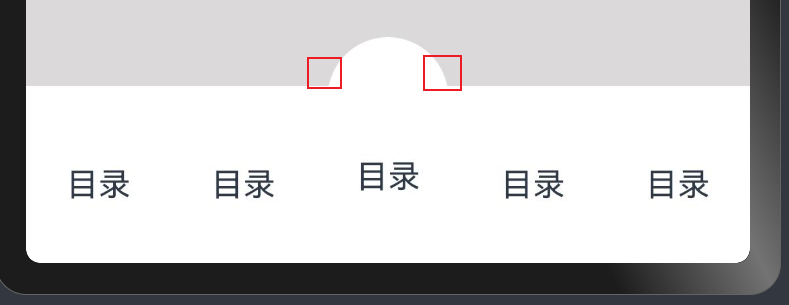
你的代码我看了 由于上面的半圆和tab栏圆弧过度不好看 所有想给两边放两个方块 然后把方块切成内圆角平滑过度到tab栏就像我上面图中那样

我找个现成的吧 如下图

cke_15448.png

实在不知道这个圆弧怎么过度过去,就想到了两个方块切内圆角实现这种过度效果,看起来就好像中间那个tab顶起来一样, 我记得CSS中用内圆角的,鸿蒙中实在没找到只能用Path画了,但感觉画出来的效果很生硬不丝滑。

在鸿蒙Next中,使用Path绘制内圆角是常见方式。推荐使用Rect结合Arc的API进行绘制,或利用CanvasdrawRoundRect方法,通过调整半径参数实现内圆角效果。也可考虑使用Shape组件,设置圆角属性并配合裁剪功能达到目标。

在HarmonyOS Next中,除了使用Path绘制内圆角,还可以考虑使用clip属性结合Shape组件实现更简洁的内圆角效果。例如,通过RectangleRoundedRectangle的裁剪能力,可以避免复杂的SVG路径计算,提升代码可读性和维护性。

具体实现方式:

Stack() {
  Image($r('app.media.yuan'))
    .clip(Shape.RoundedRect, { radius: 12 }) // 直接设置圆角裁剪
}
.width(80)
.height(80)
.backgroundColor(Color.Gray)
.borderRadius(85)

这种方法减少了路径计算的复杂度,同时保持了相同的视觉效果,更适合日常开发使用。

回到顶部