


HarmonyOS鸿蒙Next中阅读这个Tab切换怎么实现?
HarmonyOS鸿蒙Next中阅读这个Tab切换怎么实现? 如题,想实现这个tab切换,没整出来,求大佬支招。 或者哪个示例我没找到的

更多关于HarmonyOS鸿蒙Next中阅读这个Tab切换怎么实现?的实战教程也可以访问 https://www.itying.com/category-93-b0.html

经过查找示例代码应该是SegmentButtonOptions
官方文档链接https://developer.huawei.com/consumer/cn/doc/design-guides/segmentbutton-0000001929853292
更多关于HarmonyOS鸿蒙Next中阅读这个Tab切换怎么实现?的实战系列教程也可以访问 https://www.itying.com/category-93-b0.html

问题背景
SegmentButton分段按钮组件包含页签类分段按钮、胶囊类单选分段按钮和胶囊类多选分段按钮。
分段按钮组件的类型说明:‘tab’:页签类分段按钮,适用于页面或内容区域的切换场景。‘capsule’:胶囊类分段按钮,适用于单选或多选的选择场景。
解决方案
使用SegmentButton组件实现Tab切换功能,更多示例参考官方SegmentButton。
参考代码
import {SegmentButton, SegmentButtonItemTuple, SegmentButtonOptions } from '@kit.ArkUI';
@Entry
@Component
struct Index {
  @State bookCounter:number = 25
  @State singleSelectCapsuleOptions: SegmentButtonOptions = SegmentButtonOptions.capsule({
    buttons: [{ text: '书架' + this.bookCounter.toString()}, { text: '书单' }, { text: '成就' }] as SegmentButtonItemTuple,
    multiply: false,
    backgroundBlurStyle: BlurStyle.BACKGROUND_THICK
  })
  @State singleSelectCapsuleSelectedIndexes: number[] = [0]
  build() {
    Column() {
      SegmentButton({ options: this.singleSelectCapsuleOptions,
        selectedIndexes: $singleSelectCapsuleSelectedIndexes })
    }.width('100%')
  }
}

【背景知识】
Tabs:通过页签进行内容视图切换的容器组件,每个页签对应一个内容视图。
SegmentButtonV2:分段按钮组件用于创建页签型、单选或多选的胶囊型分段按钮。
【参考方案】:
可通过使用官方组件SegmentButtonV2实现效果或者也可以参考日期计算器示例中日期推算-公农历切换,通过Stack布局自己实现切换效果。

使用SegmentButton 即可实现
官方demo
// xxx.ets
import {
  ItemRestriction,
  SegmentButton,
  SegmentButtonItemTuple,
  SegmentButtonOptions,
  SegmentButtonTextItem
} from '@kit.ArkUI';

@Entry
@Component
struct Index {
  @State tabOptions: SegmentButtonOptions = SegmentButtonOptions.tab({
    buttons: [{ text: '页签按钮1' }, { text: '页签按钮2' }, {
      text: '页签按钮3'
    }] as ItemRestriction<SegmentButtonTextItem>,
    backgroundBlurStyle: BlurStyle.BACKGROUND_THICK
  })
  @State singleSelectCapsuleOptions: SegmentButtonOptions = SegmentButtonOptions.capsule({
    buttons: [{ text: '单选按钮1' }, { text: '单选按钮2' }, { text: '单选按钮3' }] as SegmentButtonItemTuple,
    multiply: false,
    backgroundBlurStyle: BlurStyle.BACKGROUND_THICK
  })
  @State multiplySelectCapsuleOptions: SegmentButtonOptions = SegmentButtonOptions.capsule({
    buttons: [{ text: '多选按钮1' }, { text: '多选按钮2' }, { text: '多选按钮3' }] as SegmentButtonItemTuple,
    multiply: true
  })
  @State iconCapsuleOptions: SegmentButtonOptions = SegmentButtonOptions.capsule({
    buttons: [
      { icon: $r('sys.media.ohos_ic_public_email'), selectedIcon: $r('sys.media.ohos_ic_public_clock') },
      { icon: $r('sys.media.ohos_ic_public_email'), selectedIcon: $r('sys.media.ohos_ic_public_clock') },
      { icon: $r('sys.media.ohos_ic_public_email'), selectedIcon: $r('sys.media.ohos_ic_public_clock') },
      { icon: $r('sys.media.ohos_ic_public_email'), selectedIcon: $r('sys.media.ohos_ic_public_clock') }
    ] as SegmentButtonItemTuple,
    multiply: false,
    backgroundBlurStyle: BlurStyle.BACKGROUND_THICK
  })
  @State iconTextCapsuleOptions: SegmentButtonOptions = SegmentButtonOptions.capsule({
    buttons: [
      { text: '图标1', icon: $r('sys.media.ohos_ic_public_email'), selectedIcon: $r('sys.media.ohos_ic_public_clock') },
      { text: '图标2', icon: $r('sys.media.ohos_ic_public_email'), selectedIcon: $r('sys.media.ohos_ic_public_clock') },
      { text: '图标3', icon: $r('sys.media.ohos_ic_public_email'), selectedIcon: $r('sys.media.ohos_ic_public_clock') },
      { text: '图标4', icon: $r('sys.media.ohos_ic_public_email'), selectedIcon: $r('sys.media.ohos_ic_public_clock') },
      { text: '图标5', icon: $r('sys.media.ohos_ic_public_email'), selectedIcon: $r('sys.media.ohos_ic_public_clock') }
    ] as SegmentButtonItemTuple,
    multiply: true
  })
  @State tabSelectedIndexes: number[] = [1]
  @State singleSelectCapsuleSelectedIndexes: number[] = [0]
  @State multiplySelectCapsuleSelectedIndexes: number[] = [0, 1]
  @State singleSelectIconCapsuleSelectedIndexes: number[] = [3]
  @State multiplySelectIconTextCapsuleSelectedIndexes: number[] = [1, 2]

  build() {
    Row() {
      Column() {
        Column({ space: 25 }) {
          SegmentButton({ options: this.tabOptions,
            selectedIndexes: $tabSelectedIndexes })
          SegmentButton({ options: this.singleSelectCapsuleOptions,
            selectedIndexes: $singleSelectCapsuleSelectedIndexes })
          SegmentButton({
            options: this.multiplySelectCapsuleOptions,
            selectedIndexes: $multiplySelectCapsuleSelectedIndexes })
          SegmentButton({ options: this.iconCapsuleOptions,
            selectedIndexes: $singleSelectIconCapsuleSelectedIndexes })
          SegmentButton({ options: this.iconTextCapsuleOptions,
            selectedIndexes: $multiplySelectIconTextCapsuleSelectedIndexes })
        }.width('90%')
      }.width('100%')
    }.height('100%')
  }
}
参考地址
https://developer.huawei.com/consumer/cn/doc/design-guides/segmentbutton-0000001929853292

自己写了一个,细节部分你再修改
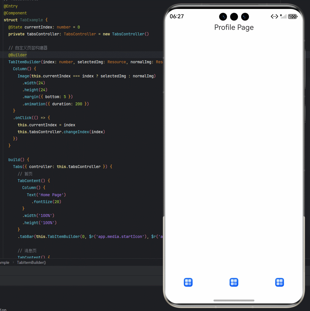
@Entry
@Component
struct TabExample {
  @State currentIndex: number = 0
  private tabsController: TabsController = new TabsController()

  // 自定义页签
  @Builder
  TabItemBuilder(index: number, selectedImg: Resource, normalImg: Resource) {
    Column() {
      Image(this.currentIndex === index ? selectedImg : normalImg)
        .width(24)
        .height(24)
        .margin({ bottom: 5 })
        .animation({ duration: 200 })
    }
    .onClick(() => {
      this.currentIndex = index
      this.tabsController.changeIndex(index)
    })
  }

  build() {
    Tabs({ controller: this.tabsController }) {
      // 首页
      TabContent() {
        Column() {
          Text('Home Page')
            .fontSize(20)
        }
        .width('100%')
        .height('100%')
      }
      .tabBar(this.TabItemBuilder(0, $r('app.media.startIcon'), $r('app.media.startIcon')))

      // 消息页
      TabContent() {
        Column() {
          Text('Message Page')
            .fontSize(20)
        }
        .width('100%')
        .height('100%')
      }
      .tabBar(this.TabItemBuilder(1, $r('app.media.startIcon'), $r('app.media.startIcon')))

      // 我的页
      TabContent() {
        Column() {
          Text('Profile Page')
            .fontSize(20)
        }
        .width('100%')
        .height('100%')
      }
      .tabBar(this.TabItemBuilder(2, $r('app.media.startIcon'), $r('app.media.startIcon')))
    }
    .barPosition(BarPosition.End) // 底部导航栏
    .onChange((index: number) => {
      this.currentIndex = index
    })
    .width('100%')
    .height('100%')
  }
}


在HarmonyOS Next中,可以通过Tabs组件结合TabContent实现Tab切换功能。以下是示例代码:
import { Tabs, TabContent } from '@ohos.arkui.advanced';

@Entry
@Component
struct TabExample {
  @State currentIndex: number = 0;

  build() {
    Column() {
      Tabs({ barPosition: BarPosition.Start, index: this.currentIndex }) {
        TabContent() {
          Text('Tab1 Content')
            .fontSize(20)
        }.tabBar('Tab1')

        TabContent() {
          Text('Tab2 Content')
            .fontSize(20)
        }.tabBar('Tab2')

        TabContent() {
          Text('Tab3 Content')
            .fontSize(20)
        }.tabBar('Tab3')
      }
      .onChange((index: number) => {
        this.currentIndex = index;
      })
      .width('100%')
      .height('100%')
    }
  }
}
关键点说明:
- Tabs组件管理多个TabContent
- tabBar()方法设置选项卡标签文本
- onChange事件监听选项卡切换
- 通过index属性控制当前选中的选项卡
可以通过修改barPosition属性调整选项卡位置(Start/End),使用样式属性自定义外观。