


HarmonyOS鸿蒙Next中Swiper设置空心圆点
HarmonyOS鸿蒙Next中Swiper设置空心圆点

.indicator(Indicator.dot()
  .right(1).bottom(6)
  .itemWidth(7)//默认宽度
  .itemHeight(7)//默认高度
  .selectedItemWidth(7)//选中宽度
  .selectedItemHeight(7)//选中高度
  .color('#00ffffff') //默认颜色
  .selectedColor(Color.White))//选中颜色
怎么设置成空心的那种
更多关于HarmonyOS鸿蒙Next中Swiper设置空心圆点的实战教程也可以访问 https://www.itying.com/category-93-b0.html

Swiper的indicator暂时不支持自定义样式,可以使用自定义UI来完成自定义的指示器。
具体可以参考如下demo:
@Entry
@Component
struct SwiperExample {
  private swiperController: SwiperController = new SwiperController()
  @State arr: string[] = ['1', '2', '3', '4', '5', '6']
  @State widthLength: number = 0
  @State heightLength: number = 0
  @State currentIndex: number = 0

  build() {
    Column({ space: 5 }) {
      Stack({ alignContent: Alignment.Bottom }) {
        Swiper(this.swiperController) {
          ForEach(this.arr, (item: string) => {
            Text(item)
              .width('90%')
              .height(200)
              .backgroundColor(0xAFEEEE)
              .textAlign(TextAlign.Center)
              .fontSize(30)
          }, (item: string) => item)
        }
        .cachedCount(2)
        .index(0)
        .indicator(false)
        .onChange((index: number) => {
          this.currentIndex = index
        })

        Row() {
          ForEach(this.arr, (item: string, index: number) => {
            Circle()
              .width(10)
              .height(10)
              .margin(10)
              .fill(this.currentIndex == index ? Color.White : Color.Transparent)
              .stroke('#fff')
          }, (item: string) => item)
        }
      }
    }
    .width('100%')
    .height('100%')
  }
}
也可以引入三方库来实现自定义指示器,参考文档 : banner。
更多关于HarmonyOS鸿蒙Next中Swiper设置空心圆点的实战系列教程也可以访问 https://www.itying.com/category-93-b0.html
楼主这样的样式目前需要自定义组件来实现,通过Swiper的onChange来处理自定义的动画,下面是我写的一个Demo:
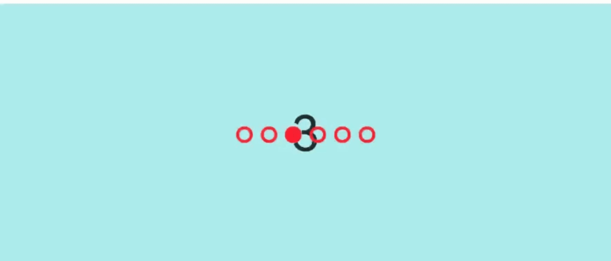
【实现效果】
【Demo代码】
@Entry
@Component
struct FocusTestPage {
  @State list: number[] = [];
  @State currentIndex: number = 0
  private indicatorController: IndicatorComponentController = new IndicatorComponentController();
  private swiperController: SwiperController = new SwiperController();

  aboutToAppear(): void {
    for (let i = 1; i <= 6; i++) {
      this.list.push(i);
    }
  }

  build() {
    Stack() {
      Swiper(this.swiperController) {
        ForEach(this.list, (item: string) => {
          Text(item.toString())
            .width('100%')
            .height(160)
            .backgroundColor(0xAFEEEE)
            .textAlign(TextAlign.Center)
            .fontSize(30)
        }, (item: string) => item)
      }
      .cachedCount(2)
      .index(0)
      .autoPlay(true)
      .interval(2000)
      .indicator(false)
      .loop(true)
      .duration(1000)
      .itemSpace(0)
      .curve(Curve.Linear)
      .onChange((index: number) => {
        console.info(index.toString());
        this.currentIndex = index
      })

      Row({ space: 5 }) {
        ForEach(this.list, (event: string, index: number) => {
          Column() {
          }
          .width(10)
          .aspectRatio(1)
          .backgroundColor(this.currentIndex === index ? '#ff23' : undefined)
          .border({
            width: 2,
            color: '#ff23',
            radius: 5,
            style: BorderStyle.Solid
          })
        })
      }
      .width('100%')
      .height(50)
      .justifyContent(FlexAlign.Center)
      .alignItems(VerticalAlign.Center)
      .zIndex(99)
    }
  }
}
【参考文档】

您可以使用自定义组件来实现一个空心的圆点指示器。这是解决官方组件功能限制的常用且有效的方法。
实现思路
- 数据驱动:自定义组件接收两个关键参数:
total(总页数/圆点数量)和current(当前激活的页码索引)。 - 动态构建:根据
total的值,使用ForEach循环渲染出对应数量的圆点。 - 样式控制:在每个圆点组件上,根据其索引是否与
current相等,来动态应用"激活"或"非激活"的样式。空心效果通过设置背景色为透明 ('#00000000') 并添加边框来实现。 - 灵活布局:使用
Row容器来水平排列所有圆点,并通过justifyContent和margin等属性控制其整体位置,完美替代.right(1).bottom(6)的效果。
代码示例
以下是实现一个自定义空心圆点指示器的示例代码:
// 自定义指示器组件 HollowDotIndicator.ets
@Component
export struct HollowDotIndicator {
  // 总页数,必填参数
  @Prop total: number = 0;
  // 当前页码,必填参数
  @Prop current: number = 0;
  // 非激活状态的颜色(默认为透明背景+白色边框,即空心)
  @Prop inactiveColor: Color = Color.White;
  // 激活状态的颜色(默认为实心白色)
  @Prop activeColor: Color = Color.White;
  // 圆点大小(默认为7,与你提供的尺寸一致)
  @Prop size: number = 7;
  // 空心圆的边框宽度
  @Prop strokeWidth: number = 1;

  build() {
    // 使用 Row 来水平排列圆点,并通过 justify 和 margin 控制位置
    Row() {
      // 循环构建圆点
      ForEach(Array.from({ length: this.total }, (_, i) => i), (index: number) => {
        // 每个圆点是一个 Column,也可以用其他容器
        Column() {
          // 空行,用于放置圆点
        }
        .width(this.size)
        .height(this.size)
        // 关键:根据当前索引判断应用哪种样式
        .backgroundColor(index === this.current ? this.activeColor : '#00000000') // 非激活状态背景透明
        .border({
          color: index === this.current ? this.activeColor : this.inactiveColor, // 激活状态边框与背景同色,视觉上为实心
          width: index === this.current ? 0 : this.strokeWidth // 激活状态边框宽度为0
        })
        .borderRadius(this.size / 2) // 设置为圆形
        .margin(5) // 圆点之间的间距
      })
    }
    // 以下样式用于将指示器定位到 Swiper 底部,替代 .right(1).bottom(6)
    .justify(FlexAlign.Center) // 水平居中
    .width('100%')
    .position({ x: 0, y: 0 })
    .margin({ bottom: 6 }) // 替代原来的 bottom(6)
  }
}
在 Swiper 中的使用方法
在你的页面中,引入并使用这个自定义组件:
import { HollowDotIndicator } from './HollowDotIndicator'; // 根据实际路径导入

@Entry
@Component
struct MySwiperPage {
  @State currentIndex: number = 0; // 控制当前页码的状态变量
  private totalPages: number = 5; // 总页数,根据你的数据源确定

  build() {
    Stack() { // 使用 Stack 将 Swiper 和 Indicator 叠放在一起
      Swiper() {
        // ... 你的 Swiper 子组件内容 ...
      }
      .index(this.currentIndex) // 绑定当前索引
      .onChange((index: number) => { // 滑动时回调,更新当前索引
        this.currentIndex = index;
      })
      .indicator(false) // 关键:必须关闭官方的指示器

      // 将自定义指示器放置在底部
      Column() {
        HollowDotIndicator({
          total: this.totalPages,
          current: this.currentIndex,
          inactiveColor: Color.White, // 空心圆为白色边框
          activeColor: Color.White,   // 实心圆为白色
          size: 7,
          strokeWidth: 1
        })
        .width('100%')
        .height(20) // 给指示器区域一定高度
      }
      .width('100%')
      .height('100%')
      .justifyContent(FlexAlign.End) // 将 Column 的内容(指示器)对齐到底部
      .margin({ bottom: 6 }) // 再调整一下整体到底部的距离
    }
  }
}

当系统默认的Indicator.dot()无法直接设置空心样式时,可以采用Stack布局+自定义组件的方式手动实现
禁用默认指示器
Swiper().indicator(false) // 关闭系统默认导航点
添加自定义导航点容器
Stack({ alignContent: Alignment.Bottom }) {
  Swiper() { /* ...Swiper内容 */ }

  Row() { // 自定义导航点容器
    ForEach(this.dataArray, (_, index: number) => {
      Column() // 单个导航点
        .width(this.currentIndex === index ? 15 : 7)  // 选中态放大
        .height(7)
        .border({  // 关键空心效果实现
          width: 1,
          color: this.currentIndex === index ? Color.White : '#00ffffff',
        })
        .backgroundColor('#00000000')  // 透明背景实现空心
        .margin(5)
    })
  }
  .margin({ bottom: 20 })  // 调整垂直位置
}
HarmonyOS Next中Swiper组件通过indicator属性设置指示器样式。使用indicatorStyle定义圆点外观,设置filledColor为透明色,strokeColor为边框颜色,strokeWidth控制边框粗细。示例代码:
indicator: {
  item: {
    selected: {
      filledColor: '#00000000',
      strokeColor: '#007DFF',
      strokeWidth: '2vp'
    },
    unselected: {
      filledColor: '#00000000',
      strokeColor: '#99000000',
      strokeWidth: '2vp'
    }
  }
}

在HarmonyOS Next中,可以通过设置指示器的边框样式来实现空心圆点效果。以下是修改后的代码:
.indicator(Indicator.dot()
  .right(1).bottom(6)
  .itemWidth(9) // 增加宽度以容纳边框
  .itemHeight(9) // 增加高度以容纳边框
  .selectedItemWidth(9)
  .selectedItemHeight(9)
  .color('#00ffffff') // 默认状态透明填充
  .selectedColor('#00ffffff') // 选中状态透明填充
  .itemBorder({
    width: 1,
    color: Color.Gray // 默认状态边框颜色
  })
  .selectedItemBorder({
    width: 1,
    color: Color.White // 选中状态边框颜色
  }))
关键点:
- 将默认和选中状态的填充色设置为透明(#00ffffff)
- 使用
itemBorder设置默认状态的边框样式 - 使用
selectedItemBorder设置选中状态的边框样式 - 适当增加item的宽高以容纳边框显示
这样就能实现空心圆点效果,默认状态显示灰色边框,选中状态显示白色边框。