


HarmonyOS鸿蒙Next中如何实现list组件同时多个ListGroupItem吸顶?
HarmonyOS鸿蒙Next中如何实现list组件同时多个ListGroupItem吸顶?
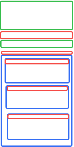
整个页面是个滚动的组件,滚动过程中红色的部分要吸顶,蓝色的块里边红色的同时只会一个吸顶
更多关于HarmonyOS鸿蒙Next中如何实现list组件同时多个ListGroupItem吸顶?的实战教程也可以访问 https://www.itying.com/category-93-b0.html

【背景知识】
吸顶效果是网页开发中的一种常见交互设计,指当用户滚动页面时,某个元素(如导航栏、标题栏、工具栏等)会固定在浏览器窗口的顶部(或其他指定位置),保持始终可见,不会随着页面滚动而消失。在开发过程中,吸顶效果通常用于需要保持关键元素始终可见的场景,以提升用户体验和操作效率。
在HarmonyOS中有多种实现吸顶效果的方案,以及不同的吸顶效果,不同方案及需要了解的知识如下:
- Tabs:通过页签进行内容视图切换的容器组件,每个页签对应一个内容视图。
- nestedScroll属性:设置前后两个方向的嵌套滚动模式,实现与父组件的滚动联动。
- List:列表包含一系列相同宽度的列表项。适合连续、多行呈现同类数据,例如图片和文本。
- sticky:配合ListItemGroup组件使用,设置ListItemGroup中header是否要吸顶或footer是否要吸底。sticky属性可以设置为StickyStyle.Header|StickyStyle.Footer以同时支持header吸顶和footer吸底。
【解决方案】
通过nestedScroll属性对滚动组件多次滚动嵌套,结合List组件的sticky属性,实现吸顶效果。
@Entry
@Component
struct Index3 {
  private timeTable: TimeTable[] = [
    {
      title: 'Header2-0',
      projects: ['内容1']
    },
    {
      title: 'Header2',
      projects: ['内容2']
    }
  ]
  private timeTable2: TimeTable[] = [
    {
      title: 'Header2-1',
      projects: ['内容2-1']
    },
    {
      title: 'Header2-2',
      projects: ['内容2-2']
    },
    {
      title: 'Header2-3',
      projects: ['内容2-3']
    }
  ]

  @Builder
  itemHead(text: string, index: number, isInner: boolean) {
    if (index === 0) {
      Text().height(0)
    } else {
      Text(text)
        .width('100%')
        .textAlign(TextAlign.Center)
        .fontColor(Color.Black)
        .height(100)
        .backgroundColor(isInner ? '#0A59F7' : '#5ba854')
    }
  }

  build() {
    Scroll() {
      Column() {
        Text('二级标题滚动嵌套吸顶')
          .width('100%')
          .height(200)
          .backgroundColor('#0A59F7')
          .textAlign(TextAlign.Center)
        Column() {
          // 第一层吸顶效果主要是通过设置nestedScroll属性以及父组件设置高度100%实现
          Text('Header1')
            .width('100%')
            .height(100)
            .backgroundColor('#317af7')
            .textAlign(TextAlign.Center)
            .fontColor(Color.Black)
          List() {
            ForEach(this.timeTable, (item: TimeTable, index) => {
              ListItemGroup({ header: this.itemHead(item.title, index, false) }) {
                ForEach(item.projects, (project: string) => {
                  ListItem() {
                    if (index === 1) {
                      List() {
                        ForEach(this.timeTable2, (item: TimeTable, index2) => {
                          ListItemGroup({ header: this.itemHead(item.title, index2, true) }) {
                            ForEach(item.projects, (project: string) => {
                              ListItem() {
                                Text(project)
                                  .width('100%')
                                  .height(800)
                                  .fontSize(20)
                                  .textAlign(TextAlign.Center)
                                  .backgroundColor(Color.Gray)
                              }
                            }, (item: string) => item)
                          }
                        })
                      }
                      .sticky(StickyStyle.Header)
                      .scrollBar(BarState.Off)
                      .width('100%')
                      .height('calc(100% - 100vp)')
                      .backgroundColor(Color.Blue)
                      .edgeEffect(EdgeEffect.Spring)
                      .nestedScroll({
                        scrollForward: NestedScrollMode.SELF_FIRST,
                        scrollBackward: NestedScrollMode.SELF_FIRST
                      })
                    } else {
                      Text(project)
                        .width('100%')
                        .height(800)
                        .fontSize(20)
                        .textAlign(TextAlign.Center)
                        .backgroundColor('#F1F3F5')
                    }
                  }
                }, (item: string) => item)
              }
            })
          }
          .sticky(StickyStyle.Header)
          .scrollBar(BarState.Off)
          .width('100%')
          .height('calc(100% - 100vp)')
          .backgroundColor('#0A59F7')
          .edgeEffect(EdgeEffect.Spring)
          .nestedScroll({
            scrollForward: NestedScrollMode.PARENT_FIRST,
            scrollBackward: NestedScrollMode.SELF_FIRST
          })
        }.height('100%')
      }
    }
    .edgeEffect(EdgeEffect.Spring)
    .friction(0.6)
    .backgroundColor(Color.White)
    .scrollBar(BarState.Off)
    .width('100%')
    .height('100%')
  }
}

interface TimeTable {
  title: string;
  projects: string[];
}
【常见FAQ】
Q:还有其他组件能实现吸顶效果吗? A:可以通过Stack组件或者zIndex属性,这类层叠布局实现组件吸顶。但这类层叠方式,该场景下并不常见,该方式更多用于网页中的客服按钮/回到页面顶部等场景。
Q:如何实现滑动时吸顶标题组件颜色渐变的效果? A:可以通过onDidScroll等监听滑动的事件,监听组件的偏移量,从而控制吸顶的标题组件改变透明度、背景颜色等状态。
更多关于HarmonyOS鸿蒙Next中如何实现list组件同时多个ListGroupItem吸顶?的实战系列教程也可以访问 https://www.itying.com/category-93-b0.html

list组件不支持同时多个ListGroupItem吸顶

在HarmonyOS Next中,使用List组件实现多个ListGroupItem同时吸顶,需通过List组件的sticky属性配合ListGroupItem实现。将ListGroupItem的sticky属性设置为true,每个ListGroupItem即可独立吸顶。代码示例如下:
List({ space: 10 }) {
  ListGroupItem({ header: 'Group1', sticky: true }) {
    ...
  }
  ListGroupItem({ header: 'Group2', sticky: true }) {
    ...
  }
}
这样设置后,滚动时多个分组头部会同时保持在顶部位置。

在HarmonyOS Next中,可以通过List组件的sticky属性配合ListGroupItem实现多层级吸顶效果。具体方案如下:
- 外层List设置sticky属性:
List({ space: 10 }) {
  // 列表内容
}
.sticky(StickyStyle.Header) // 设置头部吸顶
- 内层分组实现二级吸顶:
ListGroupItem({ header: this.groupHeader1() }) {
  // 第一组内容
}
.headerStyle(this.headerStyle)

ListGroupItem({ header: this.groupHeader2() }) {
  // 第二组内容
}
.headerStyle(this.headerStyle)
- 关键配置要点:
- 确保每个ListGroupItem的header组件设置固定高度
- 使用Stack布局管理吸顶层级
- 通过zIndex控制吸顶元素的叠加顺序
- 在aboutToAppear中预计算吸顶位置
- 样式控制:
private headerStyle: HeaderStyle = {
  height: 50,
  backgroundColor: Color.Red
}
这种方案可以实现红色分组头在滚动时吸顶,同时保证同一时间只有一个蓝色区块内的红色header处于吸顶状态。注意需要合理设置各分组的高度和位置计算,避免吸顶冲突。