


HarmonyOS鸿蒙Next中uniapp-x开发应该如何自定义hap底部的Tabbar?
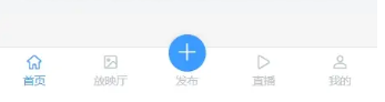
HarmonyOS鸿蒙Next中uniapp-x开发应该如何自定义hap底部的Tabbar? 我通过uniapp-x开发鸿蒙只能实现这样(如下图):

始终无法自定义图标大小以及midbutton的显示!!
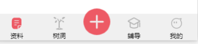
我该如何通过uniapp-x来实现以下这种效果:
有大佬可以指教一下么!谢谢
更多关于HarmonyOS鸿蒙Next中uniapp-x开发应该如何自定义hap底部的Tabbar?的实战教程也可以访问 https://www.itying.com/category-93-b0.html

开发者您好,如果在pages.json 文件中设置tabBar是无法自定义tabBar样式,需要您这边自己写一个自定义hap底部的Tabbar样式。
示例代码如下:
<template>
	<view class='bottom'>
		<view class='tabber_box'>
			<view class="tabbar_item">
				<view>
					<image class='tabbar_item_img' src='/static/component.png'></image>
				</view>
				<view>资料</view>
			</view>
			<view class="tabbar_item">
				<view>
					<image class='tabbar_item_img' src='/static/component.png'></image>
				</view>
				<view>树洞</view>
			</view>
			<view class="tabbar_item" style="margin-bottom: 25px;">
                 <view >
					<image style='width:45px;height:45px' src='/static/uni.png'></image>
				</view>
			</view>
			<view class="tabbar_item">
				<view>
					<image class='tabbar_item_img' src='/static/component.png'></image>
				</view>
				<view>辅导</view>
			</view>
			<view class="tabbar_item">
				<view>
					<image class='tabbar_item_img' src='/static/component.png'></image>
				</view>
				<view>我的</view>
			</view>
		</view>
	</view>
</template>

<style>
	.bottom {
		width: 100%;
		height: 50px;
		background-color: aquamarine;
		position: fixed;
		bottom: 0;
		overflow: visible;

		.tabber_box{
			display: flex;
			align-items:center;
			flex-direction:row;
			justify-content:space-around;
			height:100%;
			overflow: visible;
		}
		.tabbar_item{
			display:flex;
			align-items:center;
			width:50px;
			overflow: visible;
			.tabbar_item_img{
				width:30px;
				height:30px
			}
		}
	}
</style>
更多关于HarmonyOS鸿蒙Next中uniapp-x开发应该如何自定义hap底部的Tabbar?的实战系列教程也可以访问 https://www.itying.com/category-93-b0.html


在HarmonyOS Next中,使用uni-app-x开发自定义hap底部Tabbar需通过ArkUI实现。首先在pages.json中配置tabBar路径,然后在页面中使用@Tabs和@TabContent组件构建结构。通过tabBar属性关联自定义组件,利用@Builder装饰器定义Tabbar样式。可结合@State管理选中状态,使用条件渲染控制内容切换。需注意使用鸿蒙原生API和声明式UI语法,避免混合其他框架写法。

在HarmonyOS Next中,使用uni-app-x开发时,自定义TabBar(包括图标大小和中间按钮的显示)可以通过以下方式实现:
-
自定义组件替代原生TabBar
使用view、image和text等基础组件构建自定义TabBar,通过position: fixed固定在页面底部,结合条件渲染动态切换页面内容。 -
图标尺寸控制
在自定义TabBar中,直接设置image组件的width和height属性(如40px)调整图标大小,避免依赖原生TabBar的局限。 -
中间按钮实现
在TabBar布局中单独设计一个按钮,通过绝对定位(如position: absolute)将其居中,并绑定事件处理跳转逻辑。 -
状态管理
使用data变量跟踪当前选中项,通过动态类名(如:class)切换选中状态的样式,例如图标颜色和文字高亮。
示例代码框架:
<view class="custom-tabbar">
  <view v-for="(item, index) in list" :key="index" @click="switchTab(index)">
    <image :src="current === index ? item.selectedIcon : item.icon"
           style="width: 40px; height: 40px"/>
    <text :class="{ active: current === index }">{{ item.text }}</text>
  </view>
  <!-- 中间按钮 -->
  <view class="mid-button" @click="handleMidButton">
    <image src="/mid-icon.png" style="width: 50px; height: 50px"/>
  </view>
</view>
通过完全自定义的方式,可以灵活控制所有样式和交互,避开原生TabBar的限制。