


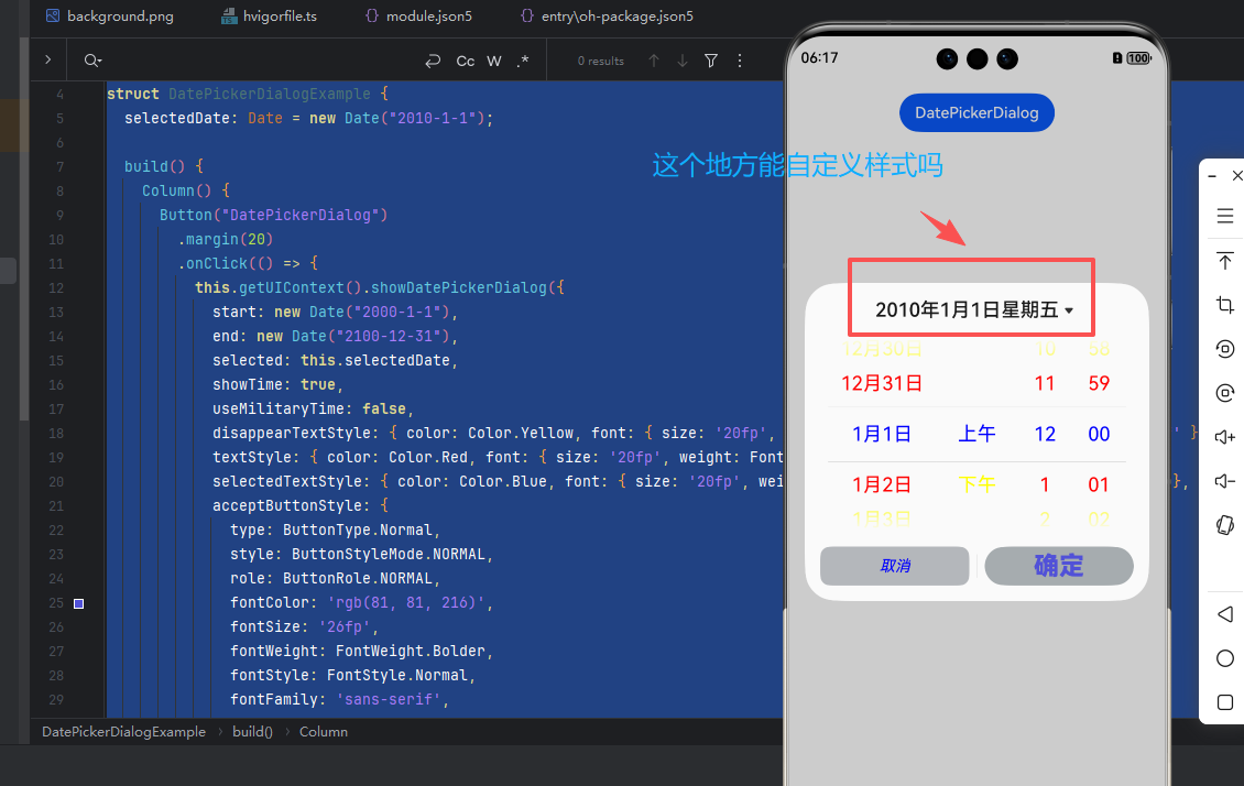
HarmonyOS鸿蒙Next中showDatePickerDialog()方法中,在官网中日期选择器的其他控件选中字体都有相关API接口可以定义样式,顶部标题的自定义,现在是否有接口提供?
HarmonyOS鸿蒙Next中showDatePickerDialog()方法中,在官网中日期选择器的其他控件选中字体都有相关API接口可以定义样式,顶部标题的自定义,现在是否有接口提供?
【问题现象】:
【版本信息】:NA
【复现代码】:NA
【尝试解决方案】:NA
更多关于HarmonyOS鸿蒙Next中showDatePickerDialog()方法中,在官网中日期选择器的其他控件选中字体都有相关API接口可以定义样式,顶部标题的自定义,现在是否有接口提供?的实战教程也可以访问 https://www.itying.com/category-93-b0.html

【问题现象】 DatePickerDialog组件顶部标题栏和底部按钮文本不支持自定义格式应该如何解决。
【背景知识】
- 日期滑动选择器弹窗 (DatePickerDialog)根据指定的日期范围创建日期滑动选择器并展示在弹窗上。
- 自定义弹窗 (CustomDialog)通常用于在保持当前的上下文环境时,临时展示用户需关注的信息或待处理的操作,用户在弹出框内完成需要进行交互的任务。
【解决方案】 在自定义弹窗中构建弹窗内容:顶部标题使用Text组件,通过参数传入标题文字,中间部分放置DatePicker组件,底部按钮通过Button按钮实现文字自定义。
@CustomDialog
struct CustomDateDialog {
  controller: CustomDialogController;
  @State selectedDate: string = '2025年10月31日';

  build() {
    Column() {
      Text(this.selectedDate).fontSize(20)
        .margin({ bottom: 20 })
      DatePicker({
        start: new Date('1970-1-1'),
        end: new Date('2100-1-1'),
        selected: new Date('2025-10-31')
      })
        .onDateChange((value: Date) => {
          this.selectedDate = `${value.getFullYear()}年${value.getMonth() + 1}月${value.getDate()}日`;
          console.info('select current date is: ' + value.toString());
        });
      // 自定义底部按钮
      Row() {
        Button('提交').onClick(() => { /* 提交逻辑 */
        });
        Button('关闭').onClick(() => { /* 关闭弹窗 */
        });
      }.margin({ top: 20 })
    }
    .justifyContent(FlexAlign.Center)
    .height('100%')
    .width('100%')
  }
}

@Entry
@Component
struct DatePickExample {
  dialogController: CustomDialogController = new CustomDialogController({
    builder: CustomDateDialog(),
  });

  build() {
    Column() {
      Button('弹窗').onClick(() => {
        this.dialogController.open();
      });
    }.width('100%')
  }
}
更多关于HarmonyOS鸿蒙Next中showDatePickerDialog()方法中,在官网中日期选择器的其他控件选中字体都有相关API接口可以定义样式,顶部标题的自定义,现在是否有接口提供?的实战系列教程也可以访问 https://www.itying.com/category-93-b0.html


目前HarmonyOS官方API中,showDatePickerDialog()方法没有提供直接自定义顶部标题样式的接口。
可自定义的部分
根据官方文档(ts-methods-datepicker-dialog.md),showDatePickerDialog()仅支持以下样式自定义:
| 可自定义部分 | 对应API | 说明 |
|---|---|---|
| ✅ 选中项文本 | selectedTextStyle | 设置选中项的文本颜色、字号、字体粗细 |
| ✅ 待选项文本 | textStyle | 设置待选项的文本颜色、字号、字体粗细 |
| ✅ 边缘项文本 | disappearTextStyle | 设置边缘项的文本颜色、字号、字体粗细 |
| ✅ 确认按钮 | acceptButtonStyle | 设置确认按钮样式、颜色、字号等 |
| ✅ 取消按钮 | cancelButtonStyle | 设置取消按钮样式、颜色、字号等 |
| ✅ 农历开关 | lunarSwitchStyle | 设置农历开关颜色样式(API 14+) |
| ✅ 弹窗背景 | backgroundColorbackgroundBlurStyleshadow | 设置弹窗背板颜色、模糊效果、阴影 |
| ❌ 顶部标题 | 无对应API | 无法自定义标题文本、颜色、字号 |
顶部标题说明
官方文档(第60行)仅提到:
当showTime为true时,点击弹窗的标题日期可以在"日期选择器"和"日期选择器+时间选择器"两个页面中切换。
这说明:
- 标题内容是自动生成的(显示选中的日期)
- 标题功能是固定的(仅在showTime=true时可点击切换)
- 标题样式无法自定义
✅ 解决方案:使用自定义弹窗
官方文档(第248-250行)明确建议:
如需完全自定义实现日期滑动选择器弹窗,可以通过先使用ts-methods-custom-dialog-box.md,然后使用ts-basic-components-dat
epicker.md组件来实现。
完整实现示例
// CustomDatePickerDialog.ets
@CustomDialog
struct CustomDatePickerDialog {
  controller: CustomDialogController;
  selectedDate: Date = new Date();
  // 自定义标题样式
  @State titleText: string = '选择日期';
  @State titleColor: ResourceColor = '#FF0000'; // 自定义红色标题
  @State titleFontSize: number = 20; // 自定义字号
  // 回调函数
  onAccept?: (value: Date) => void;
  onCancel?: () => void;
  build() {
    Column() {
      // ✅ 自定义标题区域
      Row() {
        Text(this.titleText)
          .fontSize(this.titleFontSize)
          .fontColor(this.titleColor)
          .fontWeight(FontWeight.Bold)
          .margin({ left: 20 })
        Blank()
        // 可以添加其他自定义元素,如图标、副标题等
        Image($r('app.media.icon_calendar'))
          .width(24)
          .height(24)
          .margin({ right: 20 })
      }
      .width('100%')
      .height(50)
      .backgroundColor('#F5F5F5')
      Divider()
      // DatePicker组件
      DatePicker({
        start: new Date('2000-1-1'),
        end: new Date('2100-12-31'),
        selected: this.selectedDate
      })
        .onChange((value: Date) => {
          this.selectedDate = value;
          // 动态更新标题显示
          this.titleText = `选择日期: ${value.getFullYear()}年${value.getMonth() + 1}月${value.getDate()}日`;
        })
      Divider()
      // ✅ 自定义按钮区域
      Row() {
        Button('取消')
          .fontSize(16)
          .fontColor('#666666')
          .backgroundColor(Color.Transparent)
          .onClick(() => {
            if (this.onCancel) {
              this.onCancel();
            }
            this.controller.close();
          })
        Blank()
        Button('确定')
          .fontSize(16)
          .fontColor('#007DFF')
          .backgroundColor(Color.Transparent)
          .onClick(() => {
            if (this.onAccept) {
              this.onAccept(this.selectedDate);
            }
            this.controller.close();
          })
      }
      .width('100%')
      .padding({ left: 20, right: 20, top: 10, bottom: 10 })
    }
    .width('90%')
    .backgroundColor(Color.White)
    .borderRadius(16)
  }
}
使用示例
@Entry
@Component
struct DatePickerExample {
  @State selectedDate: Date = new Date('2024-1-1');
  dialogController: CustomDialogController = new CustomDialogController({
    builder: CustomDatePickerDialog({
      selectedDate: this.selectedDate,
      titleText: '请选择生日',
      titleColor: '#FF5722', // 橙色标题
      titleFontSize: 22,
      onAccept: (value: Date) => {
        this.selectedDate = value;
        console.info(`Selected date: ${value.toString()}`);
      },
      onCancel: () => {
        console.info('Canceled');
      }
    }),
    alignment: DialogAlignment.Center,
    customStyle: false // 使用默认弹窗样式
  });
  build() {
    Column() {
      Text(`当前选择: ${this.selectedDate.toDateString()}`)
        .fontSize(18)
        .margin({ top: 20 })
      Button('打开自定义日期选择器')
        .margin({ top: 20 })
        .onClick(() => {
          this.dialogController.open();
        })
    }
    .width('100%')
    .height('100%')
    .justifyContent(FlexAlign.Center)
  }
}
进阶:完全自定义的样式
@CustomDialog
struct FullCustomDatePickerDialog {
  controller: CustomDialogController;
  selectedDate: Date = new Date();
  onAccept?: (value: Date) => void;
  build() {
    Column() {
      // ✅ 完全自定义标题栏
      Row() {
        Column() {
          Text('选择您的生日')
            .fontSize(24)
            .fontWeight(FontWeight.Bold)
            .fontColor('#FFFFFF')
          Text('Birthday Picker')
            .fontSize(12)
            .fontColor('#E0E0E0')
            .margin({ top: 4 })
        }
        .alignItems(HorizontalAlign.Start)
        Blank()
        // 自定义关闭按钮
        Image($r('sys.media.ohos_ic_public_cancel'))
          .width(24)
          .height(24)
          .fillColor('#FFFFFF')
          .onClick(() => {
            this.controller.close();
          })
      }
      .width('100%')
      .height(80)
      .padding({ left: 20, right: 20 })
      .backgroundColor('#007DFF') // 渐变背景
      .linearGradient({
        angle: 135,
        colors: [[0x007DFF, 0.0], [0x0055FF, 1.0]]
      })
      // DatePicker区域
      Column() {
        DatePicker({
          start: new Date('1900-1-1'),
          end: new Date('2100-12-31'),
          selected: this.selectedDate
        })
          .onChange((value: Date) => {
            this.selectedDate = value;
          })
      }
      .padding(20)
      .backgroundColor('#FFFFFF')
      // 自定义底部按钮
      Row() {
        Button('取消')
          .width('45%')
          .height(44)
          .fontSize(16)
          .fontColor('#007DFF')
          .backgroundColor('#F0F0F0')
          .borderRadius(8)
          .onClick(() => {
            this.controller.close();
          })
        Button('确定')
          .width('45%')
          .height(44)
          .fontSize(16)
          .fontColor('#FFFFFF')
          .backgroundColor('#007DFF')
          .borderRadius(8)
          .onClick(() => {
            if (this.onAccept) {
              this.onAccept(this.selectedDate);
            }
            this.controller.close();
          })
      }
      .width('100%')
      .padding(20)
      .justifyContent(FlexAlign.SpaceBetween)
      .backgroundColor('#FFFFFF')
    }
    .borderRadius(16)
    .clip(true)
  }
}
官方建议
根据官方文档第250行的建议,当需要完全自定义DatePicker弹窗样式时,应该:
- ✅ 使用 CustomDialog 创建自定义弹窗容器
- ✅ 在弹窗内使用 DatePicker 组件提供日期选择功能
- ✅ 完全控制标题、按钮、布局等所有样式
优势对比
| 特性 | showDatePickerDialog() | CustomDialog + DatePicker |
|---|---|---|
| 标题自定义 | ❌ 不支持 | ✅ 完全自定义 |
| 按钮样式 | ⚠️ 部分自定义(API 12+) | ✅ 完全自定义 |
| 布局控制 | ❌ 固定布局 | ✅ 自由布局 |
| 动画效果 | ❌ 固定动画 | ✅ 自定义动画 |
| 复杂交互 | ❌ 不支持 | ✅ 支持任意交互 |
| 开发成本 | 低(一行代码) | 中(需要自定义组件) |
总结
- 官方API现状: showDatePickerDialog()目前没有提供标题自定义API
- 官方推荐方案: 使用CustomDialog + DatePicker组件实现完全自定义
- 未来可能性: 可以向华为提交需求,期待未来版本添加titleStyle等API
如果你需要自定义标题样式,建议采用上述CustomDialog方案!

目前HarmonyOS Next的showDatePickerDialog()方法中,顶部标题的自定义接口尚未开放。日期选择器其他控件的字体样式可通过TextStyle相关API配置,但标题样式定制能力当前仍受限。建议关注官方ArkUI API文档的后续更新,该功能可能在未来的SDK版本中提供。
