


HarmonyOS鸿蒙Next中TimePicker如何配置达到如下设计效果
HarmonyOS鸿蒙Next中TimePicker如何配置达到如下设计效果
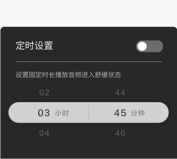
1、有单位(小时、分钟) 2、选中行底色
文档未看到相关配置,熟悉鸿蒙的朋友帮忙解答一下。
更多关于HarmonyOS鸿蒙Next中TimePicker如何配置达到如下设计效果的实战教程也可以访问 https://www.itying.com/category-93-b0.html

TimePicker没有相关的属性可以设置成该种效果。可以使用两个TextPicker实现上述效果。
private hourText: number [] =[] //存储小时数据
private minuteText: number[] =[] //存储分钟数据
aboutToAppear(){ for(let i=0;i<25;i++){ this.hourText.push[i] } for(let j=0;i<60;j++){ this.minuteText.push[j] } }
Row(){
//小时选择
Row() {
TextPicker({ range: this.hourText})
.selectedBackgroundStyle({
borderRadius: {
topLeft: 8,
topRight: 8,
bottomLeft: 8,
bottomRight: 8
},
color: “#FFFFFF”
})
.textStyle({ color: Color.Black, font: { size: 20, weight: FontWeight.Normal } })
.selectedTextStyle({ color: Color.Blue, font: { size: 30, weight: FontWeight.Bolder } })
.defaultPickerItemHeight(40)
Text(“小时”)
.height(120)
.fontSize(20)
.fontColor(Color.Black)
.fontWeight(FontWeight.Normal)
.textVerticalAlign(TextVerticalAlign.CENTER)
}
//分钟选择
Row() {
TextPicker({ range: this.minuteText})
.selectedBackgroundStyle({
borderRadius: {
topLeft: 8,
topRight: 8,
bottomLeft: 8,
bottomRight: 8
},
color: “#FFFFFF”
})
.textStyle({ color: Color.Black, font: { size: 20, weight: FontWeight.Normal } })
.selectedTextStyle({ color: Color.Blue, font: { size: 30, weight: FontWeight.Bolder } })
.defaultPickerItemHeight(40)
Text(“分钟”)
.height(120)
.fontSize(20)
.fontColor(Color.Black)
.fontWeight(FontWeight.Normal)
.textVerticalAlign(TextVerticalAlign.CENTER)
}
}
更多关于HarmonyOS鸿蒙Next中TimePicker如何配置达到如下设计效果的实战系列教程也可以访问 https://www.itying.com/category-93-b0.html


在HarmonyOS Next中,使用TimePicker组件并配置其属性可实现特定设计效果。通过设置TimePicker的type属性为TimePickerType.DIGITAL或TimePickerType.CLOCK选择数字或表盘样式。利用selectedTextColor、normalTextColor调整选中和未选中文本颜色。通过wheelModeEnabled控制是否启用滚轮模式。使用onChange回调处理时间选择事件。如需自定义背景或边框,可结合DecoratedBox或Shape组件设置。

在HarmonyOS Next中,要实现带单位(小时/分钟)和选中行底色的TimePicker,可通过自定义Picker组件实现。以下是关键配置步骤:
-
创建TextPicker组件:
[@Builder](/user/Builder) PickerBuilder() { TextPicker({ range: this.hours, selected: this.hourIndex }) .onChange((value: string, index: number) => { this.hourIndex = index }) } -
添加单位标签: 使用
Row容器将Picker与单位文本并列:Row() { this.PickerBuilder() Text('小时') .fontSize(16) .margin({ left: 8 }) } -
设置选中行样式: 通过
selectedTextStyle修改选中项样式:TextPicker() .selectedTextStyle({ fontSize: 20, fontWeight: FontWeight.Bold, backgroundColor: '#007DFF' // 设置选中行背景色 }) -
完整布局示例:
Row({ space: 12 }) {
  // 小时选择器
  Column() {
    this.TimePickerBuilder(this.hours, this.hourIndex)
    Text('小时')
  }

  // 分钟选择器
  Column() {
    this.TimePickerBuilder(this.minutes, this.minuteIndex)
    Text('分钟')
  }
}
需注意:
- 数据源需预先定义(如hours: [‘00’,‘01’…‘23’])
- 背景色值根据设计需求调整
- 可通过padding/margin调整单位标签位置
这种方案通过组合基础组件实现定制化效果,比直接使用TimePicker组件更灵活。