


HarmonyOS 鸿蒙Next UI实现
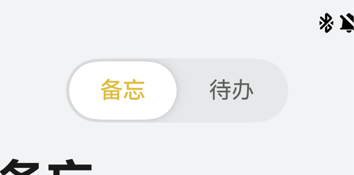
HarmonyOS 鸿蒙Next UI实现 图中的这种Tab的UI是怎样实现的?
11 回复

SegmentButton 即可实现
import {
  ItemRestriction,
  SegmentButton,
  SegmentButtonItemTuple,
  SegmentButtonOptions,
  SegmentButtonTextItem
} from '@kit.ArkUI';

@Entry
@Component
struct Index {
  @State tabOptions: SegmentButtonOptions = SegmentButtonOptions.tab({
    buttons: [{ text: '页签按钮1' }, { text: '页签按钮2' }, {
      text: '页签按钮3'
    }] as ItemRestriction<SegmentButtonTextItem>,
    backgroundColor: 'rgb(213,213,213)',
    selectedBackgroundColor: 'rgb(112,112,112)',
    textPadding: {
      top: 10,
      right: 10,
      bottom: 10,
      left: 10
    },
  });
  @State singleSelectCapsuleOptions: SegmentButtonOptions = SegmentButtonOptions.capsule({
    buttons: [{ text: '单选按钮1' }, { text: '单选按钮2' }, { text: '单选按钮3' }] as SegmentButtonItemTuple,
    multiply: false,
    fontColor: 'rgb(0,74,175)',
    selectedFontColor: 'rgb(247,247,247)',
    backgroundBlurStyle: BlurStyle.BACKGROUND_THICK
  });
  @State multiplySelectCapsuleOptions: SegmentButtonOptions = SegmentButtonOptions.capsule({
    buttons: [{ text: '多选按钮1' }, { text: '多选按钮2' }, { text: '多选按钮3' }] as SegmentButtonItemTuple,
    multiply: true,
    fontSize: 18,
    selectedFontSize: 18,
    fontWeight: FontWeight.Bolder,
    selectedFontWeight: FontWeight.Lighter,
  });
  @State iconCapsuleOptions: SegmentButtonOptions = SegmentButtonOptions.capsule({
    buttons: [
      { icon: $r('sys.media.ohos_ic_public_email'), selectedIcon: $r('sys.media.ohos_ic_public_clock') },
      { icon: $r('sys.media.ohos_ic_public_email'), selectedIcon: $r('sys.media.ohos_ic_public_clock') },
      { icon: $r('sys.media.ohos_ic_public_email'), selectedIcon: $r('sys.media.ohos_ic_public_clock') },
      { icon: $r('sys.media.ohos_ic_public_email'), selectedIcon: $r('sys.media.ohos_ic_public_clock') }
    ] as SegmentButtonItemTuple,
    multiply: false,
    imageSize: { width: 40, height: 40 },
    buttonPadding: {
      top: 6,
      right: 10,
      bottom: 6,
      left: 10
    },
    backgroundBlurStyle: BlurStyle.BACKGROUND_THICK
  });
  @State iconTextCapsuleOptions: SegmentButtonOptions = SegmentButtonOptions.capsule({
    buttons: [
      { text: '图标1', icon: $r('sys.media.ohos_ic_public_email'), selectedIcon: $r('sys.media.ohos_ic_public_clock') },
      { text: '图标2', icon: $r('sys.media.ohos_ic_public_email'), selectedIcon: $r('sys.media.ohos_ic_public_clock') },
      { text: '图标3', icon: $r('sys.media.ohos_ic_public_email'), selectedIcon: $r('sys.media.ohos_ic_public_clock') },
      { text: '图标4', icon: $r('sys.media.ohos_ic_public_email'), selectedIcon: $r('sys.media.ohos_ic_public_clock') },
      { text: '图标5', icon: $r('sys.media.ohos_ic_public_email'), selectedIcon: $r('sys.media.ohos_ic_public_clock') }
    ] as SegmentButtonItemTuple,
    multiply: true,
    imageSize: { width: 10, height: 10 },
  });
  @State tabSelectedIndexes: number[] = [0];
  @State singleSelectCapsuleSelectedIndexes: number[] = [0];
  @State multiplySelectCapsuleSelectedIndexes: number[] = [0, 1];
  @State singleSelectIconCapsuleSelectedIndexes: number[] = [3];
  @State multiplySelectIconTextCapsuleSelectedIndexes: number[] = [1, 2];

  build() {
    Row() {
      Column() {
        Column({ space: 20 }) {
          SegmentButton({ options: this.tabOptions, selectedIndexes: $tabSelectedIndexes })
          SegmentButton({
            options: this.singleSelectCapsuleOptions,
            selectedIndexes: $singleSelectCapsuleSelectedIndexes
          })
          SegmentButton({
            options: this.multiplySelectCapsuleOptions,
            selectedIndexes: $multiplySelectCapsuleSelectedIndexes
          })
          SegmentButton({
            options: this.iconCapsuleOptions,
            selectedIndexes: $singleSelectIconCapsuleSelectedIndexes
          })
          SegmentButton({
            options: this.iconTextCapsuleOptions,
            selectedIndexes: $multiplySelectIconTextCapsuleSelectedIndexes
          })
        }.width('90%')
      }.width('100%')
    }.height('100%')
  }
}
参考地址
更多关于HarmonyOS 鸿蒙Next UI实现的实战系列教程也可以访问 https://www.itying.com/category-93-b0.html

10分钟写完,建议采纳 + 关注,思路千千万,找到合适自己的就行
@Entry
@Component
struct Index {
  @State xLocation: number = 0

  changeXLocation(str: string) {
    if (str === '备忘') {
      this.xLocation = 0
      return
    }
    this.xLocation = (200 - 6) / 2
  }

  build() {
    Column() {
      Row() {
        Text('备忘')
          .borderRadius('50')
          .height('100%')
          .layoutWeight(1)
          .textAlign(TextAlign.Center)
          .onClick(() => {
            this.changeXLocation('备忘')
          })
        Text('待办')
          .borderRadius('50')
          .height('100%')
          .layoutWeight(1)
          .textAlign(TextAlign.Center)
          .onClick(() => {
            this.changeXLocation('待办')
          })

        Text()
          .borderRadius('50')
          .position({ x: this.xLocation })
          .height('100%')
          .width((200 - 6) / 2)
          .animation({ curve: Curve.Linear, duration: 100 })
          .backgroundColor(Color.White)
          .zIndex(-1)

      }
      .padding(3)
      .width(200)
      .height(50)
      .backgroundColor(Color.Brown)
      .borderRadius('50')
    }
    .width('100%')
    .height('100%')
    .backgroundColor(Color.Black)
    .justifyContent(FlexAlign.Center)
  }
}

找HarmonyOS工作还需要会Flutter技术的哦,有需要Flutter教程的可以学学大地老师的教程,很不错,B站免费学的哦:https://www.bilibili.com/video/BV1S4411E7LY/?p=17

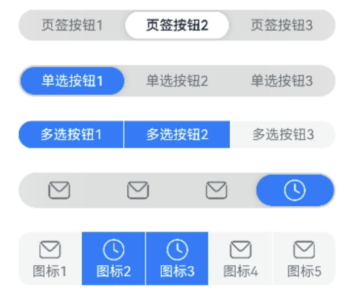
使用系统组件:SegmentButton
import {
  ItemRestriction,
  SegmentButton,
  SegmentButtonItemTuple,
  SegmentButtonOptions,
  SegmentButtonTextItem
} from '@kit.ArkUI';
@Entry
@Component
struct Index {
  @State tabOptions: SegmentButtonOptions = SegmentButtonOptions.tab({
    buttons: [{ text: '页签按钮1' }, { text: '页签按钮2' }, {
      text: '页签按钮3'
    }] as ItemRestriction<SegmentButtonTextItem>,
    backgroundBlurStyle: BlurStyle.BACKGROUND_THICK
  });
  @State singleSelectCapsuleOptions: SegmentButtonOptions = SegmentButtonOptions.capsule({
    buttons: [{ text: '单选按钮1' }, { text: '单选按钮2' }, { text: '单选按钮3' }] as SegmentButtonItemTuple,
    multiply: false,
    backgroundBlurStyle: BlurStyle.BACKGROUND_THICK
  });
  @State multiplySelectCapsuleOptions: SegmentButtonOptions = SegmentButtonOptions.capsule({
    buttons: [{ text: '多选按钮1' }, { text: '多选按钮2' }, { text: '多选按钮3' }] as SegmentButtonItemTuple,
    multiply: true
  });
  @State iconCapsuleOptions: SegmentButtonOptions = SegmentButtonOptions.capsule({
    buttons: [
      { icon: $r('sys.media.ohos_ic_public_email'), selectedIcon: $r('sys.media.ohos_ic_public_clock') },
      { icon: $r('sys.media.ohos_ic_public_email'), selectedIcon: $r('sys.media.ohos_ic_public_clock') },
      { icon: $r('sys.media.ohos_ic_public_email'), selectedIcon: $r('sys.media.ohos_ic_public_clock') },
      { icon: $r('sys.media.ohos_ic_public_email'), selectedIcon: $r('sys.media.ohos_ic_public_clock') }
    ] as SegmentButtonItemTuple,
    multiply: false,
    backgroundBlurStyle: BlurStyle.BACKGROUND_THICK
  });
  @State iconTextCapsuleOptions: SegmentButtonOptions = SegmentButtonOptions.capsule({
    buttons: [
      { text: '图标1', icon: $r('sys.media.ohos_ic_public_email'), selectedIcon: $r('sys.media.ohos_ic_public_clock') },
      { text: '图标2', icon: $r('sys.media.ohos_ic_public_email'), selectedIcon: $r('sys.media.ohos_ic_public_clock') },
      { text: '图标3', icon: $r('sys.media.ohos_ic_public_email'), selectedIcon: $r('sys.media.ohos_ic_public_clock') },
      { text: '图标4', icon: $r('sys.media.ohos_ic_public_email'), selectedIcon: $r('sys.media.ohos_ic_public_clock') },
      { text: '图标5', icon: $r('sys.media.ohos_ic_public_email'), selectedIcon: $r('sys.media.ohos_ic_public_clock') }
    ] as SegmentButtonItemTuple,
    multiply: true
  });
  @State tabSelectedIndexes: number[] = [1];
  @State singleSelectCapsuleSelectedIndexes: number[] = [0];
  @State multiplySelectCapsuleSelectedIndexes: number[] = [0, 1];
  @State singleSelectIconCapsuleSelectedIndexes: number[] = [3];
  @State multiplySelectIconTextCapsuleSelectedIndexes: number[] = [1, 2];
  build() {
    Row() {
      Column() {
        Column({ space: 25 }) {
          SegmentButton({
            options: this.tabOptions,
            selectedIndexes: $tabSelectedIndexes
          })
          SegmentButton({
            options: this.singleSelectCapsuleOptions,
            selectedIndexes: $singleSelectCapsuleSelectedIndexes
          })
          SegmentButton({
            options: this.multiplySelectCapsuleOptions,
            selectedIndexes: $multiplySelectCapsuleSelectedIndexes
          })
          SegmentButton({
            options: this.iconCapsuleOptions,
            selectedIndexes: $singleSelectIconCapsuleSelectedIndexes
          })
          SegmentButton({
            options: this.iconTextCapsuleOptions,
            selectedIndexes: $multiplySelectIconTextCapsuleSelectedIndexes
          })
        }.width('90%')
      }.width('100%')
    }.height('100%')
  }
}
效果图:


在HarmonyOS Next中,这种Tab效果可以通过TabContent和Tab组件配合TabContainer实现。以下是核心实现步骤:
- 使用
TabContainer作为容器,设置vertical属性为false实现水平布局 - 通过
Tab组件定义Tab标签,用TabContent定义对应内容区域 - 利用
indicator属性自定义底部指示器样式,如图中的蓝色下划线 - 通过
onChange事件处理Tab切换逻辑
关键代码示例:
TabContainer() {
  TabContent({ tabBar: this.TabBuilder('推荐') }) {
    // 推荐页面内容
  }
  TabContent({ tabBar: this.TabBuilder('关注') }) {
    // 关注页面内容
  }
}
可以通过修改indicator的样式参数(如height、color、width)来调整下划线外观,配合fontWeight改变文字选中状态。