


HarmonyOS鸿蒙Next中用Progress组件快速实现环形进度条
HarmonyOS鸿蒙Next中用Progress组件快速实现环形进度条 如何用鸿蒙 Progress 组件快速实现环形进度条?要求支持进度动态增减、自定义颜色和圆环宽度,且代码无额外导入、语法简单,能直接嵌入项目使用。同时需解决环形进度条样式错乱、进度更新不流畅等常见问题

Progress 组件通过type属性指定进度条类型,设置type: ProgressType.Ring即可切换为环形。核心配置包含 2 个关键属性:
value:当前进度值,需结合total属性确定进度比例;
color:进度条的填充颜色,可直接使用系统颜色或十六进制色值。
动态交互则通过@State装饰器维护进度状态,点击按钮修改状态值时,组件会自动响应更新,配合默认的过渡效果,实现流畅的进度变化。
解决步骤
创建基础布局:以 Column 为容器,嵌套 Progress 组件和控制按钮,保证页面结构简洁;
配置环形进度条:设置type为环形,指定初始进度、总进度、线条宽度和颜色;
实现动态控制:定义增加 / 减少进度的按钮,绑定点击事件修改进度状态值;
优化视觉体验:设置组件固定宽高,避免布局拉伸导致圆环变形。
完整代码
@Component
@Entry
export struct CircleProgressDemo {
  // 当前进度值(0-100)
  [@State](/user/State) progressValue: number = 30;
  // 进度条总数值
  private totalProgress: number = 100;

  build() {
    Column() {
      // 标题
      Text('环形进度条演示')
        .fontSize(26)
        .fontWeight(FontWeight.Bold)
        .margin({ top: 50, bottom: 40 });

      // 核心环形进度条
      Progress({
        value: this.progressValue,
        total: this.totalProgress,
        type: ProgressType.Ring
      })
        .width(180)
        .height(180)
        .color('#4B48F7') // 进度条颜色
        .backgroundColor('#F5F5F5'); // 圆环背景色

      // 进度数值显示
      Text(`${this.progressValue}%`)
        .fontSize(24)
        .fontWeight(FontWeight.Medium)
        .margin({ top: 20, bottom: 30 });

      // 进度控制按钮组
      Row() {
        Button('减少进度')
          .width(120)
          .height(50)
          .backgroundColor('#61CFBE')
          .fontColor(Color.White)
          .borderRadius(25)
          .margin({ right: 30 })
          .onClick(() => {
            // 进度最低为0,每次减少10
            this.progressValue = this.progressValue > 0 ? this.progressValue - 10 : 0;
          });

        Button('增加进度')
          .width(120)
          .height(50)
          .backgroundColor('#4B48F7')
          .fontColor(Color.White)
          .borderRadius(25)
          .onClick(() => {
            // 进度最高为100,每次增加10
            this.progressValue = this.progressValue < 100 ? this.progressValue + 10 : 100;
          });
      }
    }
    .width('100%')
    .height('100%')
    .backgroundColor('#F9F9F9')
    .justifyContent(FlexAlign.Start)
    .padding(20);
  }
}
效果展示:
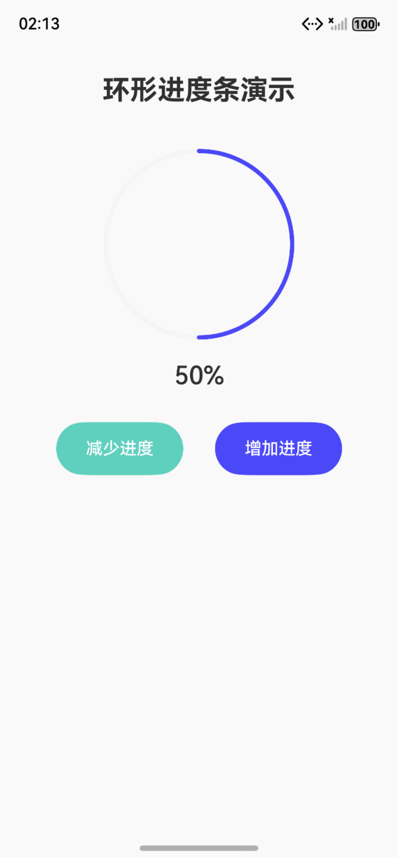
更多关于HarmonyOS鸿蒙Next中用Progress组件快速实现环形进度条的实战系列教程也可以访问 https://www.itying.com/category-93-b0.html
在HarmonyOS Next中,使用Progress组件创建环形进度条只需设置type为ProgressType.Ring。通过设置value属性控制进度值,可自定义颜色、宽度和样式。Progress组件内置环形布局,无需额外绘制逻辑,支持动态更新进度。示例代码:Progress({ value: 50, type: ProgressType.Ring }).width(100).height(100)

在HarmonyOS Next中,使用Progress组件实现环形进度条非常简单。以下是一个可直接嵌入项目的完整示例,无需额外导入:
@Component
struct CircularProgress {
  @State progressValue: number = 0

  build() {
    Column() {
      Progress({
        value: this.progressValue,
        total: 100,
        type: ProgressType.Ring
      })
        .width(120)
        .height(120)
        .color(Color.Blue)  // 自定义颜色
        .style({ strokeWidth: 8 })  // 圆环宽度

      Button('增加进度')
        .onClick(() => {
          if (this.progressValue < 100) {
            this.progressValue += 10
          }
        })

      Button('减少进度')
        .onClick(() => {
          if (this.progressValue > 0) {
            this.progressValue -= 10
          }
        })
    }
  }
}
关键特性实现:
- 动态进度:通过
@State装饰器实现进度值的响应式更新 - 自定义颜色:使用
.color()方法设置进度条颜色 - 圆环宽度:通过
.style({ strokeWidth: 8 })调整环的粗细
常见问题解决方案:
- 样式错乱:确保设置明确的
width和height,避免容器尺寸不确定 - 进度更新不流畅:使用
@State装饰器管理进度值,系统会自动处理动画过渡 - 性能优化:避免在build方法中进行复杂计算,进度更新应通过状态驱动
此代码语法简洁,完全基于ArkTS原生能力,可直接在HarmonyOS Next项目中运行使用。