


HarmonyOS鸿蒙Next中在ArkTS实现自定义弹窗(Custom Dialog)并支持传参与回调
HarmonyOS鸿蒙Next中在ArkTS实现自定义弹窗(Custom Dialog)并支持传参与回调 如何在ArkTS中实现自定义弹窗呢?

场景介绍
默认提供的弹窗虽然便捷,但在我们实际的业务中往往无法满足 UI 定制的一些需求。
例如:某些场景需要展示带输入框的确认弹窗;需要弹窗内包含图片、图标、多按钮或自定义布局;需要多个页面需复用同一类弹窗(如“退出登录确认”)等等。针对这种弹窗场景,我们就需要基于 @CustomDialog 装饰器封装可配置、可传参、带回调的自定义弹窗组件。
实现思路
一、使用 @CustomDialog 装饰器定义弹窗组件
二、通过 @Prop 或构造函数接收外部参数
三、在调用页面通过 controller 控制显示/隐藏
完整代码示例
自定义弹窗组件:ConfirmDialog.ets
[@CustomDialog](/user/CustomDialog)
export struct ConfirmDialog {
  controller: CustomDialogController;
  title: string = '提示';
  content: string = '';
  confirmText: string = '确定';
  cancelText: string = '取消';

  // 回调函数:true 表示点击确认,false 表示点击取消或关闭
  onResult: (result: boolean) => void = () => {};

  build() {
    Column() {
      Text(this.title)
        .fontSize(20)
        .fontWeight(FontWeight.Bold)
        .margin({ top: 20, bottom: 12 })

      Text(this.content)
        .fontSize(16)
        .textAlign(TextAlign.Center)
        .width('90%')
        .margin({ bottom: 20 })

      Row() {
        Button(this.cancelText)
          .width(120)
          .onClick(() => {
            this.onResult(false);
            this.controller.close();
          })

        Button(this.confirmText)
          .width(120)
          .backgroundColor('#007DFF')
          .fontColor(Color.White)
          .margin({ left: 20 })
          .onClick(() => {
            this.onResult(true);
            this.controller.close();
          })
      }
      .justifyContent(FlexAlign.Center)
      .margin({ bottom: 20 })
    }
    .width(300)
    .padding(20)
    .borderRadius(16)
    .backgroundColor(Color.White)
  }
}
页面中使用
import { ConfirmDialog } from '../components/ConfirmDialog';
@Entry
@Component
struct Index {
// 创建弹窗控制器
dialogController: CustomDialogController = new CustomDialogController({
builder: ConfirmDialog({
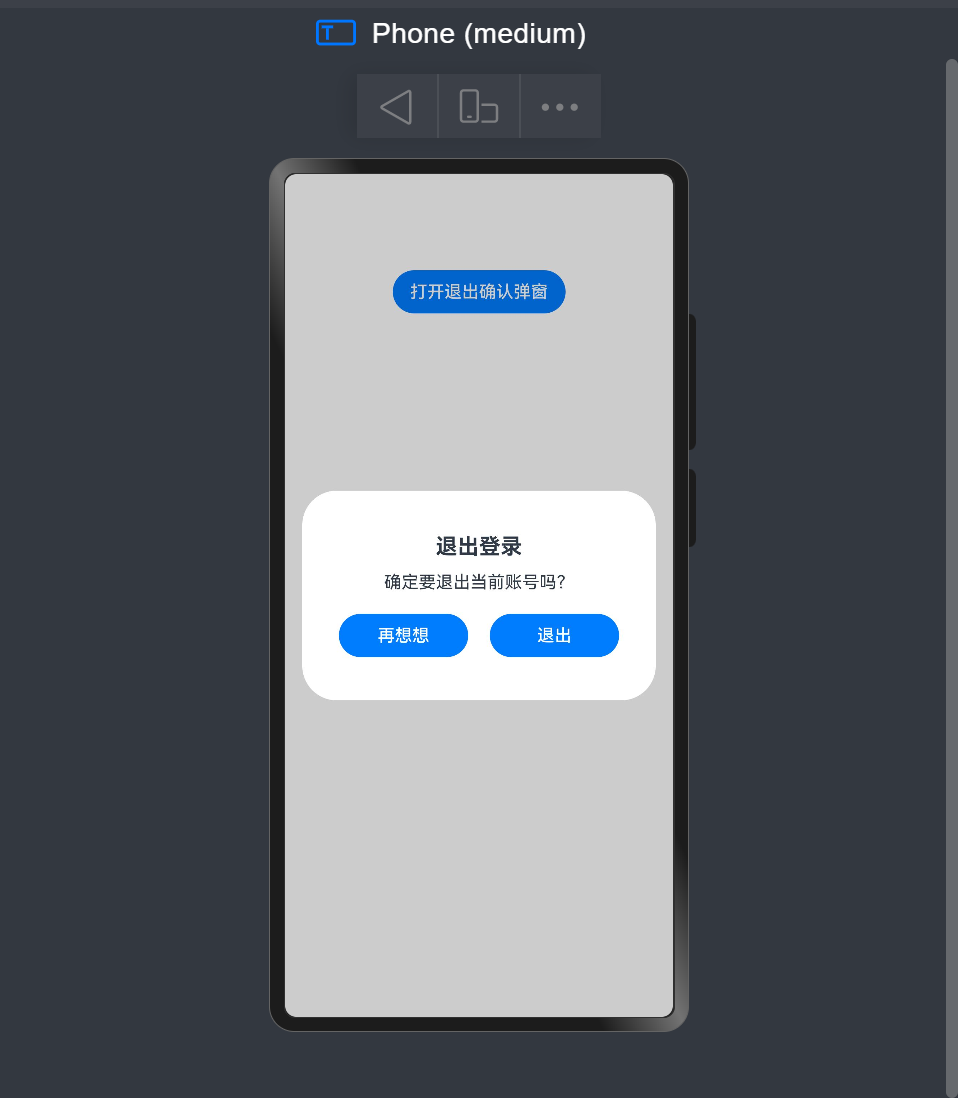
title: '退出登录',
content: '确定要退出当前账号吗?',
confirmText: '退出',
cancelText: '再想想',
onResult: (result: boolean) => {
if (result) {
// 执行退出逻辑
console.log('User confirmed logout');
// TODO: 调用登出接口
} else {
console.log('User canceled');
}
}
})
});
build() {
Column() {
Button('打开退出确认弹窗')
.onClick(() => {
this.dialogController.open();
})
.margin(50)
}
.width('100%')
.height('100%')
}
}
简易效果图
更多关于HarmonyOS鸿蒙Next中在ArkTS实现自定义弹窗(Custom Dialog)并支持传参与回调的实战系列教程也可以访问 https://www.itying.com/category-93-b0.html

在HarmonyOS Next的ArkTS中,自定义弹窗可通过CustomDialogController实现。定义继承CustomDialog的组件,使用@CustomDialog装饰器。传参通过构造函数或属性绑定,回调通过定义事件处理器或传递函数参数完成。弹窗内容使用ArkTS声明式UI构建,控制器管理显示与隐藏。

在HarmonyOS Next的ArkTS中,实现一个支持传参和回调的自定义弹窗,核心是使用@CustomDialog装饰器。以下是关键步骤和代码示例:
1. 创建自定义弹窗组件
使用@CustomDialog装饰器定义一个弹窗组件,并通过构造参数接收外部传入的数据。
// CustomDialogExample.ets
@CustomDialog
struct CustomDialogExample {
  // 1. 接收外部传入的参数
  @Prop dialogTitle: string = '默认标题'
  @Prop message: string = ''

  // 2. 定义回调函数
  private onConfirm: () => void
  private onCancel: () => void

  // 3. 构造函数接收参数和回调
  constructor(
    title: string,
    msg: string,
    confirmCallback: () => void,
    cancelCallback: () => void
  ) {
    this.dialogTitle = title
    this.message = msg
    this.onConfirm = confirmCallback
    this.onCancel = cancelCallback
  }

  build() {
    Column() {
      // 弹窗标题
      Text(this.dialogTitle)
        .fontSize(20)
        .fontWeight(FontWeight.Bold)
        .margin({ top: 20 })

      // 消息内容
      Text(this.message)
        .fontSize(16)
        .margin({ top: 15, bottom: 25 })

      // 按钮区域
      Row() {
        Button('取消')
          .onClick(() => {
            this.onCancel()  // 执行取消回调
            this.close()     // 关闭弹窗
          })

        Button('确认')
          .onClick(() => {
            this.onConfirm() // 执行确认回调
            this.close()     // 关闭弹窗
          })
      }
      .justifyContent(FlexAlign.SpaceAround)
      .width('100%')
      .margin({ bottom: 20 })
    }
    .padding(20)
    .width('80%')
  }
}
2. 在页面中使用自定义弹窗
通过CustomDialogController控制器来显示弹窗,并传递参数和回调函数。
// Index.ets
@Entry
@Component
struct Index {
  // 1. 创建弹窗控制器
  private dialogController: CustomDialogController = new CustomDialogController({
    builder: CustomDialogExample,
    // 传递参数和回调
    customStyle: true
  })

  build() {
    Column() {
      Button('显示弹窗')
        .onClick(() => {
          // 2. 显示弹窗并传递参数
          this.dialogController.open()
        })
    }
  }

  // 3. 定义回调函数
  private handleConfirm() {
    console.log('用户点击了确认')
    // 处理确认逻辑
  }

  private handleCancel() {
    console.log('用户点击了取消')
    // 处理取消逻辑
  }
}
3. 进阶:使用更灵活的参数传递
如果需要传递动态参数,可以这样优化:
// 在调用open时传递参数
this.dialogController.open({
  title: '操作确认',
  message: '确定要执行此操作吗?',
  onConfirm: () => this.handleConfirm(),
  onCancel: () => this.handleCancel()
})
关键要点:
@CustomDialog装饰器用于定义弹窗组件- 构造函数是接收外部参数的主要方式
- 回调函数通过成员变量传递
CustomDialogController控制弹窗的显示和隐藏- 调用
close()方法关闭弹窗
这种实现方式完全遵循ArkTS的响应式编程范式,能够很好地集成到HarmonyOS Next的应用架构中。