


HarmonyOS鸿蒙Next中如何实现滑动时吸顶的tabs背景为和页面背景图一致的颜色渐变
HarmonyOS鸿蒙Next中如何实现滑动时吸顶的tabs背景为和页面背景图一致的颜色渐变 【问题描述】如何实现滑动时吸顶的tabs背景为和页面背景图一致的颜色渐变。
【问题现象】
1.滑动前:
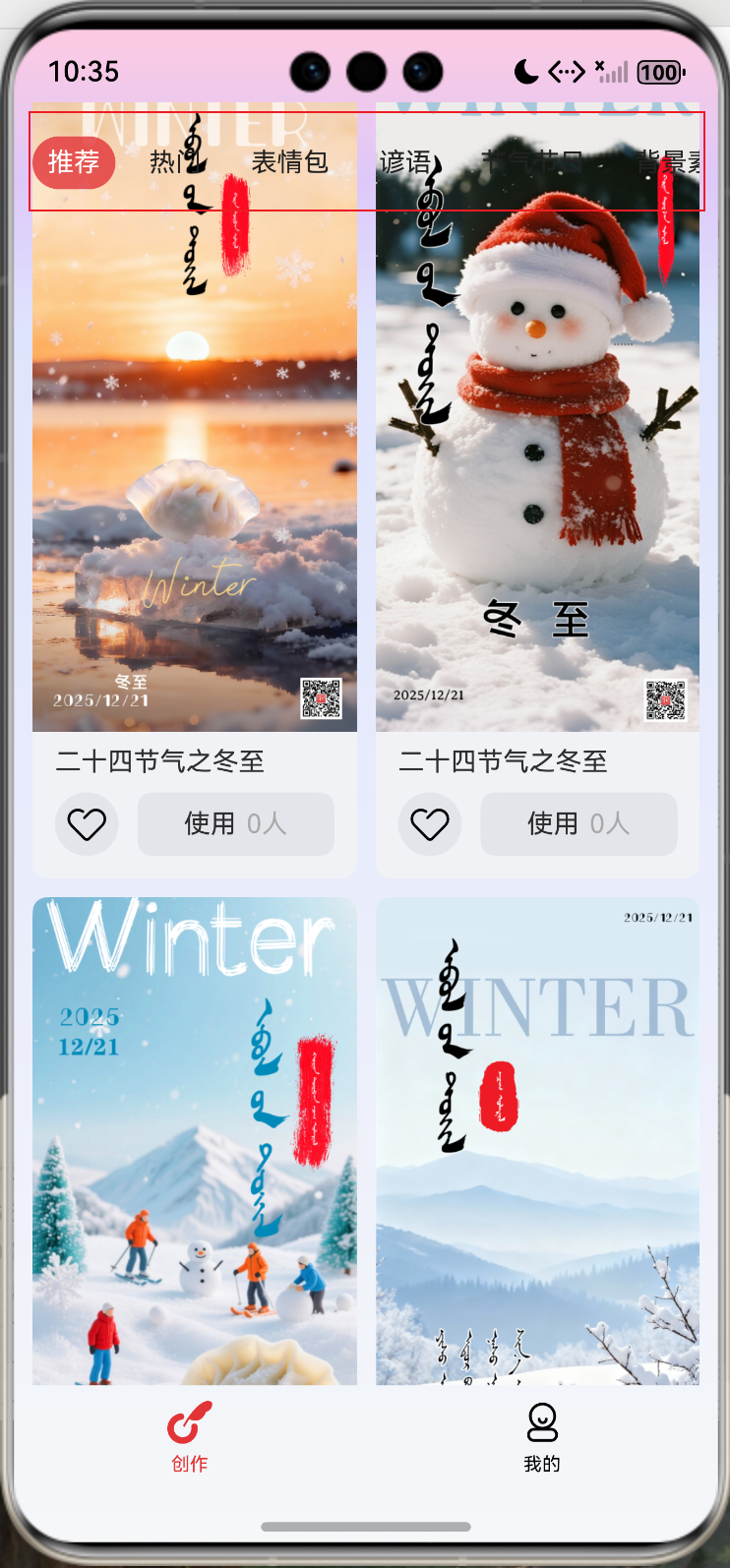
2.滑动后tabs吸顶,但是背景是下面的内容部分,而不是页面背景图的渐变色
3.想实现的效果:tabs背景为背景图的渐变色
更多关于HarmonyOS鸿蒙Next中如何实现滑动时吸顶的tabs背景为和页面背景图一致的颜色渐变的实战教程也可以访问 https://www.itying.com/category-93-b0.html
4 回复


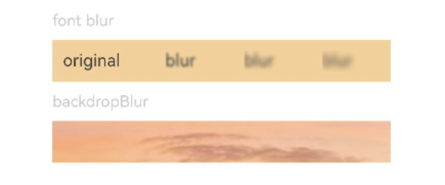
通过blur设置内容模糊,通过backdropBlur设置背景模糊:
@Entry
@Component
struct BlurEffectsExample {
  build() {
    Column({ space: 10 }) {
      // 对字体进行模糊
      Text('font').fontSize(15).fontColor(0xCCCCCC).width('90%')
      Flex({ alignItems: ItemAlign.Center }) {
        Text('original').margin(10)
        Text('blur')
          .blur(5).margin(10)
        Text('blur')
          .blur(10, undefined).margin(10) // 内容模糊半径为5,禁用系统自适应优化策略。
        Text('blur')
          .blur(15).margin(10)
      }.width('90%').height(40)
      .backgroundColor(0xF9CF93)

      // 对背景进行模糊
      Text('backdropBlur').fontSize(15).fontColor(0xCCCCCC).width('90%')
      Text()
        .width('90%')
        .height(40)
        .fontSize(16)
        .backdropBlur(3)
        // $r('app.media.image')需要替换为开发者所需的图像资源文件
        .backgroundImage($r('app.media.image'))
        .backgroundImageSize({ width: 1200, height: 160 })
    }.width('100%').margin({ top: 5 })
  }
}
通过backgroundBlurStyle设置背景模糊样式:
@Entry
@Component
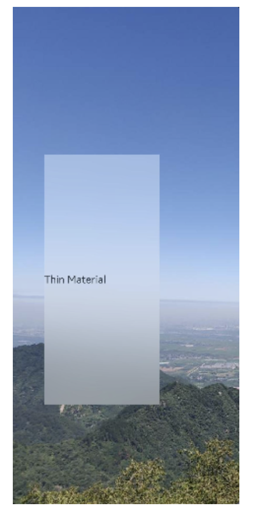
struct BackgroundBlurStyleDemo {
build() {
Column() {
Row() {
Text("Thin Material")
}
.width('50%')
.height('50%')
.backgroundBlurStyle(BlurStyle.Thin,
{ colorMode: ThemeColorMode.LIGHT, adaptiveColor: AdaptiveColor.DEFAULT, scale: 1.0 })
.position({ x: '15%', y: '30%' })
}
.height('100%')
.width('100%')
// $r('app.media.bg')需要替换为开发者所需的图像资源文件
.backgroundImage($r('app.media.bg'))
.backgroundImageSize(ImageSize.Cover)
}
}
设置blendMode为FAST类型使各个图层的效果按顺序进行混合:
@Component
export struct FastMode {
  @Consume('navPathStack') navPathStack: NavPathStack;
  build() {
    NavDestination() {
      Stack() {
        Stack() {
          Image($r('app.media.map')).width('100%').height('100%').borderRadius(15)
          Flex({ direction: FlexDirection.ColumnReverse }) {
          }
          .height(80)
          .backgroundBlurStyle(BlurStyle.COMPONENT_ULTRA_THIN, { scale: 0.3 })
          .flexShrink(0)
          .width('100%')
          .padding(0)
          .borderRadius({
            topLeft: 0,
            topRight: 0,
            bottomLeft: 15,
            bottomRight: 15
          })
          .position({ x: 0, y: 220 })
        }.margin({ left: '16', right: '16' })
        .height(300)
        .borderRadius(15)
        // blend mode is set to fast mode
        .blendMode(BlendMode.SRC_OVER, BlendApplyType.FAST)
      }
      .width('100%')
      .height('100%')
      .backgroundImage($r('app.media.img'))
      .backgroundImageSize(ImageSize.Cover)
      .expandSafeArea([SafeAreaType.SYSTEM], [SafeAreaEdge.TOP, SafeAreaEdge.BOTTOM])
    }
    .hideTitleBar(true)
  }
}

在HarmonyOS Next中,可通过以下步骤实现滑动吸顶Tabs背景与页面背景图一致的渐变效果:
- 使用
Scroll组件监听滚动,结合@State变量动态计算Tabs的透明度或背景色。 - 在Tabs组件上应用
background属性,使用LinearGradient设置渐变,颜色值从页面背景图中提取。 - 通过
position属性固定Tabs在顶部,滚动时根据Scroll偏移量同步调整渐变色参数。
示例代码片段:
@State scrollY: number = 0
Scroll() {
  // 页面内容
}
.onScroll((yOffset: number) => {
  this.scrollY = yOffset
})

Tabs() {
  // Tab内容
}
.background(
  LinearGradient({
    angle: 180,
    colors: [`#${extractedColor1}`, `#${extractedColor2}`]
  })
)

在HarmonyOS Next中实现滑动时吸顶的Tabs背景与页面背景图一致的渐变效果,关键在于将Tabs组件的背景设置为与页面背景相同的渐变,并在吸顶时保持该背景。以下是实现步骤:
1. 定义统一的渐变背景
在resources/base/element/color.json中定义渐变色的起始和结束颜色值,确保Tabs和页面背景使用相同的颜色资源。
2. 使用<Tabs>组件并设置背景
在ArkUI中,通过<Tabs>组件结合TabContent实现内容区域,并为Tabs设置background属性,使用LinearGradient绘制与页面背景一致的渐变。
示例代码:
import { LinearGradient } from '@kit.ArkGraphics2D';

@Entry
@Component
struct Index {
  build() {
    Column() {
      // 页面背景图或渐变区域(可根据实际需求使用Image或Column背景)
      Column() {
        // 页面顶部内容
      }
      .background(
        LinearGradient({
          angle: 180,
          colors: [['#FF0000', 0.0], ['#00FF00', 1.0]] // 使用与Tabs一致的渐变色
        })
      )
      .height('40%')

      // Tabs区域
      Tabs() {
        TabContent() {
          // Tab 1 内容
        }
        .tabBar('Tab 1')

        TabContent() {
          // Tab 2 内容
        }
        .tabBar('Tab 2')
      }
      .barMode(BarMode.Scrollable)
      .backgroundColor(Color.Transparent) // 设置Tabs背景透明
      .background(
        LinearGradient({
          angle: 180,
          colors: [['#FF0000', 0.0], ['#00FF00', 1.0]] // 与页面背景相同的渐变
        })
      )
      .onAttach(() => {
        // 可在此处监听滑动状态,动态调整背景(如吸顶时保持渐变)
      })
    }
    .width('100%')
    .height('100%')
  }
}
3. 处理吸顶时的背景保持
- 方案一(推荐):将Tabs的
background直接设置为与页面背景相同的渐变,如上例所示。当Tabs吸顶时,其背景会覆盖下方内容,自然显示渐变。 - 方案二:若页面背景是图片,可将图片提取为上层容器的背景,并确保Tabs背景透明。吸顶时,Tabs会显示下层容器的背景图。但需注意层级关系,避免被内容遮挡。
4. 注意事项
- 颜色一致性:确保Tabs的渐变色值与页面背景图的主要渐变色匹配,可通过取色工具获取精确值。
- 性能优化:避免在滑动过程中频繁重绘渐变,使用预定义的
LinearGradient资源。 - 层级管理:检查Tabs与页面其他组件的层级,确保吸顶时Tabs背景能正确覆盖下方内容。
通过以上步骤,即可实现Tabs吸顶时背景与页面背景图渐变一致的效果。