


HarmonyOS鸿蒙Next中如何简单打造自己的按钮背景色调色板?
HarmonyOS鸿蒙Next中如何简单打造自己的按钮背景色调色板? 要求实现 “按钮背景色可灵活切换” 的功能(后续可用于主题切换、个性化设置、表单状态标识等)
方便我们通过调色板选择自己心意的按钮颜色。
展示可视化调色板,可直接点击色块快速切换目标颜色。

在 HarmonyOS 应用开发中,我们经常需要实现 “按钮背景色可切换” 的功能(如主题切换、个性化设置、表单状态标识等)。这里我设计了简单实例,支持点击按钮自动循环切换背景色,同时展示可视化调色板,用户可直接点击色块快速切换目标颜色。也便于我们开发者快速选择合适的按钮颜色。
一、实现思路解析
定义调色板数据源:用数组存储自定义颜色(支持十六进制、rgb、命名色),可自由增减修改;
响应式状态管理:通过 @State 维护当前选中颜色的索引,实现 UI 实时联动;
双切换模式:
自动切换:点击按钮时索引递增,超出数组长度自动重置,循环遍历调色板;
手动选择:调色板色块支持点击,直接切换到对应颜色;
兼容型布局:用 Flex+ForEach 组件,实现调色板自动换行,适配低版本 SDK;
视觉优化:选中色块添加黑色边框高亮,按钮文字固定白色适配所有背景色,圆角设计提升交互体验。
二、关键代码实现
按钮实现:
    // 核心切换按钮
      Button("点击切换颜色")
        .width(250)
        .height(80)
        .fontSize(18)
        .fontWeight(FontWeight.Medium)
        .fontColor("#FFFFFF")// 文字白色,适配所有背景色
        .backgroundColor(this.colorPalette[this.currentColorIndex])
        .borderRadius(16) // 圆角优化
        .onClick(() => {
          // 循环切换颜色索引(超出长度自动重置为0)
          this.currentColorIndex = (this.currentColorIndex + 1) % this.colorPalette.length;
        })
自定义调色板:
  // 调色板布局:Flex自动换行(替代Wrap,兼容4.0+)
      Flex({ wrap: FlexWrap.Wrap, justifyContent: FlexAlign.Center }) {
        // ArkTS规范:必须用ForEach循环渲染组件
        ForEach(
          this.colorPalette, // 数据源
          (color: string, index: number) => {
            // 替换View:用Column作为色块容器(ArkTS基础组件)
            Column()
              .width(40)
              .height(40)
              .backgroundColor(color)
              .borderRadius(8)
              .margin(8)
              // 点击色块直接切换到对应颜色
              .onClick(() => {
                this.currentColorIndex = index;
              })
              // 当前选中的色块添加黑色边框高亮
              .border({
                width: this.currentColorIndex === index ? 2 : 0,
                color: "#000000",
                style: BorderStyle.Solid
              })
          },
          (index: number) => index.toString() // 唯一标识(必填,避免渲染异常)
        )
      }
      .width("100%") // 占满宽度,实现自动换行
三、完整代码
@Entry
@Component
struct ColorSwitchButtonPage {
// 自定义调色板:支持十六进制/ rgb / 命名色,可自由修改
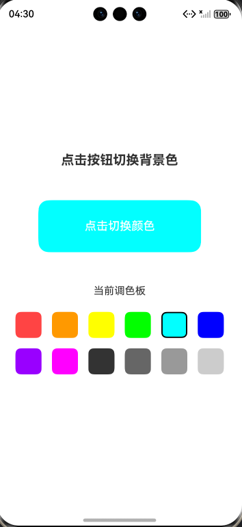
private colorPalette: string[] = [
"#FF4444", "#FF9900", "#FFFF00", "#00FF00",
"#00FFFF", "#0000FF", "#9900FF", "#FF00FF",
"#333333", "#666666", "#999999", "#CCCCCC"
];
// 当前选中的颜色索引(响应式状态)
[@State](/user/State) currentColorIndex: number = 0;
build() {
// 根布局:垂直列,居中显示
Column() {
// 标题文本
Text("点击按钮切换背景色")
.fontSize(20)
.fontWeight(FontWeight.Bold)
.margin({ bottom: 50 })
// 核心切换按钮
Button("点击切换颜色")
.width(250)
.height(80)
.fontSize(18)
.fontWeight(FontWeight.Medium)
.fontColor("#FFFFFF")// 文字白色,适配所有背景色
.backgroundColor(this.colorPalette[this.currentColorIndex])
.borderRadius(16) // 圆角优化
.onClick(() => {
// 循环切换颜色索引(超出长度自动重置为0)
this.currentColorIndex = (this.currentColorIndex + 1) % this.colorPalette.length;
})
// 调色板标题
Text("当前调色板")
.fontSize(16)
.margin({ top: 50, bottom: 15 })
// 调色板布局:Flex自动换行
Flex({ wrap: FlexWrap.Wrap, justifyContent: FlexAlign.Center }) {
ForEach(
this.colorPalette, // 数据源
(color: string, index: number) => {
// 替换View:用Column作为色块容器(ArkTS基础组件)
Column()
.width(40)
.height(40)
.backgroundColor(color)
.borderRadius(8)
.margin(8)
// 点击色块直接切换到对应颜色
.onClick(() => {
this.currentColorIndex = index;
})
// 当前选中的色块添加黑色边框高亮
.border({
width: this.currentColorIndex === index ? 2 : 0,
color: "#000000",
style: BorderStyle.Solid
})
},
(index: number) => index.toString() // 唯一标识(必填,避免渲染异常)
)
}
.width("100%") // 占满宽度,实现自动换行
}
.width("100%")
.height("100%")
.justifyContent(FlexAlign.Center) // 垂直居中
.padding(20) // 内边距,避免内容贴边
}
}
四、效果展示
更多关于HarmonyOS鸿蒙Next中如何简单打造自己的按钮背景色调色板?的实战系列教程也可以访问 https://www.itying.com/category-93-b0.html

在HarmonyOS Next中,可通过ArkUI的Button组件结合状态样式管理实现按钮背景色调色板。使用@State装饰器定义颜色变量,在按钮的backgroundColor属性中引用。通过onClick事件触发颜色切换逻辑,利用数组或条件语句循环更新颜色值。示例代码片段:Button('点击切换').backgroundColor(this.currentColor).onClick(() => { this.currentColor = colors[this.index]; })。

在HarmonyOS Next中,你可以通过自定义组件和状态管理来高效地构建一个按钮背景色调色板。核心思路是使用@State装饰器管理当前选中的颜色,并通过ForEach循环渲染色块选项。
以下是关键步骤和代码示例:
-
定义颜色数据与状态: 首先,定义一个颜色数组作为调色板数据源,并使用
@State装饰器定义一个变量来跟踪当前选中的颜色。// 定义调色板颜色数组 private colorOptions: ResourceColor[] = [$r('app.color.red'), $r('app.color.blue'), $r('app.color.green'), Color.Black, Color.Gray] // 使用@State装饰器管理当前选中的颜色 @State currentColor: ResourceColor = this.colorOptions[0] -
构建调色板UI: 使用
Row或Flex布局容器,结合ForEach遍历颜色数组,为每个颜色创建一个可点击的色块。// 调色板组件 @Builder ColorPalette() { Row({ space: 10 }) { ForEach(this.colorOptions, (color: ResourceColor) => { // 每个色块是一个圆形按钮 Circle({ width: 30, height: 30 }) .fill(color) // 填充色块颜色 .onClick(() => { // 点击时更新当前选中的颜色 this.currentColor = color }) .border({ width: this.currentColor === color ? 2 : 0, // 选中状态加边框 color: Color.White }) }) } .padding(10) .backgroundColor(Color.White) .borderRadius(20) .shadow(ShadowStyle.OUTER_DEFAULT_MD) } -
应用颜色到目标按钮: 创建一个目标按钮,其背景色绑定到
currentColor状态变量。当currentColor改变时,按钮背景色会自动更新。// 目标按钮组件 Button('示例按钮') .width(200) .height(50) .backgroundColor(this.currentColor) // 背景色绑定当前选中颜色 .fontColor(Color.White) -
组合完整页面: 将调色板和目标按钮组合在
Column布局中。build() { Column({ space: 20 }) { this.ColorPalette() // 调色板 Button('示例按钮') // 目标按钮 .width(200) .height(50) .backgroundColor(this.currentColor) .fontColor(Color.White) } .width('100%') .height('100%') .justifyContent(FlexAlign.Center) }
实现要点:
- 状态驱动UI:利用
@State装饰器的响应式能力,当currentColor变化时,所有依赖它的UI(色块边框、按钮背景)会自动刷新。 - 颜色资源:建议将常用颜色定义为资源(
$r('app.color.xxx')),便于统一管理和主题适配。 - 扩展性:此方案易于扩展。你可以将颜色数组改为从配置文件或网络获取,实现动态调色板;也可结合
@StorageLink或AppStorage实现主题色的持久化存储,用于全局主题切换。
通过以上方式,你就能在HarmonyOS Next应用中创建一个交互直观、颜色可灵活切换的按钮背景色调色板。