


HarmonyOS鸿蒙Next中用animateTo实现按钮点击微动效
HarmonyOS鸿蒙Next中用animateTo实现按钮点击微动效 如何使用animateTo来实现一个按钮的点击微动效呢?
4 回复

实现场景
动效是现在所有APP中都需要的一个场景,使用有微动效的按钮,点击率可能都会提高,能增加用户的留存。我们在对按钮点击时轻微动效,以此来提升交互体验。
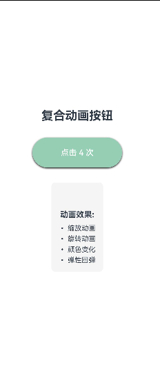
实现效果:
1、缩放动画
2、旋转动画
3、颜色变化
4、弹性回弹
完整代码
@Entry
@Component
struct ComplexAnimatedButton {
  @State scaleValue: number = 1.0;
  @State rotationValue: number = 0;
  @State backgroundColor1: string = '#007DFF';
  @State textColor: string = '#FFFFFF';
  @State isAnimating: boolean = false;

  private clickCount: number = 0;

  onClickHandler() {
    if (this.isAnimating) return; // 防止重复点击

    this.isAnimating = true;
    this.clickCount++;

    // 根据点击次数改变背景色
    const colors = ['#007DFF', '#FF6B6B', '#4ECDC4', '#45B7D1', '#96CEB4'];
    this.backgroundColor1 = colors[this.clickCount % colors.length];

    // 开始复合动画序列
    this.scaleValue = 0.85; // 按下时缩小

    // 旋转动画
    this.rotationValue = 360;

    // 文字颜色变化
    this.textColor = '#FFFFFF';

    // 设置动画完成后恢复
    setTimeout(() => {
      this.scaleValue = 1.0; // 恢复大小
      this.rotationValue = 0; // 恢复旋转

      setTimeout(() => {
        this.isAnimating = false;

        // 轻微的弹性效果
        setTimeout(() => {
          this.scaleValue = 1.05;
          setTimeout(() => {
            this.scaleValue = 1.0;
          }, 100);
        }, 50);
      }, 300);
    }, 300);
  }

  build() {
    Column() {
      // 标题
      Text('复合动画按钮')
        .fontSize(24)
        .fontWeight(FontWeight.Bold)
        .margin({ bottom: 30 })

      // 动画按钮
      Button(`点击 ${this.clickCount} 次`)
        .onClick(this.onClickHandler.bind(this))
        .width(180)
        .height(60)
        .borderRadius(12)
        .fontColor(this.textColor)
        .fontSize(16)
        .fontWeight(FontWeight.Medium)
        .backgroundColor(this.backgroundColor1)
        .scale({ x: this.scaleValue, y: this.scaleValue, z: 1.0 })
        .rotate({ x: 0, y: 0, z: 1, angle: this.rotationValue })
        .shadow({
          radius: 8,
          color: this.backgroundColor + '40', // 添加透明度
          offsetX: 0,
          offsetY: 4,
        })
        .animation({
          duration: 300,
          delay: 0,
          iterations: 1,
          playMode: 0,
        })

      // 效果说明
      Column() {
        Text('动画效果:')
          .fontSize(16)
          .fontWeight(FontWeight.Bold)
          .margin({ top: 40, bottom: 10 })

        Text('• 缩放动画')
          .fontSize(14)
          .margin({ bottom: 5 })
        Text('• 旋转动画')
          .fontSize(14)
          .margin({ bottom: 5 })
        Text('• 颜色变化')
          .fontSize(14)
          .margin({ bottom: 5 })
        Text('• 弹性回弹')
          .fontSize(14)
      }
      .padding(15)
      .borderRadius(8)
      .backgroundColor('#F5F5F5')
      .margin({ top: 30 })
    }
    .width('100%')
    .height('100%')
    .justifyContent(FlexAlign.Center)
    .alignItems(HorizontalAlign.Center)
  }
}
更多关于HarmonyOS鸿蒙Next中用animateTo实现按钮点击微动效的实战系列教程也可以访问 https://www.itying.com/category-93-b0.html

- onTouch是组件的通用事件,当手指触碰屏幕时会触发该回调。它有一个touchType类型的参数,当值为Down时表示手指按下时触发,当值为Up时表示手指抬起时触发。
- UIContext组件中的keyframeAnimateTo方法可以用来设置关键帧动画,以实现点击图标的动画效果。
@Entry
@Component
struct ClickAnimationPage {
  length: number = 60;
  @State nLength: number = 60;
  @State fontSizeInfoClick: number = 10;
  @State fontSizeInfoPerformance: number = 15;
  @State valueInfo: number = 0;
  @State count: number = 1;
  @State fontSizeInfoProgress: number = 18;
  uiContext: UIContext | undefined = undefined;

  aboutToAppear(): void {
    this.uiContext = this.getUIContext?.();
  }

  onPageShow(): void {
    this.length = 60;
    setTimeout(() => {
      this.length = 70;
    }, 50);
  }

  build() {
    Column() {
      Row() {
        Text('X')
          .fontColor(Color.Black).fontWeight(700).fontSize(13);
        Text(this.count.toString())
          .fontColor(Color.Black).fontWeight(700).fontSize(this.fontSizeInfoProgress);
      };
      Stack() {
        Column() {
          Text('点击').fontSize(this.fontSizeInfoPerformance).fontColor(Color.White);
        }
        .opacity(0.8)
        .width(this.nLength)
        .height(this.nLength)
        .borderRadius(this.nLength / 2)
        .backgroundColor(Color.Orange)
        .justifyContent(FlexAlign.Center);
        Column() {
          Progress({ value: this.valueInfo, total: 100, type: ProgressType.Ring })
            .width(this.nLength)
            .height(this.nLength)
            .color(Color.Blue)
            .style({ strokeWidth: 5 })
            .onTouch((event: TouchEvent) => {
              if (TouchType.Up === event.type) {
                // 用户可在这自定义实现动画效果
                this.nLength = 60;
                this.fontSizeInfoClick = 10;
                this.fontSizeInfoPerformance = 15;
                this.fontSizeInfoProgress = 15;
                this.valueInfo = 0;
                if (!this.uiContext) {
                  return;
                }
                this.uiContext.keyframeAnimateTo({ iterations: 3 }, [
                  {
                    duration: 100, event: () => {
                    this.valueInfo = 0;
                  }
                  },
                  {
                    duration: 100, event: () => {
                    this.valueInfo = 100;
                  }
                  }
                ]);
              }
              if (TouchType.Down === event.type) {
                // 用户可在这自定义实现动画效果
                this.nLength = 50;
                this.fontSizeInfoClick = 7;
                this.fontSizeInfoPerformance = 10;
                this.fontSizeInfoProgress = 18;
                this.valueInfo = 0;
                ++this.count;
                if (!this.uiContext) {
                  return;
                }
                this.uiContext.keyframeAnimateTo({ iterations: 3 }, [
                  {
                    duration: 100, event: () => {
                    this.valueInfo = 0;
                  }
                  },
                  {
                    duration: 100, event: () => {
                    this.valueInfo = 100;
                  }
                  }
                ]);
              }
            });
        }
        .width(60)
        .height(60)
        .justifyContent(FlexAlign.Center);
      };
    }
    .justifyContent(FlexAlign.Center)
    .alignItems(HorizontalAlign.Center)
    .width('100%')
    .height('100%');
  }
}
参考地址

在HarmonyOS Next中,使用animateTo实现按钮点击微动效,可通过设置组件的缩放、透明度等属性变化来创建。例如,在按钮的点击事件中调用animateTo,并在闭包内修改scale或opacity属性,即可产生平滑的过渡动画。代码示例如下:
// 示例:点击时缩放
Button('点击')
  .onClick(() => {
    animateTo({
      duration: 100,
      curve: Curve.EaseInOut
    }, () => {
      // 在此处修改状态变量,例如控制缩放比例
    })
  })
这能实现按钮被点击时的视觉反馈。

在HarmonyOS Next中,可以使用animateTo结合状态变量来实现按钮点击微动效。以下是一个简洁的实现示例:
import { animateTo } from '@kit.ArkUI';

@Entry
@Component
struct ButtonAnimationExample {
  @State scaleValue: number = 1.0;

  build() {
    Column() {
      Button('点击我')
        .scale({ x: this.scaleValue, y: this.scaleValue })
        .onClick(() => {
          // 点击时缩小
          animateTo({
            duration: 100,
            curve: Curve.EaseInOut,
            onFinish: () => {
              // 恢复原状
              animateTo({
                duration: 100,
                curve: Curve.EaseInOut
              }, () => {
                this.scaleValue = 1.0;
              });
            }
          }, () => {
            this.scaleValue = 0.9;
          });
        })
    }
    .width('100%')
    .height('100%')
    .justifyContent(FlexAlign.Center)
  }
}
关键点说明:
- 使用
@State装饰器定义缩放状态变量scaleValue - 通过
.scale()修饰器将状态变量应用到按钮 - 在
onClick事件中嵌套使用animateTo:- 第一次动画:快速缩小到0.9倍(100ms)
- 第二次动画:在
onFinish回调中恢复原始大小(100ms)
- 使用
Curve.EaseInOut曲线使动画过渡更自然
扩展效果:
- 可结合
.opacity()实现淡入淡出 - 可修改
.scale()的x和y值实现不对称缩放 - 可调整
duration控制动画速度
这种实现方式性能较好,能提供流畅的视觉反馈,适用于需要轻量级交互反馈的场景。