


HarmonyOS鸿蒙Next中使用Progress组件展示任务进度
HarmonyOS鸿蒙Next中使用Progress组件展示任务进度 当用户执行一个需要等待的操作时,如文件下载、数据加载或软件安装,一个清晰、动态的进度条是必不可少的UI元素。它能够告知用户当前任务的进展,有效缓解用户在等待过程中的焦虑感,并让应用显得更加专业和响应迅速。
那我们应该如何使用 Progress 组件来展示这种进度呢?

使用场景
如文件传输应用中显示文件下载、上传的进度和速度。如数据加载应用从网络或本地数据库加载大量数据时,展示加载进度。如安装与更新服务中,针对应用安装、系统更新或资源包解压的过程展示等。
实现思路
实现的核心是:定义进度状态 -> 布局Progress组件 -> 绑定状态与样式 -> 通过事件更新状态。
第一步:定义进度状态,在组件中,使用 @State 装饰器定义一个数值类型的变量来存储当前的进度值。
第二步:布局Progress组件,在页面的 build() 方法中,添加 Progress 组件。
第三步:绑定状态与样式,Progress 组件提供了 type 属性来设置样式,常用的有 ProgressType.Linear(线性进度条)和 ProgressType.Ring(环形进度条)。
第四步:通过事件更新状态,在“开始下载”按钮的 onClick 事件中,使用 setInterval 定时器来模拟进度增长。在定时器的回调函数中,递增 @State 变量的值。
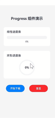
实现效果
完整实现代码
import promptAction from '@ohos.promptAction';

@Entry
@Component
struct ProgressDemoPage {
  // 1. 定义进度状态
  [@State](/user/State) downloadProgress: number = 0;
  private timer: number = -1; // 用于存储定时器的ID

  // 开始模拟下载
  startDownload() {
    if (this.timer > 0) {
      return; // 避免重复启动
    }
    this.timer = setInterval(() => {
      if (this.downloadProgress < 100) {
        this.downloadProgress += 2; // 每次增加2%
      } else {
        this.resetDownload(); // 下载完成后自动重置
        promptAction.showToast({ message: '下载完成!' });
      }
    }, 100); // 每100ms更新一次
  }

  // 重置下载进度
  resetDownload() {
    if (this.timer > 0) {
      clearInterval(this.timer);
      this.timer = -1;
    }
    this.downloadProgress = 0;
  }

  // 4. 在组件销毁时清除定时器,防止内存泄漏
  aboutToDisappear() {
    this.resetDownload();
  }

  build() {
    Column() {
      Text('Progress 组件演示')
        .fontSize(24)
        .fontWeight(FontWeight.Bold)
        .margin({ top: 50, bottom: 40 })

      // 2. & 3. 线性进度条
      Column() {
        Text('线性进度条')
          .fontSize(18)
          .fontWeight(FontWeight.Medium)
          .alignSelf(ItemAlign.Start)
          .margin({ bottom: 15 })

        Progress({ value: this.downloadProgress, total: 100, type: ProgressType.Linear })
          .width('100%')
          .height(20)
          .color('#007DFF') // 进度颜色
          .backgroundColor('#F1F3F5') // 背景颜色
          .style({ strokeWidth: 20 }) // 线条宽度,对于Linear类型即高度

        Text(`${this.downloadProgress}%`)
          .fontSize(14)
          .margin({ top: 8 })
      }
      .width('90%')
      .padding(20)
      .backgroundColor(Color.White)
      .borderRadius(12)
      .margin({ bottom: 30 })

      // 2. & 3. 环形进度条
      Column() {
        Text('环形进度条')
          .fontSize(18)
          .fontWeight(FontWeight.Medium)
          .alignSelf(ItemAlign.Start)
          .margin({ bottom: 15 })

        // 使用Stack将百分比文字叠加在环形进度条中心
        Stack() {
          Progress({ value: this.downloadProgress, total: 100, type: ProgressType.Ring })
            .width(100)
            .height(100)
            .color('#4CAF50')
            .style({ strokeWidth: 8, scaleCount: 12, scaleWidth: 5 }) // 刻度样式

          Text(`${this.downloadProgress}%`)
            .fontSize(18)
            .fontWeight(FontWeight.Bold)
        }
        .alignContent(Alignment.Center)
      }
      .width('90%')
      .padding(20)
      .backgroundColor(Color.White)
      .borderRadius(12)
      .margin({ bottom: 40 })

      // 控制按钮
      Row() {
        Button('开始下载')
          .width('40%')
          .height(45)
          .backgroundColor('#007DFF')
          .onClick(() => {
            this.startDownload();
          })

        Button('重置')
          .width('40%')
          .height(45)
          .backgroundColor('#FA2A2D')
          .margin({ left: '10%' })
          .onClick(() => {
            this.resetDownload();
            promptAction.showToast({ message: '已重置' });
          })
      }
      .width('90%')
      .justifyContent(FlexAlign.Center)

    }
    .width('100%')
    .height('100%')
    .justifyContent(FlexAlign.Start)
    .backgroundColor('#F5F5F5')
    .padding({ top: 20, left: 16, right: 16 })
  }
}
更多关于HarmonyOS鸿蒙Next中使用Progress组件展示任务进度的实战系列教程也可以访问 https://www.itying.com/category-93-b0.html

在HarmonyOS Next中,Progress组件用于展示任务进度。它支持线性进度条和环形进度条两种样式。
通过设置Progress组件的value属性可以指定当前进度值,total属性设置总进度值。样式可通过type属性设置为线性(ProgressType.Linear)或环形(ProgressType.Ring)。
Progress组件还支持自定义颜色、宽度等样式属性。

在HarmonyOS Next中,使用Progress组件展示任务进度非常直观。该组件提供了线性(ProgressType.Linear)和环形(ProgressType.Ring)两种样式,并支持动态更新。
基本用法示例:
import { Progress, ProgressType } from '@kit.ArkUI';

@Entry
@Component
struct ProgressExample {
  @State progressValue: number = 0; // 进度值,范围0-100

  build() {
    Column() {
      // 1. 线性进度条
      Progress({ value: this.progressValue, type: ProgressType.Linear })
        .width('80%')
        .height(20)

      // 2. 环形进度条
      Progress({ value: this.progressValue, type: ProgressType.Ring })
        .width(100)
        .height(100)

      // 模拟进度更新
      Button('开始加载')
        .onClick(() => {
          let timer = setInterval(() => {
            if (this.progressValue >= 100) {
              clearInterval(timer);
              return;
            }
            this.progressValue += 10; // 每次增加10%
          }, 500);
        })
    }
    .width('100%')
    .height('100%')
    .justifyContent(FlexAlign.Center)
  }
}
关键特性说明:
- 进度控制:通过
value参数绑定进度值(0-100),配合@State变量可实现动态更新。 - 样式定制:
- 线性进度条可通过
.color()设置颜色,.style()调整样式。 - 环形进度条支持设置
.strokeWidth(线宽)和.shadow(阴影)。
- 线性进度条可通过
- 场景适配:
- 文件上传/下载等连续进度场景适合线性进度条。
- 数据加载、安装过程等场景可使用环形进度条增强视觉焦点。
最佳实践建议:
- 对于耗时不确定的任务,可结合
ProgressType.Linear与动态文案(如“已加载50%”)提升体验。 - 若需精确控制动画效果,可通过
Progress的animation参数配置缓动函数和时长。
通过以上方式,您可以高效实现进度展示功能,有效提升应用交互的友好性。