


HarmonyOS 鸿蒙Next中如何在实现自定义组件?
HarmonyOS 鸿蒙Next中如何在实现自定义组件? 问题描述:需要封装一个带图标和文字的按钮组件。
3 回复

回答内容:使用@Component装饰器定义自定义组件。
示例代码:
/**
* @author J.query
* @date 2025/12/23 11:17
* @email j-query@foxmail.com
* Description:
*/
[@Component](/user/Component)
struct IconTextButton {
@Prop icon: string;
@Prop text: string;
@State pressed: boolean = false;
build() {
Row() {
Image(this.icon)
.width(24)
.height(24)
Text(this.text)
.fontSize(16)
.fontWeight('bold')
}
.backgroundColor(this.pressed ? '#007DFF' : '#FFFFFF')
.borderRadius(8)
.padding({ left: 12, right: 12, top: 8, bottom: 8 })
.onTouch((event) => {
if (event.type === TouchType.Down) {
this.pressed = true;
} else if (event.type === TouchType.Up) {
this.pressed = false;
}
})
}
}
@Entry
[@Component](/user/Component)
struct UseCustomComponent {
build() {
Column() {
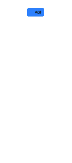
IconTextButton({ icon: 'icons/heart.png', text: '点赞' })
}
.width('100%')
.height('100%')
}
}
效果:显示带图标的按钮,按压时背景变色。

更多关于HarmonyOS 鸿蒙Next中如何在实现自定义组件?的实战系列教程也可以访问 https://www.itying.com/category-93-b0.html

在HarmonyOS Next中,自定义组件通过ArkTS的@Component装饰器实现。开发者需定义struct结构,并使用@Builder、@BuilderParam等装饰器构建UI。组件状态管理使用@State、@Prop等装饰器。通过继承或组合现有组件,可封装特定功能与样式。

在HarmonyOS Next中实现自定义组件(如带图标和文字的按钮),核心是使用ArkTS的@Component装饰器。以下是关键步骤和代码示例:
- 创建组件结构:使用@Component定义可复用UI单元。
[@Component](/user/Component)
struct IconButton {
  // 定义组件参数
  private icon: Resource = $r('app.media.icon');
  private text: string = '按钮';
  private onClick: () => void = () => {};

  build() {
    // 构建UI布局
    Row() {
      Image(this.icon)
        .width(20)
        .height(20)
      Text(this.text)
        .fontSize(16)
    }
    .padding(10)
    .backgroundColor(Color.Blue)
    .onClick(() => {
      this.onClick();
    })
  }
}
[@Component](/user/Component)
struct IconButton {
  [@Prop](/user/Prop) icon: Resource;
  [@Prop](/user/Prop) text: string;
  private onClick: () => void;

  // 组件实现
}
- 使用自定义组件:在页面中直接调用并传递参数。
@Entry
[@Component](/user/Component)
struct Index {
  build() {
    Column() {
      IconButton({
        icon: $r('app.media.home'),
        text: '首页',
        onClick: () => {
          console.log('按钮被点击');
        }
      })
    }
  }
}
注意事项:
这种封装方式实现了UI与逻辑的分离,符合HarmonyOS Next的组件化开发范式。