


HarmonyOS鸿蒙Next中如何实现底部栏tabBar缩放动效?
HarmonyOS鸿蒙Next中如何实现底部栏tabBar缩放动效? 如何实现底部栏tabBar缩放动效?
4 回复


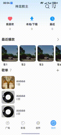
效果
注意看底部栏有一个缩放效果
实现思路
- 实现底部栏tabBar布局
- 给图片增加scale属性
- 点击事件通过animateTo改变scale属性数据就可以
完整代码
@Component
export struct TabBar {
  @Consume navPathStack: NavPathStack
  @Consume tabBarIndex: number
  @Consume scaleX: number
  @Consume scaleY: number

  @Builder
  tabBarBuilder(id: number, icon: string, title: string, replacePathByName: string) {
    Column({ space: 5 }) {
      Image($r(icon))
        .width(35)
        .height(35)
        .padding(5)
        .fillColor(this.tabBarIndex === id ? '#fff' : '#aaa')
        .backgroundColor(this.tabBarIndex === id ? '#52a5ff' : Color.Transparent)
        .borderRadius('50%')
        .scale({ x: this.tabBarIndex === id ? this.scaleX : 1, y: this.tabBarIndex === id ? this.scaleY : 1 })
      Text(title)
        .fontSize(14)
        .fontColor(this.tabBarIndex === id ? '#52a5ff' : '#333')
        .textAlign(TextAlign.Center)
    }
    .height('100%')
    .onClick(() => {
      this.navPathStack.replacePathByName(replacePathByName, null)
      this.tabBarIndex = id
      this.scaleX = 0
      this.scaleY = 0
      animateTo({ duration: 300 }, () => {
        this.scaleX = 1
        this.scaleY = 1
      })
    })
    .layoutWeight(1)
    .justifyContent(FlexAlign.Center)
  }

  build() {
    Row() {
      this.tabBarBuilder(0, 'app.media.tabbar_square', '广场', 'Square')
      this.tabBarBuilder(1, 'app.media.tabbar_find', '发现', 'Find')
      this.tabBarBuilder(2, 'app.media.tabbar_ai', '创作', 'Ai')
      this.tabBarBuilder(3, 'app.media.tabbar_mine', '我的', 'Profile')
    }.height(70)
  }
}

在HarmonyOS Next中,实现底部栏TabBar缩放动效主要使用ArkUI的动画能力。通过为TabBar的每个图标组件绑定animation属性,并配置animateTo函数来驱动缩放过程。关键是在Tab的点击事件或状态变化时,触发动画执行。通常定义一个状态变量(如currentIndex)来标记选中项,然后使用条件渲染或属性绑定,为当前选中项应用放大关键帧动画(如scale从1.0到1.2),同时为非选中项应用缩小或恢复原状的动画。动画参数如时长、曲线(如Ease.InOut)可在animation配置中设置。

在HarmonyOS Next中实现底部栏Tab的缩放动效,核心是使用ArkUI的动画能力,结合状态管理和组件属性变化。以下是两种主流实现方案:
方案一:使用属性动画(推荐)
通过animation属性为TabContent内的图标和文字分别设置缩放动画。
关键步骤:
- 定义状态变量:使用
@State装饰器记录当前选中的Tab索引。 - 计算缩放比例:在构建每个Tab时,判断其索引是否与选中索引匹配。匹配的Tab缩放比例为
1.2(放大),未匹配的为1.0(原始大小)。 - 应用动画:为图标和文字组件的
scale属性绑定计算出的比例值,并设置animation动画参数(如时长、曲线)。
代码示例(简化逻辑):
@Entry
@Component
struct AnimatedTabBar {
  @State currentIndex: number = 0

  build() {
    Column() {
      // 页面内容...
      // 底部Tab栏
      Row() {
        ForEach(this.tabs, (item: TabItem, index: number) => {
          Column() {
            // 图标:根据是否选中应用缩放动画
            Image(item.icon)
              .scale({
                x: this.currentIndex === index ? 1.2 : 1.0,
                y: this.currentIndex === index ? 1.2 : 1.0
              })
              .animation({
                duration: 200,
                curve: Curve.EaseOut
              })
            // 文字
            Text(item.text)
              .scale({
                x: this.currentIndex === index ? 1.1 : 1.0,
                y: this.currentIndex === index ? 1.1 : 1.0
              })
              .animation({
                duration: 200,
                curve: Curve.EaseOut
              })
          }
          .onClick(() => {
            this.currentIndex = index // 点击切换状态,触发动画
          })
        })
      }
    }
  }
}
方案二:使用显式动画
通过animateTo函数在点击事件中执行更复杂的动画序列。
适用场景:需要与多个属性变化同步或执行顺序动画时。
// 在.onClick事件中
animateTo({
  duration: 300,
  curve: Curve.Friction
}, () => {
  this.currentIndex = index // 状态变化在动画闭包内执行
})
优化建议
- 性能:动画时长建议设置在
200-300ms,使用Curve.EaseOut或Curve.Friction等曲线使动效更自然。 - 视觉:可同时配合透明度(
opacity)或颜色变化,增强选中态反馈。 - 布局:缩放可能导致布局挤压,建议为Tab容器预留足够空间或使用绝对定位。
以上方案均基于ArkUI框架的标准能力,无需额外库即可实现流畅的Tab缩放效果。