


HarmonyOS鸿蒙Next中富文本编辑器除了使用较重的markdown三方库,是否还有其他方式实现?
HarmonyOS鸿蒙Next中富文本编辑器除了使用较重的markdown三方库,是否还有其他方式实现? 富文本编辑器除了使用较重的markdown三方库,是否还有其他方式实现?
请提供详细的解释和demo源码

使用鸿蒙系统ArkUI框架提供的RichEditor组件即可实现。

一、代码实现和详细解释
1、组件创建方式
RichEditor控件提供了两种创建方式:
(1)使用属性字符串构建
这种方式一般用于比较简单的富文本场景,例如上图颜色不同的一段话。 基于属性字符串(StyledString/MutableStyledString)构建,持有属性字符串对象来管理数据,通过修改属性字符串对象的内容、样式,再传递给组件,实现对富文本组件内容的更新。 相比于使用controller接口进行内容样式更新,使用起来更加灵活便捷。
[@Entry](/user/Entry)
[@Component](/user/Component)
struct Index {

  // 定义字体样式对象,设置字体颜色为粉色
  fontStyle: TextStyle = new TextStyle({
    fontColor: Color.Pink
  });

  // 创建可变样式字符串,用于存储富文本内容及其样式
  // 初始文本为"使用属性字符串构建的RichEditor组件"
  // 并为前5个字符("使用属性字")应用上面定义的粉色字体样式
  mutableStyledString: MutableStyledString = new MutableStyledString("使用属性字符串构建的RichEditor组件",
    [{
      start: 0,          // 样式起始位置(从0开始)
      length: 5,         // 样式作用的字符长度
      styledKey: StyledStringKey.FONT,  // 样式类型为字体样式
      styledValue: this.fontStyle       // 具体的样式值
    }]);

  // 初始化属性字符串模式的RichEditor控制器
  // 该控制器专门用于处理基于属性字符串的富文本操作
  controller: RichEditorStyledStringController = new RichEditorStyledStringController();

  // 配置RichEditor组件的选项,将控制器传入
  options: RichEditorStyledStringOptions = { controller: this.controller };


  build() {
    Column() {
      // 构建RichEditor组件,使用上面配置的选项
      RichEditor(this.options)
        // 组件初始化完成回调
        // 当RichEditor组件准备好后,将之前创建的可变样式字符串设置到编辑器中
        .onReady(() => {
          this.controller.setStyledString(this.mutableStyledString);
        })
    }
    .height('100%')  // Column高度占满整个父容器
    .width('100%')   // Column宽度占满整个父容器
    .justifyContent(FlexAlign.Center)  // 垂直方向居中对齐子组件
  }
}
(2)使用RichEditorController构建

这种方式一般用于复杂内容场景,通过RichEditorController提供的接口实现内容、样式的管理。
[@Entry](/user/Entry)
[@Component](/user/Component)
struct IndexPage2 {
  // 初始化富文本编辑器控制器,用于管理RichEditor组件
  controller: RichEditorController = new RichEditorController();

  // 配置RichEditor组件选项,传入控制器实例
  options: RichEditorOptions = { controller: this.controller };

  build() {
    Column() {
      Column() {
        // 创建RichEditor组件并应用配置选项
        RichEditor(this.options)
          // 组件初始化完成回调,用于设置初始内容
          .onReady(() => {
            // 1. 添加第一段文本内容
            // 使用addTextSpan方法添加文本,并设置橙色字体、16px大小
            this.controller.addTextSpan('使用RichEditorController', {
              style: {
                fontColor: Color.Orange,
                fontSize: 16
              }
            });

            // 2. 添加符号内容
            // 使用addSymbolSpan方法添加系统内置符号(篮球图标)
            // 设置符号大小为30px
            this.controller.addSymbolSpan($r("sys.symbol.basketball_fill"), {
              style: {
                fontSize: 30
              }
            });

            // 3. 添加第二段文本内容
            // 使用addTextSpan方法添加文本,并设置红色字体、20px大小
            this.controller.addTextSpan('构建富文本!!!', {
              style: {
                fontColor: Color.Red,
                fontSize: 20
              }
            });
          })
      }.width('100%')  // 内部Column宽度占满父容器
    }.height('100%')  // 外部Column高度占满父容器
  }
}
2、组件的属性配置参数效果
RichEditor提供了丰富的属性来定制编辑体验,下面介绍几个常用属性的配置方法。
(1)自定义选择菜单
通过bindSelectionMenu属性可以设置自定义选择菜单,替代组件默认的文本选择菜单,实现更丰富的菜单功能,如翻译、加粗等。
// 自定义菜单构建器
@Builder
CustomMenu() {
  Column() {
    Menu() {
      MenuItemGroup() {
        MenuItem({
          startIcon: $r('app.media.icon_bold'),
          content: "加粗"
        })
        MenuItem({
          startIcon: $r('app.media.icon_italic'),
          content: "斜体"
        })
        MenuItem({
          startIcon: $r('app.media.icon_underline'),
          content: "下划线"
        })
      }
    }
    .radius(8)
    .backgroundColor(Color.White)
    .width(200)
  }
}

// 在RichEditor中绑定自定义菜单
RichEditor(this.options)
  .onReady(() => {
    this.controller.addTextSpan('长按触发自定义菜单', {
      style: {
        fontColor: Color.Black,
        fontSize: 16
      }
    })
  })
  .bindSelectionMenu(RichEditorSpanType.TEXT, this.CustomMenu, ResponseType.LongPress)
  .width(300)
  .height(200)
(2)光标和手柄颜色设置
通过caretColor属性可以设置输入框光标和手柄的颜色,提高视觉辨识度,使光标颜色与应用整体风格相协调。
RichEditor(this.options)
  .onReady(() => {
    this.controller.addTextSpan('设置了橙色光标和手柄的富文本', {
      style: {
        fontColor: Color.Black,
        fontSize: 16
      }
    })
  })
  .caretColor(Color.Orange)
  .width(300)
  .height(100)
(3)占位文本设置
通过placeholder属性可以设置无输入时的提示文本,引导用户正确操作。
RichEditor(this.options)
  .placeholder("请输入您的内容...", {
    fontColor: Color.Gray,
    font: {
      size: 14,
      family: "HarmonyOS Sans"
    }
  })
  .width(300)
  .height(80)
3、组件的事件监听与交互控制逻辑
RichEditor提供了丰富的事件监听接口,实现更灵活的编辑交互逻辑。
(1)初始化完成事件
初始化回调函数,一般在这里进行数据的加载,或者组件文本的拼接等。
RichEditor(this.options)
  .onReady(() => {
    console.info('RichEditor初始化完成');

  })
(2)选择变化事件
内容选择区域或光标位置变化时触发,可用于实时更新工具栏状态。
RichEditor(this.options)
  .onSelectionChange((range) => {
    console.info(`选中范围变化: start=${range.start}, end=${range.end}`);
    // 根据选中范围更新工具栏按钮状态
    this.updateToolbarState(range);
  })
(3)粘贴事件
粘贴操作前触发,可用于自定义粘贴内容处理。
RichEditor(this.options)
  .onPaste((event) => {
    // 阻止默认粘贴行为
    event.preventDefault();
    // 自定义粘贴处理逻辑
    this.handleCustomPaste(event);
  })
4、内容操作与管理
通过控制器可以实现对编辑内容的程序化操作。
添加文本内容
// 添加普通文本
this.controller.addTextSpan('新添加的文本内容', {
  style: {
    fontSize: 16,
    fontColor: Color.Blue
  }
});

// 在指定位置添加文本
this.controller.addTextSpan('在指定位置添加的文本', {
  style: {
    fontSize: 16,
    fontStyle: FontStyle.Italic
  },
  offset: 10 // 在偏移量10的位置添加
});
5、添加图片内容
this.controller.addImageSpan($r('app.media.image'), {
  imageStyle: {
    size: [300, 200], // 图片大小
    objectFit: ImageFit.Contain, // 图片缩放类型
    verticalAlign: ImageSpanAlignment.MIDDLE // 垂直对齐方式
  }
});
6、更新文本样式
// 更新指定范围的文本样式
this.controller.updateSpanStyle({
  start: 0,
  end: 5,
  textStyle: {
    fontWeight: 700, // 加粗
    decoration: {
      type: TextDecorationType.Underline, // 下划线
      color: Color.Red
    }
  }
});
二、DEMO源码示例:
const canvasWidth = 1000;
const canvasHeight = 100;
const Indentation = 40;
// 段落缩进标记生成器类
class LeadingMarginCreator {
private settings: RenderingContextSettings = new RenderingContextSettings(true); // 渲染上下文设置
private offscreenCanvas: OffscreenCanvas = new OffscreenCanvas(canvasWidth, canvasHeight); // 离屏画布
private offContext: OffscreenCanvasRenderingContext2D = this.offscreenCanvas.getContext("2d", this.settings); // 离屏画布渲染上下文
public static instance: LeadingMarginCreator = new LeadingMarginCreator(); // 单例实例
// 获得字体字号级别(0-4级)
public getFontSizeLevel(fontSize: number) {
const fontScaled: number = Number(fontSize) / 16; // 字体缩放比例(相对于16px基准)
enum FontSizeScaleThreshold {
SMALL = 0.9, // 小字体阈值
NORMAL = 1.1, // 正常字体阈值
LEVEL_1_LARGE = 1.2, // 1级大字体阈值
LEVEL_2_LARGE = 1.4, // 2级大字体阈值
LEVEL_3_LARGE = 1.5 // 3级大字体阈值
}
let fontSizeLevel: number = 1; // 初始字号级别为1
// 根据缩放比例确定字号级别
if (fontScaled < FontSizeScaleThreshold.SMALL) {
fontSizeLevel = 0;
} else if (fontScaled < FontSizeScaleThreshold.NORMAL) {
fontSizeLevel = 1;
} else if (fontScaled < FontSizeScaleThreshold.LEVEL_1_LARGE) {
fontSizeLevel = 2;
} else if (fontScaled < FontSizeScaleThreshold.LEVEL_2_LARGE) {
fontSizeLevel = 3;
} else if (fontScaled < FontSizeScaleThreshold.LEVEL_3_LARGE) {
fontSizeLevel = 4;
} else {
fontSizeLevel = 1;
}
return fontSizeLevel;
}
// 获得缩进级别比例(根据缩进宽度计算比例)
public getmarginLevel(width: number) {
let marginlevel: number = 1; // 初始缩进比例为1
// 根据不同缩进宽度设置对应的比例
if (width === 40) {
marginlevel = 2.0;
} else if (width === 80) {
marginlevel = 1.0;
} else if (width === 120) {
marginlevel = 2/3;
} else if (width === 160) {
marginlevel = 0.5;
} else if (width === 200) {
marginlevel = 0.4;
}
return marginlevel;
}
// 生成文本标记(将文本转换为像素图)
public genStrMark(fontSize: number, str: string): PixelMap {
this.offContext = this.offscreenCanvas.getContext("2d", this.settings); // 重新获取渲染上下文
this.clearCanvas(); // 清空画布
this.offContext.font = fontSize + 'vp sans-serif'; // 设置字体样式
this.offContext.fillText(str + '.', 0, fontSize * 0.9); // 绘制文本(末尾加点以确保宽度)
// 获取像素图(根据文本长度计算宽度)
return this.offContext.getPixelMap(0, 0, fontSize * (str.length + 1) / 1.75, fontSize);
}
// 生成方形标记(绘制正方形并转换为像素图)
public genSquareMark(fontSize: number): PixelMap {
this.offContext = this.offscreenCanvas.getContext("2d", this.settings); // 重新获取渲染上下文
this.clearCanvas(); // 清空画布
const coordinate = fontSize * (1 - 1 / 1.5) / 2; // 计算起始坐标
const sideLength = fontSize / 1.5; // 计算正方形边长
this.offContext.fillRect(coordinate, coordinate, sideLength, sideLength); // 绘制正方形
// 获取正方形像素图
return this.offContext.getPixelMap(0, 0, fontSize, fontSize);
}
// 生成圆圈符号标记(根据缩进级别、字体大小等参数绘制圆形标记)
public genCircleMark(fontSize: number, width: number, level?: number): PixelMap {
const indentLevel = level ?? 1; // 缩进级别(默认1)
const offsetLevel = [22, 28, 32, 34, 38]; // 不同字号级别的垂直偏移量
const fontSizeLevel = this.getFontSizeLevel(fontSize); // 获取字号级别
const marginlevel = this.getmarginLevel(width); // 获取缩进比例
const newCanvas = new OffscreenCanvas(canvasWidth, canvasHeight); // 创建新的离屏画布
const newOffContext: OffscreenCanvasRenderingContext2D = newCanvas.getContext("2d", this.settings); // 新画布的渲染上下文
const centerCoordinate = 50; // 圆心水平坐标基准
const radius = 10; // 圆半径基准
this.clearCanvas(); // 清空画布
// 绘制椭圆(根据参数计算位置和大小)
newOffContext.ellipse(
100 * (indentLevel + 1) - centerCoordinate * marginlevel, // 圆心x坐标
offsetLevel[fontSizeLevel], // 圆心y坐标(根据字号级别)
radius * marginlevel, // 水平半径(根据缩进比例)
radius, // 垂直半径
0, 0, 2 * Math.PI // 椭圆参数(起始角度、结束角度)
);
newOffContext.fillStyle = '66FF0000'; // 填充颜色(半透明红色)
newOffContext.fill(); // 填充图形
// 获取圆形标记的像素图(根据缩进级别计算宽度)
return newOffContext.getPixelMap(0, 0, 100 + 100 * indentLevel, 100);
}
private clearCanvas() {
this.offContext.clearRect(0, 0, canvasWidth, canvasHeight); // 清空画布
}
}
[@Entry](/user/Entry)
[@Component](/user/Component)
struct IndexPage3 {
// 富文本控制器(用于操作编辑器内容和样式)
controller: RichEditorController = new RichEditorController();
options: RichEditorOptions = { controller: this.controller }; // 富文本编辑器选项
// 缩进标记生成器实例(使用单例模式)
private leadingMarkCreatorInstance = LeadingMarginCreator.instance;
private fontNameRawFile: string = 'MiSans-Bold'; // 自定义字体名称
// 状态变量(用于界面交互和数据展示)
[@State](/user/State) fs: number = 30; // 字体大小
[@State](/user/State) cl: number = Color.Black; // 字体颜色
[@State](/user/State) start: number = -1; // 选中起始位置
[@State](/user/State) end: number = -1; // 选中结束位置
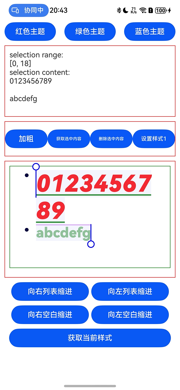
[@State](/user/State) message: string = "[-1, -1]"; // 选中范围提示信息
[@State](/user/State) content: string = ""; // 选中内容
private leftMargin: Dimension = 0; // 左缩进量
private richEditorTextStyle: RichEditorTextStyle = {}; // 富文本样式
// 新增:光标颜色和选中背景色状态
[@State](/user/State) cursorColor: Color|string = Color.Black; // 光标颜色
[@State](/user/State) selectionColor: Color|string = Color.Gray; // 选中背景色
aboutToAppear() {
// 注册自定义字体(应用启动时加载字体文件)
this.getUIContext().getFont().registerFont({
familyName: 'MiSans-Bold',
familySrc: '/font/MiSans-B更多关于HarmonyOS鸿蒙Next中富文本编辑器除了使用较重的markdown三方库,是否还有其他方式实现?的实战系列教程也可以访问 https://www.itying.com/category-93-b0.html

鸿蒙Next中实现富文本编辑器,除了使用markdown三方库,还可以使用鸿蒙原生组件Web组件加载本地或在线HTML编辑器,或基于ArkUI的TextArea与自定义组件结合实现基础富文本功能。

在HarmonyOS Next中,实现富文本编辑器不依赖重型Markdown库,有以下几种更轻量的方案:
-
使用Web组件加载轻量HTML编辑器 通过
Web组件嵌入精简的编辑器库(如TinyMCE精简版或自定义编辑器):// 示例:加载本地HTML编辑器 [@Component](/user/Component) struct RichTextEditor { controller: WebController = new WebController() build() { Column() { Web({ src: $rawfile('editor.html'), controller: this.controller }) } } } -
基于TextArea的扩展方案 结合
TextArea和自定义工具栏实现基础富文本功能:[@Component](/user/Component) struct SimpleEditor { @State content: string = '' private insertTag(tag: string) { this.content += `<${tag}>选中文本</${tag}>` } build() { Column() { // 工具栏 Row() { Button('B').onClick(() => this.insertTag('b')) Button('I').onClick(() => this.insertTag('i')) } // 编辑区域 TextArea({ text: this.content }) .onChange((value: string) => { this.content = value }) } } } -
使用Canvas自定义绘制 通过
Canvas实现完全自定义的编辑器渲染:[@Component](/user/Component) struct CanvasEditor { private commands: Array<string> = [] build() { Canvas(this.context) .onReady(() => { // 绘制文本和格式 }) .onTouch((event) => { // 处理触摸选择 }) } } -
利用RichText组件显示 配合可编辑区域实现内容渲染分离:
[@Component](/user/Component)
struct DualComponentEditor {
  @State htmlContent: string = '<b>示例文本</b>'

  build() {
    Column() {
      // 编辑区域
      TextInput({ text: this.htmlContent })
        .onChange((value) => {
          this.htmlContent = value
        })
      // 预览区域
      RichText(this.htmlContent)
    }
  }
}
推荐方案:对于大多数应用,方案2(TextArea扩展)和方案4(RichText组合)在性能和开发效率上最平衡。若需要复杂功能,可考虑方案1配合定制化的轻量Web编辑器。
关键优势:
- 减少包体积(可减少80%+的依赖大小)
- 更好的性能表现
- 更高的定制灵活性
注意事项:
- 需要自行处理跨平台格式兼容
- 复杂格式(如表格、代码块)需额外开发
- 粘贴板HTML处理需要单独实现
这些方案避免了引入完整Markdown库的资源开销,同时保持了核心编辑功能。