


HarmonyOS鸿蒙Next中如何实现一个自定义的英文键盘组件
HarmonyOS鸿蒙Next中如何实现一个自定义的英文键盘组件
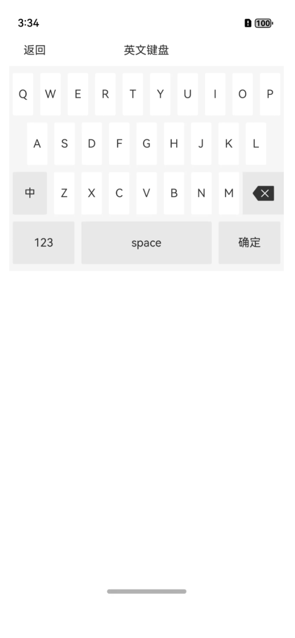
在一些重重安全性的软件,都会自己来定义软键盘,比如银行类的,关于支付类的等等,那么如上的一个英文键盘,该如何实现呢?本篇问答,就带着大家着手来实现一下。
更多关于HarmonyOS鸿蒙Next中如何实现一个自定义的英文键盘组件的实战教程也可以访问 https://www.itying.com/category-93-b0.html

代码实现
为了能更好的实现UI效果,这里也是采用了多组件的实现方式,毕竟每一行的边距是不一样的,总共分为了四行进行实现,大家可以采用网格布局,或者List组件都可以进行实现,这里我采用的Row组件,在Row组件里再使用ForEach进行遍历子组件,当然了,毕竟数据量小,具体用哪一种方式,还是看大家自己选择。
咱们只说一行代码实现即可啊,因为都是重复的,无非就是展示的数据源及边距不一样,每一个子元素重要的就是其权重。
Row() {
        ForEach(["Q", "W", "E", "R", "T", "Y", "U", "I", "O", "P"], (item: string) => {
          Text(item)
            .layoutWeight(1)
            .height(this.rectHeight)
            .fontSize(this.rectTextSize)
            .fontColor(this.rectTextColor)
            .backgroundColor(this.englishBgColor)
            .textAlign(TextAlign.Center)
            .margin({ left: 5, right: 5 })
            .borderRadius(this.rectBorderRadius)
            .onClick(() => {
              if (this.onItemClick != undefined) {
                this.onItemClick(item)
              }
            })
        })
      }
全部代码
代码实现起来非常的简单,大家自己看就行。
@Component
export struct EnglishKeyboardView {
  bgColor: ResourceColor = "#f5f5f5" //背景颜色
  englishBgColor: ResourceColor = "#ffffff" //英文背景颜色
  otherBgColor: ResourceColor = "#e8e8e8" //非英文背景颜色
  rectBorderWidth: Length = 1 //格子边框宽度
  rectBorderRadius: Length = 2 //格子边框圆角
  rectTextSize: Length = 16 //格子的文字大小
  rectTextColor: ResourceColor = "#333333" //格子文字的默认颜色
  deleteIconWidth: Length = 30 //删除图片宽度
  deleteIconSrc: PixelMap | ResourceStr | DrawableDescriptor = $r("app.media.view_ic_key_delete")
  rectHeight: Length = 60 //每个格子高度
  marginTop: Length = 10 //距离上
  marginBottom: Length = 10 //距离下
  onItemClick?: (item: string) => void //点击条目
  onDelete?: () => void //点击删除
  onComplete?: () => void //点击完成
  onChinese?: () => void //中文
  onSpace?: () => void //空格
  onNumber?: () => void //数字

  build() {
    Column() {
      Row() {
        ForEach(["Q", "W", "E", "R", "T", "Y", "U", "I", "O", "P"], (item: string) => {
          Text(item)
            .layoutWeight(1)
            .height(this.rectHeight)
            .fontSize(this.rectTextSize)
            .fontColor(this.rectTextColor)
            .backgroundColor(this.englishBgColor)
            .textAlign(TextAlign.Center)
            .margin({ left: 5, right: 5 })
            .borderRadius(this.rectBorderRadius)
            .onClick(() => {
              if (this.onItemClick != undefined) {
                this.onItemClick(item)
              }
            })
        })
      }

      Row() {
        ForEach(["A", "S", "D", "F", "G", "H", "J", "K", "L"], (item: string) => {
          Text(item)
            .layoutWeight(1)
            .height(this.rectHeight)
            .fontSize(this.rectTextSize)
            .fontColor(this.rectTextColor)
            .backgroundColor(this.englishBgColor)
            .textAlign(TextAlign.Center)
            .margin({ left: 5, right: 5 })
            .borderRadius(this.rectBorderRadius)
            .onClick(() => {
              if (this.onItemClick != undefined) {
                this.onItemClick(item)
              }
            })
        })
      }.margin({ top: 10, left: 20, right: 20 })

      Row() {
        ForEach(["中", "Z", "X", "C", "V", "B", "N", "M", "删除"], (item: string, index: number) => {
          if (index == 8) {
            Column() {
              Image(this.deleteIconSrc)
                .width(this.deleteIconWidth)
            }
            .layoutWeight(1.5)
            .justifyContent(FlexAlign.Center)
            .backgroundColor(this.otherBgColor)
            .height(this.rectHeight)
            .onClick(() => {
              //删除
              if (this.onDelete != undefined) {
                this.onDelete()
              }
            })
          } else {
            Text(item)
              .layoutWeight(index == 0 ? 1.5 : 1)
              .height(this.rectHeight)
              .fontSize(this.rectTextSize)
              .fontColor(this.rectTextColor)
              .backgroundColor((index == 0) ? this.otherBgColor : this.englishBgColor)
              .textAlign(TextAlign.Center)
              .margin({ left: 5, right: 5 })
              .borderRadius(this.rectBorderRadius)
              .onClick(() => {
                if (index == 0) {
                  //中文
                  if (this.onChinese != undefined) {
                    this.onChinese()
                  }

                } else {
                  if (this.onItemClick != undefined) {
                    this.onItemClick(item)
                  }
                }
              })
          }

        })
      }.margin({ top: 10 })

      Row() {
        ForEach(["123", "space", "确定"], (item: string, index: number) => {
          Text(item)
            .layoutWeight((index == 1) ? 2 : 1)
            .height(60)
            .backgroundColor(this.otherBgColor)
            .textAlign(TextAlign.Center)
            .margin({ left: 5, right: 5 })
            .borderRadius(this.rectBorderRadius)
            .onClick(() => {
              if (index == 0) {
                //数字
                if (this.onNumber != undefined) {
                  this.onNumber()
                }
              } else if (index == 1) {
                //空格
                if (this.onSpace != undefined) {
                  this.onSpace()
                }
              } else if (index == 2) {
                //确定
                if (this.onComplete != undefined) {
                  this.onComplete()
                }
              }
            })
        })
      }.margin({ top: 10 })
    }.backgroundColor(this.bgColor)
    .padding({ top: this.marginTop, bottom: this.marginBottom })
  }
}
封装使用
和车牌省份简称一样,车牌字母也进行封装,方便大家进行使用。
方式一:在Terminal窗口中,执行如下命令安装三方包,DevEco Studio会自动在工程的oh-package.json5中自动添加三方包依赖。
建议:在使用的模块路径下进行执行命令。
ohpm install @abner/keyboard
方式二:在工程的oh-package.json5中设置三方包依赖,配置示例如下:
"dependencies": { "@abner/keyboard": "^1.0.0"}
代码调用
EnglishKeyboardView({
        onItemClick: (item: string) => {
          //点击事件
          console.log("=====点击内容:" + item)
        },
        onDelete: () => {
          //点击删除
          console.log("=====点击删除")
        },
        onComplete: () => {
          //点击确定
          console.log("=====点击确定")
        },
        onChinese: () => {
          //点击中文切换
          console.log("=====点击中文切换")
        },
        onSpace: () => {
          //点击空格
          console.log("=====点击空格")
        },
        onNumber: () => {
          //点击数字
          console.log("=====点击数字")
        }
      })
属性介绍
| 属性 | 类型 | 概述 |
|---|---|---|
| onItemClick | (item: string) => void | 点击条目回调 |
| onDelete | () => void | 点击删除回调 |
| onComplete | () => void | 点击完成回调 |
| onChinese | () => void | 点击中文回调 |
| onSpace | () => void | 点击空格回调 |
| onNumber | () => void | 点击数字回调 |
| bgColor | ResourceColor | 背景颜色 |
| englishBgColor | ResourceColor | 英文背景颜色 |
| otherBgColor | ResourceColor | 非英文背景颜色 |
| rectBorderWidth | Length | 格子边框宽度 |
| rectBorderRadius | Length | 格子边框圆角 |
| rectTextSize | Length | 格子的文字大小 |
| rectTextColor | ResourceColor | 格子文字的默认颜色 |
| deleteIconWidth | Length | 删除icon宽度 |
| deleteIconSrc | PixelMap /ResourceStr /DrawableDescriptor | 删除icon资源 |
| rectHeight | Length | 每个格子高度 |
| marginTop | Length | 距离上边的距离 |
| marginBottom | Length | 距离下边的距离 |
相关总结
实现方式呢,有很多种,目前采用了比较简单的一种,如果大家采用网格Grid组件实现方式,也是可以的,但是需要考虑每行的边距以及数据,还有最后两行的格子占位问题。
更多关于HarmonyOS鸿蒙Next中如何实现一个自定义的英文键盘组件的实战系列教程也可以访问 https://www.itying.com/category-93-b0.html

在HarmonyOS Next中,实现自定义英文键盘组件需使用ArkUI框架。首先,通过@Component装饰器创建自定义组件。使用Flex或Grid容器布局键盘按键,每个按键为Button组件。通过@State或@Prop装饰器管理按键状态与输入内容。为按键绑定onClick事件,在事件处理函数中更新输入内容或调用系统输入法接口。可结合TextInput组件显示输入结果。
在HarmonyOS Next中实现自定义英文键盘组件,可通过ArkUI声明式开发范式构建。以下是关键实现步骤:
1. 布局结构
使用Column和Row容器构建键盘网格布局,每个键位用Text组件表示,并包裹在Button或Gesture组件中实现交互。
Column() {
  // 第一行 QWERTY...
  Row() {
    ForEach(this.row1, (item: string) => {
      Button(item)
        .key(item)
        .onClick(() => this.onKeyClick(item))
    })
  }
  // 其他行类似...
}
2. 按键处理
- 普通字母:直接输入字符。
- 功能键(如Shift、Delete):
- Shift键切换大小写状态,通过状态变量控制字母显示。
- Delete键删除输入内容,可调用文本组件的删除方法。
// 状态定义
@State letters: string[] = ['q', 'w', 'e', 'r'...] // 小写初始值
@State isUpperCase: boolean = false

// Shift键处理
onShiftClick() {
  this.isUpperCase = !this.isUpperCase
  this.letters = this.isUpperCase
    ? this.letters.map(letter => letter.toUpperCase())
    : this.letters.map(letter => letter.toLowerCase())
}

// 删除键处理
onDeleteClick() {
  // 调用输入框的删除逻辑
}
3. 输入关联
通过@Link或事件回调将键盘与输入框绑定:
// 键盘组件
@Component
struct CustomKeyboard {
  @Link inputText: string

  onKeyClick(key: string) {
    this.inputText += key
  }
}

// 使用页
@Entry
@Component
struct HomePage {
  @State text: string = ''

  build() {
    Column() {
      TextInput({ text: this.text })
      CustomKeyboard({ inputText: $text })
    }
  }
}
4. 样式定制
- 使用
borderRadius、backgroundColor设置圆角背景。 - 通过
fontSize、fontWeight调整字体样式。 - 添加按压态样式反馈:
Button(item)
  .backgroundColor(this.isPressed ? '#CCCCCC' : '#FFFFFF')
  .borderRadius(8)
  .fontSize(20)
5. 安全增强(针对金融场景)
- 使用
SecureInput防止系统截屏。 - 通过随机键位排列防止输入轨迹记录。
- 禁止第三方输入法切换。
注意事项
- 键盘尺寸需适配不同屏幕,使用百分比或
Grid布局。 - 触摸反馈需及时,避免延迟感。
- 可封装为
@Component组件方便复用。
此方案完全基于HarmonyOS Next的ArkUI框架,无需依赖系统键盘,符合金融级应用的安全要求。