


HarmonyOS 鸿蒙Next中下面的样式怎么实现
HarmonyOS 鸿蒙Next中下面的样式怎么实现
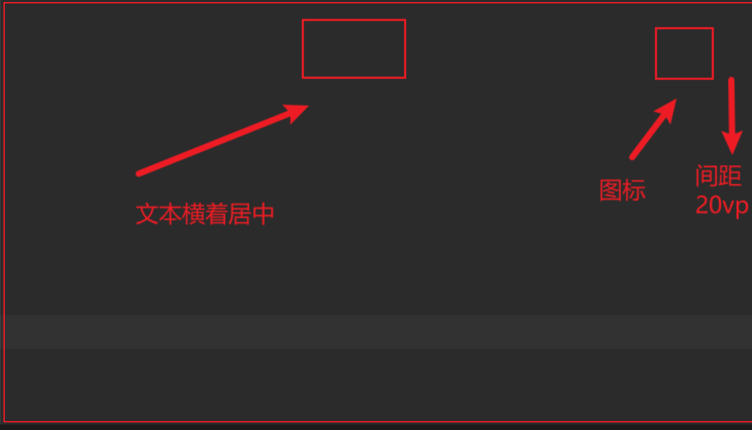
就是中间的是标题居中,然后右边距离右边框20vp有个图标。
Row() {
    Blank()
    Text("标题")
      .fontSize(16)
      .fontColor('#333')
      .margin({ top: 10, bottom: 10 })

    Blank()
    Image($r('app.media.background'))
      .width(24)
      .height(24)

  }
  .width('100%')
  .justifyContent(FlexAlign.Center)
我写的总感觉不行
更多关于HarmonyOS 鸿蒙Next中下面的样式怎么实现的实战教程也可以访问 https://www.itying.com/category-93-b0.html
4 回复

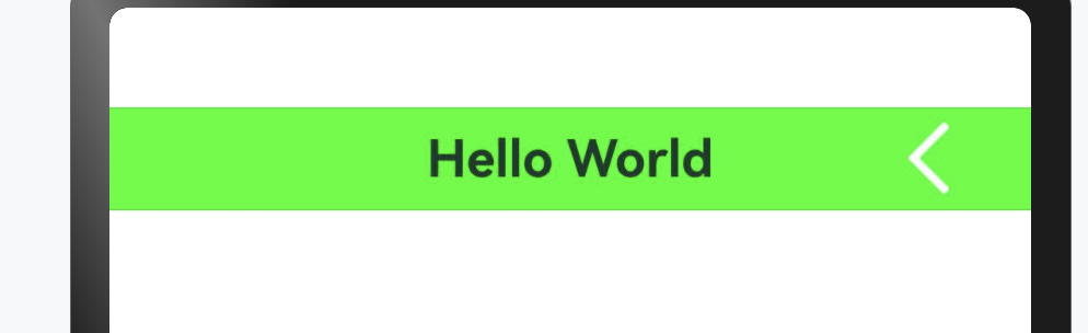
你这中间的text组件和右侧的图标虽然在一条横线上,但是此处用相对布局更容易实现你的效果:RelativeContainer
RelativeContainer() {

  Text('Hello World')
    .fontSize(20)
    .fontWeight(FontWeight.Bold)
    .alignRules({
      center: { anchor: '__container__', align: VerticalAlign.Center },
      middle: { anchor: '__container__', align: HorizontalAlign.Center }
    })

  Image($r('app.media.ack'))
    .height(40)
    .width(40)
    .alignRules({
      right: { anchor: '__container__', align: HorizontalAlign.End }
    })
    .margin({ right: 20 })
  }
  .height(40)
  .width('100%')
  .backgroundColor('#0f0')
更多关于HarmonyOS 鸿蒙Next中下面的样式怎么实现的实战系列教程也可以访问 https://www.itying.com/category-93-b0.html

弄一个和Image一样宽的布局占位,标题使用layoutWeight撑满,设置最大行数1
Row({ space: 10 }) {
  Row()
    .width(24)

  Text("标题")
    .fontSize(16)
    .fontColor('#333')
    .margin({ top: 10, bottom: 10 })
    .layoutWeight(1)
    .textAlign(TextAlign.Center)
    .maxLines(1)
    .textOverflow({
      overflow: TextOverflow.Ellipsis
    })

  Image($r('app.media.background'))
    .width(24)
    .height(24)

}
.padding({ left: 20, right: 20 })
.width('100%')
.justifyContent(FlexAlign.Center)
在HarmonyOS Next中,样式主要通过ArkUI的声明式UI语法实现。使用通用属性方法(如.width()、.height())或属性样式(如.border())直接在组件上设置。也支持在build()函数外定义@Styles装饰器函数来复用样式,或使用@Extend装饰器扩展内置组件样式。对于更复杂的场景,可通过@CustomDialog定义自定义弹窗样式。

在HarmonyOS Next中实现标题居中、右侧图标距边框20vp的布局,推荐使用Flex或Row结合justifyContent和margin属性。以下是两种实现方式:
方案一:使用Flex布局(推荐)
Flex({ justifyContent: FlexAlign.SpaceBetween, alignItems: ItemAlign.Center }) {
  Text('标题')
    .fontSize(16)
    .fontColor('#333')
    .margin({ top: 10, bottom: 10 })
    .layoutWeight(1) // 占据剩余空间实现居中
    .textAlign(TextAlign.Center)

  Image($r('app.media.background'))
    .width(24)
    .height(24)
    .margin({ right: 20 }) // 右侧间距20vp
}
.width('100%')
方案二:使用Row布局
Row() {
  // 左侧空白撑开
  Blank()
    .layoutWeight(1)

  Text('标题')
    .fontSize(16)
    .fontColor('#333')
    .margin({ top: 10, bottom: 10 })

  // 右侧空白撑开
  Blank()
    .layoutWeight(1)

  Image($r('app.media.background'))
    .width(24)
    .height(24)
    .margin({ right: 20 })
}
.width('100%')
.justifyContent(FlexAlign.Center)
关键点说明:
- Flex布局方案:通过
layoutWeight(1)让Text占据所有可用空间,配合textAlign实现视觉居中,图标通过margin控制右侧间距。 - Row布局方案:使用两个
Blank()配合layoutWeight将标题推到中间位置。 - 间距控制:图标右侧间距使用
.margin({ right: 20 })实现20vp距离。
两种方案都能准确实现需求,Flex方案代码更简洁,推荐使用。