


HarmonyOS鸿蒙Next中自定义的CustomDialog如何让下方的Button点击效果铺满?
HarmonyOS鸿蒙Next中自定义的CustomDialog如何让下方的Button点击效果铺满?
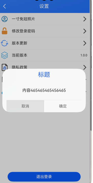
弹框相关代码
@CustomDialog
export struct AppCustomDialog {
  controller: CustomDialogController;
  build() {
    Column() {
      // 请将$r('app.string.i_am_content')替换为实际资源文件,在本示例中该资源文件的value值为"我是内容"
      Text("标题")
        .fontSize(25)
        .fontColor($r('app.color.sys_blue_color'))
        .padding(10)

      Column(){
        Text("内容465465465456465")
          .fontSize(17)
      }
      .width('100%')
      .layoutWeight(1)

      .justifyContent(FlexAlign.Center)
      Divider()
      Row() {
        Button('取消')
          .height('100%')
          .flexGrow(1) // 平分Row的宽度(和确定按钮各占50%)
          .fontColor($r('app.color.sys_text_gray'))
          .backgroundColor(Color.Transparent)
          .borderRadius(0) // 取消圆角(若弹框底部是直角)
          .onClick(() => {
          this.controller.close()
        })
        Divider().vertical(true)
        Button('确定')
          .height('100%')
          .flexGrow(1) // 平分Row的宽度(和确定按钮各占50%)
          .fontColor($r('app.color.sys_text_gray'))
          .backgroundColor(Color.Transparent)
          .borderRadius(0) // 取消圆角(若弹框底部是直角)
          .onClick(() => {
          this.controller.close()
        })
      }
      .width('100%')
      .height(50)
      .justifyContent(FlexAlign.SpaceAround)

    }
    .height(180)
    .width('90%')
    .justifyContent(FlexAlign.Start)
  }
}
更多关于HarmonyOS鸿蒙Next中自定义的CustomDialog如何让下方的Button点击效果铺满?的实战教程也可以访问 https://www.itying.com/category-93-b0.html

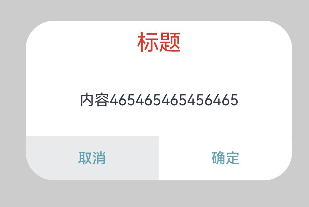
修改完毕请查收:
@CustomDialog
export struct AppCustomDialog {
  controller: CustomDialogController;
  build() {
    Column() {
      // 请将$r('app.string.i_am_content')替换为实际资源文件,在本示例中该资源文件的value值为"我是内容"
      Text("标题")
        .fontSize(25)
        .fontColor($r('app.color.sys_blue_color'))
        .padding(10)

      Column(){
        Text("内容465465465456465")
          .fontSize(17)
      }
      .width('100%')
      .layoutWeight(1)

      .justifyContent(FlexAlign.Center)
      Divider()
      Row() {
        Button('取消')
          .height('100%')
          .flexGrow(1) // 平分Row的宽度(和确定按钮各占50%)
          .fontColor($r('app.color.sys_text_gray'))
          .backgroundColor(Color.Transparent)
          .borderRadius(0) // 取消圆角(若弹框底部是直角)
          .onClick(() => {
          this.controller.close()
        })
        Divider().vertical(true)
        Button('确定')
          .height('100%')
          .flexGrow(1) // 平分Row的宽度(和确定按钮各占50%)
          .fontColor($r('app.color.sys_text_gray'))
          .backgroundColor(Color.Transparent)
          .borderRadius(0) // 取消圆角(若弹框底部是直角)
          .onClick(() => {
          this.controller.close()
        })
      }
      .width('100%')
      .height(50)
      .justifyContent(FlexAlign.SpaceAround)

    }
    .height(180)
    .width('100%')
    .justifyContent(FlexAlign.Start)
  }
}
更多关于HarmonyOS鸿蒙Next中自定义的CustomDialog如何让下方的Button点击效果铺满?的实战系列教程也可以访问 https://www.itying.com/category-93-b0.html


在HarmonyOS Next中,要使CustomDialog下方Button点击效果铺满,需设置Button组件的layoutWeight属性为1,并确保其父容器为线性布局且方向为水平。同时,将Button的宽度设置为match_parent,高度可固定或自适应。示例代码中,在Column容器内放置Button,并配置相应属性即可实现铺满效果。

要让CustomDialog下方按钮的点击效果铺满,关键在于确保按钮的点击区域覆盖整个底部区域。从你的代码看,主要问题是按钮的点击区域被限制在文本区域,没有扩展到整个按钮容器。
以下是修改建议:
-
移除按钮的透明背景限制: 将
.backgroundColor(Color.Transparent)改为.backgroundColor(Color.White)或指定颜色,这样点击区域会覆盖整个按钮背景。 -
调整按钮布局属性: 确保按钮使用
.width('100%')和.height('100%')来填充Row容器。 -
使用布局权重: 你已经使用了
.flexGrow(1),这很好,但需要配合正确的父容器设置。
修改后的按钮代码示例:
Button('取消')
  .width('100%')
  .height('100%')
  .flexGrow(1)
  .fontColor($r('app.color.sys_text_gray'))
  .backgroundColor($r('app.color.button_bg')) // 改为实际背景色
  .borderRadius(0)
  .onClick(() => {
    this.controller.close()
  })
同时确保Row容器设置正确:
Row()
  .width('100%')
  .height(50)
  .justifyContent(FlexAlign.SpaceBetween) // 改为SpaceBetween
这样修改后,按钮的点击区域就会铺满整个底部区域,实现全宽点击效果。