


HarmonyOS鸿蒙Next 6导航栏悬浮效果
HarmonyOS鸿蒙Next 6导航栏悬浮效果 大佬们知道CelesMark X里的导航栏的悬浮效果是怎么做的吗?是Tabs的功能还是手搓的?

更多关于HarmonyOS鸿蒙Next 6导航栏悬浮效果的实战教程也可以访问 https://www.itying.com/category-93-b0.html

自己手搓也用不了多少代码:
1、设置.barHeight(0),使用自定义的tabbar
2、使用Stack将自定义的tabbar放到上层
3、使用setWindowLayoutFullScreen设置全屏显示
4、使用foregroundBlurStyle给组件添加模糊效果
import { window } from '@kit.ArkUI';
// xxx.ets
@Entry
@Component
struct TabsExample {
@State selectedIndex: number = 0
private controller: TabsController = new TabsController();
aboutToAppear(): void {
const context = this.getUIContext().getHostContext()
if (context) {
window.getLastWindow(context).then(win => {
win.setWindowLayoutFullScreen(true)
})
}
}
build() {
Stack() {
Tabs({ barPosition: BarPosition.End, controller: this.controller }) {
TabContent() {
Column().width('100%').height('100%').backgroundColor('#00CB87')
}
.tabBar(BottomTabBarStyle.of($r('app.media.startIcon'), 'green'))
TabContent() {
Column().width('100%').height('100%').backgroundColor('#007DFF')
}.tabBar(BottomTabBarStyle.of($r('app.media.startIcon'), 'blue'))
TabContent() {
Column().width('100%').height('100%').backgroundColor('#FFBF00')
}.tabBar(BottomTabBarStyle.of($r('app.media.startIcon'), 'yellow'))
TabContent() {
Column().width('100%').height('100%').backgroundColor('#E67C92')
}.tabBar(BottomTabBarStyle.of($r('app.media.startIcon'), 'pink'))
}
.barHeight(0)
.animationDuration(0)
.scrollable(false)
.width('100%')
.layoutWeight(1)
Stack() {
Stack()
.width('100%')
.height('100%')
// BlurStyle.Thin: 为组件添加轻薄材质模糊效果
// ThemeColorMode.LIGHT: 固定使用浅色模式效果
// AdaptiveColor.DEFAULT: 不使用取色模糊,使用默认的颜色作为蒙版颜色
// scale: 背景材质模糊效果程度,默认值是1
.foregroundBlurStyle(BlurStyle.Thin,
{
colorMode: ThemeColorMode.LIGHT,
adaptiveColor: AdaptiveColor.DEFAULT,
scale: 1.0
})
Row() {
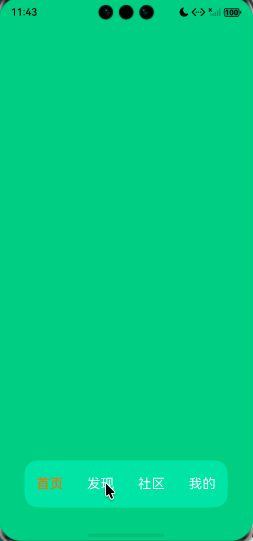
ForEach(['首页', '发现', '社区', '我的'], (item: number, index: number) => {
Text(item.toString())
.fontColor(index === this.selectedIndex ? '#ffff6f00' : '#fff')
.fontSize(20)
.layoutWeight(1)
.height('100%')
.textAlign(TextAlign.Center)
.onClick(() => {
this.selectedIndex = index
this.controller.changeIndex(index)
})
})
}
.height('100%')
.width('100%')
.justifyContent(FlexAlign.SpaceAround)
}
.clip(true)
.borderRadius(20)
.height(70)
.width('80%')
.margin({ bottom: 50 })
}
.width('100%')
.alignContent(Alignment.Bottom)
}
}
更多关于HarmonyOS鸿蒙Next 6导航栏悬浮效果的实战系列教程也可以访问 https://www.itying.com/category-93-b0.html


HarmonyOS Next 6的导航栏悬浮效果是系统UI的一项特性。该效果通过系统框架层实现,主要涉及ArkUI的组件布局与动效能力。导航栏可设置为半透明或毛玻璃样式,并叠加在应用内容之上。开发者可通过设置窗口属性或使用特定的系统API来启用此模式,其位置和交互由系统统一管理。该效果不依赖Java或C,由ArkTS/ArkUI框架支撑。

从截图和描述来看,CelesMark X中导航栏的悬浮效果,不是直接使用Tabs组件,而是通过自定义布局和手势交互实现的。
核心实现思路如下:
-
布局结构:这是一个典型的可滚动内容(如
List或Scroll)与顶部固定/悬浮栏的组合。导航栏本身是一个独立的容器(如Column或Row),其位置通过position属性或条件渲染来控制。 -
关键实现技术:
- 滚动监听:在可滚动组件的
onScroll或onScrollFrameBegin等回调中,实时获取滚动偏移量(scrollOffset)。 - 条件判断与状态更新:根据滚动偏移量计算导航栏的显示状态。通常的逻辑是:
- 当向上滚动超过一定阈值(如导航栏高度)时,切换导航栏为“悬浮”状态(显示为独立栏)。
- 当向下滚动回到顶部附近时,切换导航栏为“正常”状态(与内容一体)。
- 动画与样式:状态切换时,通常会配合透明度(
opacity)、位移(translate)或高度变化等属性动画,实现平滑的悬浮显示与隐藏效果。
- 滚动监听:在可滚动组件的
-
简单代码示意(ArkTS):
@State isNavBarFloating: boolean = false;
private scrollOffsetY: number = 0;

build() {
  Column() {
    // 1. 悬浮导航栏(条件渲染)
    if (this.isNavBarFloating) {
      this.buildFloatingNavBar() // 自定义悬浮样式
    }

    // 2. 可滚动内容区域
    Scroll(this.scroller) {
      Column() {
        // 2.1 顶部固定导航栏(初始状态)
        this.buildNormalNavBar()

        // 2.2 主要内容
        // ...
      }
    }
    .onScroll(() => {
      let currentOffset = this.scroller.currentOffset().yOffset;
      // 判断逻辑:根据滚动方向与阈值更新isNavBarFloating
      if (currentOffset > NAVBAR_HEIGHT && currentOffset > this.scrollOffsetY) {
        this.isNavBarFloating = true; // 向上滚动超过阈值,显示悬浮栏
      } else if (currentOffset <= THRESHOLD) {
        this.isNavBarFloating = false; // 回到顶部附近,隐藏悬浮栏
      }
      this.scrollOffsetY = currentOffset;
    })
  }
}
总结:这个效果是“手搓”的,核心在于监听滚动事件,动态控制导航栏的渲染状态与样式,实现从“嵌入内容”到“悬浮固定”的平滑过渡。Tabs组件主要用于标签页切换,不具备这种动态悬浮逻辑。开发者需要根据具体滚动交互需求自行实现。