


HarmonyOS鸿蒙Next中checkbox如何修改边框的宽度?
HarmonyOS鸿蒙Next中checkbox如何修改边框的宽度? 希望修改白色圆形边框的宽度,使用outlineWith后,实际加了一个黑色的矩形边框。请问这种应该怎么设置呢?
使用.border会出现两个边框

Checkbox()
  .size({ width: $r('app.float.margin_26'), height: $r('app.float.margin_26') })
  .margin({ bottom: $r('app.float.margin_14'), right: $r('app.float.margin_13') })
  .outlineWidth(2)
更多关于HarmonyOS鸿蒙Next中checkbox如何修改边框的宽度?的实战教程也可以访问 https://www.itying.com/category-93-b0.html

可以使用contentModifier自定义圆形选择框,设置边框宽度,如:
@Entry
@Component
struct CheckboxDemo {
  @State checkboxEnabled: boolean = true;

  build() {
    Column() {
      Checkbox({ name: '复选框状态', group: 'checkboxGroup' })
        .contentModifier(new MyCheckboxStyle(Color.Orange,100, 120, 100,80))
        .onChange((value: boolean) => {
          console.info('Checkbox change is' + value);
        }).enabled(this.checkboxEnabled)
    }
  }
}

class MyCheckboxStyle implements ContentModifier<CheckBoxConfiguration> {
  selectedColor: Color = Color.White;
  cx: number = 100;
  cy: number = 100;
  r: number = 100;
  r2: number = 90;

  constructor(selectedColor: Color, cx: number, cy: number, r: number,r2: number) {
    this.selectedColor = selectedColor;
    this.cx = cx;
    this.cy = cy;
    this.r = r;
    this.r2 = r2;
  }

  applyContent(): WrappedBuilder<[CheckBoxConfiguration]> {
    return wrapBuilder(buildCheckbox);
  }
}

@Builder
function buildCheckbox(config: CheckBoxConfiguration) {
  Column({ space: 10 }) {
    Text(config.name + (config.selected ? "( 选中 )" : "( 非选中 )")).margin({ right: 70, top: 50 })
    Shape() {
      Path()
        .width(100)
        .height(100)
        .commands(`M ${(config.contentModifier as MyCheckboxStyle).cx +
        (config.contentModifier as MyCheckboxStyle).r},${(config.contentModifier as MyCheckboxStyle).cy}
                   A ${(config.contentModifier as MyCheckboxStyle).r},${(config.contentModifier as MyCheckboxStyle).r} 0 1,0 ${(config.contentModifier as MyCheckboxStyle).cx -
        (config.contentModifier as MyCheckboxStyle).r},${(config.contentModifier as MyCheckboxStyle).cy}
                   A ${(config.contentModifier as MyCheckboxStyle).r},${(config.contentModifier as MyCheckboxStyle).r} 0 1,0 ${(config.contentModifier as MyCheckboxStyle).cx +
        (config.contentModifier as MyCheckboxStyle).r},${(config.contentModifier as MyCheckboxStyle).cy}`)
        .fill(Color.Red)
        .fillOpacity(0)
        .strokeWidth(10)
        .onClick(() => {
          if (config.selected) {
            config.triggerChange(false);
          } else {
            config.triggerChange(true);
          }
        })
        .opacity(config.enabled ? 1 : 0.1)
      Path()
        .width(10)
        .height(10)
        .commands(`M ${(config.contentModifier as MyCheckboxStyle).cx +
        (config.contentModifier as MyCheckboxStyle).r2},${(config.contentModifier as MyCheckboxStyle).cy}
                   A ${(config.contentModifier as MyCheckboxStyle).r2},${(config.contentModifier as MyCheckboxStyle).r2} 0 1,0 ${(config.contentModifier as MyCheckboxStyle).cx -
        (config.contentModifier as MyCheckboxStyle).r2},${(config.contentModifier as MyCheckboxStyle).cy}
                   A ${(config.contentModifier as MyCheckboxStyle).r2},${(config.contentModifier as MyCheckboxStyle).r2} 0 1,0 ${(config.contentModifier as MyCheckboxStyle).cx +
        (config.contentModifier as MyCheckboxStyle).r2},${(config.contentModifier as MyCheckboxStyle).cy}`)
        .visibility(config.selected ? Visibility.Visible :
        Visibility.Hidden)
        .fill(config.selected ? (config.contentModifier as MyCheckboxStyle).selectedColor : Color.Black)
        .stroke((config.contentModifier as MyCheckboxStyle).selectedColor)
        .opacity(config.enabled ? 1 : 0.1)
    }
    .width(300)
    .height(200)
    .viewPort({
      x: 0,
      y: 0,
      width: 310,
      height: 310
    })
    .strokeLineJoin(LineJoinStyle.Miter)
    .strokeMiterLimit(5)
    .margin({ left: 50 })
  }
}
更多关于HarmonyOS鸿蒙Next中checkbox如何修改边框的宽度?的实战系列教程也可以访问 https://www.itying.com/category-93-b0.html

使用border属性控制颜色和宽度,通过borderRadius(50)实现控制边框样式:
Checkbox()

  .size({ width: $r('app.float.margin_26'), height: $r('app.float.margin_26') })

  .border({

    width: 2,             // 边框宽度

    color: Color.White,// 白色边框

    style: BorderStyle.Solid // 实线样式

  })

  .borderRadius(50)      // 设为50%实现圆形

  .margin({

    bottom: $r('app.float.margin_14'),

    right: $r('app.float.margin_13')

  })

找HarmonyOS工作还需要会Flutter的哦,有需要Flutter教程的可以学学大地老师的教程,很不错,B站免费学的哦:https://www.bilibili.com/video/BV1S4411E7LY/?p=17


背景知识:
楼主,你使用的 outlineWidth(2)就是添加外框哦。想要设置自定义外框颜色,可以使用 selectedColor 和 unselectedColor。mark 参数可以设置勾选的颜色。
问题解决:
代码如下:
Checkbox()
.size({ width: 26, height: 26 })
.margin({ bottom: 14, right: 14 })
.backgroundColor(Color.Transparent)
.mark({
    strokeColor:Color.Black,
    size: 50,
    strokeWidth: 5
})
.selectedColor(Color.Yellow)
.unselectedColor(Color.Red)


Checkbox()
.size({ width: 26, height: 26 })
.margin({ bottom: 14, right: 14 })
.backgroundColor(Color.Transparent)
.mark({
    strokeColor:Color.Black,
    size: 50,
    strokeWidth: 5
})
.selectedColor(Color.Red)
.unselectedColor(Color.Gray)
真机调试:


Checkbox()
  .size({ width: 24, height: 24 })  // 定义组件尺寸
  .borderWidth(2)  // 边框宽度
  .borderColor('#FFFFFF')  // 边框颜色
  .borderRadius(12)  // 圆角半径(24/2=12)
  .clip(false)  // 关闭裁剪
  .selectedColor('#FFFFFF')  // 选中态边框颜色
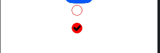
会出现两个边框
<!DOCTYPE html>
<html lang="en">
<head>
    <meta charset="UTF-8">
    <meta name="viewport" content="width=device-width, initial-scale=1.0">
    <title>Document</title>
    <style>
        * {
            margin: 0;
            padding: 0;
            box-sizing: border-box;
        }
        .container {
            width: 200px;
            height: 200px;
            background-color: #f0f0f0;
            border: 2px solid #333;
            padding: 20px;
        }
        .inner-box {
            width: 100%;
            height: 100%;
            background-color: #fff;
            border: 2px solid #666;
        }
    </style>
</head>
<body>
    <div class="container">
        <div class="inner-box"></div>
    </div>
</body>
</html>
代码解释:
这段HTML和CSS代码创建了一个包含两个边框的视觉效果。
-
外层容器 (
.container):- 宽度和高度均为200px。
- 有一个浅灰色背景 (
#f0f0f0)。 - 设置了一个2px宽的深灰色实线边框 (
border: 2px solid #333;)。 - 内部有20px的内边距 (
padding: 20px;),这会在边框和内部元素之间创建空间。
-
内层盒子 (
.inner-box):- 宽度和高度设置为100%,会填满其父容器 (
.container) 的内容区域(即扣除padding后的区域)。 - 有一个白色背景 (
#fff)。 - 设置了一个2px宽的灰色实线边框 (
border: 2px solid #666;)。
- 宽度和高度设置为100%,会填满其父容器 (
关键点:
- 由于
.container设置了padding: 20px;,使得.inner-box与.container的边框之间产生了间隔。 .inner-box自身的边框又在其内部创建了一个边界。
因此,最终渲染出的效果是一个大盒子(.container的边框)内部,包含了一个有间隔的小盒子(.inner-box的边框),从而形成了“两个边框”的视觉效果。box-sizing: border-box; 确保元素的宽度和高度计算包含边框和内边距,使尺寸控制更直观。
在HarmonyOS Next中,修改Checkbox边框宽度可通过自定义样式实现。在resources/base/element/目录下创建checkbox.json文件,定义Checkbox组件的borderWidth属性。例如:
{
  "element": {
    "name": "Checkbox",
    "attr": {
      "borderWidth": "2vp"
    }
  }
}
通过2vp等数值单位调整边框宽度,无需涉及Java或C语言代码。

在HarmonyOS Next中,直接修改Checkbox组件原生圆形边框的宽度,目前没有直接的属性支持。你遇到的问题(.outlineWidth产生矩形边框,.border产生双层边框)是正常的,因为这两个API并非用于定制Checkbox的内部绘制边框。
要实现自定义边框宽度,推荐的方法是放弃使用原生样式,通过自定义样式来完全重绘Checkbox。这是目前最可靠和灵活的解决方案。
具体步骤如下:
- 使用
Toggle组件替代Checkbox:Toggle组件提供了selected状态,更易于自定义样式。 - 利用
Toggle的builder构造器:在此构造器中,你可以根据isOn状态,使用Circle、Rectangle等基础图形组件,完全自定义“未选中”和“选中”时的外观。 - 在自定义的图形上自由设置边框:对你绘制的圆形(代表未选中状态)使用
.stroke和.strokeWidth来精确控制边框的颜色和宽度。
代码示例:
Toggle({ type: ToggleType.Checkbox, isOn: false })
  .size({ width: 26, height: 26 }) // 控制整体大小
  .onChange((isOn: boolean) => {
    // 状态变化处理
  })
  .builder((isOn: boolean) => {
    // 完全自定义样式
    if (isOn) {
      // 选中状态:一个实心圆 + 一个内部对勾(示例,对勾需用Path绘制)
      Stack() {
        Circle() // 背景圆
          .width(26)
          .height(26)
          .fill('#007DFF')
        // 此处可添加对勾Path
      }
    } else {
      // 未选中状态:一个带边框的空心圆
      Circle()
        .width(24) // 内容区域
        .height(24)
        .strokeWidth(2) // !!!这里直接设置你想要的边框宽度
        .stroke('#808080') // 边框颜色
        .fill(Color.Transparent) // 透明填充
    }
  })
核心要点:
.strokeWidth就是你想要控制的“边框宽度”。- 通过调整内层
Circle的width/height和strokeWidth,可以精确控制边框粗细与整体大小的比例。 - 选中状态也需要你自行绘制,通常是一个实心圆加一个对勾图标。
这种方法虽然代码量比直接使用 Checkbox 稍多,但获得了对视觉样式的完全控制权,包括边框宽度、颜色、内外间距等,是解决你当前问题的最佳实践。