


HarmonyOS 鸿蒙Next自适应导航
HarmonyOS 鸿蒙Next自适应导航
一、场景概述
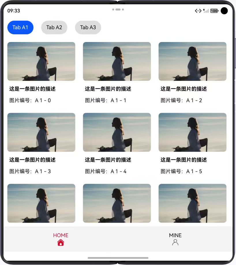
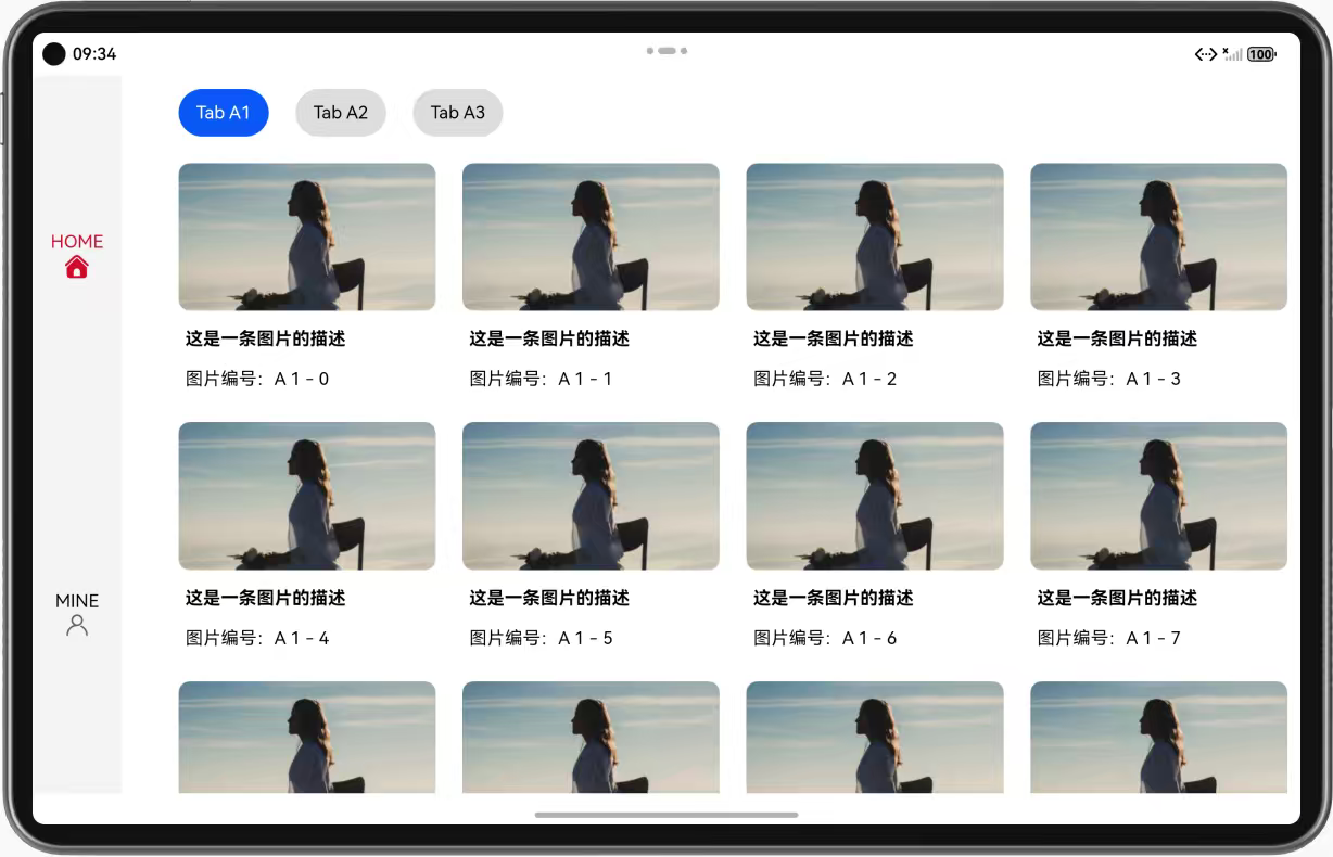
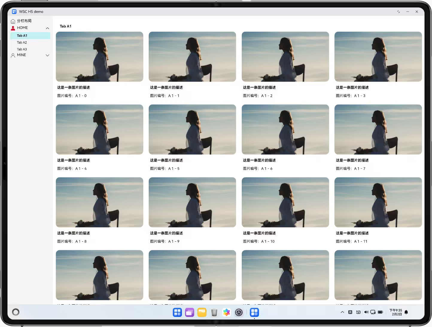
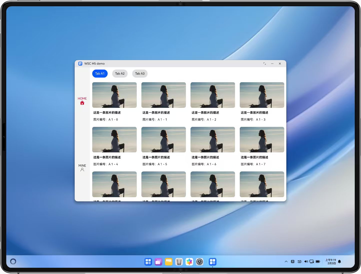
底部和侧边导航基于横向断点设置,导航栏的位置与方向得以调整,实现上下与左右布局的切换。场景示例:Wps首页导航。
1.1 使用场景
本示例通过对于横向断点的监听,设置导航栏的位置、方向与排布方式,在上下、左右和左侧详细列表的布局中进行切换,常见于各种应用首页,多级导航等场景。
| 横向断点 | sm | md | lg | xl |
|---|---|---|---|---|
| 展示逻辑 | 2列分栏+上下导航 | 3列分栏+上下导航 | 4列分栏+左测和上侧导航组合 | 4列分栏+左侧多级菜单展开 |
| 展示布局 | 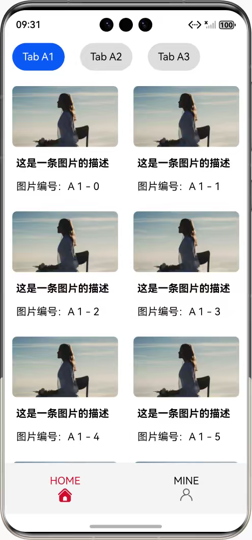 |
 |
 |
 |
1.2 常见问题
在未达到推荐使用侧边tab栏宽度的设备(双折叠屏)上使用了侧边栏tab栏(设计部推荐折叠屏使用底部tab栏),开合后页面tap栏显示位置异常,G->F仍在左侧显示,F->G在底部显示。
1.3 多设备适配
- 适配点1 多断点场景下多列切换布局适配 设备在不同断点间切换时,动态响应断点变化同步切换布局,在pc等设备上时,则响应可拉伸的窗口变化同步切换布局。
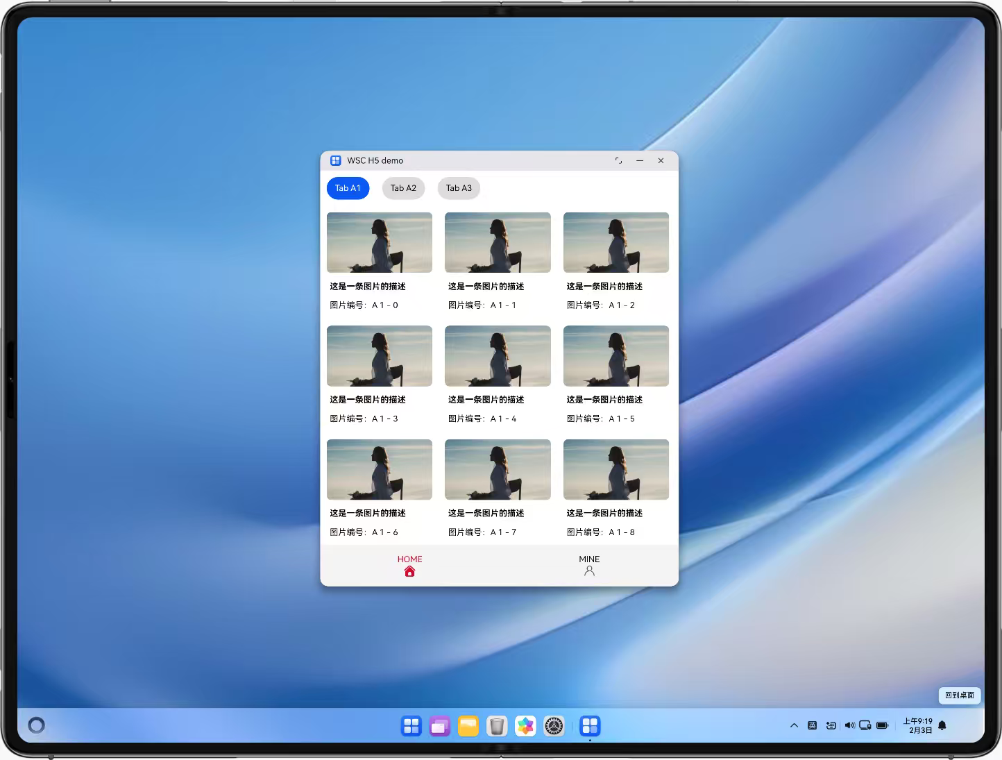

- 适配点2 多级导航适配 在设备切换到高于xl断点,或窗口扩大到高于xl断点时,将原先的tab导航条切换为左侧的多级导航条,并保留选中项。

二、开发指导
2.1 H5开发
2.1.1 关键能力
监听窗口尺寸变化以计算断点信息
本示例需要监听窗口的尺寸变化来计算当前使用的断点,其中核心逻辑主要是js部分。
对于vue3部分,使用 pinia 将相关的参数放置在全局仓库中管理,断点的计算逻辑如下:
const DEFAULT_BREAKPOINT_SETTINGS: BreakpointSettings = {
  xs: 0,
  sm: 320,
  md: 600,
  lg: 840,
  xl: 1440,
};
export const useBreakpointStore = defineStore('breakpoint', () => {
  const curBreakpoint = ref<Breakpoints>();
  // ...
  const breakpointManager = new BreakpointManager();
  breakpointManager.useBreakpointValue(breakpointSettings.value);
  breakpointManager.subscribeToBreakpoint(
    (bp) => {
      curBreakpoint.value = bp;
      windowWidth.value = window.innerWidth;
    },
    (bp) => {
      curVerticalBreakpoint.value = bp;
    }
  );
  watch(() => breakpointSettings.value, newVal => {
    breakpointManager.useBreakpointValue(newVal);
  });
  return {
    // ...
  };
});
根据断点切换来控制组件布局
通过对于pinia中响应式值的监听来控制对于组件的传值,以达成切换布局的效果。
实际使用可以配合一些常见的组件库,本场景仅提供一个简单实现的示例。
<script setup lang="ts">
// ...
const breakpointStore = useBreakpointStore();
const curDirection = computed(() => {
  switch (breakpointStore.curBreakpoint) {
    case 'xs':
    case 'sm':
    case 'md':
    return 'bottom';
    case 'lg':
    case 'xl':
    default:
    return 'left';
  }
});
// ...
</script>
<template>
  <SecondTabsContainer v-if="breakpointStore.curBreakpoint === 'xl'" :cur-tab-key="curTabKey" @update-cur-tab-key="updateSecondTabKey" />
  <TabsContainer
    v-else
    class="main-container"
    :direction="curDirection"
    ...
  >
    <TabPane
      v-for="tabSetting in TAB_SETTINGS"
      :key="tabSetting.key"
      ...
    >
      <!-- ... -->
    </TabPane>
  </TabsContainer>
</template>
案例一:根据当前断点响应式切换页面布局
使用计算值根据当前断点更新对应的css属性,并使用v-bind绑定到class中,通过flex布局的 flex-direction 和 justify-content 属性实现不同布局的切换,以下是一个实现的例子:
<script setup lang="ts">
  // ...
  const props = defineProps < {
    direction?: Direction
    // ...
  } > ();
  const DIRECTION_DICT: Record<Direction, CSSProperties['flexDirection']> = {
    top: 'column',
    bottom: 'column-reverse',
    left: 'row',
    right: 'row-reverse'
  } as const;
  const directionStyle = computed < CSSProperties > (() => ({
    display: 'flex',
    flexDirection: DIRECTION_DICT[props.direction || 'bottom']
  }));
  const DEFAULT_TAB_BAR_HEIGHT = '80px';
  const tabBarHeightStyle = computed < CSSProperties > (() => {
    if (props.hideIcon) { return {}; }
    const resVal = (typeof props.tabBarHeight === 'number' ? `${props.tabBarHeight}px` : props.tabBarHeight) || DEFAULT_TAB_BAR_HEIGHT;
    if (props.direction === 'bottom' || props.direction === 'top') {
      return { height: resVal };
    }
    return { width: resVal };
  });
  const TAB_ITEMS_CONTAINER_DIRECTION_DICT: Record<Direction, CSSProperties['flexDirection']> = {
    top: 'row',
    bottom: 'row',
    left: 'column',
    right: 'column'
  } as const;
  const tabItemsContainerDirection = computed(() => TAB_ITEMS_CONTAINER_DIRECTION_DICT[props.direction || 'bottom']);
  const tabItemsLayout = computed < CSSProperties['justify-content'] > (() => props.hideIcon ? 'flex-start' : 'space-evenly');
</script>
<template>
  <div :style="directionStyle">
    <header :style="tabBarHeightStyle" class="tab-items-container" :class="{ 'hide-icon': hideIcon }">
      <TabItem v-for="option in tabOptions" :key="option.value.tabKey" ... />
    </header>
    <!-- ... -->
  </div>
</template>
<style scoped>
  // ...
  .tab-items-container {
    display: flex;
    flex-direction: v-bind(tabItemsContainerDirection);
    justify-content: v-bind(tabItemsLayout);
  }

  // ...
</style>
案例二:在Tabs导航与多级菜单导航之间共享选中项
对每一个可选项生成一个对应的唯一键值,并将当前选中项的键值保存在顶层容器中,即可在切换时保留已选项。
实际使用可以配合一些常见的组件库,本场景仅提供一个简单实现的示例。
// TabsContainer.vue
<script setup lang="ts">
  const curTabKey = defineModel < string > ('curTabKey');
  provide('curTabKey', curTabKey);
</script>
// TabItem.vue
<script setup lang="ts">
  const curTabKey = inject < Ref < string >> ('curTabKey');
  const isActive = computed(() => curTabKey?.value === props.tabKey);
</script>
// TabPane.vue
<script setup lang="ts">
  const curTabKey = inject < Ref < string >> ('curTabKey');
  const isActive = computed(() => curTabKey?.value === props.tabKey);
</script>
// MainPage.vue
<script setup lang="ts">
  // ...
  const TAB_SETTINGS = [
    {
        title: 'HOME',
        svgUrl: HomeSvg,
        activeSvgUrl: HomeSvgActive,
        key: 'A',
        children: ['1', '2', '3']
    },
    {
        title: 'MINE',
        svgUrl: MineSvg,
        activeSvgUrl: MineSvgActive,
        key: 'B',
        children: ['1', '2', '3']
    }
  ] as const;

  const curTabKey = ref < string[] > ([TAB_SETTINGS[0].key, TAB_SETTINGS[0].children[0]]);
  const updateCurTabKey = (tabKey?: string): void => {
    const localTabKey = tabKey?.split('-')[1];
    const tabSettings = TAB_SETTINGS.find(s => s.key === localTabKey);
    if (tabSettings) {
        curTabKey.value = [tabSettings.key, tabSettings.children[0]];
    }
  };
  const updateSecondTabKey = (tabKey: string): void => {
    const keyList = tabKey.split('-');
    const mainTabKey = keyList[1];
    const secondTabKey = keyList[2];
    if (mainTabKey && secondTabKey) {
        curTabKey.value = [mainTabKey, secondTabKey];
    }
  };
</script>
<template>
  <SecondTabsContainer v-if="breakpointStore.curBreakpoint === 'xl'" :cur-tab-key="curTabKey" ... />
  <TabsContainer v-else ... :cur-tab-key="`tab-${curTabKey[0]}`">
    <TabPane v-for="tabSetting in TAB_SETTINGS" :key="tabSetting.key" ...>
      <!-- ... -->
    </TabPane>
  </TabsContainer>
</template>
2.1.2 示例代码
场景Sample示例代码地址:H5三方框架赋能指导配套代码
更多关于HarmonyOS 鸿蒙Next自适应导航的实战教程也可以访问 https://www.itying.com/category-93-b0.html

HarmonyOS Next自适应导航基于自适应布局和响应式设计,通过栅格系统、断点机制和自适应组件实现。系统根据设备屏幕尺寸、方向等自动调整导航结构,如从底部导航栏切换为侧边栏。开发者使用自适应布局能力(如Flex、Grid)和响应式UI框架进行配置,确保在不同设备上提供一致体验。
更多关于HarmonyOS 鸿蒙Next自适应导航的实战系列教程也可以访问 https://www.itying.com/category-93-b0.html

在HarmonyOS Next中实现自适应导航,关键在于利用其响应式布局能力,根据窗口断点动态调整导航栏的布局和形态。你提供的场景和代码示例清晰地展示了这一过程。
核心实现逻辑如下:
-
断点监听与管理:通过
BreakpointManager或mediaQueryAPI 监听窗口尺寸变化,获取当前所处的断点(如sm,md,lg,xl)。将断点信息作为全局状态(例如使用Pinia管理)供组件响应。 -
布局条件渲染:在组件中,根据当前断点值,使用条件渲染(如
v-if/v-else)或动态样式绑定来切换不同的导航组件或布局结构。例如,在xl断点下渲染侧边多级菜单,在其他断点下渲染底部或顶部Tab栏。 -
样式动态绑定:对于同一导航组件在不同断点下的方向变化(如上下布局变左右布局),可以通过计算属性动态生成CSS样式对象,并绑定到元素的
:style或:class上。核心是控制flex-direction、justify-content等属性。 -
状态共享与保持:为了在不同导航形态间切换时保持选中状态,需要将导航选项的选中键值(如
curTabKey)提升到父组件或状态管理中进行统一管理。通过Provide/Inject或状态管理库,使不同的导航组件(Tabs组件与多级菜单组件)都能访问和修改同一状态。
针对你提到的折叠屏适配问题,关键在于正确判断有效显示区域。在HarmonyOS Next中,应结合窗口能力(windowClass)与断点信息进行综合判断,避免仅依赖宽度断点而忽略设备形态(如折叠屏折叠状态)导致布局错位。建议在断点判断逻辑中加入对设备形态的考量。
你提供的示例代码(使用Vue3 + Pinia)模式清晰,是H5跨平台适配的典型实践。对于HarmonyOS Next的原生应用开发,其ArkUI框架也提供了类似的响应式API(如 @ohos.mediaquery 监听器、@State / @Prop 状态管理)和布局容器(如 Row、Column、Navigation),遵循相同的“监听断点 -> 更新状态 -> 驱动UI变化”的核心思想,可以构建出体验一致的自适应导航。