


HarmonyOS鸿蒙Next中borderRadius圆角不生效
HarmonyOS鸿蒙Next中borderRadius圆角不生效
build() {
Row({space: 12}) {
ForEach(this.card, (item: CardItemType) => {
Row(){
Column({space: 2}){
Text(item.title)
.fontSize(14)
.fontWeight(500)
.lineHeight(20)
Text(`${item.num}张`)
.fontSize(12)
.fontWeight(500)
.lineHeight(16)
.fontColor('#FF813C')
}
.alignItems(HorizontalAlign.Start)
.width('auto')
Image($rawfile(item.icon))
.width(37)
.height(37)
}
.width(158)
.height(61)
.padding({ left: 15, right: 10 })
.justifyContent(FlexAlign.SpaceBetween)
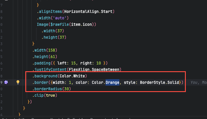
.background(Color.White)
.borderRadius(8) // 设置borderRadius生效
.clip(true)
})
}
}

为什么ArkUI 开发的这么难用。
本问题已解决,不要看采纳那个,被采纳那个人很水,压根都没复制我的代码。
当圆角 borderRadius 和 背景色同时出现,要使用 backgroundColor, 不要使用 background,否则圆角不生效。 华为解析ArtUI的人应该解决这个Bug.
更多关于HarmonyOS鸿蒙Next中borderRadius圆角不生效的实战教程也可以访问 https://www.itying.com/category-93-b0.html

开发者您好,当前本地测试您的demo,borderRadius是能够正常生效的,复现代码如下:
interface CardItemType {
title: string;
num: number;
}
@Entry
@Component
struct Index {
card: CardItemType[] = [
{
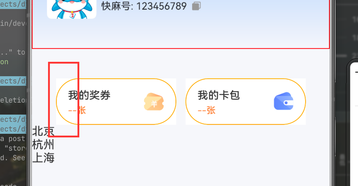
title: '我的奖券',
num: 0
},
{
title: '我的卡包',
num: 0
},
];
build() {
Row({ space: 12 }) {
ForEach(this.card, (item: CardItemType) => {
Row() {
Column({ space: 2 }) {
Text(item.title)
.fontSize(14)
.fontWeight(500)
.lineHeight(20);
Text(`${item.num}张`)
.fontSize(12)
.fontWeight(500)
.lineHeight(16)
.fontColor('#FF813C');
}
.alignItems(HorizontalAlign.Start)
.width('auto');
Image($r('app.media.startIcon'))
.width(37)
.height(37);
}
.backgroundColor(Color.Gray)
.width(158)
.height(61)
.padding({ left: 15, right: 10 })
.margin({top:80,left:10})
.justifyContent(FlexAlign.SpaceBetween)
.background(Color.White)
.borderRadius(8) // 设置borderRadius生效
.clip(true);
});
};
}
}
复现环境:
DevEco Studio版本:DevEco Studio 6.0.0 Release
HarmonyOS SDK版本:HarmonyOS 6.0.0 Release SDK
麻烦请您提供更完整的复现demo
更多关于HarmonyOS鸿蒙Next中borderRadius圆角不生效的实战系列教程也可以访问 https://www.itying.com/category-93-b0.html

你这个“技术支持”真的很扯淡,你真的拿我的代码复现的吗?你是在应付你的工作吗? 我找到问题了,我来告诉你:
背景色只能使用 .backgroundColor(Color.white)**,**如果直接使用background(Color.white),圆角失效,虽然圆角失效,但是边框倒是可以有圆角。
你们解析ArkUI的开发人员解决这个问题吧,为啥用background(), borderRadius()就失效。 还有你这个“技术支持” 真的很水


开发者您好,可以参考示例9(设置组件背景扩展)和 BackgroundOptions对象说明,当background的content参数设置为ResourceColor类型时,组件背景会默认扩展到父组件安全区。
background 更多用于复杂背景构建配合自定义组件使用,若单纯想要设置组件背景色,则建议使用backgroundColor。


你的父组件要设置背景色,才能看出来圆角。
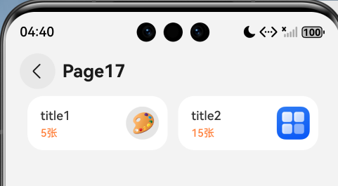
@Entry
@Component
struct Page17 {
    card: CardItemType[] = [
            { title: "title1", num: 5, icon: "app.media.practise" },
            { title: "title2", num: 15, icon: "app.media.startIcon" },
    ];

    build() {
        Navigation() {
          Row({ space: 12 }) {
            ForEach(this.card, (item: CardItemType) => {
              Row() {
                  Column({ space: 2 }) {
                    Text(item.title)
                        .fontSize(14)
                        .fontWeight(500)
                        .lineHeight(20)
                    Text(`${item.num}张`)
                        .fontSize(12)
                        .fontWeight(500)
                        .lineHeight(16)
                        .fontColor('#FF813C')
                  }
                  .alignItems(HorizontalAlign.Start)
                  .width('auto')

                  Image($r(item.icon))
                          .width(37)
                          .height(37)
              }
              .width(158)
              .height(61)
              .padding({ left: 15, right: 10 })
              .justifyContent(FlexAlign.SpaceBetween)
              // .background(Color.Red)
              .backgroundColor(Color.White)
              .borderRadius(18) // 设置borderRadius生效
              .clip(true)
            })
          }
        }
        .height('100%')
        .width('100%')
        .title("Page17")
        .titleMode(NavigationTitleMode.Mini)
        .backgroundColor($r("sys.color.chip_background_color"))
    }
}

interface CardItemType {
    title: string;
    num: number;
    icon: string;
}


在实际的开发中,background用得挺少的,按我的理解,background是在容器的底层创了一个新背景层级,因此borderRadius()只改变了原本的容器而无法改变其背景,backgroundColor则是修改的容器的背面。如果要修改background的圆角,则需要传入带有圆角的CustomBuilder。
找到开发者选项
然后找到绘图 里面有一个显示布局边界 打开 看看是不是最外层
需要确保 borderRadius 和 clip(true) 作用在包含所有内容的最外层容器,且容器的背景色 / 边框是明确的
我猜测问题出在这里:
.padding({ left: 15, right: 10 })
.borderRadius(8) // 设置borderRadius生效
.borderRadius(8) 圆角为8,是透明的,不是不起作用,你改为.borderRadius(20)试试看。
你的padding都超过8了。
你看一下我上面的回复,borderRadius(30)都不管用,borderRadius()必须使用backgroundColor,不能使用background。
另外,ArkUI的盒子模型,padding是算在盒子内的,不会撑大盒子的高度,和padding 无关。
在HarmonyOS Next中,borderRadius圆角不生效可能由以下原因导致:
- 组件不支持:部分容器组件(如Column、Row)默认不支持圆角,需使用支持样式的组件(如Div、Button)。
- 背景色未设置:圆角需配合background属性使用,未设置背景色时圆角可能不可见。
- 裁剪属性:检查组件是否设置了clip属性为true,确保内容区域按圆角裁剪。
- 尺寸限制:圆角半径值超过组件宽高的一半时,实际效果可能受限。

根据你提供的代码和描述,问题确实出在 .background(Color.White) 的用法上。
在HarmonyOS Next的ArkUI中,.background() 方法是一个通用背景设置器,它可以接受多种参数类型(如颜色、图片、渐变等)。然而,当直接传入一个 Color 对象(如 Color.White)时,在某些情况下,系统可能不会将其与后续的 borderRadius 属性进行正确的图层合成,导致圆角裁剪失效。
你找到的解决方案是正确的:使用 .backgroundColor(Color.White) 替代 .background(Color.White)。
.backgroundColor() 是专门用于设置纯色背景的方法。当使用这个方法时,ArkUI的渲染引擎会明确地将该颜色层识别为一个需要应用 borderRadius 和 clip(true) 进行裁剪的独立背景层,从而确保圆角生效。
修改后的关键代码行应为:
.backgroundColor(Color.White) // 使用backgroundColor替代background
.borderRadius(8)
.clip(true)
这不是一个“Bug”,而是API设计上的不同行为。.background() 功能更强大但更通用,.backgroundColor() 则更专一且在与样式裁剪相关的场景下行为更确定。在只需要设置纯色背景时,优先使用 .backgroundColor() 可以避免此类渲染问题。