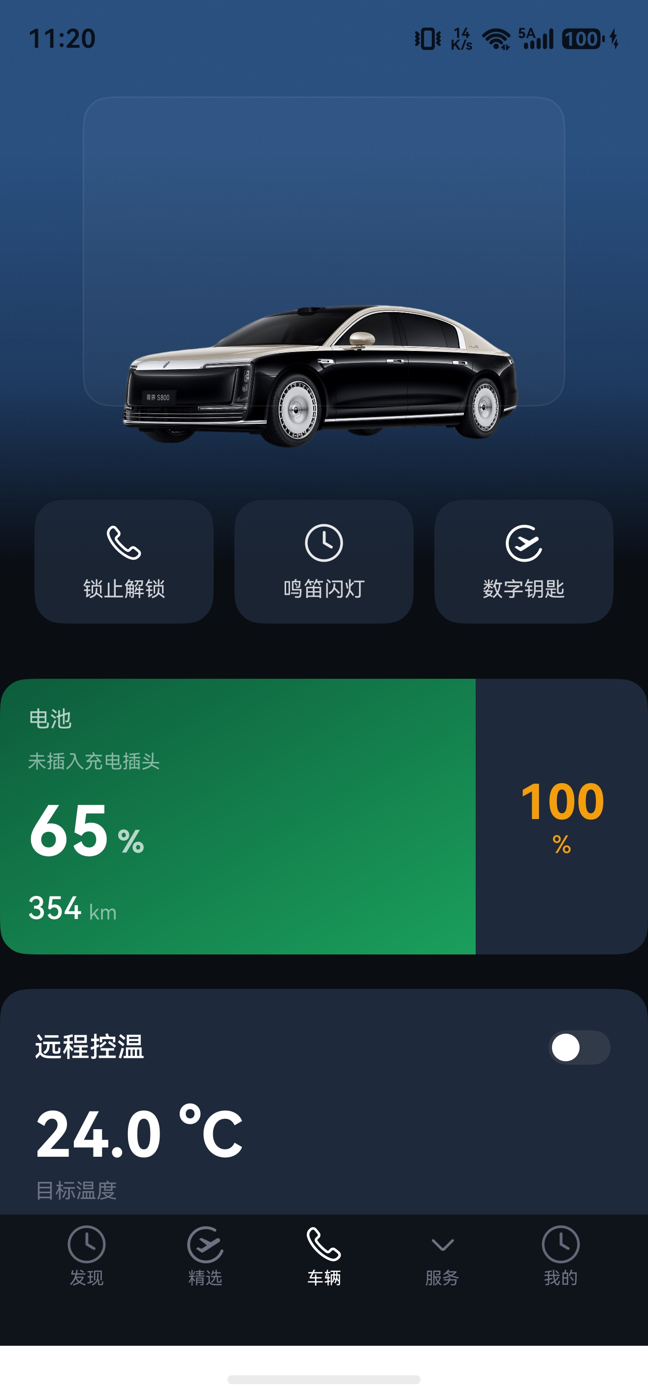




HarmonyOS鸿蒙Next中在ArkTs中怎么实现渐变背景向外延伸或溢出
HarmonyOS鸿蒙Next中在ArkTs中怎么实现渐变背景向外延伸或溢出 【问题描述】:需求是这样的,在页面内有scroll容器,铺满整个屏幕,大概中间位置有一个车图区域,车图区域的背景和前景会向上,向下延伸到与车图同层级的附近功能的区域里,这个背景的颜色也不是固定的。这个Android的compose是支持的,这个方案在鸿蒙上怎么实现呢???
【效果图】:
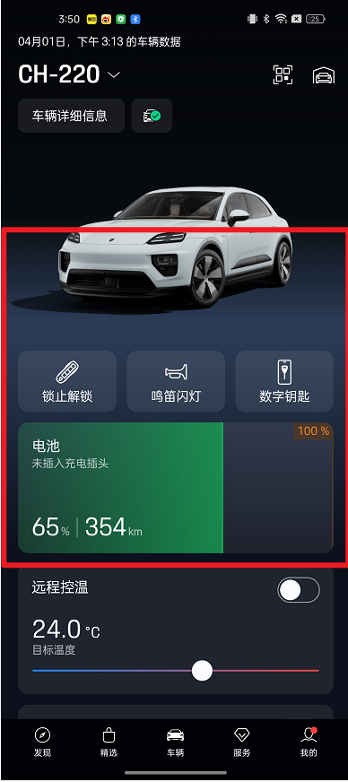
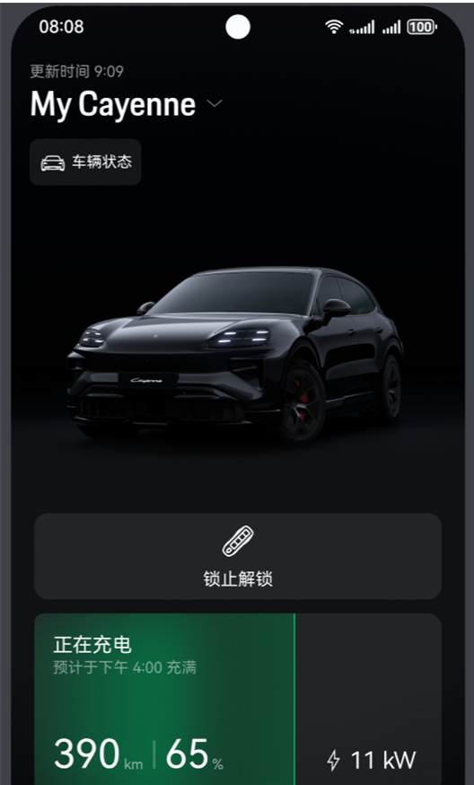
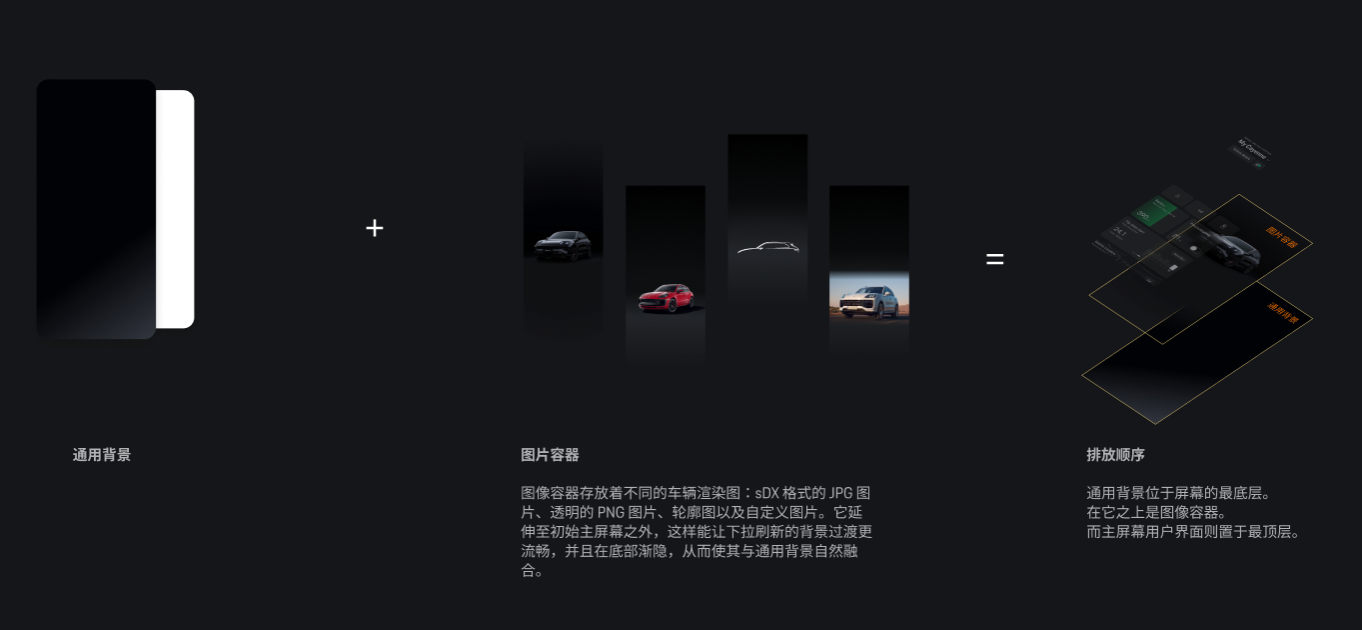
图1是我们想实现的效果,图2是现在的效果
更多关于HarmonyOS鸿蒙Next中在ArkTs中怎么实现渐变背景向外延伸或溢出的实战教程也可以访问 https://www.itying.com/category-93-b0.html

是这个效果么?
/**
 * 车辆控制页面 - 渐变背景溢出效果 Demo
 * 还原效果图 UI:深色主题 + 车图渐变背景溢出 + 电池卡片 + 温控滑块
 */

const PAGE_BG: string = '#0a0e14'
const CARD_BG: string = '#1e293b'
const GRADIENT_CENTER: string = '#1a2332'
const TEXT_PRIMARY: string = '#ffffff'
const TEXT_SECONDARY: string = '#9ca3af'
const TEXT_TERTIARY: string = '#6b7280'
const GREEN_DARK: string = '#0d5c3b'
const GREEN_BRIGHT: string = '#1a9f5c'
const AMBER: string = '#f59e0b'

@Entry
@Component
struct VehicleControlPage {
  @State isClimateOn: boolean = false
  @State targetTemp: number = 24.0
  private sliderValue: number = 0.5

  build() {
    Stack({ alignContent: Alignment.Bottom }) {
      Scroll() {
        Column() {
          this.HeaderBuilder()
          this.CarSectionBuilder()
          this.QuickActionsBuilder()
          this.BatteryCardBuilder()
          this.ClimateControlBuilder()
          Blank().height(100)
        }
      }
      .width('100%')
      .height('100%')
      .scrollBar(BarState.Off)
      .clip(false)

      this.BottomNavBuilder()
    }
    .width('100%')
    .height('100%')
    .backgroundColor(PAGE_BG)
  }

  // ==================== Header ====================

  @Builder
  HeaderBuilder() {
    Column({ space: 8 }) {
      Row() {
        Text('04月01日,下午3:13的车辆数据')
          .fontSize(12)
          .fontColor(TEXT_TERTIARY)
        Blank()
      }
      .width('100%')
      .padding({ left: 20, right: 20 })

      Row() {
        Text('CH-220')
          .fontSize(28)
          .fontWeight(FontWeight.Bold)
          .fontColor(TEXT_PRIMARY)

        Image($r('sys.media.ohos_ic_public_arrow_down'))
          .width(16)
          .height(16)
          .fillColor(TEXT_PRIMARY)
          .margin({ left: 4 })

        Blank()

        Image($r('sys.media.ohos_ic_public_clock'))
          .width(24)
          .height(24)
          .fillColor(TEXT_PRIMARY)

        Image($r('sys.media.ohos_ic_public_phone'))
          .width(24)
          .height(24)
          .fillColor(TEXT_PRIMARY)
          .margin({ left: 20 })
      }
      .width('100%')
      .padding({ left: 20, right: 20 })

      Row({ space: 8 }) {
        Text('车辆详细信息')
          .fontSize(13)
          .fontColor(TEXT_SECONDARY)
        Image($r('sys.media.ohos_ic_public_clock'))
          .width(16)
          .height(16)
          .fillColor('#4CAF50')
      }
      .width('auto')
      .padding({ left: 16, right: 16, top: 8, bottom: 8 })
      .margin({ left: 20, top: 8 })
      .backgroundColor('rgba(255,255,255,0.06)')
      .borderRadius(20)
    }
    .alignItems(HorizontalAlign.Start)
    .width('100%')
  }

  // ==================== 车图区域(渐变溢出核心) ====================

  @Builder
  CarSectionBuilder() {
    Stack({ alignContent: Alignment.Center }) {
      // 渐变背景层 —— 大幅溢出,使用高对比度颜色
      Column()
        .width('120%')       // 横向也超出,左右各 10%
        .height(680)          // 容器 320 + 上溢 160 + 下溢 200
        .offset({ y: -160 })  // 向上溢出 160vp
        .linearGradient({
          direction: GradientDirection.Bottom,
          colors: [
            [PAGE_BG, 0.0],
            ['#1e3a5f', 0.15],    // 更亮的蓝色,增强对比
            ['#2a5080', 0.35],    // 中心高亮
            ['#2a5080', 0.65],
            ['#1e3a5f', 0.85],
            [PAGE_BG, 1.0]
          ]
        })
        .blur(20)  // 模糊边缘,让溢出过渡更自然

      // 车图占位
      Column()
        .width(280)
        .height(180)
        .borderRadius(16)
        .backgroundColor('rgba(255,255,255,0.03)')
        .border({ width: 1, color: 'rgba(255,255,255,0.06)' })
        .justifyContent(FlexAlign.Center)
        .overlay(this.CarImageOverlay())
    }
    .width('100%')
    .height(320)
    .clip(false)
  }

  @Builder
  CarImageOverlay() {
    Column({ space: 8 }) {
      Image($r('app.media.car'))
        .width('90%')
        .height(260)
        .objectFit(ImageFit.Contain)
        .margin({ top: 30 })
    }
  }

  // ==================== 快捷操作按钮 ====================

  @Builder
  QuickActionsBuilder() {
    Row({ space: 12 }) {
      this.ActionCard('锁止解锁', $r('sys.media.ohos_ic_public_phone'))
      this.ActionCard('鸣笛闪灯', $r('sys.media.ohos_ic_public_clock'))
      this.ActionCard('数字钥匙', $r('sys.media.ohos_ic_public_flight'))
    }
    .width('100%')
    .padding({ left: 20, right: 20 })
    .offset({ y: -16 })
  }

  @Builder
  ActionCard(title: string, icon: Resource) {
    Column({ space: 8 }) {
      Image(icon)
        .width(24)
        .height(24)
        .fillColor(TEXT_PRIMARY)
      Text(title)
        .fontSize(12)
        .fontColor('rgba(255,255,255,0.8)')
    }
    .layoutWeight(1)
    .height(72)
    .backgroundColor('rgba(30,41,59,0.8)')
    .borderRadius(16)
    .justifyContent(FlexAlign.Center)
  }

  // ==================== 电池状态卡片 ====================

  @Builder
  BatteryCardBuilder() {
    Row() {
      // 左侧:绿色渐变区域
      Column({ space: 6 }) {
        Text('电池')
          .fontSize(13)
          .fontColor('rgba(255,255,255,0.7)')

        Text('未插入充电插头')
          .fontSize(11)
          .fontColor('rgba(255,255,255,0.5)')

        Row({ space: 4 }) {
          Text('65')
            .fontSize(40)
            .fontWeight(FontWeight.Bold)
            .fontColor(TEXT_PRIMARY)
          Text('%')
            .fontSize(18)
            .fontWeight(FontWeight.Bold)
            .fontColor('rgba(255,255,255,0.7)')
            .margin({ top: 12 })
        }

        Row({ space: 4 }) {
          Text('354')
            .fontSize(18)
            .fontWeight(FontWeight.Medium)
            .fontColor(TEXT_PRIMARY)
          Text('km')
            .fontSize(12)
            .fontColor('rgba(255,255,255,0.5)')
            .margin({ top: 4 })
        }
      }
      .layoutWeight(2)
      .height(160)
      .padding(16)
      .alignItems(HorizontalAlign.Start)
      .justifyContent(FlexAlign.SpaceBetween)
      .linearGradient({
        direction: GradientDirection.RightBottom,
        colors: [
          [GREEN_DARK, 0.0],
          [GREEN_BRIGHT, 1.0]
        ]
      })

      // 右侧:深色区域
      Column() {
        Text('100')
          .fontSize(28)
          .fontWeight(FontWeight.Bold)
          .fontColor(AMBER)
        Text('%')
          .fontSize(14)
          .fontColor(AMBER)
      }
      .width(100)
      .height(160)
      .backgroundColor(CARD_BG)
      .justifyContent(FlexAlign.Center)
    }
    .width('100%')
    .margin({ left: 20, right: 20, top: 16 })
    .borderRadius(16)
    .clip(true)
  }

  // ==================== 远程控温 ====================

  @Builder
  ClimateControlBuilder() {
    Column({ space: 16 }) {
      Row() {
        Text('远程控温')
          .fontSize(16)
          .fontWeight(FontWeight.Medium)
          .fontColor(TEXT_PRIMARY)
        Blank()
        Toggle({ type: ToggleType.Switch, isOn: this.isClimateOn })
          .onChange((value: boolean) => {
            this.isClimateOn = value
          })
      }
      .width('100%')

      Column({ space: 4 }) {
        Text('24.0 °C')
          .fontSize(36)
          .fontWeight(FontWeight.Bold)
          .fontColor(TEXT_PRIMARY)
        Text('目标温度')
          .fontSize(12)
          .fontColor(TEXT_TERTIARY)
      }
      .width('100%')
      .alignItems(HorizontalAlign.Start)

      Slider({
        value: this.sliderValue,
        min: 0,
        max: 100,
        step: 1,
        style: SliderStyle.OutSet
      })
        .width('100%')
        .blockColor(Color.White)
        .trackColor('#374151')
        .selectedColor('#4CAF50')
        .showSteps(false)
        .showTips(false)
        .onChange((value: number) => {
          this.sliderValue = value
          this.targetTemp = 16.0 + (value / 100) * 16.0
        })
    }
    .width('100%')
    .padding(20)
    .margin({ left: 20, right: 20, top: 20 })
    .backgroundColor(CARD_BG)
    .borderRadius(16)
  }

  // ==================== 底部导航栏 ====================

  @Builder
  BottomNavBuilder() {
    Column() {
      Row() {
        this.NavItem('发现', $r('sys.media.ohos_ic_public_clock'), false)
        this.NavItem('精选', $r('sys.media.ohos_ic_public_flight'), false)
        this.NavItem('车辆', $r('sys.media.ohos_ic_public_phone'), true)
        this.NavItem('服务', $r('sys.media.ohos_ic_public_arrow_down'), false)
        this.NavItem('我的', $r('sys.media.ohos_ic_public_clock'), false)
      }
      .width('100%')
      .height(56)
      .padding({ left: 16, right: 16, bottom: 8 })
    }
    .width('100%')
    .padding({ bottom: 20 })
    .backgroundColor('#0f1419')
    .borderWidth({ top: 0.5 })
    .borderColor('rgba(255,255,255,0.06)')
  }

  @Builder
  NavItem(label: string, icon: Resource, isActive: boolean) {
    Column({ space: 2 }) {
      Image(icon)
        .width(24)
        .height(24)
        .fillColor(isActive ? TEXT_PRIMARY : TEXT_TERTIARY)
      Text(label)
        .fontSize(10)
        .fontColor(isActive ? TEXT_PRIMARY : TEXT_TERTIARY)
    }
    .layoutWeight(1)
    .height(56)
    .justifyContent(FlexAlign.Center)
  }
}
更多关于HarmonyOS鸿蒙Next中在ArkTs中怎么实现渐变背景向外延伸或溢出的实战系列教程也可以访问 https://www.itying.com/category-93-b0.html


开发者您好,linearGradient属性实现渐变背景,请问这个属性不满足当前的需求点是什么?尝试利用 Stack 层叠布局实现视觉分层,并结合 Scroll 的滚动事件动态调整背景/前景的尺寸或位置。参考文章:层叠布局在HarmonyOS ArkUI中的高效应用实践。如有疑问,请及时反馈。

你这个效果在 ArkTS 里,**不要按“子组件背景溢出到兄弟组件”**去做,应该按:
“把车图区域 + 附近功能区域当成一个大 Section,在这个大 Section 里放一层可变渐变背景,前景内容再叠上去”
来实现。
这是关键。
为什么你现在做不出来
你现在大概率是这种结构:
Scroll- 车图区域
- 功能区域
- 电池卡片区域
然后你想让“车图区域自己的背景”向上、向下延伸到下面的功能区。
在 ArkTS 里,这么做通常会遇到两个问题:
- 背景只画在当前组件自己的布局范围内
Scroll/ 父容器 / 布局层级会让你看起来像“不能像 Compose 那样自由外溢”
所以不要指望单个子组件的 background 去跨 sibling 画。
正确思路
把你红框内那一整块,当成一个统一的父容器:
- 顶层是一个
Stack - 最底层放“渐变背景层”
- 上层放车图、按钮、电池卡片这些内容
- 这个父容器的高度要覆盖所有你希望被渐变影响的区域
也就是说:
不是让背景“溢出” 而是让背景所在的父容器本来就足够大
推荐结构
可以改成这种:
Scroll() {
  Column() {
    HeaderArea()

    VehicleSection()

    OtherSection()
  }
}
其中 VehicleSection() 不只是车图,而是:
- 车图
- 车图下方按钮
- 电池卡片
- 这一整块共享的背景层
ArkTS 实现示意
下面给你一个接近你这个效果的结构:
@Component
struct VehicleSection {
  build() {
    Stack({ alignContent: Alignment.Top }) {
      // 1. 底部渐变背景层
      Column()
        .width('100%')
        .height(420)
        .margin({ top: 180 })
        .borderRadius({
          topLeft: 28,
          topRight: 28,
          bottomLeft: 0,
          bottomRight: 0
        })
        .backgroundColor({
          angle: 180,
          colors: [
            ['#233B63', 0.0],
            ['#1A2238', 0.35],
            ['#161C2E', 1.0]
          ]
        })

      // 2. 前景内容层
      Column({ space: 16 }) {
        // 车图区域
        Image($r('app.media.car'))
          .width('92%')
          .aspectRatio(1.8)
          .objectFit(ImageFit.Contain)
          .margin({ top: 40 })

        // 功能按钮
        Row({ space: 12 }) {
          FeatureBtn('锁止解锁')
          FeatureBtn('鸣笛闪灯')
          FeatureBtn('数字钥匙')
        }
        .width('100%')
        .padding({ left: 16, right: 16 })

        // 电池卡片
        BatteryCard()
          .margin({ left: 16, right: 16 })
      }
    }
    .width('100%')
    .height(620)
  }
}
这个方案的核心点
1. 不要拆成多个平级区域
如果你希望背景连续覆盖:
- 车图下方
- 功能按钮区域
- 电池卡片区域
那这几个就不要是独立 sibling 各画各的背景,
而是要放进同一个 Stack 父容器。
2. 背景层单独做
不要给车图组件本身配背景。 而是单独放一个:
Column()- 或
Rect - 或自定义组件
作为背景板
然后用 .margin({ top: ... }) / .position(...) 控制它从哪里开始铺。
3. 前景靠层叠,不靠溢出
车图、按钮、电池卡片都在背景层之上。 你看到的是“背景向外延伸”,其实本质是:
背景层本来就比车图区域大
如果背景颜色不是固定的
这个在 ArkTS 里没问题,直接把渐变参数做成状态即可:
@State bgColors: ResourceColor[] | string[] = ['#233B63', '#161C2E']
或者:
.backgroundColor({
  angle: 180,
  colors: [
    [this.topColor, 0],
    [this.middleColor, 0.5],
    [this.bottomColor, 1]
  ]
})
如果你是根据车辆状态动态切换:
- 充电中:绿色系
- 普通状态:蓝灰系
- 告警状态:橙红系
那就切这组颜色值就行。
如果你想做得更像图1
图1里其实不是简单矩形渐变,更像:
- 上半部分是暗色过渡
- 下半部分有一层偏蓝的氛围底板
- 车底还有一层阴影/光晕
这时建议拆成 3 层:
- 全局暗色背景层
- 车区域氛围渐变层
- 车底光晕层
例如:
Stack() {
  // 大背景
  Column().backgroundColor('#0B1020')

  // 蓝色氛围层
  Column()
    .height(420)
    .margin({ top: 190 })
    .backgroundColor({
      angle: 180,
      colors: [['#314A74', 0], ['#1B2437', 1]]
    })

  // 车底光晕
  Ellipse()
    .width('80%')
    .height(80)
    .fill({
      angle: 0,
      colors: [['#3D5C8D88', 0], ['#3D5C8D00', 1]]
    })
    .margin({ top: 300 })

  // 前景内容
  Column() { ... }
}
这样比单层渐变更接近你图1的质感。
如果你现在是放在 Scroll 里
也没问题,注意两点:
Scroll里面这一整块要作为一个 section- 不要让“车图区域”和“功能区域”分开各自当父容器
也就是:
Scroll() {
  Column() {
    TopInfo()

    VehicleSection() // 一整块

    BottomCards()
  }
}
一句话总结
你这个在 ArkTS 里的实现思路不是“背景溢出”,而是:
用一个更大的 Stack Section 把车图和周边区域统一包起来,在底层画渐变背景,在上层叠前景内容。
ArkUI 里建议不要把它当成某个子组件“溢出”来做,而是拆成独立背景层。外层用 Stack 铺满页面:底层放 Blank/Column/Image,设置 linearGradient 或动态背景色,并用 height、position/offset 做上下延伸;上层放 Scroll 业务内容。若背景放在 Scroll 内,要检查父容器 clip/clipContent,Scroll 本身并不适合作为溢出背景容器。复杂动态色可以用 Canvas 或自定义组件绘制。

这张图片展示了一个关于 ArkTS (鸿蒙开发语言) 的技术求助帖,主要讨论如何实现一种特定的 UI 视觉效果。
核心问题
标题: 在 ArkTs 中,怎么实现渐变背景向外延伸或溢出?
需求描述
- 场景: 页面内有一个铺满全屏的
scroll容器(滚动视图)。 - 布局: 页面中间位置有一个“车图区域”(显示汽车图片的卡片)。
- 视觉需求: 这个车图区域的背景(以及前景)需要向上、向下延伸,溢出到与车图同层级的“附近功能区域”里。
- 动态性: 背景的颜色不是固定的(暗示可能是根据图片取色或动态变化的)。
- 对比: 提问者提到 Android 的 Compose 支持这种效果,询问鸿蒙上如何实现。
图片对比(关键点)
图片下方展示了两张手机界面的对比图,直观地说明了“想要的效果”和“现在的效果”的区别:
-
图 1(左侧手机):我们想实现的效果
- 特征: 中间的汽车卡片背景不仅仅是卡片本身的矩形,它产生了一种模糊的、发光的光晕效果,向上下扩散。
- 细节: 你可以看到汽车卡片背后的背景色(深蓝色/紫色调)渗透到了上方的“车辆详情信息”区域和下方的“远程控温”区域。这种效果让卡片看起来像是悬浮在一个发光体之上,视觉层次非常丰富,背景与周围的 UI 元素有了融合感。
-
图 2(中间手机):现在的效果
- 特征: 这是一个标准的卡片式布局。
- 细节: 汽车卡片是一个独立的、边界清晰的矩形(圆角矩形)。它的背景色严格限制在卡片内部,没有向周围溢出任何光影或颜色。上下区域与中间卡片之间有明显的分割,显得比较生硬,缺乏图 1 那种“沉浸式”或“光晕溢出”的氛围感。
总结
提问者希望在鸿蒙 (ArkTS) 开发中,实现一种背景模糊/光晕溢出的效果。即中间核心卡片的背景色或阴影,能够突破自身的边界,模糊地渲染在底层或相邻的组件之上,从而营造出一种通透、融合的视觉体验。
1、使用Stack 层叠布局去处理背景向外延伸;感觉最简单 2、根据图片设置自适应的背景色
1. 将图片转换为PixelMap

export async function image2PixelMap(icon: string): Promise<image.PixelMap> {
     let rawFileDescriptor: resourceManager.RawFileDescriptor = resourceMgs.getRawFdSync(icon);
     let imageSource: image.ImageSource = image.createImageSource(rawFileDescriptor);
     let pixelMap: image.PixelMap = await imageSource.createPixelMap({
       editable: false,
       desiredPixelFormat: image.PixelMapFormat.BGRA_8888,
       desiredSize: { width: 40, height: 40 }
     })
     return pixelMap;
   }

   2. 遍历PixelMap中的所有像素,放到一个数组中
   export async function traverseAllPixel(pixelMap: image.PixelMap): Promise<number[]> {
     const pixelArrayBuffer: ArrayBuffer = new ArrayBuffer(40 * 40 * 4);
     await pixelMap.readPixelsToBuffer(pixelArrayBuffer);
     const allPixels: number[] = [];
     const unit8Pixels: Uint8Array = new Uint8Array(pixelArrayBuffer);
     for (let i = 0; i < unit8Pixels.length; i += 4) {
       const rgb: ColorRgb = {
         red: unit8Pixels[i+2],
         green: unit8Pixels[i+1],
         blue: unit8Pixels[i],
         alpha:unit8Pixels[i+3]
     }
     if (rgb.red === 0 && rgb.green === 0 && rgb.blue === 0 && rgb.alpha === 0) {
       continue;
     }
     allPixels.push(ColorUtils.rgbToNumber(rgb));
     }
     return allPixels;
   }

   3. 遍历数组,找到出现次数最多的像素
   export function findMaxPixel(allPixels: number[]): number {
     let map: Map<number, number> = new Map();
     allPixels.forEach((pixel: number) => {
       if (map.has(pixel)) {
         map.set(pixel, map.get(pixel)! + 1);
       } else {
         map.set(pixel, 1);
       }
     })
     let maxPixel: number = 0;
     let maxTimes: number = 0;
     map.forEach((value: number, key: number) => {
       if (value >= maxTimes) {
         maxTimes = value;
         maxPixel = key;
       }
     })
     return maxPixel;
   }
   4. 将出现次数最多的像素值转换为RGB颜色格式
    public static numberToRgb(color: number): ColorRgb {
     return {
       red: (color & 0xFF0000) >> 16,
       green: (color & 0xFF00) >> 8,
       blue: (color & 0xFF),
       alpha:(color & 0xFF000000)>>24
     }
   }
5. 将RGB颜色格式转换为HSV格式
   public static rgb2hsv(color: ColorRgb): ColorHsv {
     const red: number = color.red / MAX_RGB_VALUE;
     const green: number = color.green / MAX_RGB_VALUE;
     const blue: number = color.blue / MAX_RGB_VALUE;

     const max: number = Math.max(red, green, blue);
     const min: number = Math.min(red, green, blue);
     const delta: number = max - min;

     let hue: number = 0;
     let saturation: number = 0;
     let value: number = 0;
     if (max === min) {
       hue = 0;
     } else if (max === red) {
       hue = (green >= blue ? ((green - blue) / delta) * 60 : ((green - blue) / delta) * 60 + 360);
     } else if (max === green) {
       hue = (((blue - red) / delta) + 2) * 60;
     } else if (max === blue) {
       hue = (((red - green) / delta) + 4) * 60;
     }
     saturation = (max === 0 ? 0 : delta / max);
     value = max;

     return {
       hue: hue,
       saturation: saturation,
       value: value,
       alpha:color.alpha
     }
   }
   6. 修改HSV格式中的S和V值,使背景色和原有颜色有明显区分
       export function modifySVValue(color: ColorHsv): void {
     if (color.hue > 20 && color.hue <= 60) {
       color.saturation = 0.12;
       color.value = 0.93;
     } else if (color.hue > 60 && color.hue <= 190) {
       color.saturation = 0.08;
       color.value = 0.91;
     } else if (color.hue > 190 && color.hue <= 270) {
       color.saturation = 0.1;
       color.value = 0.93;
     } else {
       color.saturation = 0.08;
       color.value = 0.93;
     }
   }
   7. 将HSV格式转换为RGB格式
   public static hsv2rgb(color: ColorHsv): ColorRgb {
     const h60: number = color.hue / 60;
     const h60f: number = Math.floor(h60);
     const hi: number = h60f % 6;
     const f: number = h60 - h60f;
     const p: number = color.value * (1 - color.saturation);
     const q: number = color.value * (1 - f * color.saturation);
     const t: number = color.value * (1 - (1 - f) * color.saturation);

     let red: number = 0.0;
     let green: number = 0.0;
     let blue: number = 0.0;
     if (hi === 0) {
       red = color.value;
       green = t;
       blue = p;
     } else if (hi === 1) {
       red = q;
       green = color.value;
       blue = p;
     } else if (hi === 2) {
       red = p;
       green = color.value;
       blue = t;
     } else if (hi === 3) {
       red = p;
       green = q;
       blue = color.value;
     } else if (hi === 4) {
       red = t;
       green = p;
       blue = color.value;
     } else if (hi === 5) {
       red = color.value;
       green = p;
       blue = q;
     }
     return {
       red: Math.floor(red * MAX_RGB_VALUE),
       green: Math.floor(green * MAX_RGB_VALUE),
       blue: Math.floor(blue * MAX_RGB_VALUE),
       alpha:color.alpha
     }
   }
   8. 将rgb转换为数字
     public static rgbToNumber(color: ColorRgb): number {
     return ((0xFF << 24) | (color.red << 16) | (color.green << 8) | color.blue);
   }

在ArkTS中,使用Stack配合Image或Shape设置渐变,通过overflow(Overflow.Visible)允许子组件超出父容器边界。例如:
Stack().width('100%').height(200).overflow(Overflow.Visible) {
  Circle().fill(LinearGradient(...)).width(300).height(300).offset(...)
}
也可直接设置组件的position或transform实现向外延伸。

在 ArkUI(ArkTS)中实现“渐变背景延伸溢出”核心思路:把渐变背景做成独立层,利用 Stack 布局使其尺寸超越车图区域并利用负 margin 或 translate 向外延伸,同时确保父容器 Scroll 不裁剪溢出内容。
关键做法:
- 在 Scroll 上设置
.clip(false),否则溢出会被裁剪。 - 用 Stack 包裹车图与关联功能区,将渐变背景作为底层 Column,高度按需放大(如 130%),通过
.margin({ top: -vp })向上延伸,.translate({ y: -vp })也可。 - 渐变颜色动态变化:用
@State变量构建linearGradient。
代码骨架(以车图区域上下溢出为例):
@State bgColors: Array<[number, string]> = [[0, '#FF0000'], [1, '#0000FF']]

Scroll() {
  Stack() {
    // 延伸的背景层
    Column()
      .width('100%')
      .height('130%')          // 超出车图本身高度
      .linearGradient({
        direction: GradientDirection.Top,
        colors: this.bgColors
      })
      .margin({ top: -60 })    // 向上延伸
    // 车图与周边功能区域
    Column() {
      // 上方功能区...
      Image($r('app.media.car')) // 车图
        .width('100%')
      // 下方功能区...
    }
    .width('100%')
  }
}
.clip(false)    // Scroll 不裁剪
若仅需在局部区域溢出且不依赖 Scroll 的 clip,可将上述 Stack 放在 Column 中并设置自身 .clip(false)。注意动态渐变直接用状态变量驱动即可。