




HarmonyOS鸿蒙NEXT中如何深度定制一多组件?以这里tabs为例
HarmonyOS鸿蒙NEXT中如何深度定制一多组件?以这里tabs为例 参考文档,写了一个简单的tabs的一多demo
请问如何深度自定义这些组件?比如实现WPS那样的跨设备的一多导航栏?
样式可以稍微复杂一些,除了实现官方这里简单基础的tabs功能,最好有一些必须要自定义才能实现的,可以简单给一个可以运行的demo

听说WPS是用的QT?如果这个方便的话,能否也给一个简单的demo说明一下如何实现?非常感谢
官方文档中的简单一多工程,以及断点相关的科普可以省略
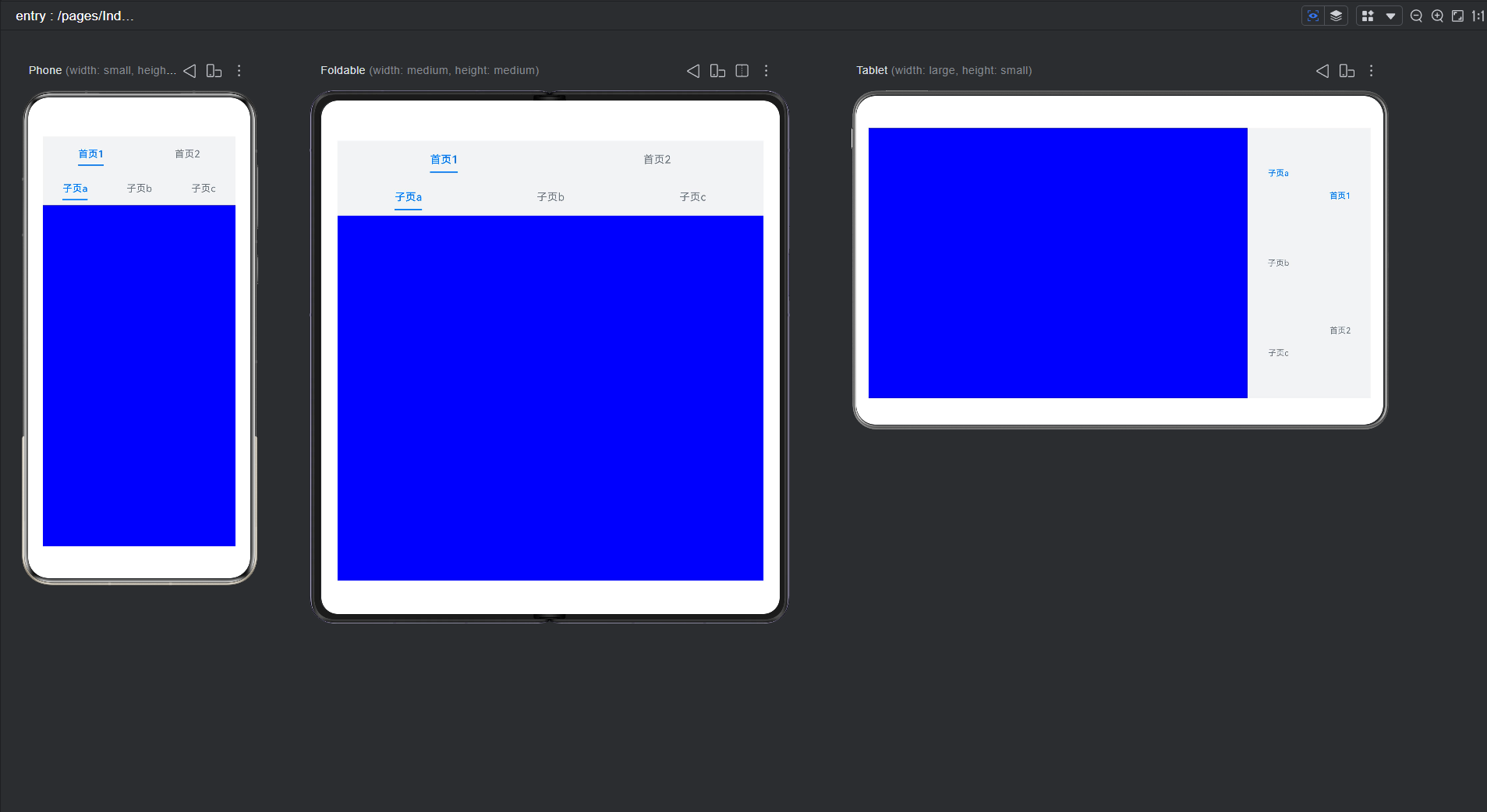
import { BreakpointSystem, BreakpointTypeEnum } from 'utils';

@Entry
@Component
struct TabsExample {
  private breakpointSystem: BreakpointSystem = new BreakpointSystem();

  // 每个 Tabs 独立 controller
  private mainTabsController: TabsController = new TabsController();
  private subTabsController1: TabsController = new TabsController();
  private subTabsController2: TabsController = new TabsController();

  @StorageProp('currentBreakpoint') currentBreakpoint: string = BreakpointTypeEnum.MD;

  @State barMode: BarMode = BarMode.Fixed;

  aboutToAppear() {
    AppStorage.setOrCreate('UIContext', this.getUIContext());
    this.breakpointSystem.register();
  }

  aboutToDisappear() {
    this.breakpointSystem.unregister();
  }

  private isLarge(): boolean {
    return this.currentBreakpoint === BreakpointTypeEnum.LG;
  }

  build() {
    Column() {
      Row() {

        // ===== 外层 Tabs =====
        Tabs({
          barPosition: this.isLarge() ? BarPosition.End : BarPosition.Start,
          controller: this.mainTabsController
        }) {

          // ===== 首页1 =====
          TabContent() {
            Tabs({
              barPosition: this.isLarge() ? BarPosition.End : BarPosition.Start,
              controller: this.subTabsController1
            }) {

              TabContent() {
                Column()
                  .width('100%')
                  .height('100%')
                  .backgroundColor(Color.Blue)
              }.tabBar(SubTabBarStyle.of('子页a'))

              TabContent() {
                Column()
                  .width('100%')
                  .height('100%')
                  .backgroundColor(Color.Green)
              }.tabBar(SubTabBarStyle.of('子页b'))

              TabContent() {
                Column()
                  .width('100%')
                  .height('100%')
                  .backgroundColor(Color.Pink)
              }.tabBar(SubTabBarStyle.of('子页c'))

            }
            .nestedScroll(TabsNestedScrollMode.SELF_FIRST)
            .vertical(this.isLarge())
            .barWidth(this.isLarge() ? 120 : undefined)
          }
          .tabBar(SubTabBarStyle.of("首页1"))


          // ===== 首页2 =====
          TabContent() {
            Tabs({
              barPosition: this.isLarge() ? BarPosition.End : BarPosition.Start,
              controller: this.subTabsController2
            }) {

              TabContent() {
                Column()
                  .width('100%')
                  .height('100%')
                  .backgroundColor(Color.Blue)
              }.tabBar(SubTabBarStyle.of('子页d'))

              TabContent() {
                Column()
                  .width('100%')
                  .height('100%')
                  .backgroundColor(Color.Green)
              }.tabBar(SubTabBarStyle.of('子页e'))

              TabContent() {
                Column()
                  .width('100%')
                  .height('100%')
                  .backgroundColor(Color.Pink)
              }.tabBar(SubTabBarStyle.of('子页f'))

            }
            .nestedScroll(TabsNestedScrollMode.SELF_FIRST)
            .vertical(this.isLarge())
            .barWidth(this.isLarge() ? 120 : undefined)
          }
          .tabBar(SubTabBarStyle.of('首页2'))

        }
        .height('100%')
        .backgroundColor(0xf1f3f5)
        .barMode(this.barMode)
        .vertical(this.isLarge())
        .barWidth(this.isLarge() ? 120 : undefined)
      }
      .width('100%')
      .height('100%')
      .padding('24vp')
    }
  }
}
// BreakpointSystem.ets
import { mediaquery } from '@kit.ArkUI';

declare interface BreakpointTypeOption<T> {
  xs?: T
  sm?: T
  md?: T
  lg?: T
  xl?: T
  xxl?: T
}

export class BreakpointType<T> {
  options: BreakpointTypeOption<T>;

  constructor(option: BreakpointTypeOption<T>) {
    this.options = option
  }

  getValue(currentBreakPoint: string) {
    if (currentBreakPoint === 'xs') {
      return this.options.xs;
    } else if (currentBreakPoint === 'sm') {
      return this.options.sm;
    } else if (currentBreakPoint === 'md') {
      return this.options.md;
    } else if (currentBreakPoint === 'lg') {
      return this.options.lg;
    } else if (currentBreakPoint === 'xl') {
      return this.options.xl;
    } else if (currentBreakPoint === 'xxl') {
      return this.options.xxl;
    } else {
      return undefined;
    }
  }
}

interface Breakpoint {
  name: string,
  size: number,
  mediaQueryListener?: mediaquery.MediaQueryListener
}

export enum BreakpointTypeEnum {
  SM = 'sm',
  MD = 'md',
  LG = 'lg',
  XL = 'xl'
}

export class BreakpointSystem {
  private currentBreakpoint: string = "md";
  private breakpoints: Breakpoint[] = [
    { name: 'sm', size: 320 },
    { name: 'md', size: 600 },
    { name: 'lg', size: 840 },
    { name: 'xl', size: 1500 }
  ];

  private updateCurrentBreakpoint(breakpoint: string) {
    if (this.currentBreakpoint !== breakpoint) {
      this.currentBreakpoint = breakpoint;
      AppStorage.setOrCreate<string>('currentBreakpoint', this.currentBreakpoint);
      console.log('on current breakpoint: ' + this.currentBreakpoint);
    }
  }

  public register() {
    this.breakpoints.forEach((breakpoint: Breakpoint, index) => {
      let condition: string;
      if (index === this.breakpoints.length - 1) {
        condition = '(' + breakpoint.size + 'vp<=width' + ')';
      } else {
        condition = '(' + breakpoint.size + 'vp<=width<' + this.breakpoints[index + 1].size + 'vp)';
      }
      let UIContext :UIContext= AppStorage.get('UIContext') as UIContext;
      breakpoint.mediaQueryListener = UIContext.getMediaQuery().matchMediaSync(condition);
      breakpoint.mediaQueryListener.on('change', (mediaQueryResult) => {
        if (mediaQueryResult.matches) {
          this.updateCurrentBreakpoint(breakpoint.name);
        }
      })
    })
  }

  public unregister() {
    this.breakpoints.forEach((breakpoint: Breakpoint) => {
      if (breakpoint.mediaQueryListener) {
        breakpoint.mediaQueryListener.off('change');
      }
    })
  }
}
更多关于HarmonyOS鸿蒙NEXT中如何深度定制一多组件?以这里tabs为例的实战教程也可以访问 https://www.itying.com/category-93-b0.html

如果目标是 WPS 这类办公应用的“一多导航”,不建议继续把所有结构都塞进 Tabs。Tabs 适合做同层内容切换,但复杂一多更建议拆成三层:
- 断点层:统一维护 sm/md/lg/xl。
- 导航层:手机用底部/顶部 Tabs,平板和 2in1 用 SideBarContainer 或左侧自定义 rail。
- 内容层:用 Navigation + NavPathStack 管详情页,宽屏时切 NavigationMode.Split,窄屏时切 Stack。
核心代码可以这样组织:
@Builder
NavItem(icon: Resource, text: string, index: number) {
  Column() {
    Image(icon).width(24).height(24)
    Text(text).fontSize(12)
  }
  .width(72)
  .height(56)
  .backgroundColor(this.current === index ? '#e8f0ff' : Color.Transparent)
  .onClick(() => this.current = index)
}
宽屏时把这些 NavItem 放到左侧 Column,窄屏时放到底部 Row;右侧内容区域根据 current 渲染不同业务页。真正的“深度定制”通常不是改 Tabs 内置 tabBar,而是自建导航条,让状态、路由和断点都在你自己手里。Qt 方向也能做,但在 HarmonyOS NEXT 原生应用里,优先用 ArkUI 的 Navigation/SideBarContainer/Grid 组合,后续维护和系统适配会更稳。
更多关于HarmonyOS鸿蒙NEXT中如何深度定制一多组件?以这里tabs为例的实战系列教程也可以访问 https://www.itying.com/category-93-b0.html

尊敬的开发者,您好,tabs一多适配开发者可参考底部/侧边导航,基于一多能力实现响应式布局。深度自定义tabs组件,您具体可以参考如下demo,如果还是不能满足您的需求,您可以提供更详细的需求信息。关于您对WPS应用的一些疑问,您可以询问WPS的官网进行询问。
示例代码如下:
// Cover.ets
import { MediaQuery, mediaquery } from '@kit.ArkUI';

export class MediaListener {
  private static instance: MediaListener | undefined = undefined;

  public static getInstance(): MediaListener {
    if (!MediaListener.instance) {
      MediaListener.instance = new MediaListener();
    }
    return MediaListener.instance;
  }

  // 定义屏幕宽度断点(单位:vp)
  private SM_SCREEN: string = '(max-width: 599vp)'; // 小屏设备
  private MD_SCREEN: string = '(min-width: 600vp) and (max-width: 839vp)'; // 中屏
  private LG_SCREEN: string = '(min-width: 840vp) and (max-width: 1049)'; // 大屏
  private XL_SCREEN: string = '(min-width: 1051vp)'; // 超大屏
  smListener: mediaquery.MediaQueryListener | undefined = undefined;
  mdListener: mediaquery.MediaQueryListener | undefined = undefined;
  lgListener: mediaquery.MediaQueryListener | undefined = undefined;
  xlListener: mediaquery.MediaQueryListener | undefined = undefined;

  initListen(uiContext: UIContext) {
    let mediaQuery: MediaQuery = uiContext.getMediaQuery();
    this.smListener = mediaQuery.matchMediaSync(this.SM_SCREEN);
    this.mdListener = mediaQuery.matchMediaSync(this.MD_SCREEN);
    this.lgListener = mediaQuery.matchMediaSync(this.LG_SCREEN);
    this.xlListener = mediaQuery.matchMediaSync(this.XL_SCREEN);
  }

  startListen() {
    // sm小屏监听回调
    this.smListener?.on('change', (result: mediaquery.MediaQueryResult) => {
      if (result.matches) {
        AppStorage.setOrCreate('windowSize', 1);
      }
    });

    // md中屏监听回调
    this.mdListener?.on('change', (result: mediaquery.MediaQueryResult) => {
      if (result.matches) {
        AppStorage.setOrCreate('windowSize', 2);
      }
    });

    // lg大屏监听回调
    this.lgListener?.on('change', (result: mediaquery.MediaQueryResult) => {
      if (result.matches) {
        AppStorage.setOrCreate('windowSize', 3);
      }
    });

    // xl超大屏监听回调
    this.xlListener?.on('change', (result: mediaquery.MediaQueryResult) => {
      if (result.matches) {
        AppStorage.setOrCreate('windowSize', 4);
      }
    });
  }

  stopListen() {
    this.smListener?.off('change');
    this.mdListener?.off('change');
    this.lgListener?.off('change');
    this.xlListener?.off('change');
  }
}
import { MediaListener } from './Cover';
import { CommonModifier, window } from '@kit.ArkUI';

interface TabItem {
  icon: Resource;
  name: string;
  index: number;
}

@Entry
@Component
struct Index {
  windowStage: window.WindowStage = AppStorage.get('windowStage') as window.WindowStage;
  tabController: TabsController = new TabsController();
  tabList: TabItem[] = [
    { icon: $r('app.media.startIcon'), name: '页签1', index: 0 }, // 图片资源替换成所需资源
    { icon: $r('app.media.startIcon'), name: '页签2', index: 1 }// 图片资源替换成所需资源
  ];
  childList: string[] = ['精选', '视频', '社区', '新闻'];
  @State tabPosition: BarPosition = BarPosition.End;
  @State isVertical: boolean = false;
  @State imgWidth: number = 40;
  @State nameSize: number = 16;
  @State childNameSize: number = 20;
  // 实现Tabs一多的适配,首先需要使用@StorageProp装饰器获取到全局的断点值。然后就可以使用断点值来进行一多适配了。
  @StorageProp('windowSize') @Watch('windowSizeChange') windowSize: number = 0;
  @State currentIndex: number = 0;
  @State childIndex: number = 0;
  @State childIndex2: number = 0;

  @Builder
  tabBuilder(item: TabItem) {
    Flex({
      direction: this.windowSize <= 2 ? FlexDirection.Column : FlexDirection.Row,
      justifyContent: FlexAlign.Center,
      alignItems: ItemAlign.Center
    }) {
      Image(item.icon)
        .width(this.imgWidth)
        .aspectRatio(1);
      Text(item.name)
        .fontSize(this.nameSize)
        .fontWeight(FontWeight.Medium)
        .fontColor(this.currentIndex === item.index ? '#007df5' : '#000000');
    }
    .padding(16)
    .width('100%')
    .height('100%');
  }

  @Builder
  childTabBar(item: string, index: number) {
    Flex({ justifyContent: FlexAlign.Center, alignItems: ItemAlign.Center }) {
      Text(item)
        .fontSize(this.nameSize)
        .fontWeight(this.childIndex === index ? FontWeight.Bold : FontWeight.Regular);
    }
    .width(80)
    .height('25%');
  }

  windowSizeChange() {
    // 根据窗口大小变化,控制Tabs页签的横竖显示等属性
    if (this.windowSize === 1) {
      this.isVertical = false;
      this.tabPosition = BarPosition.Start;
      this.imgWidth = 40;
      this.nameSize = 16;
      this.childNameSize = 22;
    } else if (this.windowSize === 2) {
      this.isVertical = false;
      this.tabPosition = BarPosition.Start;
      this.imgWidth = 50;
      this.nameSize = 22;
      this.childNameSize = 26;
    } else {
      this.isVertical = true;
      this.tabPosition = BarPosition.End;
      this.imgWidth = 60;
      this.nameSize = 28;
      this.childNameSize = 32;
    }
  }

  aboutToAppear(): void {
    // 设置沉浸式
    this.setImmersive(this.windowStage.getMainWindowSync());
    // 监听窗口大小变化
    MediaListener.getInstance().initListen(this.getUIContext());
    MediaListener.getInstance().startListen();
  }

  aboutToDisappear(): void {
    // 取消监听
    MediaListener.getInstance().stopListen();
  }

  build() {
    Column() {
      Tabs({
        barPosition: this.tabPosition,
        controller: this.tabController,
        index: this.currentIndex
      }) {
        TabContent() {
          Column() {
            Tabs({
              barPosition: this.tabPosition,
              index: this.childIndex
            }) {
              ForEach(this.childList, (item: string, index: number) => {
                TabContent() {
                  Column() {
                    Text(`${item}的内容`)
                      .fontSize(this.childNameSize);
                  }
                  .backgroundColor('#0a59f7')
                  .justifyContent(FlexAlign.Center)
                  .width('100%')
                  .height('100%');
                }
                .tabBar(this.childTabBar(item, index));
              });
            }
            .vertical(this.isVertical)
            .backgroundColor('#ffffff')
            .onAnimationStart((index: number, targetIndex: number, event: TabsAnimationEvent) => {
              this.childIndex = targetIndex;
            })
            .onGestureRecognizerJudgeBegin((event: BaseGestureEvent, current: GestureRecognizer,
              others: Array<GestureRecognizer>): GestureJudgeResult => { // 在识别器即将要成功时,根据当前组件状态,设置识别器使能状态
              if (current) {
                let target = current.getEventTargetInfo();
                if (target && current.isBuiltIn() && current.getType() == GestureControl.GestureType.PAN_GESTURE) {
                  let panEvent = event as PanGestureEvent;
                  if (!this.isVertical && panEvent && panEvent.velocityX < 0 && this.childIndex === 3) { // 内层Tabs滑动到尽头
                    return GestureJudgeResult.REJECT;
                  }
                  if (!this.isVertical && panEvent && panEvent.velocityX > 0 && this.childIndex === 0) { // 内层Tabs滑动到开头
                    return GestureJudgeResult.REJECT;
                  }
                  if (this.isVertical && panEvent && panEvent.velocityY < 0 && this.childIndex === 3) { // 内层Tabs滑动到尽头
                    return GestureJudgeResult.REJECT;
                  }
                  if (this.isVertical && panEvent && panEvent.velocityY > 0 && this.childIndex === 0) { // 内层Tabs滑动到开头
                    return GestureJudgeResult.REJECT;
                  }
                }
              }
              return GestureJudgeResult.CONTINUE;
            }, true);
          }
          .padding(16);
        }
        .backgroundColor('#ffffff')
        .tabBar(this.tabBuilder(this.tabList[0]));

        // 其他TabContent嵌套Tabs的内容,开发者可参考上面代码实现
        TabContent() {
          Tabs({
            barPosition: this.tabPosition,
            index: this.childIndex2
          }) {
            TabContent() {
              Column() {
                Text('a页签的内容')
                  .fontSize(this.childNameSize);
              }
              .justifyContent(FlexAlign.Center)
              .width('100%')
              .height('100%');
            }
            .tabBar('a');

            TabContent() {
              Column() {
                Text('b页签的内容')
                  .fontSize(this.childNameSize);
              }
              .justifyContent(FlexAlign.Center)
              .width('100%')
              .height('100%');
            }
            .tabBar('b');
          }
          .vertical(this.isVertical)
          .onAnimationStart((index: number, targetIndex: number, event: TabsAnimationEvent) => {
            this.childIndex2 = targetIndex;
          })
          .onGestureRecognizerJudgeBegin((event: BaseGestureEvent, current: GestureRecognizer,
            others: Array<GestureRecognizer>): GestureJudgeResult => { // 在识别器即将要成功时,根据当前组件状态,设置识别器使能状态
            if (current) {
              let target = current.getEventTargetInfo();
              if (target && current.isBuiltIn() && current.getType() == GestureControl.GestureType.PAN_GESTURE) {
                let panEvent = event as PanGestureEvent;
                if (!this.isVertical && panEvent && panEvent.velocityX < 0 && this.childIndex2 === 1) { // 内层Tabs滑动到尽头
                  return GestureJudgeResult.REJECT;
                }
                if (!this.isVertical && panEvent && panEvent.velocityX > 0 && this.childIndex2 === 0) { // 内层Tabs滑动到开头
                  return GestureJudgeResult.REJECT;
                }
                if (this.isVertical && panEvent && panEvent.velocityY < 0 && this.childIndex2 === 1) { // 内层Tabs滑动到尽头
                  return GestureJudgeResult.REJECT;
                }
                if (this.isVertical && panEvent && panEvent.velocityY > 0 && this.childIndex2 === 0) { // 内层Tabs滑动到开头
                  return GestureJudgeResult.REJECT;
                }
              }
            }
            return GestureJudgeResult.CONTINUE;
          }, true);
        }
        .tabBar(this.tabBuilder(this.tabList[1]));

        // ...
      }
      .backgroundColor('#f1f3f5')
      .barHeight(this.isVertical ? '100%' : this.imgWidth + 80)
      .barWidth(this.isVertical ? this.imgWidth + 80 : '100%')
      .vertical(this.isVertical)
      .onAnimationStart((index: number, targetIndex: number, event: TabsAnimationEvent) => {
        this.currentIndex = targetIndex;
      });
    }
    .width('100%')
    .height('100%');
  }

  // 设置沉浸式
  setImmersive(mainWindow: window.Window) {
    try {
      mainWindow.setWindowLayoutFullScreen(true)
        .then(() => {
          console.info(`Succeeded in setting immersive mode.`);
        })
        .catch((err: BusinessError) => {
          console.error(`Failed to set immersive mode. Code: ${err.code}, message: ${err.message}`);
        });
      mainWindow.setWindowDecorVisible(false);
    } catch (error) {
      let err = error as BusinessError;
      console.error(`Failed to set immersive type. Code: ${err.code}, message: ${err.message}`);
    }
  }
}
在EntryAbility文件设置:
  onWindowStageCreate(windowStage: window.WindowStage): void {
    // Main window is created, set main page for this ability
    hilog.info(DOMAIN, 'testTag', '%{public}s', 'Ability onWindowStageCreate');
    AppStorage.setOrCreate('windowStage',windowStage)
    windowStage.loadContent('pages/Index', (err) => {
      if (err.code) {
        hilog.error(DOMAIN, 'testTag', 'Failed to load the content. Cause: %{public}s', JSON.stringify(err));
        return;
      }
      hilog.info(DOMAIN, 'testTag', 'Succeeded in loading the content.');
    });
  }

在HarmonyOS NEXT中,使用ArkTS深度定制Tabs组件:通过barMode属性设置滚动/固定模式,利用TabContent的builder自定义每项布局(图标、文本等),结合@Extend装饰器扩展样式。配合GridRow/GridCol实现多端自适应,使用@State管理内嵌组件的动态切换。
实现WPS式跨设备导航栏的关键在于 完全自定义 TabBar,并结合断点做动态形态切换。下面是一个可运行的深度定制 Demo,涵盖:自定义图标+文字 TabBar、大屏侧边栏折叠仅显示图标、小屏底部栏。
// 自定义TabBar构建器:每个Tab的样式完全由你控制
@Builder
function CustomTabBar(title: string, icon: Resource, isLarge: boolean, isCollapsed: boolean) {
  Column() {
    Image(icon).width(24).height(24)
    if (isLarge && !isCollapsed) {
      Text(title).fontSize(12).margin({ top: 4 })
    }
  }
  .justifyContent(FlexAlign.Center)
  .width('100%')
  .padding({ top: 8, bottom: 8 })
}

@Entry
@Component
struct AdvancedTabs {
  @StorageProp('currentBreakpoint') currentBreakpoint: string = 'md';
  @State isCollapsed: boolean = false; // 控制侧边栏是否仅图标
  private controller: TabsController = new TabsController();

  build() {
    Column() {
      // 大屏时显示折叠按钮
      if (this.isLarge()) {
        Button(this.isCollapsed ? '展开' : '折叠')
          .margin(10)
          .onClick(() => this.isCollapsed = !this.isCollapsed)
      }
      Row() {
        Tabs({
          barPosition: this.isLarge() ? BarPosition.Start : BarPosition.Start,
          controller: this.controller
        }) {
          TabContent() {
            Text('文档页面').fontSize(24)
          }.tabBar(this.CustomTabBar('文档', $r('app.media.ic_document'), this.isLarge(), this.isCollapsed))

          TabContent() {
            Text('表格页面').fontSize(24)
          }.tabBar(this.CustomTabBar('表格', $r('app.media.ic_sheet'), this.isLarge(), this.isCollapsed))

          TabContent() {
            Text('演示页面').fontSize(24)
          }.tabBar(this.CustomTabBar('演示', $r('app.media.ic_slide'), this.isLarge(), this.isCollapsed))
        }
        .vertical(this.isLarge())  // 大屏垂直排列
        .barWidth(this.isLarge() ? (this.isCollapsed ? 72 : 160) : '100%')
        .barMode(BarMode.Fixed)
        .layoutWeight(1)
      }
      .width('100%')
      .height('100%')
    }
  }

  isLarge(): boolean {
    return this.currentBreakpoint === 'lg';
  }
}
无法仅靠属性实现的深度定制点:
- 动态折叠侧边栏:大屏下通过
isCollapsed控制barWidth,并在自定义 TabBar 中根据状态隐藏文字,只显示图标,实现 WPS 左侧导航的收缩效果。 - 每个 Tab 的完全自定义样式:图标、文字、角标、背景色、圆角等均可自由绘制,比如激活态变蓝、添加未读红点。
- 跨设备形态切换:小屏时
vertical=false底部栏,大屏时vertical=true左侧栏,且折叠后仅显示图标,这是标准 Tabs 属性无法直接实现的组合效果。 - 集成浮层或弹出菜单:在自定义 TabBar 中可响应长按、双击等事件,弹出二级菜单,完全不受 Tabs 内置交互限制。
该 Demo 直接基于你的断点系统,省去基础工程介绍,展示了“必须自定义才能实现”的深层次响应式导航栏,复现类似 WPS 的多态底座。
