


HarmonyOS 鸿蒙Next中tabbar能设置圆角吗?
HarmonyOS 鸿蒙Next中tabbar能设置圆角吗? 功能描述
在不引用hdstab的情况下,怎么让tabbars实现圆角呢?
版本信息
import { window } from '@kit.ArkUI';

// xxx.ets
@Entry
@Component
struct TabsExample {
  @State selectedIndex: number = 0
  private controller: TabsController = new TabsController();

  // aboutToAppear(): void {
  //   const context = this.getUIContext().getHostContext()
  //   if (context) {
  //     window.getLastWindow(context).then(win => {
  //       win.setWindowLayoutFullScreen(true)
  //     })
  //   }
  // }

  build() {
    Stack() {
      Tabs({ barPosition: BarPosition.End, controller: this.controller }) {
        TabContent() {
          Column().width('100%').height('100%').backgroundColor('#00CB87')
        }
        .tabBar(BottomTabBarStyle.of($r('app.media.startIcon'), 'green'))

        TabContent() {
          Column().width('100%').height('100%').backgroundColor('#007DFF')
        }.tabBar(BottomTabBarStyle.of($r('app.media.startIcon'), 'blue'))

        TabContent() {
          Column().width('100%').height('100%').backgroundColor('#FFBF00')
        }.tabBar(BottomTabBarStyle.of($r('app.media.startIcon'), 'yellow'))

        TabContent() {
          Column().width('100%').height('100%').backgroundColor('#E67C92')
        }.tabBar(BottomTabBarStyle.of($r('app.media.startIcon'), 'pink'))
      }
      // .barHeight(0)
      .barMode(BarMode.Fixed)
      .barOverlap(true)
      .barWidth("80%")
      .barHeight("160px")
      .animationDuration(0)
      .scrollable(false)
      .width('100%')
      .layoutWeight(1)

      // Stack() {
      //   Stack()
      //     .width('100%')
      //     .height('100%')
      //     // BlurStyle.Thin: 为组件添加轻薄材质模糊效果
      //     // ThemeColorMode.LIGHT: 固定使用浅色模式效果
      //     // AdaptiveColor.DEFAULT: 不使用取色模糊,使用默认的颜色作为蒙版颜色
      //     // scale: 背景材质模糊效果程度,默认值是1
      //     .foregroundBlurStyle(BlurStyle.Thin,
      //       {
      //         colorMode: ThemeColorMode.LIGHT,
      //         adaptiveColor: AdaptiveColor.DEFAULT,
      //         scale: 1.0
      //       })
      //
      //   Row() {
      //     ForEach(['首页', '发现', '社区', '我的'], (item: number, index: number) => {
      //       Text(item.toString())
      //         .fontColor(index === this.selectedIndex ? '#ffff6f00' : '#fff')
      //         .fontSize(20)
      //         .layoutWeight(1)
      //         .height('100%')
      //         .textAlign(TextAlign.Center)
      //         .onClick(() => {
      //           this.selectedIndex = index
      //           this.controller.changeIndex(index)
      //         })
      //     })
      //   }
      //   .height('100%')
      //   .width('100%')
      //   .justifyContent(FlexAlign.SpaceAround)
      // }
      // .clip(true)
      // .borderRadius(20)
      // .height(70)
      // .width('80%')
      // .margin({ bottom: 50 })
    }
    // .width('100%')
    // .alignContent(Alignment.Bottom)
  }
}
更多关于HarmonyOS 鸿蒙Next中tabbar能设置圆角吗?的实战教程也可以访问 https://www.itying.com/category-93-b0.html
6 回复

仅供参考:
@Entry
@Component
struct TabsExample {
@State selectedIndex: number = 0
private controller: TabsController = new TabsController();
bgColors = ["#00CB87", "#007DFF", "#FFBF00", "#E67C92"];
build() {
Column() {
Tabs({ index: this.selectedIndex, barPosition: BarPosition.End, controller: this.controller }) {
TabContent() {
Column() {
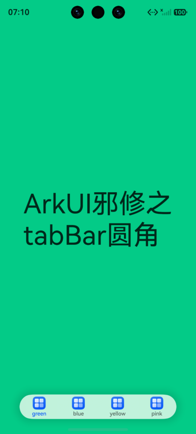
Text("ArkUI邪修之tabBar圆角").fontSize(50)
}.justifyContent(FlexAlign.Center)
.width('100%').height('100%').backgroundColor('#00CB87')
}
.tabBar(BottomTabBarStyle.of($r('app.media.startIcon'), 'green'))
TabContent() {
Column().width('100%').height('100%').backgroundColor('#007DFF')
}.tabBar(BottomTabBarStyle.of($r('app.media.startIcon'), 'blue'))
TabContent() {
Column().width('100%').height('100%').backgroundColor('#FFBF00')
}.tabBar(BottomTabBarStyle.of($r('app.media.startIcon'), 'yellow'))
TabContent() {
Column().width('100%').height('100%').backgroundColor('#E67C92')
}.tabBar(BottomTabBarStyle.of($r('app.media.startIcon'), 'pink'))
}
// .barHeight(0)
.barMode(BarMode.Fixed)
.barOverlap(true)
.barWidth("80%")
.barHeight("160px")
.animationDuration(0)
.scrollable(false)
.width('100%')
.height("100%")
.layoutWeight(1)
.id("tabsId")
.onAppear(() => {
const tabs = this.getUIContext().getAttachedFrameNodeById("tabsId");
const tabBar = tabs?.getChild(2);
if (tabBar) {
const commAttr: ESObject = tabBar.commonAttribute;
commAttr["setNodePtr"](tabBar["nodePtr_"]);
commAttr["border"]({
radius: 30,
// width: 1, //可选
// color: Color.Red //可选
});
commAttr["shadow"](ShadowStyle.OUTER_FLOATING_SM);
}
})
.onTabBarClick((index: number) => {
this.selectedIndex = index;
})
}.width("100%").height("100%")
.backgroundColor(this.bgColors[this.selectedIndex]) //根据实际情况
.expandSafeArea([SafeAreaType.SYSTEM], [SafeAreaEdge.TOP, SafeAreaEdge.BOTTOM])
}
}
更多关于HarmonyOS 鸿蒙Next中tabbar能设置圆角吗?的实战系列教程也可以访问 https://www.itying.com/category-93-b0.html


内置 Tabs 的底部 bar 主要提供位置、宽高、模式等配置,并没有一个稳定公开的 borderRadius API 直接改 TabBar 容器圆角。更稳的做法是隐藏或压低内置 bar,然后自己叠一个自定义 tabbar。
实现思路:
Tabs只负责页面切换,保留TabsController。- 设置
.barHeight(0)或让内置 bar 不参与视觉展示。 - 在外层
Stack底部放一个Row/Stack,自己设置.borderRadius()、背景、模糊、阴影。 - 点击自定义 tab 时调用
controller.changeIndex(index),同时更新selectedIndex。
Stack({ alignContent: Alignment.Bottom }) {
  Tabs({ index: this.selectedIndex, controller: this.controller }) {
    TabContent() { /* page 0 */ }
    TabContent() { /* page 1 */ }
  }
  .barHeight(0)
  .width('100%')
  .height('100%')

  Row() {
    ForEach(this.tabs, (item: string, index: number) => {
      Text(item)
        .layoutWeight(1)
        .textAlign(TextAlign.Center)
        .fontColor(index === this.selectedIndex ? '#ff6f00' : '#666666')
        .onClick(() => {
          this.selectedIndex = index;
          this.controller.changeIndex(index);
        })
    })
  }
  .width('80%')
  .height(64)
  .margin({ bottom: 32 })
  .borderRadius(32)
  .backgroundColor('#ffffffff')
  .shadow(ShadowStyle.OUTER_FLOATING_SM)
}
不建议依赖 getAttachedFrameNodeById() 去改内部节点样式,这属于实现细节,版本升级后容易失效。业务里要稳定上线,优先自定义 tabbar。


鸿蒙Next的TabBar组件(如Tabs、BottomTabBar)本身没有直接提供圆角属性。可通过自定义Builder实现:使用Stack包裹每个Tab项,设置borderRadius;或利用Shape裁剪容器边缘实现圆角外观。
系统Tabs的默认bar不支持直接设置borderRadius圆角。你可以通过**自定义tabBar**来实现圆角样式:
- 隐藏默认
bar:设置.barHeight(0)。 - 在
TabContent的.tabBar属性里传入自定义构建器,构建一个带圆角的容器并绑定切换逻辑。
精简示例:
@Builder
customTabBar(text: string, index: number) {
  Text(text)
    .textAlign(TextAlign.Center)
    .width('100%')
    .height(48)
    .backgroundColor(this.currentIndex === index ? '#FF6F00' : Color.Gray)
    .borderRadius(24)
    .onClick(() => {
      this.currentIndex = index
      this.tabsController.changeIndex(index)
    })
}

build() {
  Tabs({ barPosition: BarPosition.End, controller: this.tabsController }) {
    TabContent() { /* 内容 */ }
      .tabBar(this.customTabBar('首页', 0))
    TabContent() { /* 内容 */ }
      .tabBar(this.customTabBar('发现', 1))
    // ...更多TabContent
  }
  .barHeight(0)
  .barMode(BarMode.Fixed)
}
这样即可让每个tab项拥有独立圆角,整体tabbar也能呈现圆角效果。