


HarmonyOS鸿蒙Next中Guage自定义indicator问题
HarmonyOS鸿蒙Next中Guage自定义indicator问题
Gauge({ value: 50, min: 0, max: 100 }) {
Text("测试")
.fontSize($r('[resource_library].float.float_14'))
.fontWeight(600)
.fontColor($r('[resource_library].color.color_FA2924_FFADAD'))
.textAlign(TextAlign.Center)
}
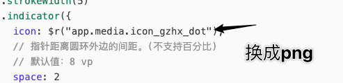
.strokeWidth(5)
.indicator({
icon: $r("app.media.icon_gzhx_dot"),
// 指针距离圆环外边的间距。(不支持百分比)
// 默认值:8 vp
space: 2
})
.startAngle(-135)
.endAngle(135)
.trackShadow(null)
// 空的就行
.description(this.descriptionBuilder)
.colors(new LinearGradient([
{ color: '#FF6506', offset: 0 },
{ color: '#FF0000', offset: 1 }
]))
.strokeWidth(8)
.width(62)
.height(62)
指示器使用如下
效果如下
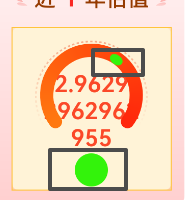
2个框,上边框是变成椭圆了似的.下边框是同一份资源在image的呈现.
更多关于HarmonyOS鸿蒙Next中Guage自定义indicator问题的实战教程也可以访问 https://www.itying.com/category-93-b0.html

你的 SVG 是一个10*10的正方形,半径是5本身是完美的正圆。但Gauge 在渲染 indicator 时,不会保持原始宽高比,而是把图标塞进一个内部的矩形区域里强制填满。
你换成 PNG 格式的正圆图片试一下
如果一定要使用svg 的话 ,我记得svg 可以设置比例的 宽高比例固定一下可以试试 这个我没搞过
还有一个方案你可以使用绝对定位来解决, 但是缺点是 需要精密的控制位置
如有帮助给个采纳谢谢
更多关于HarmonyOS鸿蒙Next中Guage自定义indicator问题的实战系列教程也可以访问 https://www.itying.com/category-93-b0.html


这个indicator需要SVG格式有些要求,最好用SVG2标准。你试试这个。
SVG数据:
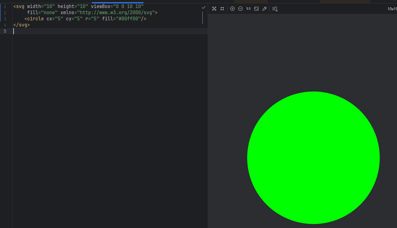
<svg xmlns="http://www.w3.org/2000/svg" fill="none" viewBox="0 0 24 24" stroke-width="1.5" stroke="currentColor" class="size-6">
  <path stroke-linecap="round" fill='red' stroke-linejoin="round" d="m11.25 9-3 3m0 0 3 3m-3-3h7.5M21 12a9 9 0 1 1-18 0 9 9 0 0 1 18 0Z" />
</svg>
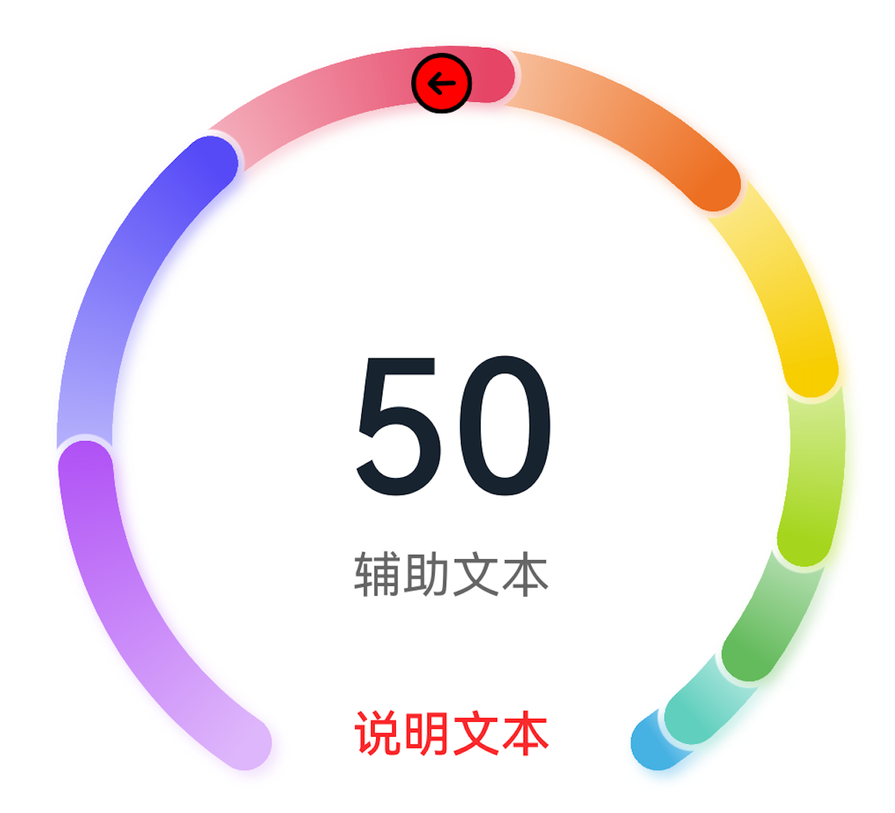
Gauge({ value: 50, min: 1, max: 100 }) {
        Column() {
          Text('50')
            .fontWeight(FontWeight.Medium)
            .width('62%')
            .fontColor('#ff182431')
            .maxFontSize('60.0vp')
            .minFontSize('30.0vp')
            .textAlign(TextAlign.Center)
            .margin({ top: '35%' })
            .textOverflow({ overflow: TextOverflow.Ellipsis })
            .maxLines(1)
          Text('辅助文本')
            .maxFontSize('16.0fp')
            .minFontSize('10.0vp')
            .fontColor($r('sys.color.ohos_id_color_text_secondary'))
            .fontWeight(FontWeight.Regular)
            .width('67.4%')
            .height('9.5%')
            .textAlign(TextAlign.Center)
        }.width('100%').height('100%')
      }
      .indicator({icon:$r('app.media.icon_dot'), space:0})
      .value(50)
      .startAngle(210)
      .endAngle(150)
      .colors([[new LinearGradient([{ color: '#deb6fb', offset: 0 }, { color: '#ac49f5', offset: 1 }]), 9],
        [new LinearGradient([{ color: '#bbb7fc', offset: 0 }, { color: '#564af7', offset: 1 }]), 8],
        [new LinearGradient([{ color: '#f5b5c2', offset: 0 }, { color: '#e64566', offset: 1 }]), 7],
        [new LinearGradient([{ color: '#f8c5a6', offset: 0 }, { color: '#ed6f21', offset: 1 }]), 6],
        [new LinearGradient([{ color: '#fceb99', offset: 0 }, { color: '#f7ce00', offset: 1 }]), 5],
        [new LinearGradient([{ color: '#dbefa5', offset: 0 }, { color: '#a5d61d', offset: 1 }]), 4],
        [new LinearGradient([{ color: '#c1e4be', offset: 0 }, { color: '#64bb5c', offset: 1 }]), 3],
        [new LinearGradient([{ color: '#c0ece5', offset: 0 }, { color: '#61cfbe', offset: 1 }]), 2],
        [new LinearGradient([{ color: '#b5e0f4', offset: 0 }, { color: '#46b1e3', offset: 1 }]), 1]])
      .width('80%')
      .height('80%')
      .strokeWidth(18)
      .trackShadow({ radius: 7, offsetX: 7, offsetY: 7 })
      .description(this.descriptionBuilder)
      .padding(18)
分享给你个高质量SVG,《Heroicons》。

在HarmonyOS Next中,Gauge组件的indicator可通过GaugeOptions的indicator属性自定义,类型为IndicatorOptions。使用IndicatorOptions.builder回调中的Canvas API绘制自定义图形,如指针、弧线等。确保在build方法中调用Canvas绘制。
在 Gauge 组件的 indicator 中使用 icon 仅传入图片资源时,系统会根据指示器的计算区域缩放该图标,且不会保持图片的原始宽高比,因此会出现你看到的上边框“椭圆”拉伸变形。而在普通 Image 组件中默认保持比例,所以显示正常。
修复方法:改用 indicator 的 content 属性自定义指示器内容,通过 Image 组件并设置 objectFit(ImageFit.Contain) 或明确宽高来维持原始比例。示例:
.indicator({
  content: () => {
    Image($r("app.media.icon_gzhx_dot"))
      .width(16).height(16) // 按原始比例设定尺寸
      .objectFit(ImageFit.Contain)
  },
  space: 2
})
这样就可以避免图标因内部缩放而变形。