


HarmonyOS鸿蒙Next中华为音乐的底部Tabs和MiniPlayer怎么实现的
HarmonyOS鸿蒙Next中华为音乐的底部Tabs和MiniPlayer怎么实现的 我好像没找到自定义组件能使用沉浸光感,没有思路现在

更多关于HarmonyOS鸿蒙Next中华为音乐的底部Tabs和MiniPlayer怎么实现的的实战系列教程也可以访问 https://www.itying.com/category-93-b0.html


HarmonyOS 沉浸式底部Tabs和MiniPlayer实现指南
在鸿蒙应用(API 23+ / HarmonyOS 6.1+,无权限的话需提工单申请权限API 23权限)中实现类似华为音乐的底部Tabs和MiniPlayer的沉浸光感效果,需综合运用ArkUI声明式开发范式和HDS材质能力,以下是经过验证的正确实现方案:
效果预览
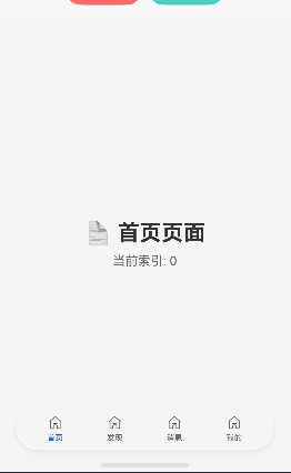
上图展示了使用 HdsTabs + barFloatingStyle 实现的悬浮毛玻璃效果,TabBar 带有半透明背景和圆角,内容可延伸到TabBar下方。
一、沉浸式底部Tabs实现方案
1. 核心原理
- 使用
HdsTabs组件 +barFloatingStyle配置 - 关键点:通过
systemMaterialEffect设置自适应材质,实现毛玻璃悬浮效果
2. 完整代码示例
import { HdsTabs, HdsTabsController } from '@kit.UIDesignKit'
import { hdsMaterial } from '@hms.hds.hdsMaterial'

interface TabItem {
  icon: Resource
  text: string
  index: number
}

@Component
export struct GlassmorphismTabBar {
  private controller: HdsTabsController = new HdsTabsController()
  @State currentIndex: number = 0
  private tabItems: TabItem[] = [
    { icon: $r('app.media.public_home_normal'), text: '首页', index: 0 },
    { icon: $r('app.media.public_home_normal'), text: '发现', index: 1 },
    { icon: $r('app.media.public_home_normal'), text: '消息', index: 2 },
    { icon: $r('app.media.public_home_normal'), text: '我的', index: 3 }
  ]

  build() {
    HdsTabs({ controller: this.controller, index: this.currentIndex }) {
      ForEach(this.tabItems, (item: TabItem) => {
        TabContent() {
          // 页面内容
          Column() {
            Text(`${item.text}页面`)
              .fontSize(24)
          }
          .width('100%')
          .height('100%')
          .justifyContent(FlexAlign.Center)
        }
        .tabBar(new BottomTabBarStyle(item.icon, item.text))
      }, (item: TabItem) => item.index.toString())
    }
    .barOverlap(true)  // 允许内容延伸到TabBar底部
    .barPosition(BarPosition.End)
    // 核心:开启悬浮样式 + 自适应材质(毛玻璃效果)
    .barFloatingStyle({
      barBottomMargin: 28,  // 底部间距(适配安全区)
      systemMaterialEffect: {
        materialType: hdsMaterial.MaterialType.ADAPTIVE,  // 自适应材质
        materialLevel: hdsMaterial.MaterialLevel.EXQUISITE // 精致级别(最强毛玻璃)
      }
    })
    .vertical(false)
    .onChange((index: number) => {
      this.currentIndex = index
    })
    .width('100%')
    .height('100%')
  }
}
3. 关键配置说明
barFloatingStyle 参数
- barBottomMargin: 底部间距,建议 28vp 适配安全区
- systemMaterialEffect:
materialType: 材质类型(ADAPTIVE 自适应)materialLevel: 材质等级- EXQUISITE - 精致级(最强毛玻璃,推荐✨)
- GENTLE - 温和级
- SMOOTH - 平滑级
BottomTabBarStyle 用法
// 正确:直接使用,无需导入
.tabBar(new BottomTabBarStyle(icon, text))
// 不需要从任何模块导入 BottomTabBarStyle
4. 注意事项
- BottomTabBarStyle 是全局类,不需要导入
- 图标资源可以使用:
- 系统Symbol:
$r('sys.symbol.xxx') - 系统媒体:
$r('sys.media.xxx') - 应用资源:
$r('app.media.xxx')
- 系统Symbol:
- 必须使用 HdsTabs,普通 Tabs 不支持此特性
- API版本要求:需要 API 23+ / HarmonyOS 6.1+
二、MiniPlayer悬浮控件实现
1. MiniPlayer组件代码
import { hdsMaterial } from '@hms.hds.hdsMaterial'

@Component
export struct MiniPlayer {
  @State isPlaying: boolean = false
  @State currentProgress: number = 0
  @State musicTitle: string = '歌曲名称'

  build() {
    Column() {
      Row() {
        // 左侧:专辑封面
        Image($r('app.media.public_home_normal'))
          .width(40)
          .height(40)
          .borderRadius(4)
          .margin({ right: 12 })
        // 中间:歌曲信息 + 进度条
        Column({ space: 4 }) {
          Row() {
            Text(this.musicTitle)
              .fontSize(14)
              .fontColor('#333333')
              .fontWeight(FontWeight.Medium)
              .maxLines(1)
              .textOverflow({ overflow: TextOverflow.Ellipsis })
              .layoutWeight(1)
          }

          // 进度条
          Slider({ value: this.currentProgress, min: 0, max: 100 })
            .layoutWeight(1)
            .trackThickness(3)
            .selectedColor('#007DFF')
            .blockColor('#007DFF')
        }
        .layoutWeight(1)
        .margin({ right: 12 })
        // 右侧:播放/暂停按钮
        SymbolGlyph(this.isPlaying
          ? $r('sys.symbol.pause_fill')
          : $r('sys.symbol.play_fill'))
          .fontSize(24)
          .fontColor(['#333333'])
      }
      .width('100%')
      .padding({ left: 16, right: 16, top: 8, bottom: 8 })
      // 使用HDS材质效果实现毛玻璃光感
      .backgroundBlurStyle(BlurStyle.Thick, {
        colorMode: ThemeColorMode.LIGHT,
        adaptiveColor: AdaptiveColor.DEFAULT,
        scale: 1.0
      })
      .backgroundColor(Color.Transparent)
      .borderRadius(12)
      .shadow({
        radius: 8,
        color: 'rgba(0, 0, 0, 0.1)',
        offsetX: 0,
        offsetY: -2
      })
    }
    .width('100%')
    .padding({ bottom: 28 }) // 底部安全区间距
  }
}
2. 布局方案
Column() {
  // 主内容区(可滚动)
  Scroll() { ... }

  // MiniPlayer 悬浮播放控件(使用HDS光感)
  MiniPlayer()
    .width('100%')
    .padding({ left: 12, right: 12, top: 8, bottom: 0 })

  // 毛玻璃TabBar
  GlassmorphismTabBar()
    .layoutWeight(1)
}
3. 特性说明
- HDS光感材质:使用
.backgroundBlurStyle(BlurStyle.Thick)替代简单半透明,实现真实模糊背景 - 视觉统一:与 TabBar 采用相同的光感技术,确保整体风格一致性
- 圆角设计:
borderRadius(12)提升视觉体验 - 阴影效果:
shadow增强悬浮感 - 安全区适配:
padding({ bottom: 28 })适配底部安全区
三、完整实现路径
1. 项目结构
entry/src/main/ets/
├── views/
│   ├── GlassmorphismTabBar.ets    # 毛玻璃TabBar组件
│   ├── ImmersiveTabBar.ets        # 基础TabBar组件
│   └── MiniPlayer.ets             # 光感悬浮播放控件
└── pages/
    ├── GlassTabPage.ets           # 毛玻璃示例页面(含MiniPlayer)
    └── ImmersiveTabPage.ets       # 基础示例页面
2. 使用步骤
a. 创建 TabBar 组件(参考 GlassmorphismTabBar.ets) b. 在页面中引入
{ GlassmorphismTabBar } from '../views/GlassmorphismTabBar'

@Entry
@Component
struct MyPage {
  build() {
    Column() {
      // 页面内容
      GlassmorphismTabBar()
        .layoutWeight(1)
    }
  }
}

既然有人已经告知如何使用miniBar了,我可以提供另一个思路来实现所有组件的沉浸式光感,方案是把HdsTabs封装成一个公共组件,内容为空,只实现tabBar看下我实现的一个界面,一种曲线救国的方式。代码:
import { HdsTabs } from "@hms.hds.hdsBaseComponent"
import { hdsMaterial } from "@kit.UIDesignKit"

@ComponentV2
export struct AreaWithHdsTabBar {

  @BuilderParam @Require content: () => void
  @Param @Require barHeight: number
  @Param @Require barWidth: number


  build() {
    HdsTabs() {
      TabContent() {
      }
      .tabBar(this.content)
    }
    // 这里HdaTabs的宽高要比tabBar多出一些距离,否则在拖动变形的时候会截断
    .width(this.barWidth+10)
    .height(this.barHeight+20)
    .barOverlap(true)
    .barPosition(BarPosition.End)
    .vertical(false)
    .barHeight(this.barHeight)
    .barWidth(this.barWidth)
    .barFloatingStyle({
      systemMaterialEffect: {
        materialType: hdsMaterial.MaterialType.IMMERSIVE,
        materialLevel: hdsMaterial.MaterialLevel.EXQUISITE
      },
      barBottomMargin: 10,
      gradientMask: { maskColor: '#00000000', maskHeight: 20 },
    })
  }
}
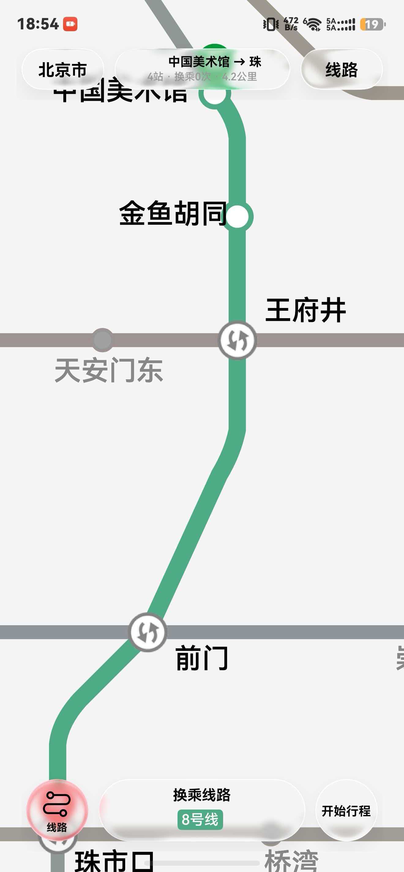
效果图:
视频效果可以看我B站视频:

分享下实现思路,底部Tabs可以直接用ArkUI的Tabs组件快速搭建,也可以用Stack+自定义Row实现带毛玻璃效果的沉浸式导航栏,通过backgroundBlurStyle配合半透明背景就能模拟出类似的沉浸光感;MiniPlayer建议放在Stack中置于Tabs上层实现页面内悬浮,需要跨页面全局显示的话可以用子窗口实现,同时记得用expandSafeArea适配底部安全区,模糊效果建议控制使用范围,避免影响性能。

在HarmonyOS NEXT中,华为音乐的底部Tabs通过Tabs + TabContent组件实现,配合barWidth、barHeight等属性控制样式。MiniPlayer使用Stack布局将播放器组件固定到底部,并叠加在页面内容之上。通过offset或position属性调节位置,利用状态管理控制显示/隐藏。

在鸿蒙 Next 中,华为音乐底部 Tabs 和 MiniPlayer 的沉浸光感(即内容延伸至系统导航栏背后),核心是窗口沉浸式设置加上组件自身对安全区的适配,并非依赖某个“沉浸光感组件”。
实现思路:
- 窗口全局沉浸:在
onWindowStageCreate中通过window.setSystemBarProperties设置导航栏透明、不隐藏,并设置状态栏/导航栏图标反色(根据背景深浅),这样系统 UI 就透出底层内容。 - 页面根布局铺满:页面的根容器设置
expandSafeArea([SafeAreaType.SYSTEM], [SafeAreaEdge.BOTTOM]),让内容绘制延伸到导航栏区域。 - 底部布局的安全偏移:Tabs 组件本身可通过
barPosition放在底部,再为其底部内边距或高度额外增加导航栏高度(例如bottomPadding: 34vp)以保证内容不被导航栏遮挡。MiniPlayer 作为一个绝对定位/固定在底部的自定义组件,同理设置offset或bottom时需加上安全区高度。 - 遮罩或渐变:若需要“光感”背景,可在底部组件上方添加一层渐变透明遮罩,或使用模糊效果 (
blur),让下方内容产生沉浸感。
这样,自定义组件虽没有内置的“沉浸光感”开关,但通过主动适配窗口沉浸与安全区,就能实现和华为音乐一样的底部 Tabs + MiniPlayer 效果。