


HarmonyOS 鸿蒙Next中列表渐隐效果
HarmonyOS 鸿蒙Next中列表渐隐效果 请问fadingEdge的默认渐隐效果如何通过linearGradient实现单边效果

开发者你好,可以使用linearGradient颜色渐变和overlay来实现,实现思路以及示例demo可以参考:
- 创建可滚动的主页面。
- 利用颜色渐变通用属性,创建两端渐隐的自定义组件。
- 通过overlay通用属性,设置子组件为遮罩层。
@Entry
@Component
struct FadingEdge {
  private textArray: number[] = [];
  // 渐变起始和终止颜色
  @State linearGradientBegin1Color: string = Const.BEGIN_COLOR;
  @State linearGradientEnd1Color: string = Const.END_COLOR;

  @State linearGradientBegin2Color: string = Const.BEGIN_COLOR;
  @State linearGradientEnd2Color: string = Const.END_COLOR;

  aboutToAppear(): void {
    for (let i = 0; i < Const.ITEM_COUNT; i++) {
      this.textArray.push(i);
    }
  }

  build() {
    Column({ space: Const.ROOT_GAP }) {
      // 主体
      List({ space: Const.EXAMPLE_IMAGE_GAP }) {
        ForEach(this.textArray, () => {
          ListItem() {
            // 图片示例,需要替换为实际资源值
            Image($r('app.media.fadingedge_example1'))
              .width(200)
              .height(120)
              .borderRadius(8);
          };
        }, (item: number) => item.toString());
      }
      .listDirection(Axis.Horizontal)
      .width('100%')
      .height(120)
      .overlay(this.fadingOverlay())
      .edgeEffect(EdgeEffect.None)
      .scrollBar(BarState.Off)
      .onScrollStart(()=>{
        this.linearGradientBegin1Color = Const.END_COLOR;
        this.linearGradientEnd1Color = Const.BEGIN_COLOR;

        this.linearGradientBegin2Color = Const.BEGIN_COLOR;
        this.linearGradientEnd2Color = Const.END_COLOR;
      })
      .onReachStart(() => {
        this.linearGradientBegin1Color = Const.BEGIN_COLOR;
        this.linearGradientEnd1Color = Const.BEGIN_COLOR;

        this.linearGradientBegin2Color = Const.BEGIN_COLOR;
        this.linearGradientEnd2Color = Const.END_COLOR;
      })
      .onReachEnd(() => {
        this.linearGradientBegin1Color = Const.END_COLOR;
        this.linearGradientEnd1Color = Const.BEGIN_COLOR;

        this.linearGradientBegin2Color = Const.BEGIN_COLOR;
        this.linearGradientEnd2Color = Const.BEGIN_COLOR;
      });
    }
    .width('100%')
    .height('100%')
    .padding(10);
  }

  // 浮层组件
  @Builder
  fadingOverlay() {
    Column()
      .width("100%")
      .height(120)
      // TODO: 知识点: linearGradient 可以设置指定范围内的颜色渐变效果
      .linearGradient({
        angle: Const.OVERLAY_LINEAR_GRADIENT_ANGLE,
        colors: [
          [this.linearGradientBegin1Color, Const.OVERLAY_LINEAR_GRADIENT_COLOR_POS[0]],
          [this.linearGradientEnd1Color, Const.OVERLAY_LINEAR_GRADIENT_COLOR_POS[1]],
          [this.linearGradientBegin2Color, Const.OVERLAY_LINEAR_GRADIENT_COLOR_POS[2]],
          [this.linearGradientEnd2Color, Const.OVERLAY_LINEAR_GRADIENT_COLOR_POS[3]],
        ]
      })
      .animation({
        curve: Curve.Ease,
        duration: Const.DURATION
      })
      .hitTestBehavior(HitTestMode.Transparent);
  }
}

class Const {
  // 示例图片间距
  public static readonly EXAMPLE_IMAGE_GAP: number = 10;
  // 示例图片数量
  public static readonly ITEM_COUNT: number = 6;
  // 动画时长
  public static readonly DURATION: number = 220;
  // 边缘渐变起始和终止颜色
  public static readonly BEGIN_COLOR: string = '#00ffffff';
  public static readonly END_COLOR: string = '#ffffffff';
  // 根容器组件默认间距
  public static readonly ROOT_GAP: number = 20;
  // 顶部菜单栏间距
  public static readonly MENU_ITEM_SPACE: number = 5;
  // 顶部菜单栏Item中文字与图片间距
  public static readonly MENU_ITEM_COL_SPACE: number = 5;
  // 渐变角度
  public static readonly OVERLAY_LINEAR_GRADIENT_ANGLE: number = 90;
  // 渐变颜色位置
  public static readonly OVERLAY_LINEAR_GRADIENT_COLOR_POS: number[] = [0.0, 0.15, 0.85, 1.0];
  // tosat提示框持续时间
  public static readonly PROMPT_TOAST_DURATION: number = 1200;
}
更多关于HarmonyOS 鸿蒙Next中列表渐隐效果的实战系列教程也可以访问 https://www.itying.com/category-93-b0.html

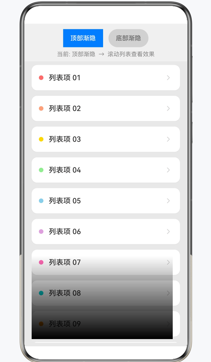
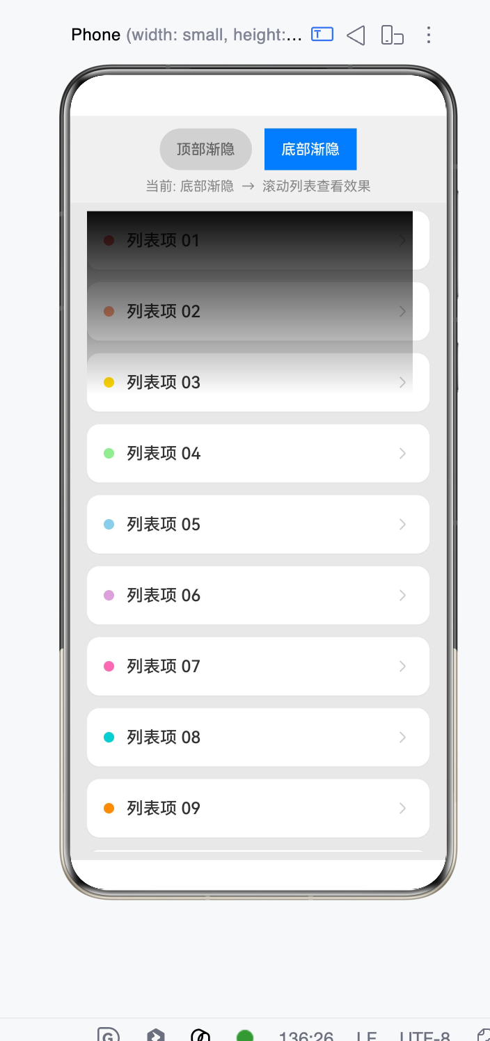
效果如图,代码在最下面,如有帮助给个采纳谢谢
interface listsPa{ label: string; bgColor: string }
@Entry
@Component
struct FadingEdgeListPage {
  @State fadeDirection: GradientDirection = GradientDirection.Bottom; // 渐隐方向
  @State fadeLabel: string = '底部渐隐';                                // 按钮文案

  // 背景色(渐变终点色需与此保持一致)
  private readonly BG_COLOR: string = '#E8E8E8';
  private readonly ITEM_BG: string = '#FFFFFF';

  // 更多数据确保滚动体验
  private dataList: listsPa[] = [
    { label: '列表项 01', bgColor: '#FF6B6B' },
    { label: '列表项 02', bgColor: '#FFA07A' },
    { label: '列表项 03', bgColor: '#FFD700' },
    { label: '列表项 04', bgColor: '#90EE90' },
    { label: '列表项 05', bgColor: '#87CEEB' },
    { label: '列表项 06', bgColor: '#DDA0DD' },
    { label: '列表项 07', bgColor: '#FF69B4' },
    { label: '列表项 08', bgColor: '#00CED1' },
    { label: '列表项 09', bgColor: '#FF8C00' },
    { label: '列表项 10', bgColor: '#9370DB' },
    { label: '列表项 11', bgColor: '#3CB371' },
    { label: '列表项 12', bgColor: '#CD853F' },
    { label: '列表项 13', bgColor: '#BA55D3' },
    { label: '列表项 14', bgColor: '#20B2AA' },
    { label: '列表项 15', bgColor: '#FF6347' },
    { label: '列表项 16', bgColor: '#4682B4' },
    { label: '列表项 17', bgColor: '#DB7093' },
    { label: '列表项 18', bgColor: '#32CD32' },
    { label: '列表项 19', bgColor: '#FF4500' },
    { label: '列表项 20', bgColor: '#8A2BE2' },
  ];

  /**
   * 构建渐变遮罩 Builder
   *
   * 渐变逻辑:
   * - 起始 0%:完全透明 => DST_IN 下内容不可见(被裁剪)
   * - 终点 30%:完全填充背景色 => DST_IN 下内容完全可见
   * - 30%~100%:保持完全填充(中间以下的内容正常显示)
   */
  @Builder
  fadeMask() {
    Stack()
      .width('100%')
      .height('100%')
      .linearGradient({
        direction: this.fadeDirection,
        colors: [
          ['#00' + this.BG_COLOR.slice(1), 0.0],          // 0%处完全透明
          [this.BG_COLOR, 0.3],                             // 30%处完全遮挡
        ]
      })
      // 关键:DST_IN 保留目标在源有 alpha 处的像素
      .blendMode(BlendMode.DST_IN, BlendApplyType.OFFSCREEN)
      .hitTestBehavior(HitTestMode.None)                    // 穿透触摸事件
  }

  build() {
    Column() {
      // 顶部切换按钮
      Row() {
        Button('顶部渐隐')
          .type(this.fadeDirection === GradientDirection.Top ? ButtonType.Normal : ButtonType.Capsule)
          .backgroundColor(this.fadeDirection === GradientDirection.Top ? '#007AFF' : '#D1D1D1')
          .fontColor(this.fadeDirection === GradientDirection.Top ? Color.White : '#666')
          .fontSize(14)
          .onClick(() => {
            this.fadeDirection = GradientDirection.Top;
            this.fadeLabel = '顶部渐隐';
          })

        Button('底部渐隐')
          .type(this.fadeDirection === GradientDirection.Bottom ? ButtonType.Normal : ButtonType.Capsule)
          .backgroundColor(this.fadeDirection === GradientDirection.Bottom ? '#007AFF' : '#D1D1D1')
          .fontColor(this.fadeDirection === GradientDirection.Bottom ? Color.White : '#666')
          .fontSize(14)
          .margin({ left: 12 })
          .onClick(() => {
            this.fadeDirection = GradientDirection.Bottom;
            this.fadeLabel = '底部渐隐';
          })
      }
      .width('100%')
      .justifyContent(FlexAlign.Center)
      .padding({ top: 12, bottom: 8 })
      .backgroundColor('#F0F0F0')

      // 提示文字
      Text(`当前: ${this.fadeLabel}  →  滚动列表查看效果`)
        .fontSize(13)
        .fontColor('#888')
        .width('100%')
        .textAlign(TextAlign.Center)
        .padding({ bottom: 8 })
        .backgroundColor('#F0F0F0')

      // 核心区域:List + 渐变遮罩 overlay
      List({ space: 12 }) {
        ForEach(this.dataList, (item:listsPa, index: number) => {
          ListItem() {
            Row() {
              // 左侧色块
              Circle({ width: 10, height: 10 })
                .fill(item.bgColor)
                .margin({ right: 12 })

              Text(item.label)
                .fontSize(16)
                .fontWeight(FontWeight.Medium)
                .fontColor('#333')

              Blank()

              Image($r('sys.media.ohos_ic_public_arrow_right'))
                .width(20)
                .height(20)
                .fillColor('#CCC')
            }
            .width('100%')
            .height(56)
            .padding({ left: 16, right: 16 })
            .borderRadius(12)
            .backgroundColor(this.ITEM_BG)
            .shadow({
              radius: 4,
              color: '#10000000',
              offsetY: 1
            })
          }
          .onClick(() => {
            console.log('fadingEdge item clicked: ' + item.label);
          })
        }, (_item:listsPa, index: number) => index.toString())
      }
      .width('100%')
      .layoutWeight(1)
      .padding({ left: 16, right: 16, top: 8, bottom: 8 })
      .scrollBar(BarState.Off)
      .edgeEffect(EdgeEffect.Spring)
      // 渐变遮罩通过 overlay 叠加到 List 上
      .overlay(this.fadeMask)
    }
    .width('100%')
    .height('100%')
    .backgroundColor(this.BG_COLOR)
  }
}

List.fadingEdge(true) 的效果本质上是:
- 内容正常显示
- 靠近边缘区域透明度逐渐变为 0
- 是一个 Alpha Mask(透明度渐变)
- 不是颜色渐变
如果想用 linearGradient 自己实现类似效果,通常需要在 List 上方或下方叠加一个渐变层。
例如实现顶部单边渐隐:
Stack() {
  List() {
    // 列表内容
  }
  .width('100%')
  .height('100%')

  // 顶部渐隐层
  Column()
    .width('100%')
    .height(40)
    .linearGradient({
      direction: GradientDirection.Bottom,
      colors: [
        ['#FFFFFFFF', 0],
        ['#00FFFFFF', 1]
      ]
    })
}
底部单边渐隐
Stack() {
  List() {
  }
  .width('100%')
  .height('100%')

  Column()
    .width('100%')
    .height(40)
    .align(Alignment.Bottom)
    .linearGradient({
      direction: GradientDirection.Top,
      colors: [
        ['#FFFFFFFF', 0],
        ['#00FFFFFF', 1]
      ]
    })
}
如果背景色不是白色
很多人容易写:
'#FFFFFF'
实际上应该使用页面背景色:
例如页面背景:
.backgroundColor('#F1F3F5')
则:
.linearGradient({
  direction: GradientDirection.Bottom,
  colors: [
    ['#F1F3F5', 0],
    ['#00F1F3F5', 1]
  ]
})
否则渐隐区域会出现明显色块。
更接近系统 fadingEdge 的实现
系统 fadingEdge 的渐隐长度大约在:
24vp ~ 48vp
比较自然的是:
.height(32)
渐变:
.linearGradient({
  direction: GradientDirection.Bottom,
  colors: [
    ['rgba(255,255,255,1)', 0],
    ['rgba(255,255,255,0.8)', 0.2],
    ['rgba(255,255,255,0)', 1]
  ]
})
这样比简单两段渐变更接近系统效果。
如果要完全模拟 List.fadingEdge
仅靠 linearGradient 无法做到 100% 一致。
因为系统的:
.fadingEdge(true)
是对 List 内容做 Alpha Mask,内容本身会逐渐透明;
而 linearGradient 是覆盖一层渐变色,本质是:
内容 + 半透明遮罩
两者渲染机制不同。
如果只是视觉效果,推荐:
Stack
 ├─ List
 └─ Gradient Overlay
这是目前 HarmonyOS NEXT 中最接近且性能最好的单边渐隐实现方案。
单边渐隐建议用“列表外层 Stack + 渐变遮罩”,不要逐项改 ListItem.opacity。比如只做底部渐隐:
Stack({ alignContent: Alignment.Bottom }) {
  List() {
    ForEach(this.data, item => { ListItem() { Text(item) } })
  }
  Row()
    .height(32).width('100%')
    .linearGradient({
      direction: GradientDirection.Bottom,
      colors: [['#00FFFFFF', 0.0], ['#FFFFFFFF', 1.0]]
    })
    .hitTestBehavior(HitTestMode.Transparent)
}
如果背景不是白色,把第二个颜色换成页面背景色;顶部渐隐就把遮罩对齐到 Alignment.Top,并把渐变方向反过来。参考来源:官方《颜色渐变》《触摸测试控制》。

找HarmonyOS工作还需要会Flutter的哦,有需要Flutter教程的可以学学大地老师的教程,很不错,B站免费学的哦:https://www.bilibili.com/video/BV1S4411E7LY/?p=17,

可以试下这个
@Entry
@Component
struct TestPage {
    private arr: number[] = [0, 1, 2, 3, 4, 5, 6, 7, 8, 9];

    @Builder
    testBuild() {
        Stack()
            .width('100%')
            .height('100%')
            .linearGradient({
                direction: GradientDirection.Bottom,
                colors: [['#00FFFFFF', 0.0], ['#FFFFFFFF', 0.1]]
            })
            .blendMode(BlendMode.DST_IN, BlendApplyType.OFFSCREEN)
            .hitTestBehavior(HitTestMode.None)
    }

    build() {
        Column() {
            List({ space: 20, initialIndex: 0 }) {
                ForEach(this.arr, (item: number) => {
                    ListItem() {
                        Text(item.toString())
                            .width('100%')
                            .height(100)
                            .fontSize(16)
                            .textAlign(TextAlign.Center)
                            .borderRadius(10)
                            .backgroundColor(0xFFFFFF)
                    }
                    .onClick(() => {
                        console.log('item clicked: ' + item);
                    })
                }, (item: number) => item.toString())
            }
            .width('90%')
            .height('100%')
            .scrollBar(BarState.Off)
            .overlay(this.testBuild())
        }
        .width('100%')
        .backgroundColor(0xDCDCDC)
    }
}

鸿蒙原生fadingEdge属性虽能快速实现边缘渐隐,但存在致命局限:它强制使用黑色作为渐隐色,无法与非黑色背景自然融合,且不支持动态控制渐隐的显示与隐藏,在复杂UI场景下体验极差。很多开发者为了适配白色背景不得不放弃原生方案,转而寻找更灵活的自定义实现。通过LinearGradient线性渐变结合遮罩的方式,可以完美复刻原生渐隐效果,同时实现完全可控的单边渐隐,满足绝大多数业务需求。
核心原理基于鸿蒙的遮罩机制和BlendMode.DstOut混合模式。遮罩的作用是决定容器内哪些区域可见、哪些区域不可见;而DstOut混合模式的特性是,遮罩中不透明的区域会清除下方的原始内容,透明区域则完整保留原始内容。这与原生fadingEdge的底层原理完全一致,但我们可以自由控制渐变的所有参数。利用这一特性,我们只需让遮罩的主体部分保持全透明(保留中间所有内容),仅在需要渐隐的单边绘制一条线性渐变,就能实现内容从完全可见到完全消失的平滑过渡。
具体实现逻辑:创建一个通用容器组件,用于包裹需要添加渐隐效果的任意内容。给这个容器添加一个自定义遮罩层,遮罩层由两部分组成:第一层是铺满整个容器的全透明矩形,确保容器中间的内容完全显示;第二层是仅覆盖目标边缘的渐变矩形,这个矩形的尺寸由渐隐长度决定,方向由目标边决定。
四个不同方向的单边渐隐,渐变参数有明确对应:顶部渐隐时,渐变方向从上到下,颜色从背景色过渡到透明,高度等于渐隐长度,宽度铺满容器;底部渐隐时,渐变方向改为从下到上,矩形定位在容器底部;左侧渐隐时,渐变方向从左到右,宽度等于渐隐长度,高度铺满容器;右侧渐隐时,渐变方向从右到左,矩形定位在容器右侧。
关键参数中,渐隐长度决定了过渡效果的柔和程度,通常设置在16vp到32vp之间,过短会显得生硬,过长则会影响内容显示。渐隐颜色是实现自然效果的核心,必须将其设置为与容器父背景完全一致的颜色,这样内容看起来就像是自然融入了背景中,而不是被黑色覆盖,这也是自定义方案相比原生最大的优势之一。
实际开发中最常用的场景是给可滚动组件添加渐隐效果。此时可以给Scroll或List组件添加滚动监听,当内容可以向上滚动时显示顶部渐隐,当内容可以向下滚动时显示底部渐隐,滚动到边界时自动隐藏对应边的渐隐,这样能给用户更清晰的滚动提示。


在 HarmonyOS NEXT 中,列表渐隐效果可通过 List 组件的 edgeEffect 属性实现,设置 EdgeEffect.FADE 即可在列表边缘产生渐隐。若需要自定义渐隐,可在 onScrollIndex 回调中根据滚动位置动态修改 ListItem 的 opacity,配合 animateTo 实现平滑动画。
在 HarmonyOS Next 中,List 组件的 fadingEdge 属性默认提供上下两侧的渐隐效果。若想通过 linearGradient 仅实现单边(如下边缘)渐隐,可以在列表上层覆盖一个固定高度的渐变遮罩,利用从透明到背景色的线性渐变模拟边缘淡出。
@Entry
@Component
struct SingleFadingEdgeDemo {
  @State message: string[] = new Array(20).fill('').map((_, i) => `Item ${i + 1}`);
  build() {
    Stack({ alignContent: Alignment.Bottom }) {
      // 列表主体
      List() {
        ForEach(this.message, (item: string) => {
          ListItem() {
            Text(item)
              .width('100%')
              .height(60)
              .textAlign(TextAlign.Center)
          }
        })
      }
      .width('100%')
      .height('100%')

      // 底部单边渐隐遮罩
      Column()
        .width('100%')
        .height(40)  // 渐隐区域高度,与 fadingEdgeLength 一致
        .linearGradient({
          direction: GradientDirection.Bottom,
          colors: [['#00FFFFFF', 0], ['#FFFFFFFF', 1]]  // 从透明到页面背景色(此处为白色)
        })
        .hitTestBehavior(HitTestMode.None)  // 避免遮挡列表触摸事件
    }
    .width('100%')
    .height('100%')
  }
}
- 顶部单边只需将遮罩置于顶部,并调整渐变方向为
GradientDirection.Top。 - 颜色停止点的首色需使用透明(或
Color.Transparent),末色与页面背景一致。 - 通过
hitTestBehavior让遮罩不拦截触摸,保证列表正常操作。
这样便用 linearGradient 实现了类似 fadingEdge 的单边渐隐效果。