


HarmonyOS鸿蒙Next中怎么封装弹性自定义滚动条组件
HarmonyOS鸿蒙Next中怎么封装弹性自定义滚动条组件
官方的文档里面自定义滚动条只是把组件绑定到了滚动条位置上一起滚动,滚动条的长度并不能和系统默认的一样自动变化。那个滚动条更像是换皮的slider。从头开始手搓感觉很蠢而且降低性能,有什么好方法创建自定义滚动条组件吗,如果需要统一多平台样式,滚动条也设置成fluentui、swing等这种形态,鸿蒙端需要怎么做
更多关于HarmonyOS鸿蒙Next中怎么封装弹性自定义滚动条组件的实战教程也可以访问 https://www.itying.com/category-93-b0.html

尊敬的开发者,您好 关于您反馈的问题 自定义滚动条可以通过ScrollBar组件来实现 参考代码
import { ColorMetrics } from '@kit.ArkUI'
@Entry
@Component
struct ScrollBarExample {
  private scroller: Scroller = new Scroller();
  private arr: number[] = [0, 1, 2, 3, 4, 5, 6, 7, 8, 9, 10, 11, 12, 13, 14, 15];
  @State scrollBarColor: ColorMetrics = ColorMetrics.rgba(255, 192, 203, 1.0);


  build() {
    Column() {
      Stack({ alignContent: Alignment.End }) {
        Scroll(this.scroller) {
          Flex({ direction: FlexDirection.Column }) {
            ForEach(this.arr, (item: number) => {
              Row() {
                Text(item.toString())
                  .width('80%')
                  .height(60)
                  .backgroundColor('#3366CC')
                  .borderRadius(15)
                  .fontSize(16)
                  .textAlign(TextAlign.Center)
                  .margin({ top: 5 })
              }
            }, (item: number) => item.toString())
          }.margin({ right: 15 })
        }
        .width('90%')
        .scrollBar(BarState.Off)
        .edgeEffect(EdgeEffect.Spring)
        .scrollable(ScrollDirection.Vertical)

        ScrollBar({ scroller: this.scroller }) {
          Text()
            .width(10)
            .height(10)
            .borderRadius(10)
            .backgroundColor('#C0C0C0')
        }.width(10)
        .backgroundColor('#ededed')
        .scrollBarColor(this.scrollBarColor)
        .size({ height: 200 })
        .enableNestedScroll(true)

      }
    }
  }
}
更多关于HarmonyOS鸿蒙Next中怎么封装弹性自定义滚动条组件的实战系列教程也可以访问 https://www.itying.com/category-93-b0.html
这个场景更适合把“滚动内容”和“滚动条外观”拆开处理。ArkUI 公开能力里,Scroll/List/Grid/WaterFlow 自带滚动条主要支持 scrollBar、scrollBarColor、scrollBarWidth 这类状态、颜色和宽度配置,没有直接把系统默认滚动条整体改成 Fluent、Swing 风格,同时继续保留系统自动计算滑块长度的接口。做统一样式时,可以给内容区绑定同一个 Scroller,先关掉原生滚动条:.scrollBar(BarState.Off),再用 ScrollBar({ scroller }) 自定义轨道和滑块外观。这样拖拽联动、跟手滚动仍交给框架,稳定性和性能都会比从头手搓整套滚动逻辑更稳。至于滑块长度随内容比例自动变化,公开文档没有单独暴露配置项,通常需要结合可视区尺寸、内容总长度和当前滚动偏移自己计算 thumbLength 和 thumbOffset。圆形穿戴界面可以再看 ArcScrollBar,但它只适用于 Wearable。


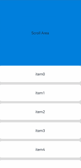
您好,系统提供的滚动条组件ScrollBar组件是完全可以满足你的需求的~~~
上代码:
import { ColorMetrics } from '@kit.ArkUI'
@Entry
@Component
struct StickyNestedScroll {
  listScroller: Scroller = new Scroller();
  @State array: number[] = [];
  @State scrollBarColor: ColorMetrics = ColorMetrics.rgba(24, 35, 48, 0.4);
  @Styles
  listCard() {
    .backgroundColor(Color.White)
    .height(72)
    .width('100%')
    .borderRadius(12)
  }
  build() {
    Stack() {
      Scroll() {
        Column() {
          Text('Scroll Area')
            .width('100%')
            .height('40%')
            .backgroundColor('#0080DC')
            .textAlign(TextAlign.Center)
          List({ space: 10, scroller: this.listScroller }) {
            ForEach(this.array, (item: number) => {
              ListItem() {
                Text('item' + item)
                  .fontSize(16)
              }
              .listCard()
            }, (item: number) => item.toString())
          }
          .scrollBar(BarState.Off)
          .nestedScroll({
            scrollForward: NestedScrollMode.PARENT_FIRST,
            scrollBackward: NestedScrollMode.SELF_FIRST
          })
          .height('100%')
        }
        .width('100%')
      }
      .edgeEffect(EdgeEffect.Spring)
      .backgroundColor('#DCDCDC')
      .scrollBar(BarState.Off)
      .width('100%')
      .height('100%')
      ScrollBar({ scroller: this.listScroller })
        .position({ right: 0 })
        .enableNestedScroll(true)
        .scrollBarColor(this.scrollBarColor)
    }
  }
  aboutToAppear() {
    for (let i = 0; i < 15; i++) {
      this.array.push(i);
    }
  }
}

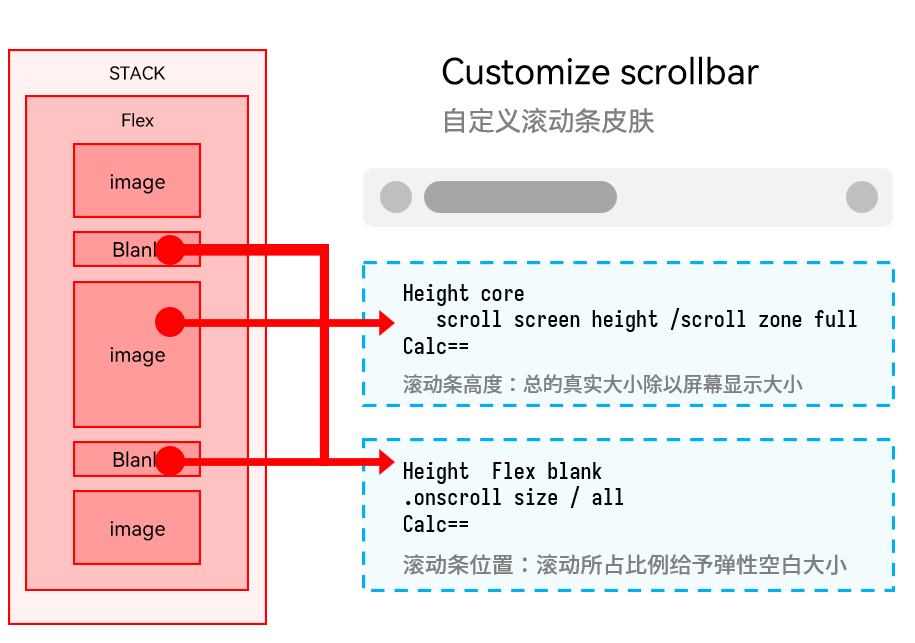
在HarmonyOS Next中,使用ArkTS封装弹性自定义滚动条组件:基于Scroll组件,通过监听onScroll事件获取偏移量,结合@State和animateTo实现弹性动画。自定义滚动条用Stack布局叠加,通过offset属性控制位置,并设置interpolation为弹性曲线。完整组件包含滚动容器、进度条和滑块,利用PanGesture或Drag手势支持拖动。

隐藏系统默认滚动条后,利用 Scroll 的 onScroll 事件获取当前偏移量,同时通过 onAreaChange 或 measure 获取内容区域总尺寸与视口尺寸,动态计算滑块长度(视口高度/内容高度 * 轨道长度)和位置(偏移量/可滚动范围 * 轨道可滑动范围)。将自定义滑块放入 Stack 叠在内容上方即可。
核心代码思路:
Scroll() {
  Column().onAreaChange((_, area) => {
    this.contentHeight = area.height as number
  })
}
.onScroll((_, offset) => {
  this.scrollOffset = offset
})
.width('100%').height('100%')
.scrollBar(BarState.Off)  // 隐藏默认滚动条
轨道和滑块用绝对定位放在 Stack 中:
Stack({ alignContent: Alignment.End }) {
  // 内容区...
  // 自定义滚动条
  Row()
    .width(4)
    .height('100%')
    .backgroundColor('#EEEEEE')
  Row()
    .width(4)
    .height(`${(this.viewHeight / this.contentHeight) * 100}%`)
    .backgroundColor('#999999')
    .position({ right: 0, top: `${(this.scrollOffset / (this.contentHeight - this.viewHeight)) * (100 - this.sliderHeightPercent)}%` })
}
这便实现了滑块长度随内容动态缩放,完全掌控样式,可轻松适配 Fluent UI 或 Swing 风格。