


HarmonyOS鸿蒙Next中爱奇艺的Tab是怎么实现的
HarmonyOS鸿蒙Next中爱奇艺的Tab是怎么实现的
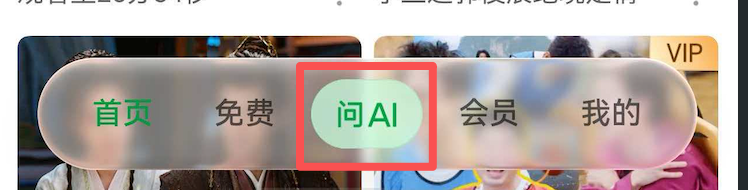
如图,tabs中间的 “问AI” 效果是怎么实现的
更多关于HarmonyOS鸿蒙Next中爱奇艺的Tab是怎么实现的的实战教程也可以访问 https://www.itying.com/category-93-b0.html

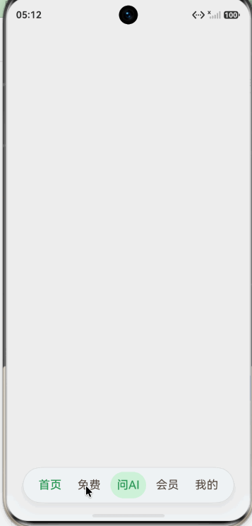
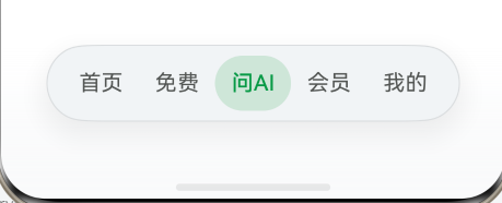
你好,从6.1.0(23) 版本开始,通过barFloatingStyle 设置页签栏为悬浮样式和沉浸光感效果。
通过 onContentWillChange 去拦截页面切换,点击‘问AI’时不进行切换。
import {
  HdsNavigation,
  HdsNavigationTitleMode,
  HdsTabs,
  HdsTabsController,
  hdsMaterial
} from '@kit.UIDesignKit';

@Entry
@Component
export struct Index {
  private controller: HdsTabsController = new HdsTabsController();
  @State private currentIndex: number = 0
  @State private showAI: boolean = false

  build() {
    HdsNavigation() {
      HdsTabs({ controller: this.controller }) {
        TabContent() {

        }
        .backgroundColor('#80eeeeee')
        .tabBar(this.tabItem('首页', 0))

        TabContent() {
        }
        .backgroundColor('#80ffff00')
        .tabBar(this.tabItem('免费', 1))

        TabContent() {
        }
        .tabBar(this.tabItem('问AI', 2))

        TabContent() {
        }
        .backgroundColor('#800000ff')
        .tabBar(this.tabItem('会员', 3))

        TabContent() {
        }
        .backgroundColor('#80ff00ff')
        .tabBar(this.tabItem('我的', 4))
      }
      .scrollable(false)
      .animationDuration(0)
      .barOverlap(true)
      .vertical(false)
      .barPosition(BarPosition.End)
      .onContentWillChange((currentIndex, comingIndex) => {
        if (comingIndex == 2) {
          this.showAI = true
          return false;
        }
        return true;
      })
      .barFloatingStyle({
        barBottomMargin: 28,
        systemMaterialEffect: {
          materialType: hdsMaterial.MaterialType.ADAPTIVE,
          materialLevel: hdsMaterial.MaterialLevel.ADAPTIVE
        }
      })
      .onChange((index: number) => {
        this.currentIndex = index
      })
    }
    .backgroundColor('#eee')
    .mode(NavigationMode.Stack)
    .hideBackButton(true)
    .titleMode(HdsNavigationTitleMode.MINI)
    .ignoreLayoutSafeArea([LayoutSafeAreaType.SYSTEM], [LayoutSafeAreaEdge.TOP, LayoutSafeAreaEdge.BOTTOM])
  }

  @Builder
  tabItem(title: string, index: number) {
    if (title === '问AI') {
      Text(title)
        .fontColor(this.showAI ? '#fff' : '#4F9860')
        .fontSize(18)
        .fontWeight(FontWeight.Medium)
        .backgroundColor(this.showAI ? '#ff17d042' : '#D5F1DB')
        .borderRadius('50%')
        .padding(10)
        .bindPopup(this.showAI, {
          builder: this.aiBuilder,
          placement: Placement.Top,
          popupColor: '#eee',
          backgroundBlurStyle: BlurStyle.NONE,
          offset: { y: -10 },
          onStateChange: (e) => {
            if (!e.isVisible) {
              this.showAI = false
            }
          }
        })
    } else {
      Text(title)
        .fontColor(index === this.currentIndex ? '#4F9860' : '#51473F')
        .fontSize(18)
        .fontWeight(index === this.currentIndex ? FontWeight.Medium : FontWeight.Normal)
    }
  }

  @Builder
  aiBuilder() {
    Column({ space: 5 }) {
      Image($r('app.media.startIcon')).width(24)
      Text('This is ai Popup').fontSize(15)
    }
    .width('100%')
    .padding(20)
  }
}
更多关于HarmonyOS鸿蒙Next中爱奇艺的Tab是怎么实现的的实战系列教程也可以访问 https://www.itying.com/category-93-b0.html

开发者您好,这是通过设置沉浸光感HdsTabs的自定义样式实现的,可以参考我的这篇文章:
沉浸光感HDS底部页签:HdsTabs自定义tabBar解决方案
注:需了解沉浸光感适配。

试试看:
import { hdsMaterial, HdsTabs, HdsTabsController } from '@kit.UIDesignKit';

@Entry
@Component
struct Index {
	private controller: HdsTabsController = new HdsTabsController();
	@State selectedIndex: number = 0;

	build() {
		Column() {
				HdsTabs({ controller: this.controller }) {
					TabContent() {

					}
					.tabBar(this.tabBuilder(0, "首页"))

					TabContent() {

					}
					.tabBar(this.tabBuilder(1, "免费"))

					TabContent() {

					}
					.tabBar(this.tabBuilder(2, "问AI"))

					TabContent() {

					}
					.tabBar(this.tabBuilder(3, "会员"))

					TabContent() {

					}
					.tabBar(this.tabBuilder(4, "我的"))

				}
				.barOverlap(true)
				.barPosition(BarPosition.End)
				.vertical(false)
				// 设置页签栏悬浮样式。
				.barFloatingStyle({
					barWidth: { smallWidth: 300 },
					barBottomMargin: 28,
					gradientMask: { maskColor: '#66F1F3F5', maskHeight: 92 },
					systemMaterialEffect: {
							materialType: hdsMaterial.MaterialType.IMMERSIVE,
							materialLevel: hdsMaterial.MaterialLevel.ADAPTIVE
					},
				})
				.onTabBarClick((index: number) => {
					this.selectedIndex = index;
				})
		}
	}

	@Builder
	tabBuilder(index: number, name: string) {
		Column() {
			Text(name)
				.fontColor(this.selectedIndex === index ? "#079A46" : "#ff535654")
				.fontWeight(this.selectedIndex === index ? 500 : 400)
		}
		.width('100%')
		.height(40)
		.justifyContent(FlexAlign.Center)
		.borderRadius(50)
		.backgroundColor(this.selectedIndex === index ? "#9ab8dcc4" : Color.Transparent)
	}

}

背景知识:
可以使用 HdsNavigation + HdsTabs 来实现,barOverlap 数据来确定使用漂浮tab。
问题解决:
示例代码:
import { HdsNavigation, HdsTabs, HdsTabsController, ScrollEffectType, hdsMaterial } from '@kit.UIDesignKit';
import { LengthMetrics, promptAction } from '@kit.ArkUI';
import common from '@ohos.app.ability.common';

interface HomeTabItem {
    title: string;
    subTitle: string;
    tag: string;
}

@Entry
@Component
struct HdsNavigationPage {
    private tabsController: HdsTabsController = new HdsTabsController();
    @State currentIndex: number = 0;
    private tabTitles: string[] = [
        '首页',
        '免费',
        'Ai',
        '会员',
        '我的'
    ];
    context = this.getUIContext().getHostContext() as common.UIAbilityContext

    build() {
        HdsNavigation() {
            HdsTabs({ controller: this.tabsController, index: this.currentIndex }) {
                TabContent() {
                    this.TabPage(this.tabTitles[0])
                }
                .tabBar(this.tabTitles[0])

                TabContent() {
                    this.TabPage(this.tabTitles[1])
                }
                .tabBar(this.tabTitles[1])

                TabContent() {
                    this.TabPage(this.tabTitles[2])
                }
                .tabBar(this.tabTitles[2])

                TabContent() {
                    this.TabPage(this.tabTitles[3])
                }
                .tabBar(this.tabTitles[3])

                TabContent() {
                    this.TabPage(this.tabTitles[4])
                }
                .tabBar(this.tabTitles[4])
            }
            .width('100%')
            .height('100%')
            .barPosition(BarPosition.End)
            .vertical(false)
            //设置是否 悬浮的tab
            .barOverlap(true)
            .onChange((index: number) => {
                console.log(`HdsNavigation index=${index}`)
                this.currentIndex = index;
            })
            .onContentWillChange((currentIndex: number, comingIndex: number) => {
              //注意请使用 comingIndex 来判断
                if (comingIndex == 2) {
                    //可以在这里处理点击ai后进行处理点击ai tab的按钮逻辑
                    this.getUIContext().getPromptAction().showToast({
                        message: "Ai",
                        duration: 2000,
                        bottom: 80
                    })
                    return false
                } else {
                    return true
                }
                // onContentWillChange 方法的返回值很明确,内容将改变吗? true 改变 false不改变

            })
            //悬浮tab样式
            .barFloatingStyle({
                barBottomMargin: 28,
                systemMaterialEffect: {
                    materialType: hdsMaterial.MaterialType.ADAPTIVE,
                    materialLevel: hdsMaterial.MaterialLevel.ADAPTIVE
                }
            })
        }
        .width('100%')
        .height('100%')
        .backgroundColor($r('sys.color.ohos_id_color_background'))
        .mode(NavigationMode.Stack)
        .hideBackButton(true)

    }

    @Builder
    private TabPage(title: string) {
        Scroll() {
            Column({ space: 12 }) {
                this.Banner(title)
            }
            .width('100%')
            .padding({
                left: 16,
                right: 16,
                top: 16,
                bottom: 24
            })
        }
        .width('100%')
        .height('100%')
        .backgroundColor(Color.Grey)
        .edgeEffect(EdgeEffect.Spring)
    }

    @Builder
    private Banner(title: string) {
        Column({ space: 8 }) {
            Text(title)
                .fontSize(28)
                .fontWeight(FontWeight.Bold)
                .fontColor(Color.White)
            Text('HdsNavigation + HdsTabs')
                .fontSize(15)
                .fontColor('#EAF1FF')
        }
        .alignItems(HorizontalAlign.Start)
        .justifyContent(FlexAlign.End)
        .width('100%')
        .height(168)
        .padding(20)
        .borderRadius(16)
        .linearGradient({
            angle: 135,
            colors: [
                ['#0A59F7', 0],
                ['#19A08E', 1]
            ]
        })
    }
}
真机演示:
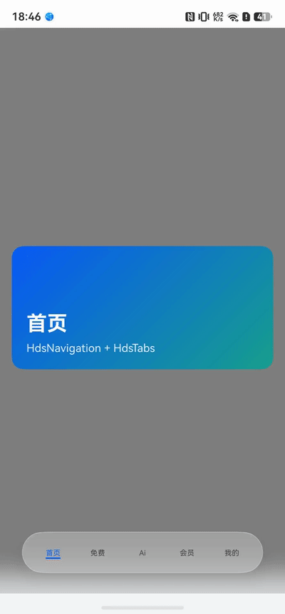


这个就是自定义的,底部放一个全屏 Stack,然后下面是内容区,中间叠一个自定义 TabBar
至于选择后的凸起,可以参考下面文档实现效果
尊敬的开发者,您好:
如果您是想在常态下,让中间的“问AI”Tab以特定样式展示,可以在TabBar Builder中通过条件控制TabBar样式的展示。 可以在2楼代码的基础上,修改tabBuilder的内容,如下:
@Builder
tabBuilder(index: number, name: string) {
  Column() {
    Text(name)
      .fontColor(name === '问AI' ? '#079A46' : (this.selectedIndex === index ? '#079A46' : '#ff535654'))
      .fontWeight(this.selectedIndex === index ? 500 : 400);
  }
  .width('100%')
  .height(40)
  .justifyContent(FlexAlign.Center)
  .borderRadius(50)
  .backgroundColor(name === '问AI' ? '#9ab8dcc4' : Color.Transparent);
}
做上述修改后可以让中间“问AI”的样式常驻,这里通过 name === ‘问AI’ 进行判断,使用时判断条件根据实际修改即可。
可参考文档:HdsTabs


可通过自定义 Tabs 组件的 tabBar 实现“问AI”这种中间凸起按钮。核心是利用 @Builder 构建不同样式的 Tab 项,让中间项使用负的 margin 或 translate 向上偏移,并配以圆形背景。
简要代码示例:
@Entry
@Component
struct AiTabDemo {
  @State currentIndex: number = 0
  private tabsController: TabsController = new TabsController()

  @Builder tabBarBuilder(title: string, index: number, isCenter: boolean = false) {
    Column() {
      if (isCenter) {
        // 中间凸起按钮
        Image($r('app.media.ai_icon'))
          .width(48).height(48)
          .borderRadius(24)
          .backgroundColor('#FF5500')
          .margin({ top: -20 })   // 向上偏移,形成凸起效果
      } else {
        Text(title)
          .fontSize(14)
          .fontColor(this.currentIndex === index ? '#FF5500' : '#182431')
      }
    }
    .width('100%')
    .height('100%')
    .justifyContent(FlexAlign.Center)
    .onClick(() => {
      this.currentIndex = index
      this.tabsController.changeIndex(index)
    })
  }

  build() {
    Tabs({ controller: this.tabsController, index: 0 }) {
      TabContent() { Text('首页内容') }
        .tabBar(this.tabBarBuilder('首页', 0))

      TabContent() { Text('发现内容') }
        .tabBar(this.tabBarBuilder('发现', 1))

      TabContent() { Text('AI 内容') }
        .tabBar(this.tabBarBuilder('', 2, true))   // 中间项

      TabContent() { Text('消息内容') }
        .tabBar(this.tabBarBuilder('消息', 3))

      TabContent() { Text('我的内容') }
        .tabBar(this.tabBarBuilder('我的', 4))
    }
    .barMode(BarMode.Fixed)
    .onChange((index: number) => {
      this.currentIndex = index
    })
  }
}
要点:
- 中间 Tab 项传
isCenter: true,使用Image并设置margin.top为负值,使其视觉上突出于 TabBar。 - 点击时通过
tabsController.changeIndex()切换页面,保持与其他 Tab 一致的切换逻辑。 - 为避免背景遮挡,可设置 TabBar 的背景为透明,或在
Tabs上通过barHeight适当留高,给凸起按钮留出空间。
这样即可实现类似“问AI”的凸起 Tab 效果。