

HarmonyOS鸿蒙Next中如何在ArkUI中使用Badge修饰符为角标添加背景边框和圆角?
HarmonyOS鸿蒙Next中如何在ArkUI中使用Badge修饰符为角标添加背景边框和圆角? 在ArkUI开发中,使用Badge修饰符时,默认样式比较简单。如何自定义角标的背景色、边框样式和圆角?是否支持自定义角标的位置偏移

Badge组件是ArkUI中用于在UI元素上展示角标、红点、数字/文本提示的容器组件。其样式自定义主要通过构造参数中的 style属性(类型为 BadgeStyle)来实现。BadgeStyle对象提供了丰富的属性来控制角标的外观。
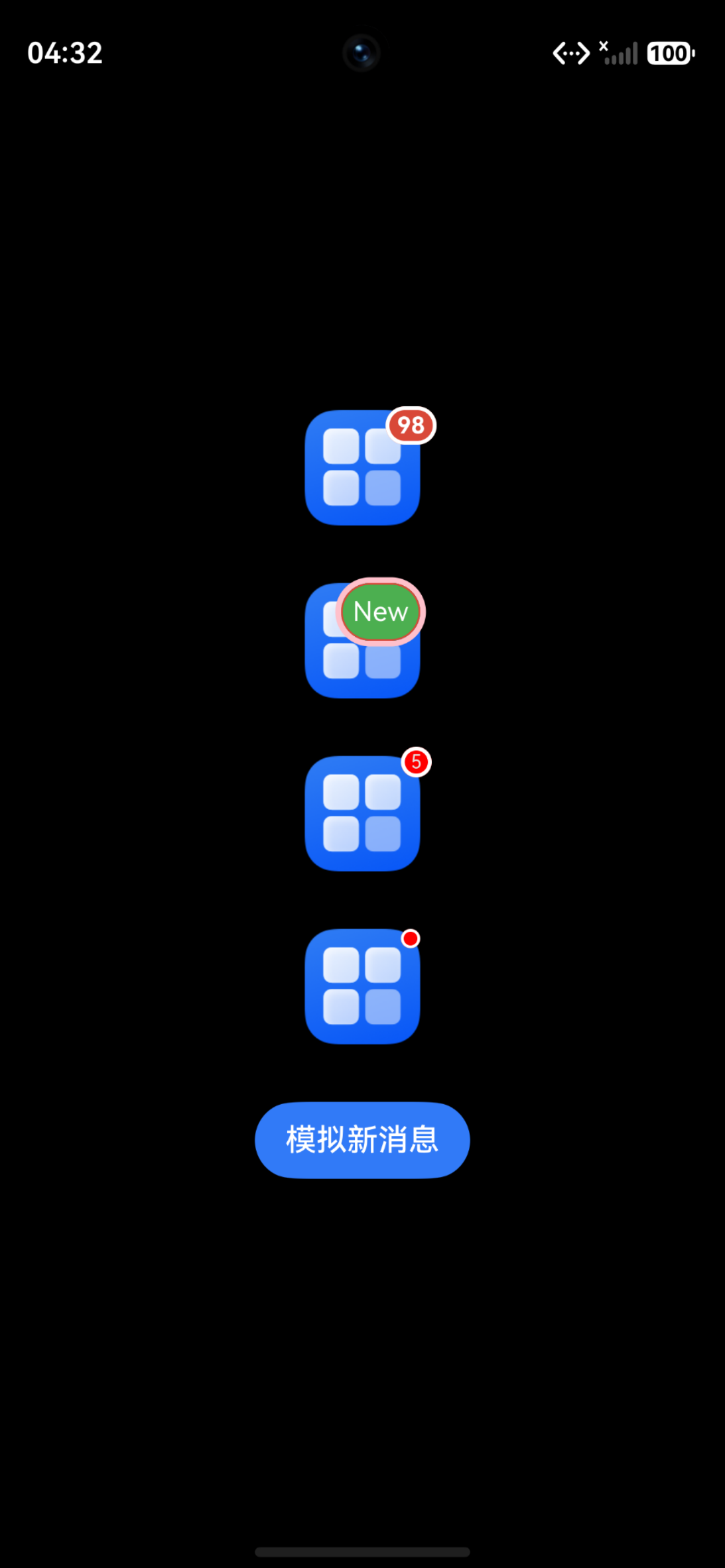
关于位置偏移,Badge的 position属性除了支持 BadgePosition枚举(RightTop、Right、Left)之外,从API version 10开始还支持传入 Position对象,通过x、y坐标精确控制角标位置。
import { LengthMetrics } from '@kit.ArkUI';

@Entry
@Component
struct BadgeCustomStyleDemo {
  @State unreadCount: number = 88;

  // 根据数值动态计算角标背景色
  get badgeBgColor(): ResourceColor {
    return this.unreadCount > 99 ? Color.Red : '#FF6B35';
  }

  build() {
    Column({ space: 30 }) {

      // 场景一:自定义背景色 + 底板描边(borderColor / borderWidth)
      Badge({
        count: this.unreadCount,
        maxCount: 99,
        position: BadgePosition.RightTop,
        style: {
          badgeSize: 20,            // 角标尺寸
          badgeColor: this.badgeBgColor, // 自定义背景色,支持动态绑定
          color: Color.White,       // 文字颜色
          fontSize: 12,             // 文字大小
          fontWeight: FontWeight.Bold, // 文字字重
          borderColor: Color.White, // 底板描边颜色(API 10+)
          borderWidth: 2            // 底板描边宽度(API 10+,默认1vp)
        }
      }) {
        Image($r('app.media.startIcon'))
          .width(60)
          .height(60)
      }

      // 场景二:自定义背景色 + 外描边(outerBorderColor / outerBorderWidth,API 22+)
      // 外描边绘制在组件外部,不会与背景色重叠
      Badge({
        value: 'New',
        position: BadgePosition.RightTop,
        style: {
          badgeSize: 30,
          badgeColor: '#4CAF50',                  // 自定义背景色
          color: Color.White,
          fontSize: 14,
          outerBorderColor: Color.Pink,           // 外描边颜色(API 22+)
          outerBorderWidth: LengthMetrics.vp(3),   // 外描边宽度(API 22+)
          enableAutoAvoidance: true                // 文本超长时自动避让延伸
        }
      }) {
        Image($r('app.media.startIcon'))
          .width(60)
          .height(60)
      }

      // 场景三:使用 Position 对象精确控制角标位置偏移
      Badge({
        count: 5,
        position: { x: 50, y: -5 },  // 精确偏移,(0,0)为组件左上角
        style: {
          badgeSize: 16,
          badgeColor: Color.Red,
          borderColor: Color.White,
          borderWidth: 2
        }
      }) {
        Image($r('app.media.startIcon'))
          .width(60)
          .height(60)
      }

      // 场景四:红点提示(value为空字符串时仅显示圆点)
      Badge({
        value: '',
        position: BadgePosition.RightTop,
        style: {
          badgeSize: 10,           // 圆点大小
          badgeColor: Color.Red,   // 圆点颜色
          borderColor: Color.White,
          borderWidth: 1.5
        }
      }) {
        Image($r('app.media.startIcon'))
          .width(60)
          .height(60)
      }

      // 动态更新角标数量
      Button('模拟新消息')
        .onClick(() => {
          this.unreadCount += 10;
        })
    }
    .width('100%')
    .height('100%')
    .alignItems(HorizontalAlign.Center)
    .justifyContent(FlexAlign.Center)
  }
}
更多关于HarmonyOS鸿蒙Next中如何在ArkUI中使用Badge修饰符为角标添加背景边框和圆角?的实战系列教程也可以访问 https://www.itying.com/category-93-b0.html

背景知识:
Badge 信息标记组件,可以附加在单个组件上用于信息提醒的容器组件。
问题解决:
示例代码:
@State count:number = 1;

@Builder
    showBadge(){
        Badge({
            count: this.count,
            style: {},
            position: BadgePosition.RightTop,
        }) {
            Image($r('app.media.ic_friend_sel'))
                .width(50)
                .height(50)
                .onClick(()=>{
                    this.count++;
                })
        }
        .width(55)
    }
真机演示:
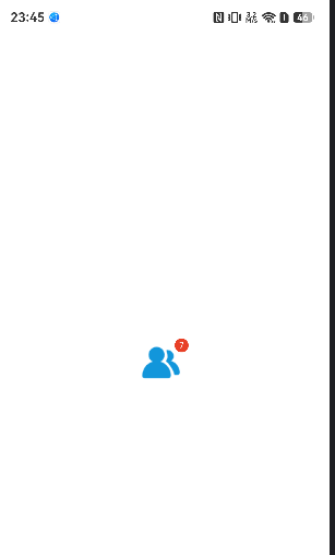

Badge系统组件,看 API参考,灵活度比较低,不过就它的使用场景基本满足了。
角标的背景色(style可配)、边框样式(宽度和颜色)、圆角(不支持)、位置偏移(自身不支持,可设置子组件padding有限实现)。
要实现更灵活显示角标,可以叠加组件的方式自己实现。

效果如图, 代码在下面 ,讲解说明可以查看这个博客 HarmonyOS6 Badge 角标组件,5 分钟搞懂怎么用 如有帮助给个采纳谢谢
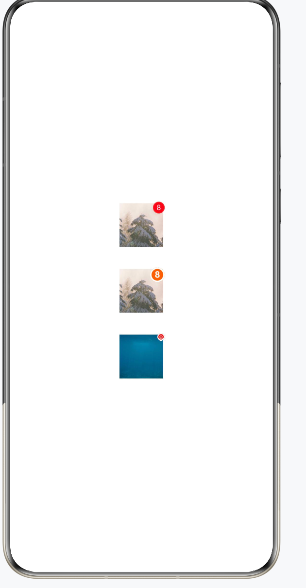
代码 :
@Entry
@Component
struct BadgeDemo {
    @State count: number = 8;

    build() {
        Column({ space: 30 }) {

            // 基础用法:默认红点角标
            Badge({
                count: this.count,
                style: { badgeSize: 16, badgeColor: '#FA2A2D' }
            }) {
                Image($r('app.media.img'))
                    .width(60)
                    .height(60)
            }

            // 自定义背景色、边框、圆角
            Badge({
                count: this.count,
                maxCount: 99,
                style: {
                    fontSize: 12,
                    badgeSize: 20,           // 角标整体尺寸(圆形时的直径)
                    badgeColor: '#FF6B00',   // 角标背景色
                    fontWeight: FontWeight.Bold,

                    // 边框
                    borderWidth: 2,
                    borderColor: '#FFFFFF'
                }
            }) {
                Image($r('app.media.img'))
                    .width(60)
                    .height(60)
            }

            // 不显示数字,只显示小红点
            Badge({
                count: this.count,
                style: {
                    badgeSize: 10,
                    badgeColor: '#FF0000',
                    borderWidth: 1.5,
                    borderColor: '#FFFFFF'
                }
            }) {
                Image($r('app.media.img_3'))
                    .width(60)
                    .height(60)
            }
        }
        .width('100%')
        .height('100%')
        .justifyContent(FlexAlign.Center)
    }
}

Badge 支持一定程度的样式自定义,但能力有限。
背景色、边框、字体等都可以通过 style 配置:
Badge({
  count: 8,
  position: BadgePosition.RightTop,
  style: {
    badgeColor: '#FF4D4F',    // 背景色
    borderColor: Color.White, // 边框颜色
    borderWidth: 2,           // 边框宽度
    color: Color.White,       // 文字颜色
    fontSize: 12,
    badgeSize: 20
  }
}) {
  Image($r('app.media.icon'))
}
BadgeStyle 目前支持的主要属性有:
- badgeColor:角标背景色
- badgeSize:角标尺寸
- color:文字颜色
- fontSize:文字大小
- fontWeight:文字粗细
- borderColor:边框颜色
- borderWidth:边框宽度
关于圆角:
Badge 本身不提供 borderRadius 属性,圆形或胶囊形状由系统自动计算,无法单独指定圆角半径。
关于位置偏移:
Badge 只支持三种预设位置:
BadgePosition.Left
BadgePosition.Right
BadgePosition.RightTop
不支持类似 offset、translate 这种像素级位置偏移。
如果设计要求一般做法是使用 Stack 自己叠一个角标组件,而不是直接使用 Badge。这样灵活度最高。

可以通过style来配置背景颜色和圆角,通过position来自定义控制位置偏移,默认(0,0)处理。(0,0)为组件左上角位置。
      Badge({
                value: 'New',
                position: { x: 10, y: 20 },
                style: { badgeSize: 16, badgeColor: '#FA2A2D' }
            }) {
                Text('list2').width(27).height(19).fontSize(14).fontColor('#182431')
            }.width(49.5).height(19)
            .margin({ left: 12 })

Badge 支持一定程度的样式自定义,但要看你用的是 Badge 容器能力还是自己叠出来的角标。常规数字/红点角标可以通过 Badge 的 style 设置颜色、字体、尺寸等,并用 position/offset 类参数控制相对位置;如果要非常复杂的边框、渐变、特殊圆角,通常用 Stack 自定义一个角标组件更可控。
实践上建议分两档:简单消息数用 Badge,保持系统语义和布局简单;复杂视觉比如描边胶囊、双色背景、动画角标,就把目标组件和自定义角标放进 Stack,角标本身用 Text/Column 设置 backgroundColor、border、borderRadius、padding,再通过 align/offset 定位。这样不会被 Badge 默认尺寸和样式限制住。
必须可以的!
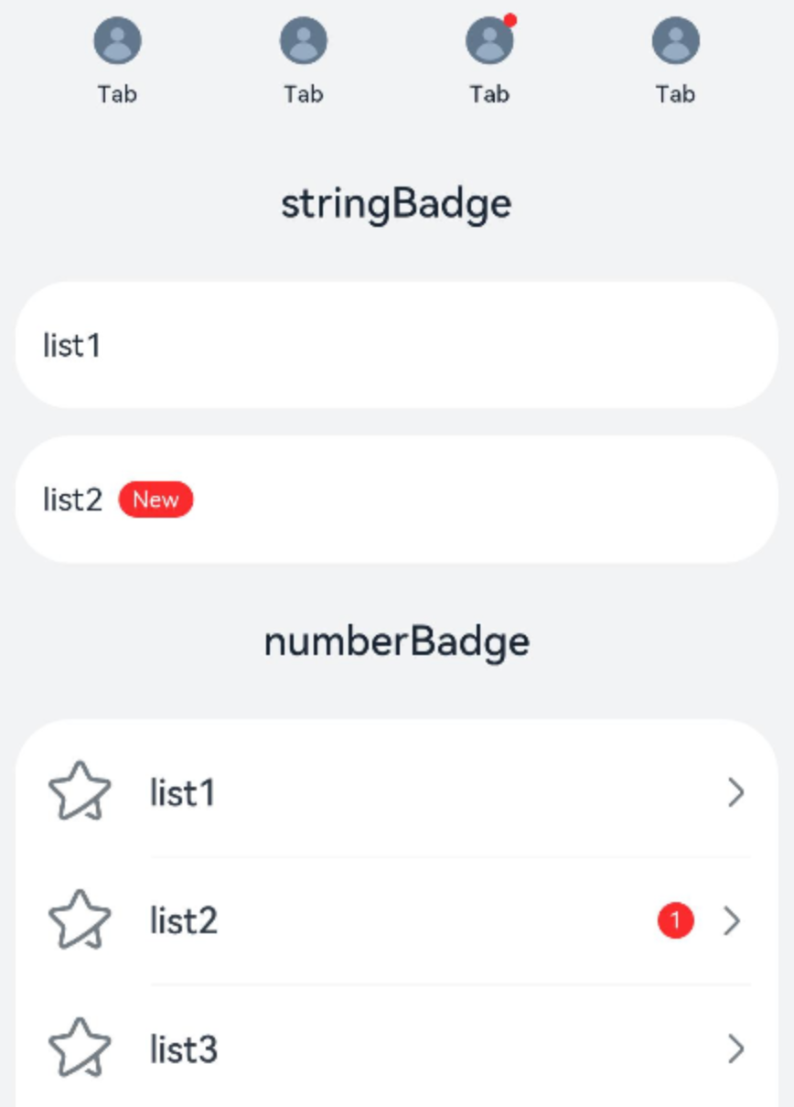
上代码:
// xxx.ets
@Entry
@Component
struct BadgeExample {
  @Builder
  tabBuilder(index: number) {
    Column() {
      if (index === 2) {
        Badge({
          value: '',
          style: { badgeSize: 6, badgeColor: '#FA2A2D' }
        }) {
          Image('/common/public_icon_off.svg')
            .width(24)
            .height(24)
        }
        .width(24)
        .height(24)
        .margin({ bottom: 4 })
      } else {
        Image('/common/public_icon_off.svg')
          .width(24)
          .height(24)
          .margin({ bottom: 4 })
      }
      Text('Tab')
        .fontColor('#182431')
        .fontSize(10)
        .fontWeight(500)
        .lineHeight(14)
    }.width('100%').height('100%').justifyContent(FlexAlign.Center)
  }
  @Builder
  itemBuilder(value: string) {
    Row() {
      Image('common/public_icon.svg').width(32).height(32).opacity(0.6)
      Text(value)
        .width(177)
        .height(21)
        .margin({ left: 15, right: 76 })
        .textAlign(TextAlign.Start)
        .fontColor('#182431')
        .fontWeight(500)
        .fontSize(16)
        .opacity(0.9)
      Image('common/public_icon_arrow_right.svg').width(12).height(24).opacity(0.6)
    }.width('100%').padding({ left: 12, right: 12 }).height(56)
  }
  build() {
    Column() {
      // 红点类型的标记组件
      Text('dotsBadge').fontSize(18).fontColor('#182431').fontWeight(500).margin(24)
      Tabs() {
        TabContent()
          .tabBar(this.tabBuilder(0))
        TabContent()
          .tabBar(this.tabBuilder(1))
        TabContent()
          .tabBar(this.tabBuilder(2))
        TabContent()
          .tabBar(this.tabBuilder(3))
      }
      .width(360)
      .height(56)
      .backgroundColor('#F1F3F5')
      // 根据字符创建的标记组件
      Column() {
        Text('stringBadge').fontSize(18).fontColor('#182431').fontWeight(500).margin(24)
        List({ space: 12 }) {
          ListItem() {
            Text('list1').fontSize(14).fontColor('#182431').margin({ left: 12 })
          }
          .width('100%')
          .height(56)
          .backgroundColor('#FFFFFF')
          .borderRadius(24)
          .align(Alignment.Start)
          ListItem() {
            Badge({
              value: 'New',
              position: BadgePosition.Right,
              style: { badgeSize: 16, badgeColor: '#FA2A2D' }
            }) {
              Text('list2').width(27).height(19).fontSize(14).fontColor('#182431')
            }.width(49.5).height(19)
            .margin({ left: 12 })
          }
          .width('100%')
          .height(56)
          .backgroundColor('#FFFFFF')
          .borderRadius(24)
          .align(Alignment.Start)
        }.width(336)
        // 根据数字创建的标记组件
        Text('numberBadge').fontSize(18).fontColor('#182431').fontWeight(500).margin(24)
        List() {
          ListItem() {
            this.itemBuilder('list1')
          }
          ListItem() {
            Row() {
              Image('common/public_icon.svg').width(32).height(32).opacity(0.6)
              Badge({
                count: 1,
                position: BadgePosition.Right,
                style: { badgeSize: 16, badgeColor: '#FA2A2D' }
              }) {
                Text('list2')
                  .width(177)
                  .height(21)
                  .textAlign(TextAlign.Start)
                  .fontColor('#182431')
                  .fontWeight(500)
                  .fontSize(16)
                  .opacity(0.9)
              }.width(240).height(21).margin({ left: 15, right: 11 })
              Image('common/public_icon_arrow_right.svg').width(12).height(24).opacity(0.6)
            }.width('100%').padding({ left: 12, right: 12 }).height(56)
          }
          ListItem() {
            this.itemBuilder('list3')
          }
          ListItem() {
            this.itemBuilder('list4')
          }
        }
        .width(336)
        .height(232)
        .backgroundColor('#FFFFFF')
        .borderRadius(24)
        .padding({ top: 4, bottom: 4 })
        .divider({
          strokeWidth: 0.5,
          color: 'rgba(0,0,0,0.1)',
          startMargin: 60,
          endMargin: 12
        })
      }.width('100%').backgroundColor('#F1F3F5').padding({ bottom: 12 })
    }.width('100%')
  }
}

在ArkUI中使用Badge修饰符,通过.badgeStyle()方法配置BadgeStyle对象,其中可设置border(如{ width: 1, color: '#000' })添加边框,borderRadius(如10)设置圆角。示例:
Badge({ value: '1' }) { /* 组件 */ }
  .badgeStyle({ backgroundColor: '#FF0000', border: { width: 2, color: '#00FF00' }, borderRadius: 8 })
在ArkUI中,使用Badge修饰符时,可通过其选项参数自定义角标样式与位置:
// 假设修饰一个组件
Text('消息')
  .badge('99+', {
    style: {
      backgroundColor: Color.Red,    // 背景色
      textColor: Color.White,        // 文字颜色
      borderColor: Color.Yellow,     // 边框颜色
      borderWidth: 2,                // 边框宽度
      borderRadius: 4,              // 圆角
      badgeSize: 18                 // 角标尺寸
    },
    position: BadgePosition(6, -6)  // 位置偏移 (x, y),正负均可
  })
style接受BadgeStyle类型,可设置背景色、文字颜色、边框(颜色/宽度)、圆角及角标大小。position接受BadgePosition(x, y),参数为相对默认位置的偏移量(单位 vp),可自由控制角标位置。
注意:如果边框和背景色搭配,需同时设置 borderColor 与 borderWidth 才会生效。仅此即可完成自定义,无需额外组件。
