




HarmonyOS鸿蒙Next中和设置一样的列表怎么做
HarmonyOS鸿蒙Next中和设置一样的列表怎么做 我自己手搓的列表就是不太像,圆角也不一样,字体也不一样,请问像系统应用这样的列表控件有没有规范的实践?
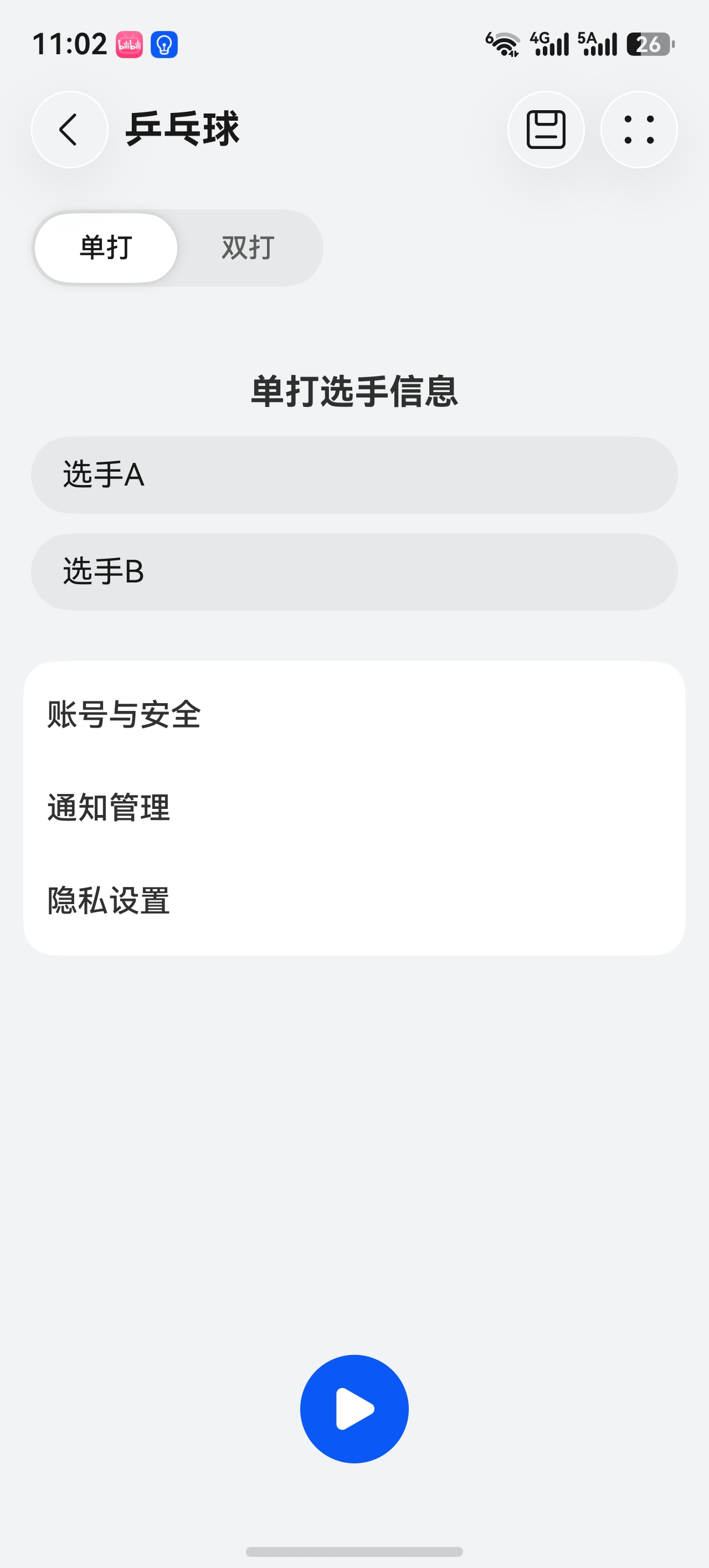
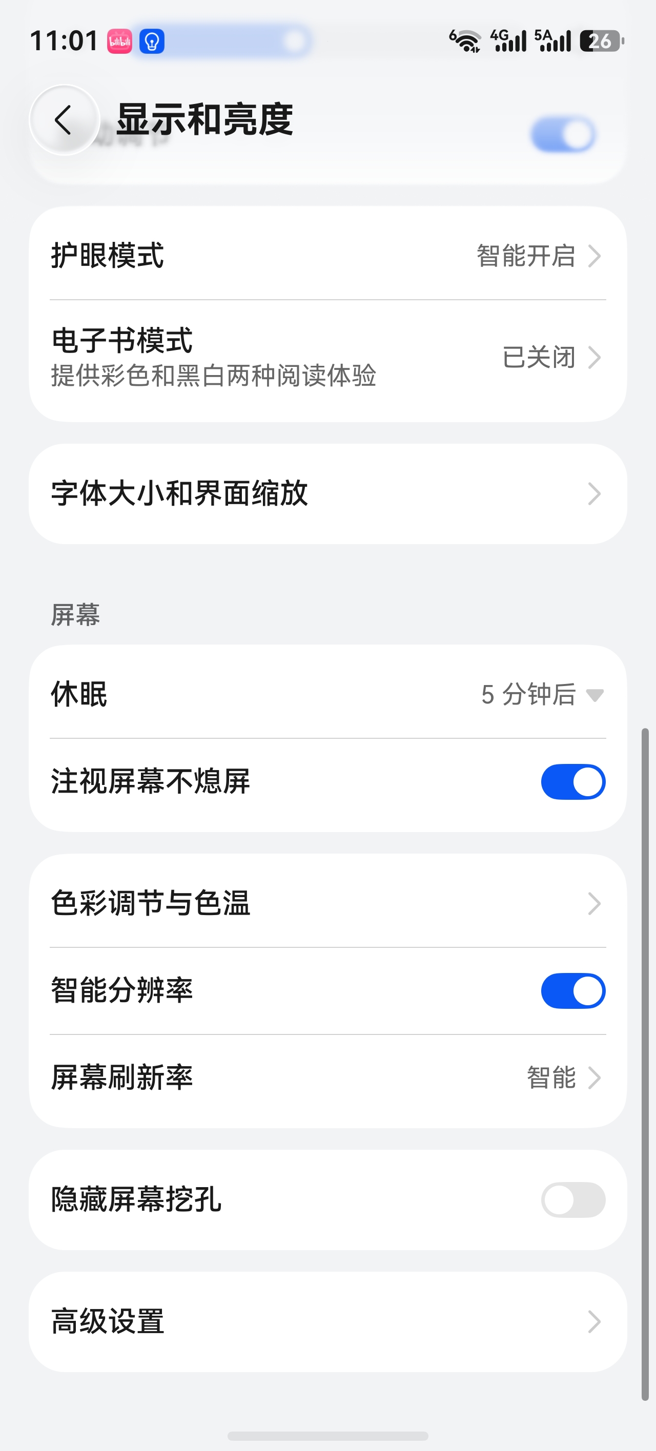
更多关于HarmonyOS鸿蒙Next中和设置一样的列表怎么做的实战教程也可以访问 https://www.itying.com/category-93-b0.html
6 回复

HdsListItemCard组件
https://developer.huawei.com/consumer/cn/doc/harmonyos-references/ui-design-hdslistitemcard,
更多关于HarmonyOS鸿蒙Next中和设置一样的列表怎么做的实战系列教程也可以访问 https://www.itying.com/category-93-b0.html


在HarmonyOS NEXT中,使用ArkTS声明式UI,通过List和ListItem组件即可实现设置列表。示例:
@Entry
@Component
struct SettingList {
  private settings: string[] = ['Wi-Fi', '蓝牙', '显示']

  build() {
    List() {
      ForEach(this.settings, (item: string) => {
        ListItem() {
          Row() {
            Text(item).fontSize(16)
            Blank()
            Image($r('app.media.arrow')).width(20).height(20)
          }.width('100%').padding(12)
        }
        .divider({ strokeWidth: 1, color: '#ddd' })
      })
    }
    .width('100%')
  }
}
通过divider添加分割线,Blank占位右侧箭头图标,即可复刻系统设置列表样式。

要做出和系统设置一致的列表,核心是使用List组件配合ListItemGroup实现圆角卡片分组样式,并结合系统规范的颜色与字体。
圆角与背景:
- 给
List设置borderRadius(16)、backgroundColor('#f1f3f5')(页面底色),并通过padding留白。 - 每个
ListItemGroup内部ListItem使用白色背景,首尾项单独设置圆角,可用borderRadius控制,避免整组超出覆盖。
字体与尺寸:
- 主标题使用系统默认字体(自动为HarmonyOS Sans),
fontSize(16),fontColor('#182431')。 - 副标题或说明文字
fontSize(14),fontColor('#99000000')。 - 右侧箭头图标使用
Image加载ic_public_arrow_right,大小16×16。
分隔线:
- 组内项之间用
Divider,颜色#e5e5e5,左边留16间距,.strokeWidth(0.5)。
布局结构示例:
List({ space: 0 }) {
  ListItemGroup({ header: this.groupHeader('网络') }) {
    this.settingItem('无线局域网', '未连接', true)
    Divider().strokeWidth(0.5).color('#e5e5e5').margin({ left: 16 })
    this.settingItem('蓝牙', '开启', true)
  }
  .borderRadius(16)
  .backgroundColor(Color.White)
  .margin({ bottom: 16 })
}
.borderRadius(0)
.backgroundColor('#f1f3f5')
.padding({ left: 16, right: 16 })
其中settingItem返回一个ListItem,内含左右排列的Row,文本与箭头图片按上述样式设置。
完整遵循这些尺寸与颜色值即可还原系统风格,无需额外自定义字体。
