

HarmonyOS鸿蒙Next中手表开发想做成图中按键的这种有光的效果
HarmonyOS鸿蒙Next中手表开发想做成图中按键的这种有光的效果
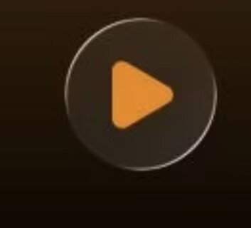
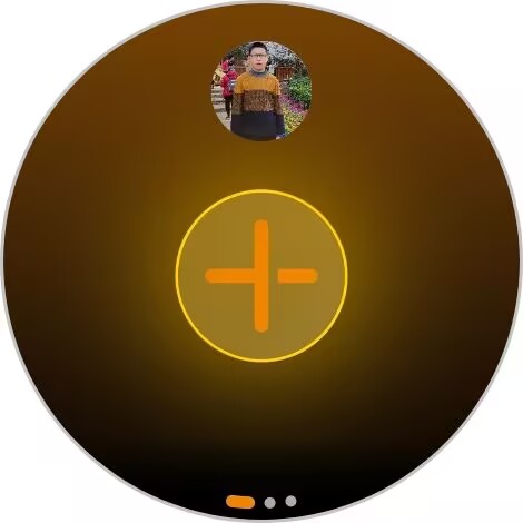
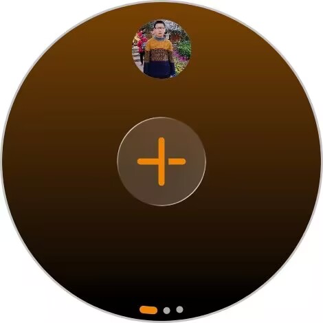
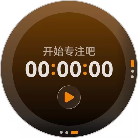
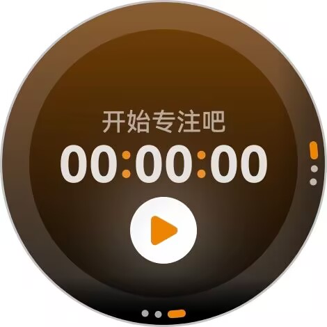
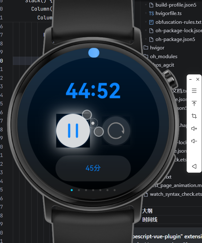
想咨询一下怎么实现,我这边实现的时候控件按键有正方形的框包住
更多关于HarmonyOS鸿蒙Next中手表开发想做成图中按键的这种有光的效果的实战教程也可以访问 https://www.itying.com/category-93-b0.html
12 回复

可以看下 SummerKaze 大佬写的这篇文章:从 HDS 风格统一出发:沉浸光感 HdsButton 的探索、封装与发布
更多关于HarmonyOS鸿蒙Next中手表开发想做成图中按键的这种有光的效果的实战系列教程也可以访问 https://www.itying.com/category-93-b0.html


《视效》的东西,光源啊、HDS的啊,基本都不支持穿戴设备。
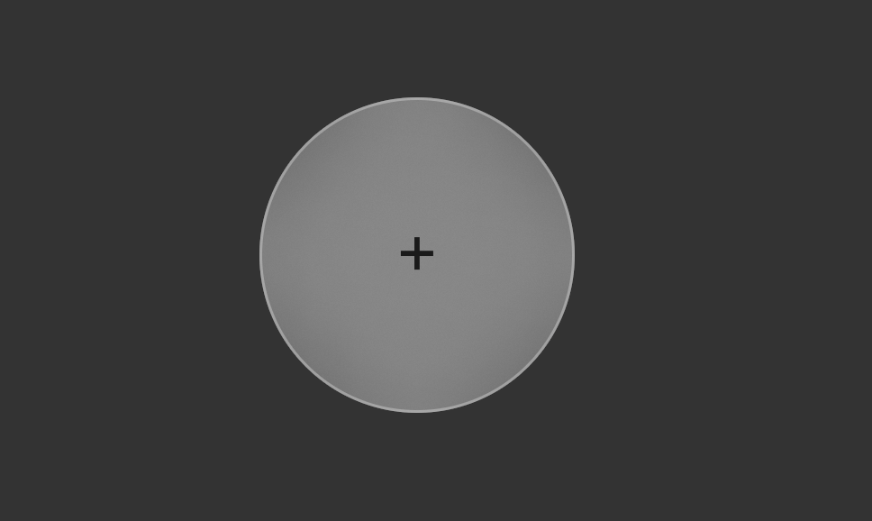
可以先用Button的contentModifier实现点效果。比如:
class MyButtonStyle implements ContentModifier<ButtonConfiguration> {
  text:string = '';
  constructor(text: string) {
    this.text = text;
  }
  applyContent(): WrappedBuilder<[ButtonConfiguration]> {
    return wrapBuilder(buildButton);
  }
}

@Builder
function buildButton(config: ButtonConfiguration) {
  Stack() {
      Column()
        .width(100)
        .height(100)
        .borderRadius(50) // 设置为圆形
        .backgroundBlurStyle(BlurStyle.Thin) // 模糊效果
        .backgroundColor('rgba(255, 255, 255, 0.2)') // 半透明背景增强质感
        .border({ width: 1, color: 'rgba(255, 255, 255, 0.3)' })
        .gesture(TapGesture({ count: 1 })//触发onClick
          .onAction((event: GestureEvent) => {
            config.triggerClick(event.fingerList[0].localX, event.fingerList[0].localY);
          })
        )
        .opacity(config.enabled ? 1 : 0.1)
    Text((config.contentModifier as MyButtonStyle).text).fontSize(22)
  }
}

@Entry
@Component
struct ButtonExample {

  build() {
    Column() {
      Button('OK')
        .contentModifier(new MyButtonStyle( '+'))
        .onClick((event) => {
          console.info('点击' + JSON.stringify(event));
        })
    }.height('100%').width('100%').justifyContent(FlexAlign.Center)
    .backgroundColor('#333333')
  }
}
自己调效果时,可以先搜查下,哪些效果支持哪些控件。



在HarmonyOS NEXT中,手表的按键发光效果可通过ArkTS声明式UI实现。使用.shadow()属性设置外发光(如金色 #FFD700,半径8-12),配合状态变量控制显隐或动画改变radius/color。也可叠加.blur()与多层组件模拟光晕。需结合animateTo或animation实现动态效果。
要实现手表按键的发光效果并去除方形边框,核心是使用径向渐变背景模拟光晕,并清除按钮默认样式。
关键步骤:
- 将按钮背景设为透明、边框设为0,避免默认矩形轮廓。
- 通过
RadialGradient创建从内到外渐隐的光晕(如白色半透到全透)。 - 配合
shadow增加立体感。 - 检查按压态样式,通过
stateStyles确保所有状态均无背景或边框。
示例 ArkTS 代码:
Button() {
  Image($r('app.media.icon')).width(40).height(40)
}
.width(64).height(64)
.borderRadius(32)
.backgroundColor(Color.Transparent)
.border({ width: 0 })
.background(new RadialGradient({
  center: [32, 32],
  radius: 32,
  colors: [
    ['rgba(255,255,255,0.3)', 0.0],
    ['rgba(255,255,255,0.0)', 1.0]
  ]
}))
.shadow({
  radius: 16,
  color: 'rgba(255,255,255,0.5)',
  offsetX: 0,
  offsetY: 0
})
.stateStyles({
  pressed: {
    .backgroundColor(Color.Transparent)
  },
  normal: {
    .backgroundColor(Color.Transparent)
  }
})
说明:渐变中心与半径根据按钮尺寸调整,调整半透明色值即可改变光效强度。若仍有方框,请确认外层容器是否设置了背景或边框。
