




HarmonyOS鸿蒙Next中关于弹窗拉起问题
HarmonyOS鸿蒙Next中关于弹窗拉起问题
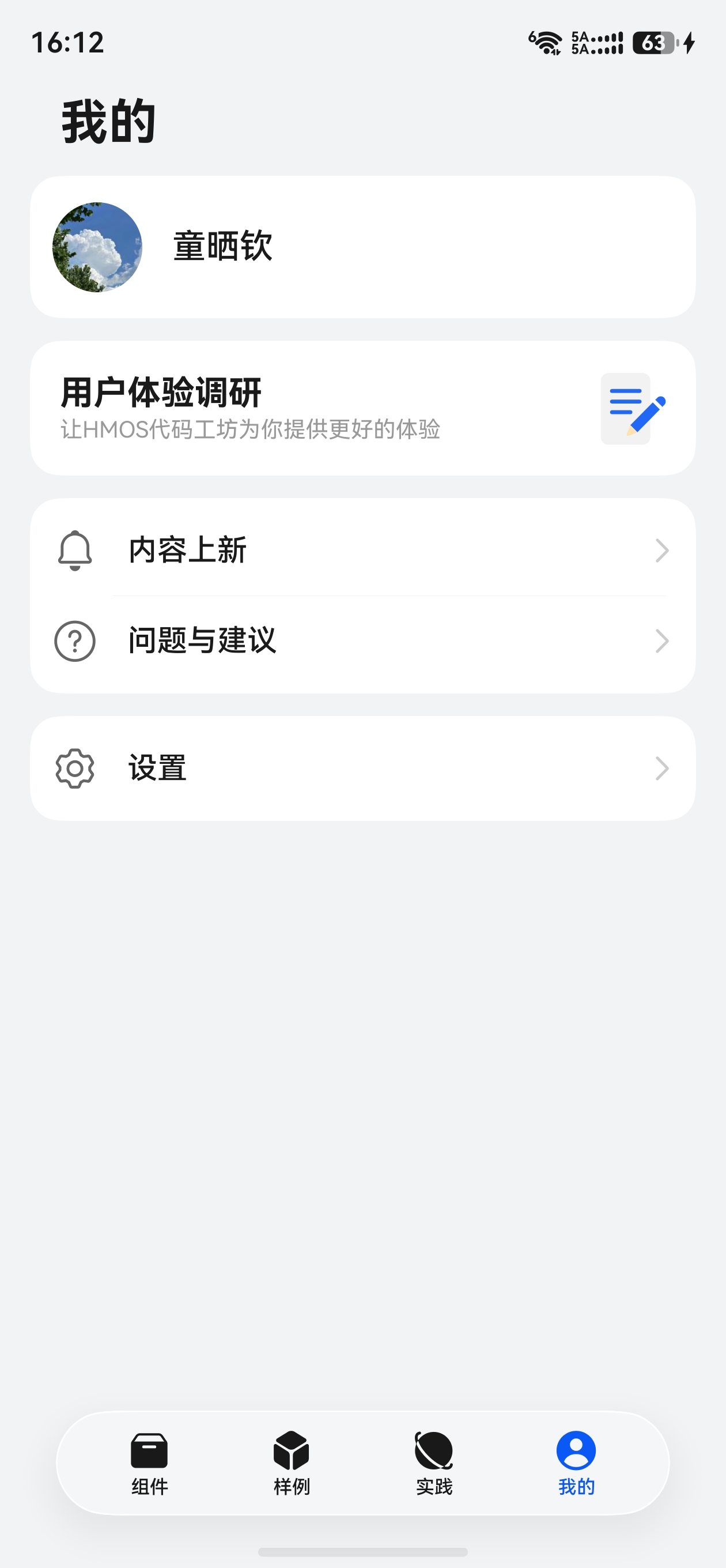
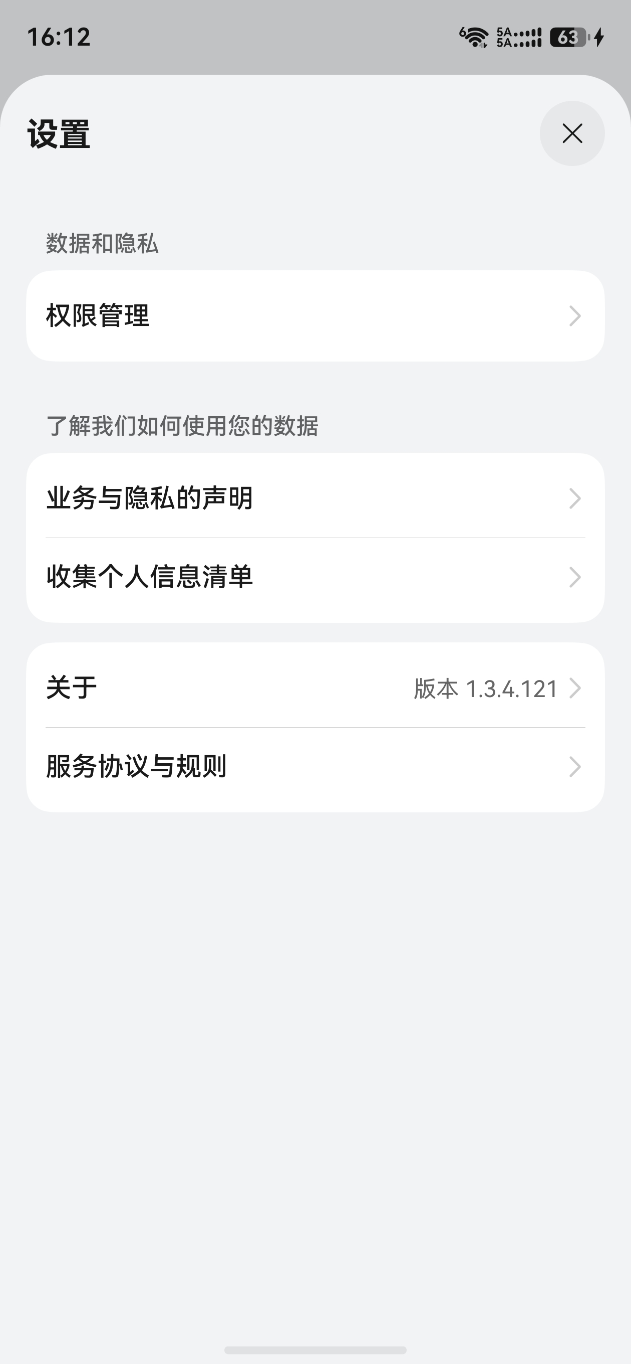
这种从下往上弹出的弹窗具体是通过什么组件实现的?能否在代码工坊中找到示例代码?
更多关于HarmonyOS鸿蒙Next中关于弹窗拉起问题的实战教程也可以访问 https://www.itying.com/category-93-b0.html

这个效果优先用 ArkUI 的 bindSheet,也就是底部 Sheet/半模态弹窗;它就是从屏幕底部拉起,适合筛选面板、操作面板、说明面板这类场景。
最小示例可以这样写:
@State showSheet: boolean = false

@Builder
SheetContent() {
  Column({ space: 12 }) {
    Text('弹窗标题').fontSize(18).fontWeight(FontWeight.Medium)
    Text('这里放你的弹窗内容')
    Button('关闭').onClick(() => {
      this.showSheet = false
    })
  }
  .width('100%')
  .padding(20)
}

build() {
  Column() {
    Button('从底部拉起')
      .onClick(() => {
        this.showSheet = true
      })
      .bindSheet(this.showSheet, this.SheetContent(), {
        preferType: SheetType.BOTTOM,
        height: 320,
        dragBar: true,
        showClose: true,
        maskColor: '#66000000',
        onWillDismiss: (action: DismissSheetAction) => {
          this.showSheet = false
          action.dismiss()
        }
      })
  }
}
如果只是底部几个操作项,例如拍照/从相册选择这种菜单,可以用 UIContext 的 showActionSheet;如果要完全自定义动画和位置,再考虑 CustomDialogController。代码工坊或示例里建议用 bindSheet、半模态弹窗、ActionSheet 这些关键词搜索。
更多关于HarmonyOS鸿蒙Next中关于弹窗拉起问题的实战系列教程也可以访问 https://www.itying.com/category-93-b0.html

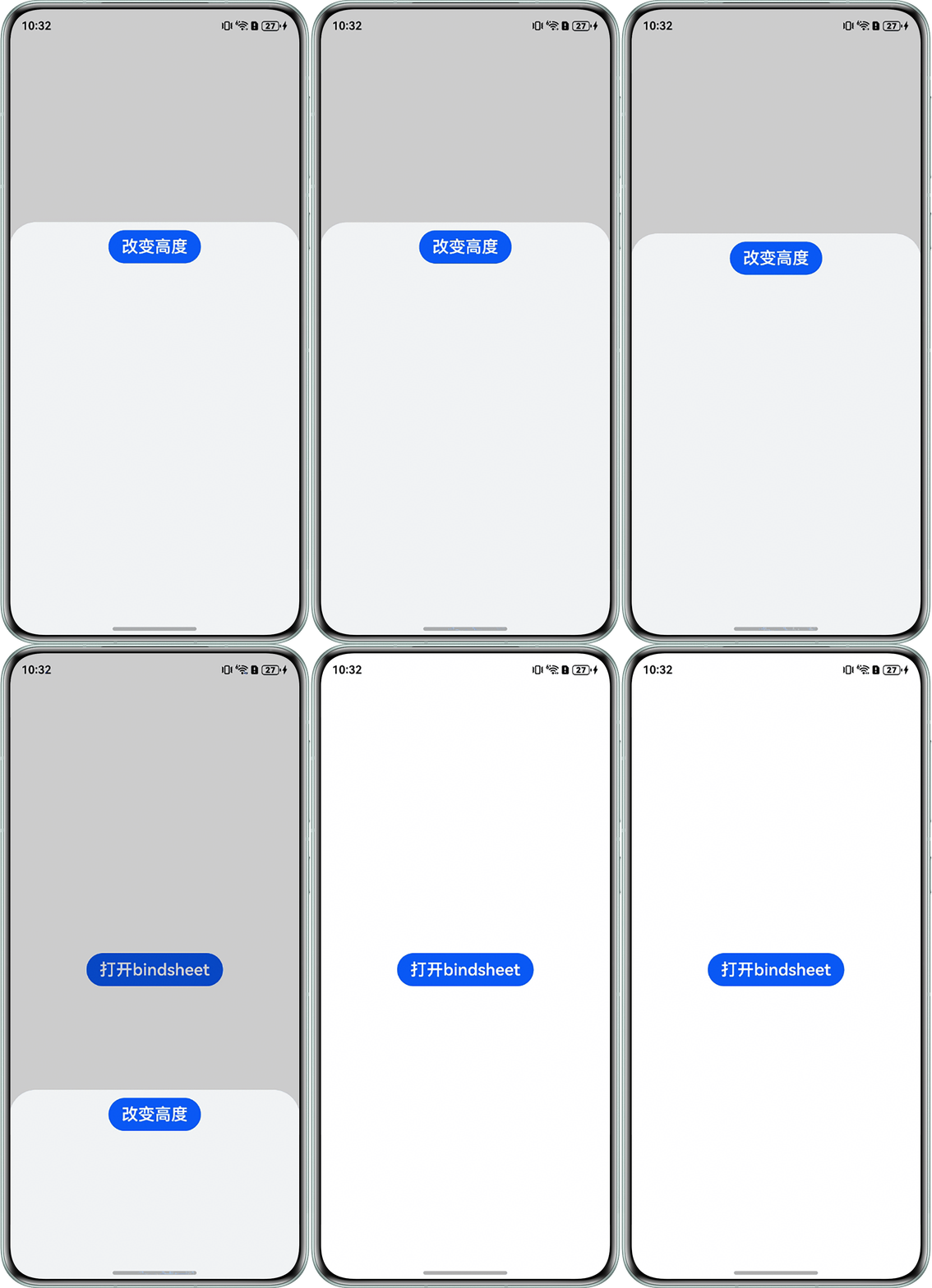

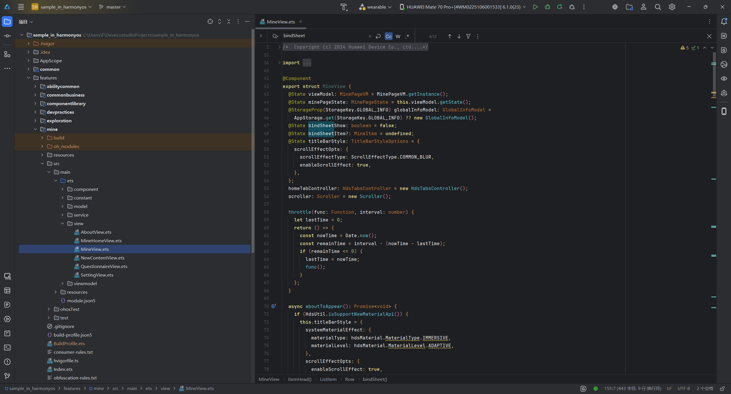
- 这个效果可以通过bindSheet属性(文档里很多示例)为组件绑定半模态页面。
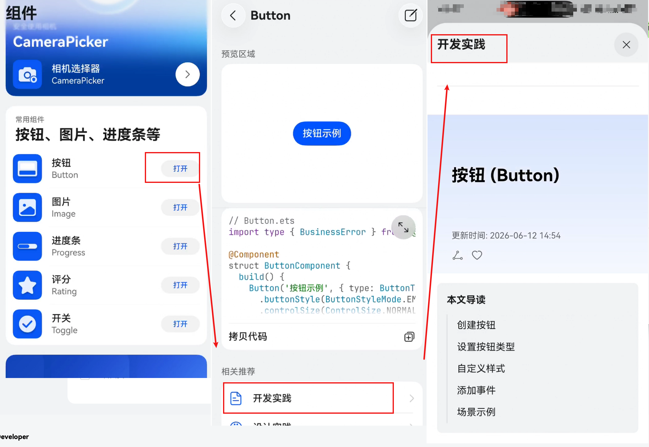
- 代码工坊App 里很多用到这个模态窗口的。
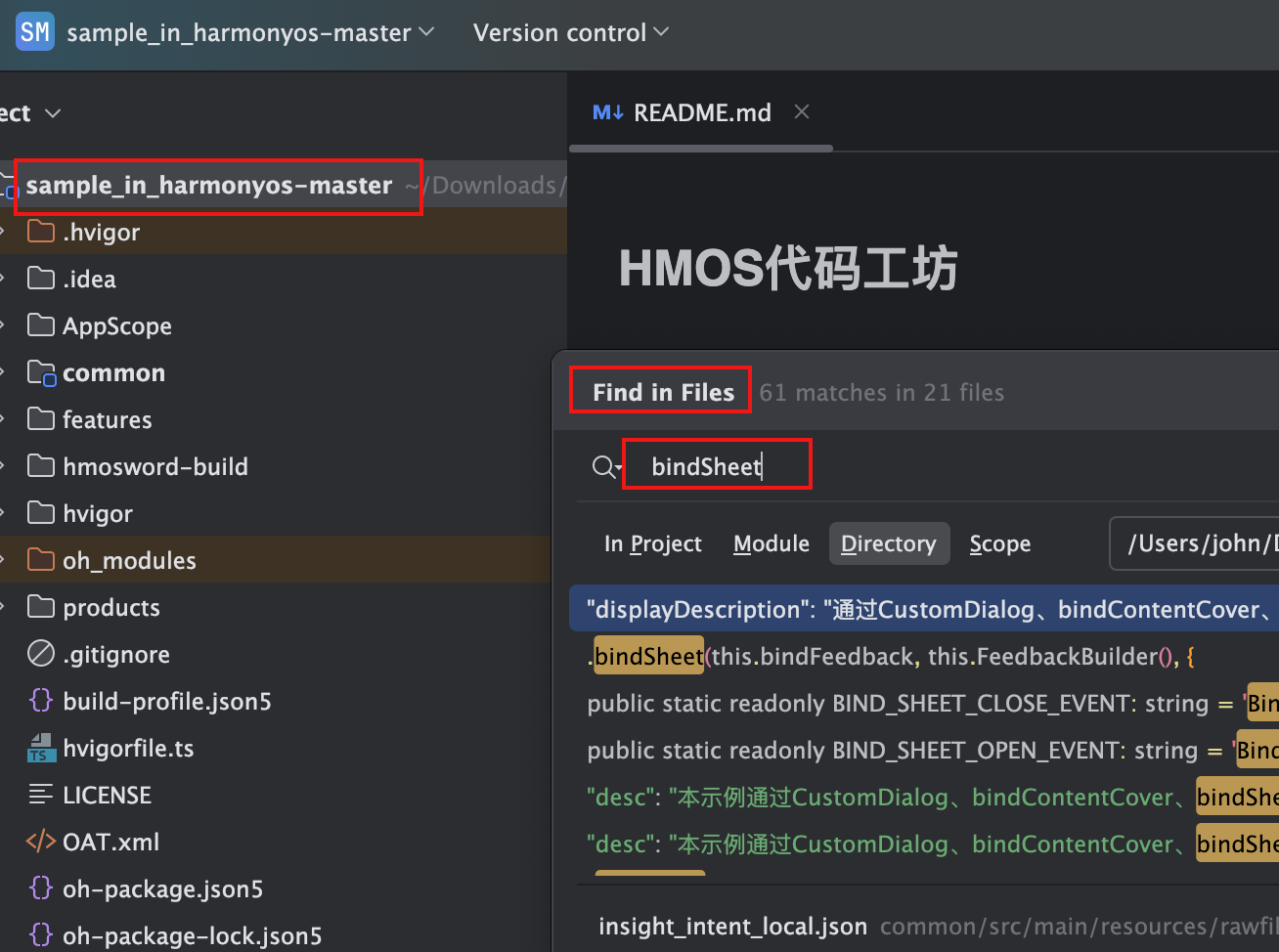
- HMOS代码工坊 源码里全文搜bindSheet。

开发者您好,可以使用模态窗口,全屏模态窗口使用bindContentCover,半模态窗口使用bindSheet,可以参考我的这篇实战文章,包含示例代码和实际运行效果图:
模态窗口的使用
https://developer.huawei.com/consumer/cn/blog/topic/03212629403776112


官网有相关代码: 示例代码
// xxx.ets
@Entry
@Component
struct SheetTransitionExample {
  @State isShow: boolean = false;
  @State sheetHeight: number = 300;

  @Builder
  myBuilder() {
    Column() {
      Button("change height")
        .margin(10)
        .fontSize(20)
        .onClick(() => {
          this.sheetHeight = 500;
        })

      Button("Set Illegal height")
        .margin(10)
        .fontSize(20)
        .onClick(() => {
          this.sheetHeight = -1;
        })

      Button("close modal 1")
        .margin(10)
        .fontSize(20)
        .onClick(() => {
          this.isShow = false;
        })
    }
    .width('100%')
    .height('100%')
  }

  build() {
    Column() {
      Button("transition modal 1")
        .onClick(() => {
          this.isShow = true;
        })
        .fontSize(20)
        .margin(10)
        .bindSheet($$this.isShow, this.myBuilder(), {
          height: this.sheetHeight,
          backgroundColor: Color.Green,
          onWillAppear: () => {
            console.info("BindSheet onWillAppear.");
          },
          onAppear: () => {
            console.info("BindSheet onAppear.");
          },
          onWillDisappear: () => {
            console.info("BindSheet onWillDisappear.");
          },
          onDisappear: () => {
            console.info("BindSheet onDisappear.");
          }
        })
    }
    .justifyContent(FlexAlign.Center)
    .width('100%')
    .height('100%')
  }
}

在HarmonyOS Next中,弹窗拉起需使用ArkUI提供的AlertDialog、CustomDialog或PopupDialog组件,通过dialogController控制显示。不可在页面未完全加载或后台状态下触发,需确保当前UIAbility处于Foreground状态。若弹窗未显示,检查是否传入正确context或存在模态窗口遮挡。

