


Flutter2.x中新增的按钮组件
Flutter2.x中新增的按钮组件的属性以及用法
| Flutter1.x中的按钮组件 | Flutter2.x中的按钮组件 |
|---|---|
| RaisedButton 凸起的按钮 | ElevatedButton 凸起的按钮 |
| FlatButton 扁平化的按钮 | TextButton 扁平化的按钮 |
| OutlineButton 线框按钮 | OutlinedButton 线框按钮 |
| IconButton 图标按钮 | IconButton 图标按钮 |
| ButtonBar 按钮组 | ButtonBar 按钮组 |
| FloatingActionButton 浮动按钮 | FloatingActionButton 浮动按钮 |
import 'package:flutter/material.dart';
import 'package:flutter/services.dart';
class ButtonExtendDemoPage extends StatelessWidget {
const ButtonExtendDemoPage({Key? key}) : super(key: key);
@override
Widget build(BuildContext context) {
return Scaffold(
appBar: AppBar(
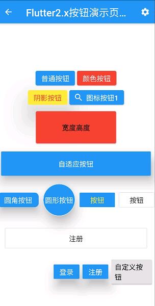
title: Text("Flutter2.x按钮演示页面"),
actions: <Widget>[
IconButton(
icon: Icon(Icons.settings),
onPressed: (){
},
)
],
),
body: Column(
mainAxisAlignment: MainAxisAlignment.center,
children: <Widget>[
Row(
mainAxisAlignment: MainAxisAlignment.center,
children: <Widget>[
ElevatedButton (
child: Text('普通按钮'),
onPressed: () {
print("普通按钮");
},
),
SizedBox(width: 5),
ElevatedButton(
child: Text('颜色按钮'),
style:ButtonStyle(
backgroundColor:MaterialStateProperty.all(Colors.red),
foregroundColor:MaterialStateProperty.all(Colors.white)
),
onPressed: () {
print("有颜色按钮");
},
),
],
),
Row(
mainAxisAlignment: MainAxisAlignment.center,
children: <Widget>[
ElevatedButton(
child: Text('阴影按钮'),
style:ButtonStyle(
backgroundColor:MaterialStateProperty.all(Colors.yellow),
foregroundColor:MaterialStateProperty.all(Colors.red),
elevation:MaterialStateProperty.all(50)
),
onPressed: () {
print("有阴影按钮");
},
),
SizedBox(width: 5),
ElevatedButton.icon(
icon: Icon(Icons.search),
label: Text('图标按钮1'),
// onPressed: null,
onPressed: () {
print("图标按钮");
})
],
),
SizedBox(height: 10),
Row(
mainAxisAlignment: MainAxisAlignment.center,
children: <Widget>[
Container(
height: 80,
width: 200,
child: ElevatedButton(
child: Text('宽度高度'),
style:ButtonStyle(
backgroundColor:MaterialStateProperty.all(Colors.red),
foregroundColor: MaterialStateProperty.all(Colors.black)
) ,
onPressed: () {
print("宽度高度");
},
),
)
],
),
SizedBox(height: 10),
Row(
mainAxisAlignment: MainAxisAlignment.center,
children: <Widget>[
Expanded(
child: Container(
height: 60,
margin: EdgeInsets.all(10),
child: ElevatedButton(
child: Text('自适应按钮1'),
onPressed: () {
print("自适应按钮");
},
),
),
)
],
),
SizedBox(height: 10),
Row(
mainAxisAlignment: MainAxisAlignment.center,
children: <Widget>[
ElevatedButton(
child: Text('圆角'),
style: ButtonStyle(
backgroundColor:MaterialStateProperty.all(Colors.blue),
foregroundColor: MaterialStateProperty.all(Colors.white),
elevation: MaterialStateProperty.all(20),
shape: MaterialStateProperty.all(
RoundedRectangleBorder(
borderRadius: BorderRadius.circular(10))
),
),
onPressed: () {
print("圆角按钮");
}),
Container(
height: 80,
child: ElevatedButton(
child: Text('圆形按钮'),
style: ButtonStyle(
backgroundColor:MaterialStateProperty.all(Colors.blue),
foregroundColor: MaterialStateProperty.all(Colors.white),
elevation: MaterialStateProperty.all(20),
shape: MaterialStateProperty.all(CircleBorder(side: BorderSide(color: Colors.white)),
)),
onPressed: () {
print("圆形按钮");
}),
),
TextButton (
child: Text("按钮"),
onPressed: () {
print('FlatButton');
},
),
SizedBox(width: 10),
OutlinedButton(
child: Text("OutlinedButton"),
onPressed: () {
print('FlatButton');
})
],
),
SizedBox(height: 10),
Row(
mainAxisAlignment: MainAxisAlignment.center,
children: <Widget>[
Expanded(
child: Container(
margin: EdgeInsets.all(20),
height: 50,
child: OutlinedButton(
child: Text("注册 配置边框"),
style: ButtonStyle(
foregroundColor: MaterialStateProperty.all(Colors.black),
side: MaterialStateProperty.all(BorderSide(width:1,color: Colors.red))
),
onPressed: () {}
),
),
)
],
),
Row(
mainAxisAlignment: MainAxisAlignment.end,
children: <Widget>[
ButtonBar(
children: <Widget>[
ElevatedButton(
child: Text('登录'),
onPressed: () {
print("宽度高度");
},
),
ElevatedButton(
child: Text('注册'),
onPressed: () {
print("宽度高度");
},
),
MyButton(text: "自定义按钮",height: 60.0,width: 100.0,pressed: (){
print('自定义按钮');
})
],
)
],
)
],
));
}
}
//自定义按钮组件
class MyButton extends StatelessWidget {
final text;
final pressed;
final width;
final height;
const MyButton({this.text='',this.pressed,this.width=80,this.height=30}) ;
@override
Widget build(BuildContext context) {
return Container(
height: this.height,
width: this.width,
child: ElevatedButton(
child: Text(this.text),
onPressed:this.pressed ,
),
);
}
}
更多关于Flutter2.x中新增的按钮组件的实战系列教程也可以访问 https://www.itying.com/category-92-b0.html
